
2.2.1: Pie Charts
- Page ID
- 5751
Pie Charts
What is the puppet doing? She can’t be cutting a pizza, because the pieces are all different colors and sizes. It seems like she is drawing some type of a display to show different amounts of a whole circle. The colors must represent different parts of the whole.

One example of what she may be doing would be that she is in charge of the student body and is presenting to the students the results of a questionnaire regarding student activities for the first semester. Of the 5 activities, the one that is orange in color is the most popular. The students have decided that they want to have a winter carnival week more than any other activity. To convey this information, the puppet is using a pie chart.
Pie charts, or circle graphs, are used extensively in statistics. These graphs appear often in newspapers and magazines. A pie chart shows the relationship of the parts to the whole by visually comparing the sizes of the sections (slices). Pie charts can be constructed by using a hundreds disk or by using a circle. The hundreds disk is built on the concept that the whole of anything is 100%, while the circle is built on the concept that 360o is the whole of anything. Both methods of creating a pie chart are acceptable, and both will produce the same result. The sections have different colors to enable an observer to clearly see the differences in the sizes of the sections. The following 2 examples will show the same problem, the first being done by using a hundreds disk, and the second being done by using a circle.
Constructing a Pie Chart
1. The Red Cross Blood Donor Clinic had a very successful morning collecting blood donations. Within 3 hours, people had made donations, and the following is a table showing the blood types of the donations:
| Blood Type | A | B | O | AB |
|---|---|---|---|---|
| Number of donors | 7 | 5 | 9 | 4 |
Construct a pie chart to represent the data. Use a hundredths disk.
Step 1: Determine the total number of donors: 7+5+9+4=25.
Step 2: Express each donor number as a percent of the whole by using the formula Percent = f/n⋅100%, where f is the frequency, and n is the total number.
7/25⋅100%=28% | 5/25⋅100%=20% | 9/25⋅100%=36% | 4/25⋅100%=16%
Step 3: Use a hundreds disk and simply count the correct number for each blood type (1 line = 1 percent).
Step 4: Graph each section. Write the name and correct percentage inside the section. Color each section a different color.
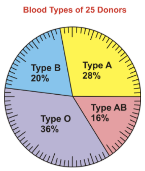
The above pie chart was created by using a hundreds disk, which is a circle with 100 divisions in groups of 5. Each division (line) represents 1 percent. From the graph, you can see that more donations were of Type O than any other type. The fewest number of donations of blood collected was of Type AB. If the percentages had not been entered in each section, these same conclusions could have been made based simply on the size of each section.
2. Construct the pie chart in the previous example by using a circle instead of a hundredths disk.
Step 1: Determine the total number of donors: 7+5+9+4=25.
Step 2: Express each donor number as the number of degrees of a circle that it represents by using the formula Degrees=fn⋅360∘, where f is the frequency and n is the total number.
725⋅360o = 100.8o | 525⋅360o = 72o | 925⋅360o = 129.6o | 425⋅360o = 57.6o
Step 3: Using a protractor, graph each section of the circle.
Step 4: Write the name and correct percentage inside each section. Color each section a different color.
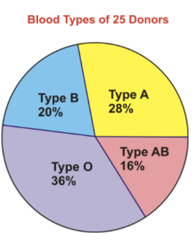
The above pie chart was created by using a protractor and graphing each section of the circle according to the number of degrees needed. From the graph, you can see that more donations were of Type O than any other type. The fewest number of donations of blood collected was of Type AB. Notice that the percentages have been entered in each section of the graph and not the numbers of degrees. This is because degrees would not be meaningful to an observer trying to interpret the graph. In order to create a pie chart by using a circle, it is necessary to use the formula to calculate the number of degrees for each section, and in order to create a pie chart by using a hundreds disk, it is necessary to use the formula to determine the percentage for each section. In the end, however, both methods result in identical graphs.
Using a Pie Chart to Answer Questions
A new restaurant is opening in town, and the owner is trying very hard to complete the menu. He wants to include a choice of 5 salads and has presented his partner with the following pie chart to represent the results of a recent survey that he conducted of the town’s people. The survey asked the question, "What is your favorite kind of salad?"
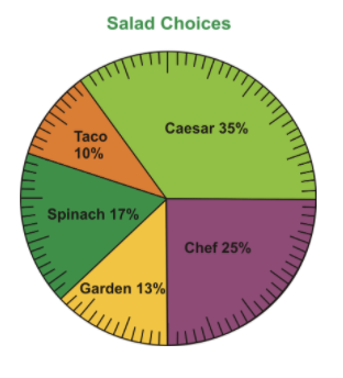
Use the pie chart to answer the following questions:

1. Which salad was the most popular choice?
The most popular salad was the caesar salad.
2. Which salad was the least popular choice?
The least popular salad was the taco salad.
3. If 300 people were surveyed, how many people chose each type of salad?
Caesar salad: 35% = 35/100 = 0.35
(300)(0.35) = 105 people
Taco salad: 10%= 10/100 = 0.10
(300)(0.10)=30 people
Spinach salad: 17%=17/100=0.17
(300)(0.17)=51 people
Garden salad: 13%=13/100=0.13
(300)(0.13)=39 people
Chef salad: 25%=25/100=0.25
(300)(0.25)=75 people
4. What is the difference between the number of people who chose the spinach salad and the number of people who chose the garden salad?
The difference between the number of people who chose the spinach salad and the number of people who chose the garden salad is 51−39=12 people.
Examples
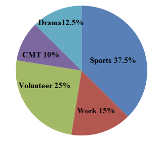
The following pie chart, which is incomplete, shows the extracurricular activities for 200 high school students:
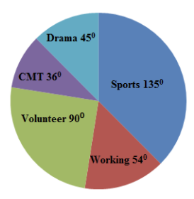
Use the pie chart to answer the following questions:
a. What makes the above pie chart incomplete?
b. How many students participate in sports?
c. How many students participate in drama?
d. How many students do CMT?
e. How many students participate in volunteer activities after school?
f. How many student work?
g. Construct the pie chart so that it shows percentages and not degrees.
Example 1
What makes the above pie chart incomplete?
The parts of the pie chart are displayed with degrees, but they should be shown with percentages.
Example 2
How many students participate in sports?
The number of students who participate in sports can be calculated as follows:
135/360=0.375(0.375)(200)=75
Example 3
How many students participate in drama?
The number of students who participate in drama can be calculated as follows:
45/360=0.125(0.125)(200)=25
Example 4
How many students do CMT?
The number of students who do CMT can be calculated as follows
36/360=0.1(0.1)(200)=20
Example 5
How many students participate in volunteer activities after school?
The number of students who participate in volunteer activities can be calculated as follows:
90/360=0.25(0.25)(200)=50
Example 6
How many students work? Construct a pie chart so that is shows percentages and not degrees.
The number of students who work can be calculated as follows:
54/360=0.15(0.15)(200)=30
Review
- On a recent math test, 9 students out of the 25 who took the test scored above 85. What percentage of the students scored above 85?
- 0.36%
- 3.6%
- 360%
- 36%
- The following pie chart represents the time spent doing various activities during one day. Using the pie chart, supply a possible activity that may be represented by each of the percentages shown in the chart.
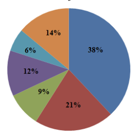
3. In a few sentences, explain whether or not you find pie charts helpful for interpreting data.
550 high school students were asked their favorite sport, and the results are shown in the pie chart below. Use the pie chart to answer the following questions:
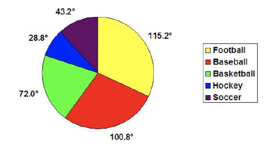
- What makes the above pie chart incomplete?
- How many students have soccer as a favorite sport?
- How many students have hockey as a favorite sport?
- How many students have basketball as a favorite sport?
- How many students have baseball as a favorite sport?
- How many students have football as a favorite sport?
- Construct the pie chart so that it shows percentages and not degrees.
Vocabulary
| Term | Definition |
|---|---|
| pie chart | A pie chart shows the relationship of the parts to the whole by visually comparing the sizes of the sections (slices) of a circle. |
| Circle graph | A circle graph is a visual display of data that illustrates data as percentages. |
| whole relationship | The whole relationship is represented by the entire circle. |
Additional Resources
PLIX: Play, Learn, Interact, eXplore - Pie Chart: Soda Party
Activities: Pie Charts Discussion Questions
Study Aids: Presenting Univariate Data
Lesson Plans: Pie Charts Lesson Plan
Practice: Pie Charts
Real World: Ice Cream Indicators