
2.2.3: Interpretation of Circle Graphs
- Page ID
- 5753
Interpreting Pie Charts
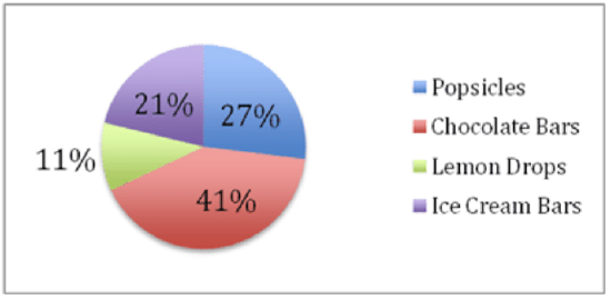
Kalena’s cheerleading squad is raising money for prom by selling candy at school football games. After a month of sales, the squad is running low on candy and decides to review the sales so far to help them decide what to order when they restock.
The pie chart below describes the number of sales that the girls have recorded for each item. If you know that they sold 850 fruit popsicles, how could you calculate the number of chocolate bars or bags of lemon drops they sold? We will review this question after the lesson.
CK-12 Foundation - CCSA
Interpreting Pie Charts
Reading a pie chart is relatively simple, which is one of the primary values of a pie chart. The only real trick to it is to become very familiar with the sector angle formula and to practice using it to deduce the value(s) of unspecified data.
Recall that each piece of the pie is called a sector, and each sector encompasses an angle that is proportional to the frequency of the data it represents. The formula relating the angle of a sector to frequency is:

Because the primary skill here is just familiarity that comes with practice, let’s jump right into the examples.
Interpreting Pie Charts
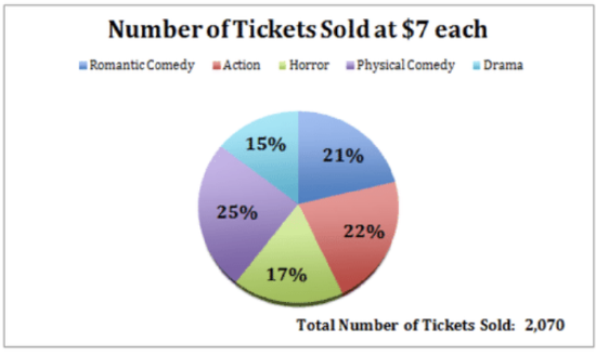
Given the pie chart below, identify or calculate the following:
CK-12 Foundation - CCSA;CC BY-NC-SA
a. The total number of tickets to comedy-themed movies
To calculate the total number of comedy movie tickets, we need to multiply the decimal equivalent of each of the two comedy categories by the total number of tickets sold to learn how many of each were sold, then find the sum.
i. .21×2070=435 romantic comedy tickets
j. .25×2070=518 physical comedy tickets
k. 435 romantic comedy + 518 physical comedy=953 Total Comedy Tickets
b. The dollar value of tickets sold to horror movies.
To find the dollar value of the horror movies, first multiply the decimal equivalent of the horror movie percentage, and multiply the result by $7, the price of each ticket.
l. .17×2070=352 horror movie tickets
m. 352×$7=$2,464 in horror movie ticket sales
c. The percentage of tickets sold to action and romantic comedies together.
To find the percentage of action and romantic comedy tickets together, simply sum the given percentages.
n. 22%+21%=33% total action and romantic comedy tickets
Calculating Information Given a Pie Chart
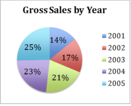
Given the pie chart below, calculate the actual gross sales in years 2001, 2002, 2003, and 2004.
Gross sales in 2005 were $94,000
CK-12 Foundation - CCSA
First we need to calculate the total gross sales for all five years. We know that the $94,000 in gross sales from 2005 represents 25% of the total, so we can calculate:
.25×x=$94,000→$94,000.25=$376,000
Now we can simply multiply the total gross sales by the percentage represented by each year to get the estimated dollar value for each category:
- 2001: 14% of $376,000 = $52,640
- 2002: 17% of $376,000 = $63,920
- 2003: 21% of $376,000 = $78,960
- 2004: 23% of $376,000 = $86,480
Verify that the total values add up: $52,640+$63,920+$78,960+$86,480+$94,000=$376,000
Evaluating Pie Charts
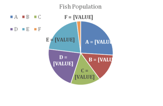
Evaluate the pie chart below and answer the questions:
CC BY-NC-SA
a. If the population of Lake C is 27,000 fish, what is the total fish population of all lakes on the chart?
The population of lake C is 27,000 fish, and represents 15% of the whole, use the data to set up an equation:
.15x=27,000→x=27000.15→x=180,000
The combined population of all lakes on the chart is 180,000 fish.
b. What is the ratio of the fish population in lakes A and C?
Lake A represents 26% of the total, and Lake C 15%.
The ratio is 2615=1.73:1
c. What is the combined population of lakes D and E?
Lake D is 22% of 180,000 and Lake E is 21% of 180,000.
Together they represent 22% + 21% = 43% of the total.
43%×180,000=77,400 fish in lakes D and E together.
Earlier Problem Revisited
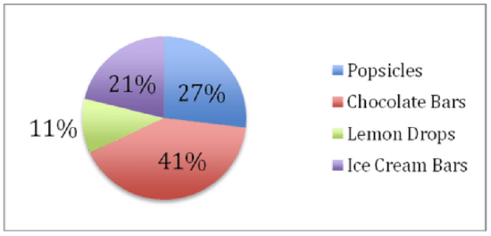
The pie chart below describes the sales that the girls have recorded as numbers of sales. If you know that they sold 850 fruit popsicles, how could you calculate the number of chocolate bars or bags of lemon drops they sold?
CK-12 Foundation - CCSA
This one should be a piece of… pie… now! 850 fruit popsicles represents 27% of the total. Set up an equation:
27%x=850→x=850.27→3,148 total sales
Chocolate Bars represent 41% of the 3,148 total sales:
.41×3148=1291 chocolate bars
Lemon Drops represent 11% of the 3,148 sales:
.11×3148=346 lemon drop bags
Examples
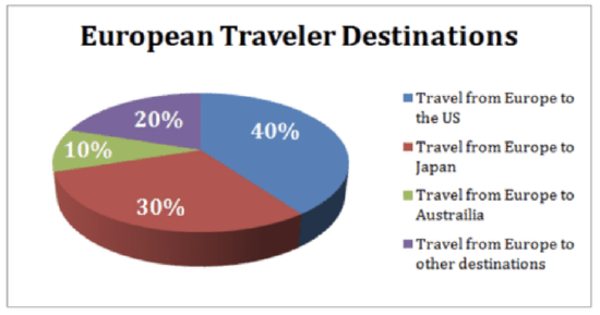
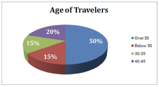
The two charts below show the distribution of overseas tourist traffic from Europe to other countries. They show the distribution by country and by age, respectively.
CK-12 Foundation - CCSA
CK-12 Foundation - CCSA
Example 1
What percentage of tourists went to either the US or Australia?
We can see from the top chart that U.S. travelers (in blue) accounted for 40% of the travel, and Australian travelers (green) represented 10%. The total percentage who went to either country is 40%+10%=50% of travelers.
Example 2
What is the ratio of European tourists that went to the USA to the number of European tourists who were below the age of 30?
40% of travelers went to the U.S, and 15% were under 30 (bottom graph, in red). The ratio is 40:15 or 8:3.
Example 3
If, among the "other destinations", India accounted for 25% of the travel, and it is known that 25 Europeans went to India, how many 30-39 year old Europeans went abroad in that year?
If India accounts for 25% of the 20% of travelers who went to “other destinations”, then it accounts for 5% of the total travelers (25%×20%=5%). If 25 Europeans went to India, then we know 25 travelers represents 5% of the total. We can calculate the total number of European travelers to be: 5%×x=25→x=25.05→x=500 total travelers. We then look at the Age of Travelers chart and see that 30-39 year olds accounted for 15% of the travel that year. Multiply 15% by 500 to find our answer, which is 75 travelers.
Example 4
Based on the data, about how many 40-49 year olds traveled to Japan?
We know there are a total of 500 travelers. We can look at the number of total travelers who went to Japan, which is 30% of the 500, or 150 people who went to Japan. Out of that 150, we can guess that 20% (the percentage of 40-49 year old travelers, from the bottom chart) of them were between the age of 40-49. 20%×150=30 people.
Review
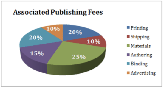
The following pie-chart shows the percentage distribution of the expenses incurred in publishing a statistics math book. Study the Pie Chart and answer the questions below.
CK-12 Foundation - CCSA
1. If the publisher paid $30,600 for printing, then how much did the publisher pay the author to write the book?
2. What is the measurement of the angle of the sector that corresponds to the authoring expense?
3. If the book is sold at 20% above the actual cost per book, and the marked price is $180.00, what is the cost of the paper used in a single copy of the book?
4. If 5500 copies of the book are published, and shipping on them amounts to $82,500, what should the selling price of the book be so that the publisher can earn a profit of 25%?
5. Authorship of the book is less than the printing cost by what percentage?
6. If the difference between two of the expenditures in the chart are represented by 54 degrees, then which combination(s) of two expenditures could they be?
7. If the cost of paper is $56,250 for printing an edition of the book, then what was the advertising cost?
8. Identify two expenditures that together have a central angle of 108 degrees.
The following pie chart shows the sources of funds that will be collected by Downtown Development to beautify the city. Use the chart to answer the questions that follow.
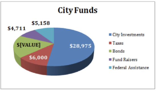
CK-12 Foundation - CCSA
9. Nearly 20% of the funding will come from which source? 55290
10. If the city could only pull $9,725 from bonds, by what percent should it increase the amount it borrows against its investments to make up the difference?
11. If the bonds are managed by a third party that collects a 10% commission, how much would the bonds have actually been worth, before being added to the budget represented in the chart above?
12. What is the degree measure corresponding to the Taxes collected?
13. What is the approximate ratio of the funds to be collected through Bonds and through City Investments?
The following charts give information about how weight is distributed throughout the human body, according to different components. Answer the questions below based on the pie charts.
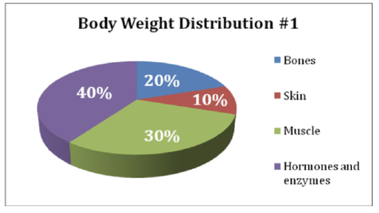
CC BY-NC-SA
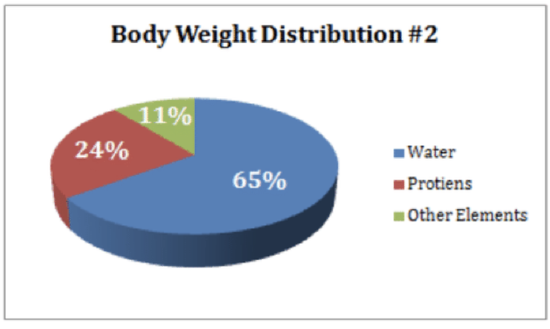
CK-12 Foundation - CCSA
14. What percentage of proteins is equivalent to the weight of skin?
15. How much of the human body is neither made of bones or skin?
16. What is the ratio of the weight of proteins in the muscles to that of the weight of proteins in the bones?
Vocabulary
| Term | Definition |
|---|---|
| Sector | A sector of a circle is a portion of a circle contained between two radii of the circle. Sectors can be measured in degrees. |
| sector angle formula | The sector angle formula is used to calculate how many degrees of the circle should be allocated to a given value and is calculated by dividing the frequency of the data in the sector by the total frequency of the data all multiplied by 360. |
Additional Resources
PLIX: Play, Learn, Interact, eXplore - Interpretations of Circle Graphs: Northwest Region in Millions
Video: Reading Pie Graphs
Practice: Interpretation of Circle Graphs
Real World: New Faces