
2.6.6: Multiple Line Graphs
- Page ID
- 5769
Multiple Line Graphs

Aaron is giving a presentation on population growth in his history class. He has organized the population (in millions) of different continents. He wants to create a graph that illustrates the data in the table below.
| (Sub)continent | 1950 | 1955 | 1960 | 1965 | 1970 | 1975 | 1980 |
| Africa | 228 | 254 | 285 | 322 | 366 | 417 | 479 |
| The Americas | 331 | 370 | 416 | 464 | 511 | 561 | 613 |
| Europe | 543 | 574 | 605 | 634 | 657 | 677 | 694 |
How can Aaron make a graph?
In this concept, you will learn how to create and read multiple line graphs.
Creating and Reading Multiple Line Graphs
Data is a set of numerical or non-numerical information. Data can be analyzed in many different ways. In this concept you will analyze numerical data using line graphs.
One way to display data is in a multiple line graph. A multiple line graph shows the relationship between independent and dependent values of multiple sets of data. Usually multiple line graphs are used to show trends over time. In the graph, each data value is represented by a point in the graph that are connected by a line. In a multiple line graph, there are two or more lines in the graph connecting two or more sets of data points. The independent variable is listed along the horizontal, or x, axis and the quantity or value of the data is listed along the vertical, or y, axis. Lastly, the legend, or key, states what each line represents.
Let's look at an example.
Full-time and part-time enrollment at California State University for fives years is recorded in the data table below. Create a multiple line graph to represent the information in the table. Then discuss the data presented in the graph.
| Year: | Number of Students Attending Full-Time: | Number of Students Attending Part-Time: |
|---|---|---|
| 2003 | 10,000 | 2,000 |
| 2004 | 9,500 | 2,100 |
| 2005 | 11,100 | 2,050 |
| 2006 | 12,000 | 2,700 |
| 2007 | 13,300 | 2,550 |
First, draw the horizontal (x) and vertical (y) axis.

Next, label the vertical axis. The vertical axis lists the dependent variable and represents the quantity of the data. In this case, the dependent variable is number of students and the label will also be "Number of Students."
Next, title the graph. The title of the graph should be short and clear. It should explain what data is presented in the graph. In this case, the title will be “Enrollment at California State University.”
Then, determine the units on the vertical axis. To do this, start by reviewing the smallest and largest values in the table. The smallest value is 2,000 and the largest is 13,300. Based on these values label the vertical axis from 0-14,000. Since the values are whole numbers and are relatively spread out, a unit of 1,000 can be used. Therefore, the vertical axis will start at 0 and go to 14,000 by increments of 1,000.
Next, draw the data points. To do this, write the years along the horizontal axis, leaving space between each. Each year will have two points representing the number of students enrolled part-time and full-time. To start, draw a point for the part-time students in 2003. To do this find 2003 on the horizontal axis and go up until 2,000, then draw a point. Then draw the point for the full-time students. To do this find 2003 on the horizontal axis and go up until 10,000, then draw the point. Continue drawing the points for both part and full time students for all years.
Next, draw the lines. To do this, start with the point on the far left of the graph that represents part-time students in 2003, then connect the points with one line from 2003 to 2007. To draw the second line, start with the point on the far left of the graph that represents full-time students in 2003, then connect the points with one line from 2003 to 2007. There should be two different lines, each representing a different group of students (part and full time).
Next, create the legend, or key. Each line represents a different student group. The legend represents this by denoting which colored line is for part-time students and full-time students.
Then, discuss the graph. To do this, analyze the graph by comparing lines and their respective steepness.
The first answer is the graph should look like the one below. The second answer is the discussion of the graph is: the number of full-time students enrolled increased by 3,300 students from 2003 to 2007, while full-time enrollment declined between 2003 and 2004, and then increased every other year; the number of part-time students enrolled increased by 550 students from 2003 to 2007; and the increase in full-time enrollment was greater than the increase in part-time enrollment.
Examples
Example 1
Earlier, you were given a problem about Aaron and his history presentation.
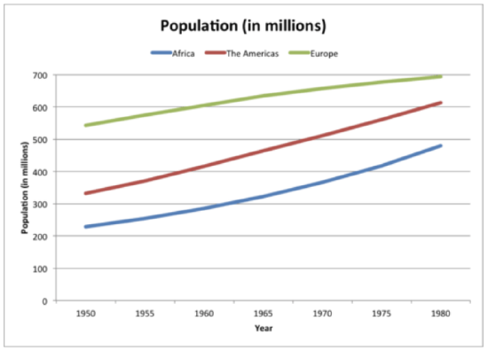
Aaron collected data on the population (in millions) of three countries into the table below. He wants to create a graph to display the data that can be included in his presentation.
| (Sub)continent | 1950 | 1955 | 1960 | 1965 | 1970 | 1975 | 1980 |
| Africa | 228 | 254 | 285 | 322 | 366 | 417 | 479 |
| The Americas | 331 | 370 | 416 | 464 | 511 | 561 | 613 |
| Europe | 543 | 574 | 605 | 634 | 657 | 677 | 694 |
How can Aaron make a graph?
First, Aaron must look at his data and determine the best graph to make to represent his data. Since Aaron has multiple countries and multiple data points for each country over time, a multiple line graph is the best way to represent his data.
Then, to make the multiple line graph, he must first draw the horizontal(x) and vertical (y) axes.

Next, he must label the horizontal axis. The horizontal axis states the independent variable. In this case, the independent variable is the year and the axis will be labeled "Year."
Next, he must label the vertical axis. The vertical axis lists the dependent variable and represents the quantity of the data. In this case, the dependent variable is population (in millions) and the label will also be "Population (in millions)."
Next, he must title the graph. The title of the graph should be short and clear. It should explain what data is presented in the graph. In this case, the title will be “Population (in millions).”
Then, he must determine the units on the vertical axis. To do this, start by reviewing the smallest and largest values in the table. The smallest value is 228 and the largest is 694. Based on these values label the vertical axis from 0-700. Since the values are whole numbers and are relatively spread out, a unit of 100 can be used. Therefore, the vertical axis will start at 0 and go to 700 by increments of 100.
Next, he must draw the data points. To do this, write the years along the horizontal axis, leaving space between each. Each year will have three points representing the population of the three continents. To start, draw a point for Africa. To do this find 1950 on the horizontal axis and go up to 228, then draw a point. Then draw the point for The Americas. To do this find 1950 on the horizontal axis and go up to 331, then draw the point. Then draw the point for Europe. To do this find 1950 on the horizontal axis and go up to 543, then draw the point. Continue drawing the points for all countries for the remaining years.
Next, he must draw the lines. To do this, start with the point on the far left of the graph that represents Africa, then connect the points with one line. To draw the second line, start with the point on the far left of the graph that represents The Americas, then connect the points with one line in a different color. To draw the third line, start with the point on the far left of the graph that represents Europe, then connect the points with one line in a different color. There should be three different lines, each representing a different country.
Next, he must create the legend, or key. Since each line represents a different country, the legend will state which colors represent Africa, The Americas, and Europe.
The graph below represents Aaron's data.
Example 2
The graph below shows the absolute minimum and maximum temperatures in Celsius in Dubai for 2005. State three conclusions about the data.
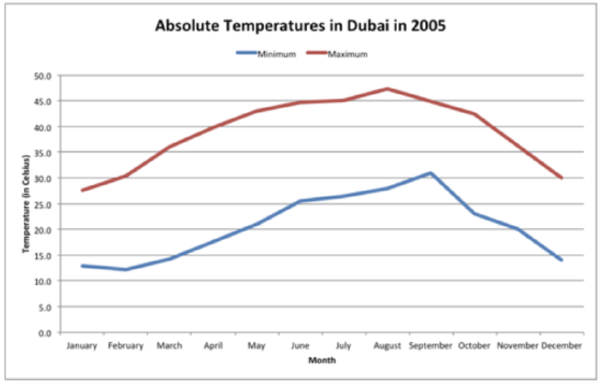
The answer is three conclusions that can be made from the graph are: the minimum and maximum temperatures do not rise and fall with each other over the course of the year; the greatest minimum temperature occurred in September, whereas the greatest maximum temperature occurred in August; and the lowest maximum and minimum temperatures both occurred in January.
Example 3
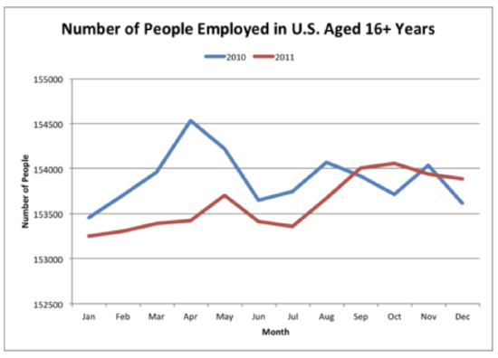
The number of people employed in the U.S. aged 16 years and over for the yeas 2010 and 2011 is represented in the table below. Create a multiple line graph to illustrate the data.
| Month | 2010 | 2011 |
| Jan | 153454 | 153250 |
| Feb | 153704 | 153302 |
| Mar | 153964 | 153392 |
| Apr | 154528 | 153420 |
| May | 154216 | 153700 |
| Jun | 153653 | 153409 |
| Jul | 153748 | 153358 |
| Aug | 154073 | 153674 |
| Sep | 153918 | 154004 |
| Oct | 153709 | 154057 |
| Nov | 154041 | 153937 |
| Dec | 153613 | 153887 |
First, draw the horizontal (x) and vertical(y)axes.
Next, label the vertical axis. The vertical axis lists the dependent variable and represents the quantity of the data. In this case, the dependent variable is number of people and the label will also be "Number of People."
Next, title the graph. The title of the graph should be short and clear. It should explain what data is presented in the graph. In this case, the title will be “Number of People Employed in the U.S. Aged 16+ Years.”
Then, determine the units on the vertical axis. To do this, start by reviewing the smallest and largest values in the table. The smallest value is 153,250 and the largest is 154,528. Based on these values label the vertical axis from 152,500-15,500. Since the values are whole numbers and are relatively close, a unit of 500 can be used. Therefore, the vertical axis will start at 152,500 and go to 155,000 by increments of 500.
Next, draw the data points. To do this, write the months along the horizontal axis, leaving space between each. Each month will have two points representing the number of people employed in 2010 and 2011. To start, draw a point for the year 2010. To do this find January on the horizontal axis and go up until 153,454, then draw a point. Then draw the point for the 2011. To do this find January on the horizontal axis and go up until 153,250, then draw the point. Continue drawing the points for both years for all months.
Next, draw the lines. To do this, start with the point on the far left of the graph that represents 2010, then connect the points with one line. To draw the second line, start with the point on the far left of the graph that represents 2011, then connect the points with one line in a different color. There should be two different lines, each representing a different year.
Next, create the legend, or key. Since each line represents a different year, the legend will state which colors represent 2010 and 2011.
The answer is the graph should look like the one below.
Example 4
The graph below shows the population in thousands for Aruba and Seychelles. List three statements about the data.

The answer is three statements that can be made from the graph are: from years 2000 to 2006 Aruba's population was less than the Seychelles; Aruba saw a substantial increase in it's population in 2006; Aruba saw a steady increase from the years 2007 to 2011.
Example 5
The graph below shows the number of students enrolled in college whose major is business for the years 2001 to 2007. List three statements about the data.
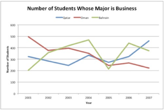
First, analyze the graph by comparing the shape of the line.
The answer is three statements that can be made from the graph are: there was a drop in the number of business majors in Qatar and Bahrain in 2005; Oman has seen a reduction in the number of business majors from years 2003 to 2007; and the number of business majors in Bahrain has seen the greatest amount of fluctuation in enrollment.
Review
The table below shows the number of tickets sold at the Phoenix Zoo and the Seattle Zoo since 1998.
- Create a multiple line graph using the data from the table.
| Year: | Number of Tickets Sold at Phoenix Zoo: | Number of Tickets Sold at Seattle Zoo: |
|---|---|---|
| 1998 | 547,000 | 601,000 |
| 1999 | 562,000 | 602,500 |
| 2000 | 569,000 | 603,700 |
| 2001 | 566,000 | 605,000 |
| 2002 | 569,000 | 604,000 |
| 2003 | 572,000 | 605,100 |
| 2004 | 576,000 | 606,000 |
| 2005 | 575,500 | 605,800 |
| 2006 | 579,000 | 607,000 |
| 2007 | 580,000 | 608,000 |
- Which zoo sold more tickets in 2003?
- Which zoo sold more tickets in 2005?
- Which was the best year for sales at the Phoenix zoo?
- Which was the best year for sales at the Seattle zoo?
- Based on this information, can we say which zoo is more popular? Why?
- Based on this data, will sales increase or decrease in 2008 at the Phoenix zoo?
- Based on this data, will sales increase or decrease in 2008 at the Seattle zoo?
- What is the difference in the quantity of tickets in 2005?
- What is the difference in the quantity of tickets in 2000?
The data table below depicts the increase in cost of a movie ticket each year since 2000.
| Year: | Price of a Ticket: |
|---|---|
| 2000 | $5.50 |
| 2001 | $5.75 |
| 2002 | $6.00 |
| 2003 | $6.25 |
| 2004 | $6.50 |
| 2005 | $7.25 |
| 2006 | $8.00 |
| 2007 | $9.25 |
- Decide which type of graph, bar or line should be used to represent the information in the data table.
- Then use the information on the data table to create the graph you’ve chosen.
- True or false. A multiple line graph is the best choice for this data.
The data table below depicts the number of newspapers in circulation (in millions) over a period of three days.
- Decide which type of graph, bar or line should be used to represent the information in the data table.
- Then use the information on the data table to create the graph you’ve chosen.
| Name of Newspaper | Friday | Saturday | Sunday |
|---|---|---|---|
| Los Angeles Times | 55 | 58 | 60 |
| New York Times | 62 | 63 | 67 |
| Chicago Sun | 47 | 49 | 49 |
| Orange County Register | 39 | 41 | 42 |
| San Francisco Chronicle | 51 | 53 | 55 |
Additional Resources
PLIX: Play, Learn, Interact, eXplore - Multiple Line Graphs: Jack's Jumpshot
Video: Reading Line Graphs
Practice: Multiple Line Graphs