
2.7.4: Scatter Plots on the Graphing Calculator
- Page ID
- 5773
Finding the Equation of Best Fit Using a Graphing Calculator
You might be familiar with the idea of calorie intake requirements, such as the guidelines shown in the table below. Use your calculator to find the line of best fit for the data.
Calorie Requirements (Male), 1-59 years
| Age Range, | 1-3 | 4-6 | 7-10 | 11-14 | 15-18 | 19-59 |
|---|---|---|---|---|---|---|
| Calorie Needs, | 1230 | 1715 | 1970 | 2220 | 2755 | 2550 |
The age is measured in years.
Finding the Equation of a Best Fit Using a Calculator
We have already learned how to find the linear equation of best fit by hand. This entire process can also be done by your graphing calculator. It is recommended that you use a graphing calculator for two main reasons: accuracy and consistency. The graphing calculator will be more accurate than a calculation by hand and it will also be more consistent between students, or a greater likelihood that everyone will get the same answer.
Below is a table for the total number of home runs hit from 1990-2000.
Let's make a scatterplot using a graphing calculator.
| 1990 | 1991 | 1992 | 1993 | 1994 | 1995 | 1996 | 1997 | 1998 | 1999 | 2000 |
|---|---|---|---|---|---|---|---|---|---|---|
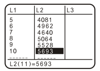
| 3317 | 3383 | 3038 | 4030 | 3306 | 4081 | 4962 | 4640 | 5064 | 5528 | 5693 |
Recall that an ordered pair is a point, (1990, 3317), for example. In the graphing calculator, you will need to enter each ordered pair as an x−value and a y−value. To do this, you need to create lists. The x−values will be List1, or L1 and the y−values will be List2, or L2. Instructions below are for the TI 83/84.
To create a list:
Step 1: Press STAT.
Step 2: In EDIT, select 1:Edit…. Press ENTER.
Step 3: The List table appears. If there are any current lists, you will need to clear them. To do this, arrow up to L1 so that it is highlighted (black). Press CLEAR, then press ENTER. Repeat with L2, if necessary.
Step 4: Now, enter the data into the lists. Enter all the entries into L1 (years) first and press enter between each entry. Then, repeat with L2 and the total home run numbers. Your screen should look something like this when you are done.
https://www.desmos.com/calculator
Step 5: Press 2nd MODE (QUIT).
To graph the plot:
Step 6: Press Y=.
Step 7: Clear any equations that are in the Y=. To do this, arrow down to the equation and press CLEAR. Press 2nd MODE (QUIT).
Step 8: Press 2ndY= (STAT PLOT). Turn Plot1 on by highlighting On and pressing ENTER. Then, select the first option for the Type of stat plot. Make sure the Xlist is L1 and the Ylist is L2. To change these, scroll down to Xlist (for example), and press 2nd 1 (L1). 2nd 2 is L2. Mark should also be on the first option.
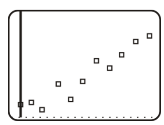
Step 9: Press GRAPH. Nothing may show up. If this is the case, press ZOOM and scroll down to 9:ZoomStat. Press ENTER. Your plot should look something like this.
https://www.desmos.com/calculator
Now you can find the equation of best fit for the data, with a graphing calculator.
To find the equation of best fit: (In the TI 83/84, it is also called Linear Regression, or LinReg)
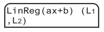
Step 1: After completing steps 1-5 above (to make the list), press STAT and then arrow over to the CALC menu.
Step 2: Select 4:LinReg(ax+b). Press ENTER.
Step 3: You will be taken back to the main screen. Type (L1,L2) and press ENTER. L1 is 2nd 1, L2 is 2nd 2 and the comma is the button above the 7.
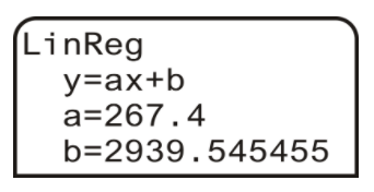
Step 4: The following screen shows up. To the calculator, a is the slope and b is still the y−intercept. Therefore, the equation of the line is y=267.4x+2939.55.
Step 5: If you would like to plot the line on the scatterplot, press
Y= and enter in the equation from Step 4:
y=267.4x+2939.55. Press GRAPH.
Use the same equation found in Step 4 above (y=267.4x+2939.55) to predict the number of home runs hit in 2015.
Use x=25 because x=0 is 1990. Plug into the linear regression equation, y=267.4x+2939.55
y=267.4(25)+2939.55
y=9624.55
Because we cannot have a fraction of a home run, round up to 9625.
Examples
Example 1
Earlier, you were asked to use your calculator to find the line of best fit for the data given about calorie intake for males.
Following the steps outlined in this concept on your calculator, the line of best fit is y=1076.3333333333+284.85714285714x.
Round all answers to the nearest hundredth.
Example 2
Use the following data set and find the equation of best fit with the graphing calculator. Also find the equation of best fit by hand. Then, use both equations to find the sales for 2010 and compare your answers.
CNN - money.cnn.com
Source: CNN
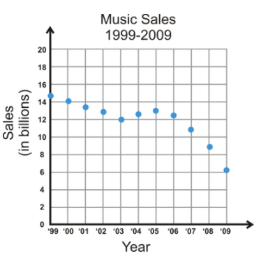
You do not have a table, so you need to estimate the values from the scatterplot. Here is a sample table for the scatterplot. Remember, this is years vs. money, in billions.
| 1999 (0) | 2000 (1) | 2001 (2) | 2002 (3) | 2003 (4) | 2004 (5) | 2005 (6) | 2006 (7) | 2007 (8) | 2008 (9) | 2009 (10) |
|---|---|---|---|---|---|---|---|---|---|---|
| 14.8 | 14.1 | 13.8 | 13 | 12 | 12.8 | 13 | 12.3 | 11 | 9 | 6.2 |
Now, using the steps illustrated in this concept, determine the equation of best fit using your graphing calculator. If you used the data set above, you should get y=−0.66x+15.28. Using the calculator’s equation for 2010 (11), we get y=−0.66(11)+15.28=8.02 billion.
To find the equation of best fit by hand, use these steps to help you.
Step 1: Draw the scatterplot on a graph.
Step 2: Sketch the line that appears to most closely follow the data. Try to have the same number of points above and below the line.
Step 3: Choose two points on the line and estimate their coordinates. These points do not have to be part of the original data set.
Step 4: Find the equation of the line that passes through the two points from Step 3.
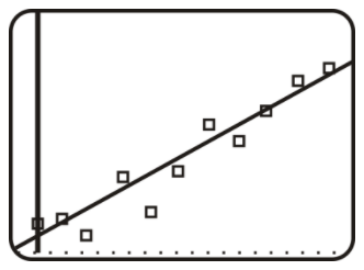
Let’s use these steps on the graph above. We already have the scatterplot drawn, so let’s sketch a couple lines to find the one that best fits the data.
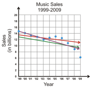
CK-12 Foundation;CNN - money.cnn.com
From the lines in the graph, it looks like the purple line might be the best choice. The red line looks good from 2006-2009, but in the beginning, all the data is above it. The green line is well below all the early data as well. Only the purple line cuts through the first few data points, and then splits the last few years. Remember, it is very important to have the same number of points above and below the line.
Using the purple line, we need to find two points on it. The second point, crosses the grid perfectly at (2000, 14). Be careful! Our graph starts at 1999, so that would be considered zero. Therefore, (2000, 14) is actually (1, 14). The line also crosses perfectly at (2007, 10) or (8, 10). Now, let’s find the slope and y−intercept.
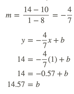
The equation of best fit is y=−4/7x+14.57.
To predict music sales in 2010, plug in 2010 for x in the equation we found solving by hand and solve for y.
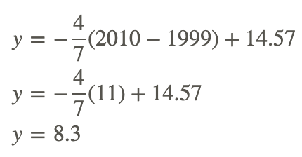
Using this equation, we get y=−0.57(11)+14.57=8.3 billion.
As you can see, the answers are pretty close.
Example 3
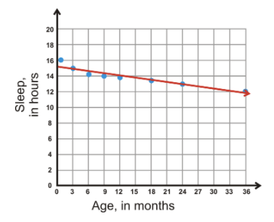
Use the following data set and find the equation of best fit with the graphing calculator. Also find the equation of best fit by hand. Then, use both equations to find the sleep requirements for 2.5 years (30 months) and compare the two answers.
Sleep Requirements, 0-3 years
| Age, x | 1 | 3 | 6 | 9 | 12 | 18 | 24 | 36 |
|---|---|---|---|---|---|---|---|---|
| Sleep, y | 16 | 15 | 14.25 | 14 | 13.75 | 13.5 | 13 | 12 |
The age is measured in months and sleep is measured in hours.
Using the steps illustrated in this concept, we get y=−0.096x+15.25 as the line of best fit on our calculator.
To find the line of best fit by hand, use the steps from Example 2 again.
Plot the points and then draw a line. Two points that seem to be on the line are (3, 15) and (24, 13).
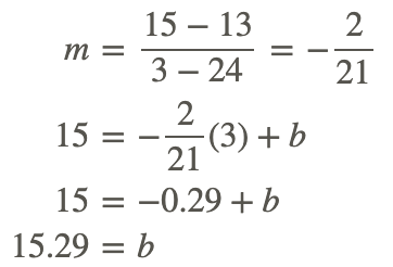
So the equation of the line by hand is y=−2/21x+15.29 or y=−0.095x+15.29.
To determine the amount of sleep needed for a 2.5 year old, you need to change the age to months so that it corresponds with the units used in the graph.
For a 2.5 year-old, or 30 month-old, s/he should sleep y=−2/21(30)+15.29≈12.4 hours using the equation we found by hand.
If you use the equation from the calculator, you get 12.37 hours. All in all, the answers are quite close.
Review
Round all decimal answers to the nearest hundredth
1. Using the company stock data below:
a. Find the equation of best fit with your calculator. Set Oct. 2009 as x=0.
The price of a company's stock from Oct 2009 - Sept 2011
| 10/09 | 11/09 | 12/09 | 1/10 | 2/10 | 3/10 | 4/10 | 5/10 | 6/10 | 7/10 | 8/10 | 9/10 |
|---|---|---|---|---|---|---|---|---|---|---|---|
| $181 | $189 | $198 | $214 | $195 | $208 | $236 | $249 | $266 | $248 | $261 | $258 |
| 10/10 | 11/10 | 12/10 | 1/11 | 2/11 | 3/11 | 4/11 | 5/11 | 6/11 | 7/11 | 8/11 | 9/11 |
| $282 | $309 | $316 | $331 | $345 | $352 | $344 | $349 | $346 | $349 | $389 | $379 |
b. Predict the sales for January 2012.
2. Using the following Home Run data:
a. Find the equation of best fit with your calculator. Set 2000 as x=0.
Total Number of Home Runs Hit in Major League Baseball, 2000-2010.
| 2000 | 2001 | 2002 | 2003 | 2004 | 2005 | 2006 | 2007 | 2008 | 2009 | 2010 |
|---|---|---|---|---|---|---|---|---|---|---|
| 5693 | 5458 | 5059 | 5207 | 5451 | 5017 | 5386 | 4957 | 4878 | 4655 | 4613 |
b. this to the answer from the problem above on home run data.
3. The table below shows the temperature for various elevations, taken at the same time of day in roughly the same location.
a. Using your calculator, find the equation of best fit.
| Elevation, ft. | 0 | 1000 | 5000 | 10,000 | 15,000 | 20,000 | 30,000 |
|---|---|---|---|---|---|---|---|
| Temperature, ∘F | 60 | 56 | 41 | 27 | 9 | -8 | -40 |
b. What would be the estimated temperature at 50,000 feet?
4. The table below shows the average life expectancy (in years) of the average male in relation to the year they were born. Source: National Center for Health Statistics
a. Using your calculator, find the equation of best fit. Set 1930 as x=30.
| Year of birth | 1930 | 1940 | 1950 | 1960 | 1970 | 1980 | 1990 | 2000 | 2007 |
|---|---|---|---|---|---|---|---|---|---|
| Life expectancy, Males | 58.1 | 60.8 | 65.6 | 66.6 | 67.1 | 70 | 71.8 | 74.3 | 75.4 |
b. What would you predict the life expectancy of a male born in 2012 to be?
5. The table below shows the average life expectancy (in years) of the average female in relation to the year they were born. Source: National Center for Health Statistics
a. Using your calculator, find the equation of best fit. Set 1930 as x=30.
| Year of birth | 1930 | 1940 | 1950 | 1960 | 1970 | 1980 | 1990 | 2000 | 2007 |
|---|---|---|---|---|---|---|---|---|---|
| Life expectancy, Males | 61.6 | 65.2 | 71.1 | 73.1 | 74.7 | 77.4 | 78.8 | 79.7 | 80.4 |
b. What would you predict the life expectancy of a male born in 2012 to be?
6. Science Connection: Why do you think the life expectancy for both men and women has increased over the last 70 years?
Answers for Review Problems
To see the Review answers, open this PDF file and look for section 2.15.
Additional Resources
Video: Linear Regression on a Graphing Calculator
Practice: Scatter Plots on the Graphing Calculator