
4.5: V. Considering the Evidence for Global Climate Change
- Page ID
- 15137
32
V. Considering the Evidence for Global Climate Change
Emily van Zee and Elizabeth Gire
Science is a way of knowing that involves noticing that something is happening, being curious about why it is happening, and asking questions and seeking answers based on evidence, particularly if what is happening seems threatening in some way. If the Earth is warming more quickly than in the past, what evidence is there that this is happening?
A. Viewing evidence for global climate change
Scientists from all over the world have collected and analyzed data that confirm that the Earth’s climate is warming more rapidly than in the past. In order for citizens to learn about and understand what is happening, this evidence needs to be communicated in readily understood ways.
Question 4.9 How is the evidence for global climate change being communicated?
A variety of approaches are available. A visually compelling display may be more persuasive than a more detailed presentation. The Internet provides many resources suitable for different audiences such as children, teachers, and the general public. Scientists have formed an international community to collaborate by assembling evidence from multiple studies and to interpret these findings for policy makers.
1. Examples of efforts to create visually compelling displays
Tables of data are hard to interpret. Long paragraphs reporting findings are hard to grasp. Therefore, many presentations about climate change include visually compelling displays of data.
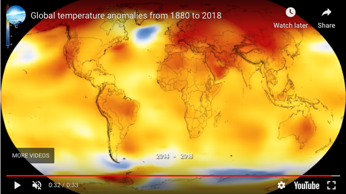
What, for example, is the evidence that the mean global temperature is rising? As shown in Fig. 4.20, the National Aeronautics and Space Administration (NASA) provides a 33 second video graphic showing an image of the globe on which changing temperatures are represented as the colors shift from cooler (gray blue) toward warm (yellow) and then warmer (red) as time shifts from 1880 to 2018.
- Click on the URL in the caption for Fig. 4.20.
- What is this display demonstrating?
A similar display notes that 2020 tied for the hottest year on record, matching 2016. (See https://www.giss.nasa.gov/research/news/20210114/ ).
Such video displays vividly illustrate differences across the globe in the ways that annual mean temperatures are changing; higher mean temperatures than normal are happening particularly in northern regions, for example, more than elsewhere.
This display represents changes in mean temperatures in an interesting way. Rather than the actual mean temperature for an area, this represents the temperature anomaly, how much the mean temperature for a given area differs for a specific year from normal for that area. The normal is defined as the mean temperature over a span of years, in this case the mean temperature for the span of thirty years from 1951 to 1980.
The reason scientists use anomalies rather than actual temperatures is explained at http://www.realclimate.org/index.php/archives/2014/12/absolute-temperatures-and-relative-anomalies/ . The basic idea is that the mean temperature for a year at a monitoring station in a valley is likely to be different from the mean temperature for the year at a monitoring station on a nearby mountain. The changes in the mean temperature for both monitoring stations in this overall area, however, are likely to be similar if the mean temperature for the overall area is changing.
The data analyzed for 2018, for example, indicate that global mean temperatures were 0.83° Celsius (1.5° Fahrenheit) warmer than the 1951 to 1980 global mean temperature. See https://svs.gsfc.nasa.gov/4626 for information about how worldwide temperature data are collected and interpreted.
Another visually compelling way to present such data is to provide a line graph. Fig. 4.21, for example, shows a line graph of global temperature anomaly versus time for 1880 to 2018.
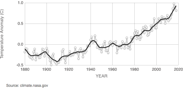
Data source: NASA’s Goddard Institute for Space Studies (GISS).
NASA/GISS https://climate.nasa.gov/vital-signs/global-temperature/
The key to interpreting line graphs is to ask oneself:
- What does the horizontal axis on the graph represent?
- What does the vertical axis represent?
- What does the line represent?
- What does the shape of the line imply?
The horizontal axis for Fig. 4.21, for example, represents time from years 1880 to 2020.
The vertical axis represents the temperature anomaly in degrees Celsius, that is, how much the global mean temperature for a specific year differed from normal (defined here as the global mean temperature over the thirty-year span from 1951 to 1980).
A gray dot represents the mean temperature anomaly for a specific year.
The jagged gray line represents how the mean temperature anomaly changed year by year from 1880 to 2018.
The black line represents a mathematically “smoothed” plot of these mean temperature anomalies from 1880 to 2018.
Years with negative mean temperature anomalies were cooler than normal (the mean temperature during 1951 to 1980). These occurred primarily before 1960.
Years with positive mean temperature anomalies were warmer than normal (the mean temperature over the years during 1951-1980). These occurred primarily after 1960.
A general interpretation of the line graph shown in Fig. 4.21 is that globally mean temperature anomalies have been increasing in recent years, indicating an on-going increase in the mean global temperature beyond the normal for the years during 1951 to 1980.
Another animated way to illustrate how mean global temperatures are increasing is to show how a line graph for temperature anomaly changes during one year, for the months January through December (See: https://earthobservatory.nasa.gov/blogs/earthmatters/2016/09/12/heres-how-the-warmest-august-in-136-years-looks-in-chart-form/ ).
Evidence presented via vivid line graphs can support arguments not only about whether global temperatures are rising but also about probable causes. A perspective sometimes stated, for example, is that the Earth’s climate has always been changing and therefore no action is possible or needed. A company providing news to the business and financial communities, www.Bloomberg.com, presents an animated graphic, What’s Really Warming the World? that directly confronts this perception. Go to https://www.bloomberg.com/graphics/2015-whats-warming-the-world/ to appreciate this effort by Eric Roston and Blacki Migliozzi to create a visually simple yet compelling display. They based a series of line graphs on findings from NASA’s Goddard Institute for Space Studies. The scientists described their methodology for distinguishing contributions of various possible causes of global warming in detail in a paper published in the Journal of Advances in Modeling Earth Systems (Miller et al, 2014) (https://pubs.giss.nasa.gov/abs/mi08910y.html ).
Interpret the first graph in this series:
- What does the horizontal axis represent?
- What does the vertical axis represent?
- What does the black line represent?
- What does the shape of the line imply?
Scroll down to see the subsequent graphs.
- What do the colored lines on these graphs represent?
- What factors do the graphs compare?
- Which factor seems to have had the most influence on the average global temperature?
- What aspects of this series of graphs make them visually compelling?
Scroll down and skim the notes about methodology. Note that the designers of this animated graphic used the thirty years from 1880 to 1910 to calculate a normal temperature to which to compare what happened each year. They also used the term “average” when referring to the “mean” temperature; both terms refer to the same number, the result of adding up a series of numbers and dividing by the number of numbers. The black line for the observed data ends at 2012. The designers of the graphic present results from a study of climate modeling that ended in 2005 so the colored lines for various possible causes end at 2005.
The graph of the combined effects tracks the line representing the rising global temperature, with the greenhouse gases providing the biggest contribution. By separating the graphs of the possible effects and then combining them, this presentation demonstrated the correlation of the increase in greenhouse gases with the increase in average global temperature.
Scientists can make inferences about earlier global temperatures and climates based on evidence from a wide variety of sources such as bore holes, ice cores, lake levels, tree rings, and plant and animal remains as recorded in paleoclimatology datasets. (See: https://www.ncdc.noaa.gov/data-access/paleoclimatology-data/datasets ).
2. Examples of Internet resources available to the public
Many agencies have been developing and providing resources on the Internet for learning about global climate change. A wide variety of websites discuss, for example, the evidence that change is already underway. These websites typically target particular audiences such as children, teachers, the general public, and policy makers as shown in Figs.4.22-4.30.
Intended Audience: Children How do we know the climate is changing?
The National Aeronautics and Space Administration (NASA) has developed an extensive website for children: Climate Kids. The website considers: Big Questions, Weather and Climate, Atmosphere, Water, Energy, and Plants and Animals (See: https://climatekids.nasa.gov/climate-change-evidence/ ) Fig. 4.22 shows an example question from the Weather and Climate webpage.

Many children’s books about climate change are available for use at home and school See: https://www.yaleclimateconnections.org/2018/08/childrens-books-about-climate-change/ .
For an extensive discussion of ways to engage children in becoming caring, participatory, and resilient citizens in their local and global communities, see:
Kenneth Winograd (Ed.), Education in Times of Environmental Crises: Teaching Children to be Agents of Change, (Routledge, Taylor & Francis Group, New York, 2016). ( https://ebookcentral.proquest.com/lib/osu/reader.action?docID=4505770 )
For an open-source children’s story about the concept of exponential growth that can be adapted to considering the increasing global temperature and its impact, see:
Katrina van Zee and Emily van Zee, Thank You Notes: A Children’s Story about Exponential Growth, (2020) https://www.merlot.org/merlot/viewSite.htm?id=9162542
This book provides an emotionally positive example of exponential growth as a way to develop conceptual and mathematical understandings of this phenomenon. Also included is an example of the impact of limited resources.
Intended Audience: Teachers How can teachers engage students in talking and writing about climate change?The National Oceanic and Atmospheric Administration (NOAA) has developed resources for teachers to use in engaging students in learning about climate change. See, for example, a 5th grade teacher’s reflection about her students’ climate change essays ( https://oceanservice.noaa.gov/education/planet-stewards/talking-about.html ). As shown in Fig. 4.23, the U.S. Global Change Research Program provides regional resources for teachers about the National Climate Assessment (NCA).
By clicking on the region in which they live, teachers can access resources directly relevant to how global climate change may be impacting their students’ lives. A summary for the Northwest, for example, states:
Changes in the timing of streamflow reduce water supplies for competing demands. Sea level rise, erosion, inundation, risks to infrastructure, and increasing ocean acidity pose major threats. Increasing wildfire, insect outbreaks, and tree diseases are causing widespread tree die-off.
https://nca2014.globalchange.gov/report/regions/northwest
Intended Audience: General public What are some indicators of climate change?
The U.S. Environmental Protection Agency (EPA) has assembled an extensive website providing information about various climate change indicators such as changes in the oceans (see: https://www.epa.gov/climate-indicators/oceans ). One issue, for example, is the extent to which land has been converted to open water as sea levels rise. The state of Louisiana, for example, loses 25-35 square miles of its coast every year (See: https://www.climate.gov/news-features/featured-images/underwater-land-loss-coastal-louisiana-1932 ). As shown in Fig. 4.24, this also is occurring regularly along the US Atlantic coast.

NASA also provides an extensive website documenting evidence that the climate is changing (see: https://climate.nasa.gov/evidence/).
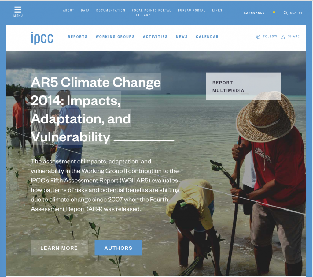
Intended Audience: Policy makers: What should policy makers know about observed global climate changes and their causes?The Intergovernmental Panel on Climate Change (https://www.ipcc.ch/about) provides policy makers with regular assessments of the scientific basis of climate change, its impacts and future risks, and options for adaptation and mitigation. The IPCC 5th Assessment Report, for example, included a Synthesis Report (see: https://www.ipcc.ch/pdf/assessment-report/ar5/syr/AR5_SYR_FINAL_SPM.pdf (pp. 1-5).
This summary for policy makers was based on detailed analyses developed by scientists from around the world. The Physical Science Basis, for example, included 1409 pages prepared by Working Group 1 (https://www.ipcc.ch/report/ar5/wg1/). This group included a team of 209 coordinating-lead authors and lead authors, 50 review editors, and more than 600 contributing authors from all over the world. Their work was reviewed by 1089 expert reviewers and 38 governments. The result was a detailed presentation of the consensus about evidence that underlies claims made about climate change by scientists from around the world.
Based on the consensus supported by these analyses, the Synthesis Report included a Summary for Policy Makers Statement (SPM):
SPM 1.1 Observed changes in the climate system
Warming of the climate system is unequivocal, and since the 1950s, many of the observed changes are unprecedented over decades to millennia. The atmosphere and ocean have warmed, the amounts of snow and ice have diminished, and sea level has risen. (p. 2)
- Work with your group members to access the suggested URL(s) above or identify alternative relevant URLs yourselves.
- Browse the website to see what is there. Select one aspect or link of interest.
- On a large white board, write a few statements that present the most useful or interesting information provided. Also include the source and URL.
- Plan and briefly practice what each of you will say during your group’s presentation.
- Present your white board to the class, with each member of your group contributing something about what you learned from exploring this issue.
- At home, briefly review and critique these websites:
-
- What do you find of interest?
- What seems likely to help or to hinder learning by the intended audience?
- What have you learned from this exploration of Internet resources about evidence that climate change is occurring?
3. Examples of the international community of scientists presenting findings to policy makers
This section considers the efforts of scientists from 195 countries to collaborate in collecting and assessing evidence about the state of the Earth’s climate system. This is the issue that the Intergovernmental Panel on Climate Change (IPCC) was set up to address more than thirty years ago, in 1988, by the World Meteorological Organization and the United Nations.
Leading scientists from throughout the world prepare these assessments, based on evidence published in scientific studies that have been peer-reviewed. The reports for the fifth assessment are publically available (see: https://www.ipcc.ch/report/ar5/ ). The sixth assessment is expected in 2022.
The IPCC Fifth Assessment Report has four parts:
Climate Change 2013: The Physical Science Basis https://www.ipcc.ch/report/ar5/wg1/
Climate Change 2014: Impacts, Adaptation, and Vulnerability https://www.ipcc.ch/report/ar5/wg2/
Climate Change 2014: Mitigation of Climate Change https://www.ipcc.ch/report/ar5/wg3/
Climate Change 2014: Synthesis Report https://www.ipcc.ch/report/ar5/syr/
As indicated in Fig. 4.25, the part that focuses upon the Physical Science Basis presents the evidence for the claims being made that the global climate is changing, with average global temperatures increasing.

Chapters include:
-
-
- Observations: Atmosphere and Surface
- Observations: Ocean
- Observations: Cryosphere (wherever frozen water is found on Earth)
- Information from Paleoclimate Archives
- Carbon and other Biogeochemical Cycles
- Clouds and Aerosols,
- Anthropogenic and Natural Radiative Forcing
- Evaluation of Climate Models
- Detection and Attribution of Climate Change: from Global to Regional
- Near-term Climate Change: Projections and Predictability
- Long-term Climate Change: Projections, Commitments and Irreversibility
- Sea Level Change,
- Climate Phenomena and Their Relevance for Future Regional Climate Change
-
As indicated in Fig. 4.26, the part that focuses on Impacts, Adaptation, and Vulnerability discusses how patterns of risks and potential benefits are shifting due to climate change.
Chapters of this part include:
Part A: Global and Sectoral Aspects
- Natural and Managed Resources and Systems, and Their Uses
- Human Settlements, Industry, and Infrastructure
- Human Health, Well-Being, and Security
- Adaptation
- Multi-Sector Impacts, Risks, Vulnerabilities, and Opportunities
Part B: Regional Aspects
- Africa
- Europe
- Asia
- Australasia
- North America
- Central and South America
- Polar Regions
- Small Islands
- The Ocean
As indicated in Fig. 4.27, the part that focuses upon Mitigation of Climate Change assesses literature on the scientific, technological, environmental, economic and social aspects of mitigation of climate changes.

Chapters of this part include:
- Integrated Risk and Uncertainty Assessment of Climate Change Response Policies
- Social, Economic, and Ethical Concepts and Methods
- Sustainable Development and Equity
- Drivers, Trends and Mitigation
- Assessing Transformation Pathways
- Energy Systems
- Transport
- Buildings
- Industry
- Agriculture, Forestry and Other Land Use
- Human Settlements, Infrastructure and Spatial Planning
- International Cooperation: Agreements and Instruments
- Regional Development and Cooperation
- National and Sub-National Policies and Institutions
- Cross-Cutting Investment and Finance Issues
SPM 1. Observed Changes and their Causes
Human influence on the climate system is clear, and recent anthropogenic emissions of greenhouse bases are the highest in history. Recent climate changes have had widespread impacts on human and natural systems. (p. 2)
SPM 1.1 Observed changes in the climate system
Warming of the climate system is unequivocal, and since the 1950s, many of the observed changes are unprecedented over decades to millennia. The atmosphere and ocean have warmed, the amounts of snow and ice have diminished, and sea level has risen. (p. 2)
SPM 1.2 Causes of climate change
Anthropogenic greenhouse gas emissions have increased since the pre-industrial era, driven largely by economic and population growth, and now are higher than ever. This has led to atmospheric concentrations of carbon dioxide, methane and nitrous oxide that are unprecedented in at least the last 800,000 years. Their effects, together with those of other anthropogenic drivers, have been detected throughout the climate system and are extremely likely to have been the dominant cause of the observed warming since the mid-20th century. (emphasis in the original) (p. 4)
SPM 1.3 Impacts of climate change
In recent decades, changes in climate have caused impacts on natural and human systems on all continents and across the oceans. Impacts are due to observed climate change, irrespective of its cause, indicating the sensitivity of natural and human systems to changing climate. (p. 6)
SPM 1.4 Extreme events
Changes in many extreme weather and climate events have been observed since about 1950. Some of these changes have been linked to human influences, including a decrease in cold temperature extremes, an increase in warm temperature extremes, an increase in extreme high sea levels and an increase in the number of heavy precipitation events in a number of regions. (p. 7)
Two additional sets of statements look to the future:
SPM 2. Future Climate Changes, Risks and Impacts (p. 8)
SPM 3. Future Pathways for Adaptation, Mitigation and Sustainable Development (p. 17)
Each Summary for Policy Makers statement is supported by a summary of relevant evidence. Fig. 4.28-Fig. 4.30, for example, support SPM 1.1 Observed changes in the climate system by providing graphs representing observations of global changes in temperature, sea level, and greenhouse gas concentrations in the atmosphere. Fig. 4.31 supports SPM 1.2, causes related to carbon dioxide emissions from 1850 to 2012.
- In small groups, discuss one of the following graphs in detail. How do you interpret the information provided by the various features of the graph?
- What does the horizontal axis on the graph represent?
- What does the vertical axis represent?
- What do the lines represent?
- What does the shape of the lines imply about combined land and ocean surface temperatures between 1850 and 2012?

https://www.ipcc.ch/pdf/assessment-report/ar5/syr/AR5_SYR_FINAL_SPM.pdf
- What does the horizontal axis on the graph represent?
- What does the vertical axis represent?
- What do the lines represent?
- What does the shape of the lines imply about globally averaged sea level change?

https://www.ipcc.ch/pdf/assessment-report/ar5/syr/AR5_SYR_FINAL_SPM.pdf
The graph in Fig. 4.30 represents the globally averaged greenhouse gas concentrations from 1850 for carbon dioxide (green), methane (orange) and nitrous oxide (red).
- What does the horizontal axis on the graph represent?
- What does the vertical axis represent?
- What do the lines represent?
- What does the shape of the lines imply about globally averaged greenhouse gas concentrations?

https://www.ipcc.ch/pdf/assessment-report/ar5/syr/AR5_SYR_FINAL_SPM.pdf
The graph in Fig 4.31 represents the weight in gigatonnes per year of global emissions of carbon dioxide due to human activity, particularly from the use of fossil fuels, cement, and flaring (burning off gas at oil and gas fields), indicated by the gray portion of the graph and from forestry and other land use, indicated by the brown portion of the graph.
- What does the horizontal axis on the graph represent?
- What does the vertical axis represent?
- What do the lines represent?
- What does the shape of the lines imply?

https://www.ipcc.ch/pdf/assessment-report/ar5/syr/AR5_SYR_FINAL_SPM.pdf
The details in these graphs can be perplexing. A general impression from viewing these graphs, however, is that there has been a steady increase recently in observations of the average global temperature, sea level, and greenhouse gas concentration in the atmosphere as well as of emissions of carbon dioxide and other greenhouse gases due to human activity. The International Panel on Climate Change’s Fifth Assessment Report and Summary for Policy Makers are complex documents prepared by scientists for scientists and for others with a need for technical information.
There are, however, many other sources of information prepared by agencies and individuals attempting to communicate the central ideas to the public. See, for example, https://climate.nasa.gov/evidence.
- Complete Table IV.2 and write a brief summary about the evidence for an increasing average global temperature.
| TABLE IV.2 Central ideas about evidence that the Earth’s average global temperatures is increasing | |||
|---|---|---|---|
| Sketch of set up or URL |
Evidence | Central Ideas | Relevant Vocabulary |
| https://climate.nasa.gov/climate_resources/139/graphic-global-warming-from-1880-to-2018/ | Visual displays can be compelling ways to communicate complex information | Temperature anomaly
Line graph |
|
| https://climatekids.nasa.gov/climate-change-evidence/
https://oceanservice.noaa.gov/education/planet-stewards/talking-about.html https://www.epa.gov/climate-indicators/oceans https://www.bloomberg.com/graphics/2015-whats-warming-the-world/ |
Many agencies are developing websites to help children, teachers, and the general public learn about the evidence that the Earth’s climate is changing | ||
| www.ipcc.ch | In 1988, scientists formed a worldwide organization to collect, analyze, and communicate scientific findings about climate change | Intergovernmental Panel on Climate Change (IPCC) | |
| https://www.ipcc.ch/report/ar5/wg1
https://www.ipcc.ch/report/ar5/wg2/ |
IPCC provides detailed reports about : I: The Physical Science Basis;II: Impacts, Adaptation, and Vulnerability; III: Mitigation of Climate Change;and a Synthesis |
||
| These reports include information for scientists and policy makers about both natural and human causes of climate change | anthropogenic | ||
| https://www.ipcc.ch/pdf/assessment-report/ar5/syr/AR5_SYR_FINAL_SPM.pdf (page 3) | Some graphs show differences between a particular measurement and the average of a collection of similar data | anomaly | |
| https://www.ipcc.ch/pdf/assessment-report/ar5/syr/AR5_SYR_FINAL_SPM.pdf (page 3) | There has been an increase in the global average temperature. | ||
| https://www.ipcc.ch/pdf/assessment-report/ar5/syr/AR5_SYR_FINAL_SPM.pdf (page 3) | There has been an increase in the global average sea level. | ||
| https://www.ipcc.ch/pdf/assessment-report/ar5/syr/AR5_SYR_FINAL_SPM.pdf (page 3) | There has been an increase in the average atmospheric concentration of greenhouse gases (carbon dioxide, methane, and nitrous oxide) | ||
| https://www.ipcc.ch/pdf/assessment-report/ar5/syr/AR5_SYR_FINAL_SPM.pdf (page 3) | There has been an increase in emissions of carbon dioxide from various human activities since 1850 | ||
The Intergovernmental Panel on Climate Change’s Sixth Assessment Report (AR6) is currently under development. The first installment, Climate Change 2021: The Physical Science Basis. Contribution of Working Group I to the Sixth Assessment Report of the Intergovernmental Panel on Climate Change, was released on August 9, 2021 with the headline Climate change widespread, rapid, and intensifying. See https://www.ipcc.ch/report/sixth-assessment-report-working-group-i/
The news release stated that:
Many of the changes observed in the climate are unprecedented in thousands, if not hundreds of thousands of years, and some of the changes already set in motion – such as continued sea level rise – are irreversible over hundreds to thoughts of years…Unless there are immediate, rapid and large-scale reductions in greenhouse gas emissions, limiting warming to close to 1.5ºC or even 2ºC will be beyond reach…At 2ºC of global warming, heat extremes would often reach critical tolerance thresholds for agriculture and health…Climate change is bringing multiple changes…For example:
- Climate change is intensifying the water cycle. This brings more intense rainfall and associated flooding, as well as more intense drought in many regions.
- Climate change is affecting rainfall patterns. In high latitudes, precipitation is likely to increase, while it is projected to decrease over large parts of thsubtropics. Changes to monsoon precipitation are expected, which will vary by region.
- Coastal areas will see continued sea level rise throughout the 21st century, contributing to more frequent and severe coastal flooding in low-lying areas and coastal erosion. Extreme sea level events that previously occurred once in 100 years could happen every year by the end of this century.
- Further warming will amplify permafrost thawing, and the loss of seasonal snow cover, melting of glaciers and ice sheets, and loss of summer Arctic sea ice.
- Changes to the ocean, including warming, more frequent marine heatwaves, ocean acidification, and reduced oxygen levels have been clearly linked to human influence. These changes affect both ocean ecosystems and the people that rely on them, and they will continue throughout at least the rest of this century.
- For cities, some aspects of climate change may be amplified, including heat (since urban areas are usually warmer than their surroundings), flooding from heavy precipitation events and sea level rise in coastal cities.
See https://www.ipcc.ch/report/ar6/wg1/downloads/report/IPCC_AR6_WGI_SPM_final.pdf for the summary for policy makers.
There are many ways in which scientists are investigating what is happening to the Earth’s climate. These illustrate that scientific investigations use a variety of methods ; and that science investigations are guided by a set of values to ensure accuracy of measurements, observations, and objectivity of findings (Next Generation Science Standards Lead States, 2013, Appendix H) (https://www.nextgenscience.org/resources/ngss-appendices ).
The WGII and WGIII reports are now available at https://www.ipcc.ch/report/sixth-assessment-report-working-group-ii/ and https://www.ipcc.ch/report/sixth-assessment-report-working-group-3/