
2.4.3: Frequency Polygons
- Page ID
- 5760
\( \newcommand{\vecs}[1]{\overset { \scriptstyle \rightharpoonup} {\mathbf{#1}} } \)
\( \newcommand{\vecd}[1]{\overset{-\!-\!\rightharpoonup}{\vphantom{a}\smash {#1}}} \)
\( \newcommand{\dsum}{\displaystyle\sum\limits} \)
\( \newcommand{\dint}{\displaystyle\int\limits} \)
\( \newcommand{\dlim}{\displaystyle\lim\limits} \)
\( \newcommand{\id}{\mathrm{id}}\) \( \newcommand{\Span}{\mathrm{span}}\)
( \newcommand{\kernel}{\mathrm{null}\,}\) \( \newcommand{\range}{\mathrm{range}\,}\)
\( \newcommand{\RealPart}{\mathrm{Re}}\) \( \newcommand{\ImaginaryPart}{\mathrm{Im}}\)
\( \newcommand{\Argument}{\mathrm{Arg}}\) \( \newcommand{\norm}[1]{\| #1 \|}\)
\( \newcommand{\inner}[2]{\langle #1, #2 \rangle}\)
\( \newcommand{\Span}{\mathrm{span}}\)
\( \newcommand{\id}{\mathrm{id}}\)
\( \newcommand{\Span}{\mathrm{span}}\)
\( \newcommand{\kernel}{\mathrm{null}\,}\)
\( \newcommand{\range}{\mathrm{range}\,}\)
\( \newcommand{\RealPart}{\mathrm{Re}}\)
\( \newcommand{\ImaginaryPart}{\mathrm{Im}}\)
\( \newcommand{\Argument}{\mathrm{Arg}}\)
\( \newcommand{\norm}[1]{\| #1 \|}\)
\( \newcommand{\inner}[2]{\langle #1, #2 \rangle}\)
\( \newcommand{\Span}{\mathrm{span}}\) \( \newcommand{\AA}{\unicode[.8,0]{x212B}}\)
\( \newcommand{\vectorA}[1]{\vec{#1}} % arrow\)
\( \newcommand{\vectorAt}[1]{\vec{\text{#1}}} % arrow\)
\( \newcommand{\vectorB}[1]{\overset { \scriptstyle \rightharpoonup} {\mathbf{#1}} } \)
\( \newcommand{\vectorC}[1]{\textbf{#1}} \)
\( \newcommand{\vectorD}[1]{\overrightarrow{#1}} \)
\( \newcommand{\vectorDt}[1]{\overrightarrow{\text{#1}}} \)
\( \newcommand{\vectE}[1]{\overset{-\!-\!\rightharpoonup}{\vphantom{a}\smash{\mathbf {#1}}}} \)
\( \newcommand{\vecs}[1]{\overset { \scriptstyle \rightharpoonup} {\mathbf{#1}} } \)
\(\newcommand{\longvect}{\overrightarrow}\)
\( \newcommand{\vecd}[1]{\overset{-\!-\!\rightharpoonup}{\vphantom{a}\smash {#1}}} \)
\(\newcommand{\avec}{\mathbf a}\) \(\newcommand{\bvec}{\mathbf b}\) \(\newcommand{\cvec}{\mathbf c}\) \(\newcommand{\dvec}{\mathbf d}\) \(\newcommand{\dtil}{\widetilde{\mathbf d}}\) \(\newcommand{\evec}{\mathbf e}\) \(\newcommand{\fvec}{\mathbf f}\) \(\newcommand{\nvec}{\mathbf n}\) \(\newcommand{\pvec}{\mathbf p}\) \(\newcommand{\qvec}{\mathbf q}\) \(\newcommand{\svec}{\mathbf s}\) \(\newcommand{\tvec}{\mathbf t}\) \(\newcommand{\uvec}{\mathbf u}\) \(\newcommand{\vvec}{\mathbf v}\) \(\newcommand{\wvec}{\mathbf w}\) \(\newcommand{\xvec}{\mathbf x}\) \(\newcommand{\yvec}{\mathbf y}\) \(\newcommand{\zvec}{\mathbf z}\) \(\newcommand{\rvec}{\mathbf r}\) \(\newcommand{\mvec}{\mathbf m}\) \(\newcommand{\zerovec}{\mathbf 0}\) \(\newcommand{\onevec}{\mathbf 1}\) \(\newcommand{\real}{\mathbb R}\) \(\newcommand{\twovec}[2]{\left[\begin{array}{r}#1 \\ #2 \end{array}\right]}\) \(\newcommand{\ctwovec}[2]{\left[\begin{array}{c}#1 \\ #2 \end{array}\right]}\) \(\newcommand{\threevec}[3]{\left[\begin{array}{r}#1 \\ #2 \\ #3 \end{array}\right]}\) \(\newcommand{\cthreevec}[3]{\left[\begin{array}{c}#1 \\ #2 \\ #3 \end{array}\right]}\) \(\newcommand{\fourvec}[4]{\left[\begin{array}{r}#1 \\ #2 \\ #3 \\ #4 \end{array}\right]}\) \(\newcommand{\cfourvec}[4]{\left[\begin{array}{c}#1 \\ #2 \\ #3 \\ #4 \end{array}\right]}\) \(\newcommand{\fivevec}[5]{\left[\begin{array}{r}#1 \\ #2 \\ #3 \\ #4 \\ #5 \\ \end{array}\right]}\) \(\newcommand{\cfivevec}[5]{\left[\begin{array}{c}#1 \\ #2 \\ #3 \\ #4 \\ #5 \\ \end{array}\right]}\) \(\newcommand{\mattwo}[4]{\left[\begin{array}{rr}#1 \amp #2 \\ #3 \amp #4 \\ \end{array}\right]}\) \(\newcommand{\laspan}[1]{\text{Span}\{#1\}}\) \(\newcommand{\bcal}{\cal B}\) \(\newcommand{\ccal}{\cal C}\) \(\newcommand{\scal}{\cal S}\) \(\newcommand{\wcal}{\cal W}\) \(\newcommand{\ecal}{\cal E}\) \(\newcommand{\coords}[2]{\left\{#1\right\}_{#2}}\) \(\newcommand{\gray}[1]{\color{gray}{#1}}\) \(\newcommand{\lgray}[1]{\color{lightgray}{#1}}\) \(\newcommand{\rank}{\operatorname{rank}}\) \(\newcommand{\row}{\text{Row}}\) \(\newcommand{\col}{\text{Col}}\) \(\renewcommand{\row}{\text{Row}}\) \(\newcommand{\nul}{\text{Nul}}\) \(\newcommand{\var}{\text{Var}}\) \(\newcommand{\corr}{\text{corr}}\) \(\newcommand{\len}[1]{\left|#1\right|}\) \(\newcommand{\bbar}{\overline{\bvec}}\) \(\newcommand{\bhat}{\widehat{\bvec}}\) \(\newcommand{\bperp}{\bvec^\perp}\) \(\newcommand{\xhat}{\widehat{\xvec}}\) \(\newcommand{\vhat}{\widehat{\vvec}}\) \(\newcommand{\uhat}{\widehat{\uvec}}\) \(\newcommand{\what}{\widehat{\wvec}}\) \(\newcommand{\Sighat}{\widehat{\Sigma}}\) \(\newcommand{\lt}{<}\) \(\newcommand{\gt}{>}\) \(\newcommand{\amp}{&}\) \(\definecolor{fillinmathshade}{gray}{0.9}\)Frequency Polygons
Another type of graph that can be drawn to represent the same set of data as a histogram represents is a frequency polygon. A frequency polygon is a graph constructed by using lines to join the midpoints of each interval, or bin. The heights of the points represent the frequencies. A frequency polygon can be created from the histogram or by calculating the midpoints of the bins from the frequency distribution table. The midpoint of a bin is calculated by adding the upper and lower boundary values of the bin and dividing the sum by 2.
Constructing Frequency Polygons
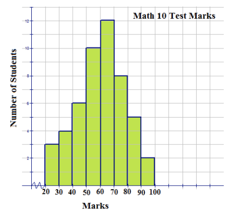
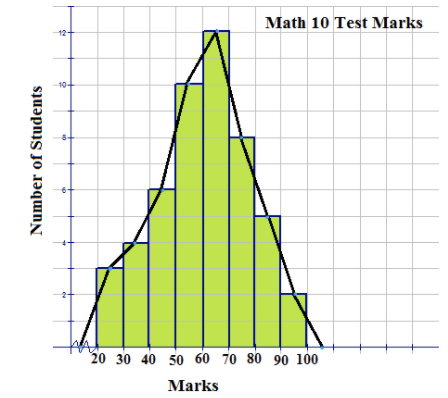
1. The following histogram represents the marks made by 40 students on a math 10 test.
Use the histogram to construct a frequency polygon to represent the data.
USGS - http://earthquake.usgs.gov/earthquakes/eqarchives/year/graphs.php;http://pixabay.com/en/server-computer-case-controller-40240/ - CC BY-NC
USGS - http://earthquake.usgs.gov/earthquakes/eqarchives/year/graphs.php;http://pixabay.com/en/server-computer-case-controller-40240/ - CC BY-NC
There is no data value greater than 0 and less than 20. The jagged line that is inserted on the x-axis is used to represent this fact. The area under the frequency polygon is the same as the area under the histogram and is, therefore, equal to the frequency values that would be displayed in a distribution table. The frequency polygon also shows the shape of the distribution of the data, and in this case, it resembles a bell curve.
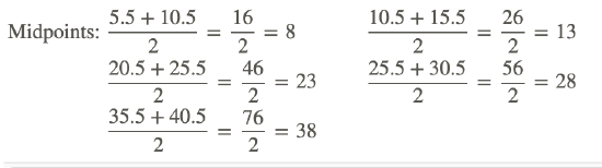
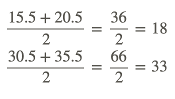
2. The following distribution table represents the number of miles run by 20 randomly selected runners during a recent road race:
| Bin | Frequency |
|---|---|
| [5.5−10.5) | 1 |
| [10.5−15.5) | 3 |
| [15.5−20.5) | 2 |
| [20.5−25.5) | 4 |
| [25.5−30.5) | 5 |
| [30.5−35.5) | 3 |
| [35.5−40.5) | 2 |

Using this table, construct a frequency polygon.
Step 1: Calculate the midpoint of each bin by adding the 2 numbers of the interval and dividing the sum by 2.
Step 2: Plot the midpoints on a grid, making sure to number the x-axis with a scale that will include the bin sizes. Join the plotted midpoints with lines.
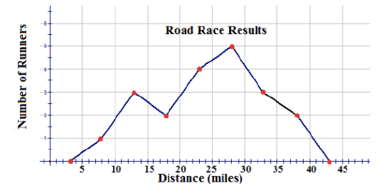
A frequency polygon usually extends 1 unit below the smallest bin value and 1 unit beyond the greatest bin value. This extension gives the frequency polygon an appearance of having a starting point and an ending point, which provides a view of the distribution of data. If the data set were very large so that the number of bins had to be increased and the bin size decreased, the frequency polygon would appear as a smooth curve.
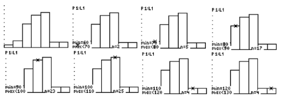
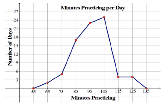
3. The histogram shown below represents the minutes spent practicing per day by a professional violinist for each of the last 80 days:
USGS - http://earthquake.usgs.gov/earthquakes/eqarchives/year/graphs.php - CC BY-NC
Construct a frequency polygon for the data.
From the histogram, the following distribution table can be constructed:
| Bin | Frequency |
|---|---|
| [60−70) | 2 |
| [70−80) | 5 |
| [80−90) | 17 |
| [90−100) | 23 |
| [100−110) | 25 |
| [110−120) | 4 |
| [120−130) | 4 |
Now you can calculate the midpoint of each bin by adding the 2 numbers of the interval and dividing the sum by 2.
Finally, you can plot the points on a grid and join the points with lines.
USGS - http://earthquake.usgs.gov/earthquakes/eqarchives/year/graphs.php - CC BY-NC
Examples
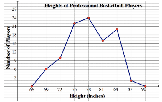
The frequency polygon below represents the heights, in inches, of a group of professional basketball players. Use the frequency polygon to answer the following questions:
USGS - http://earthquake.usgs.gov/earthquakes/eqarchives/year/graphs.php - CC BY-NC
Example 1
How many players' heights were measured?
To find the number of players whose heights were measured, just add up all of the frequencies. This can be done as follows:
6+10+22+24+16+20+2=100
This means that 100 players' heights were measured.
Example 2
What was the bin size of the histogram on which the frequency polygon is based?
The bin size of the histogram on which the frequency polygon is based is 3. This is apparent from the fact that the points that were connected to create the frequency polygon are 3 inches apart on the horizontal axis.
Example 3
What range of heights was most common among the basketball players?
Remember that the x-coordinate of each of the points that were connected to create the frequency polygon is the midpoint of one of the bins of the corresponding histogram. It's obvious from the frequency polygon that 78 inches has the greatest frequency, but this doesn't necessarily mean that height most common among the basketball players was 78 inches. All it means is that the range of heights that was most common among the basketball players was 76.5 inches to 79.5 inches.
Example 4
What range of heights was least common among the basketball players?
For the same reason that the range of heights that was most common among the basketball players was 76.5 inches to 79.5 inches, the range of heights that was least common among the basketball players was 85.5 inches to 88.5 inches. Remember that the points at 66 inches and 90 inches along the horizontal axis were just added to give the frequency polygon the appearance of having a starting point and an ending point.
Example 5
What percentage of the basketball players measured had a height of less than 76.5
The point at 75 inches along the horizontal axis represents the bin [73.5, 76.5). Therefore, to find the number of basketball players measured who had a height of less than 76.5 inches, add the frequencies of the first 3 bins as follows:
6+10+22=38
This means that 38 players had a height of less than 76.5 inches, so the percentage of the basketball players measured who had a height of less than 76.5 inches is 38/100=0.38=38%.
Review
- What name is given to the graph that uses lines to join the midpoints of the classes?
- bar graph
- stem-and-leaf
- histogram
- frequency polygon
- What is the midpoint of the bin [14.5-23.5)?
- 19
- 4.5
- 18.5
- 38
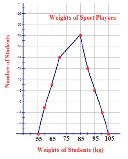
- The following frequency polygon represents the weights of players who all participated in the same sport. Use the polygon to answer the following questions:
USGS - http://earthquake.usgs.gov/earthquakes/eqarchives/year/graphs.php - CC BY-NC
a. How many players played the sport?
b. What was the most common weight for the players?
c. What sport do you think the players may have been playing?
d. What do the weights of 55 kg and 105 kg represent?
e. What 2 weights have no recorded players weighing those amounts?
Suppose the points (10, 0), (20, 4), (30, 12), (40, 18), (50, 9), (60, 7), (70, 0) were connected to form a frequency polygon. Use this information to answer the following questions:
- What was the bin size of the histogram on which the frequency polygon is based?
- Which bin had the highest frequency?
- Which bin had the lowest frequency?
- What percentage of the data had a value below 55?
Use the histogram shown below to answer the following questions:
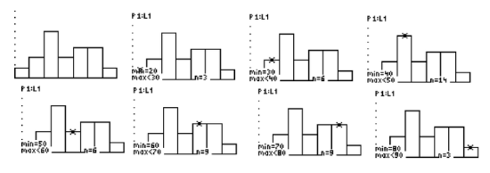
- How many points would be connected to form the corresponding frequency polygon? (Include the points added to give the frequency polygon the appearance of having a starting point and an ending point.)
- List the points.
- Create the frequency polygon.
Vocabulary
| Term | Definition |
|---|---|
| frequency polygon | A frequency polygon is a graph constructed by using lines to join the midpoints of each interval, or bin. |
| absolute frequency polygon | An absolute frequency polygon has ‘peaks’ that represent the actual number of points in the associated interval. |
| relative frequency | A histogram is a graph that illustrates the relative frequency or probability density of a single variable. |
| relative frequency polygon | A relative frequency polygon has peaks that represent the percentage of total data points falling within the interval. |
Additional Resources
PLIX: Play, Learn, Interact, eXplore - Constructing a Frequency Polygon
Video: Frequency Polygons Principles
Activities: Frequency Polygons Discussion Questions
Study Aids: Presenting Univariate Data
Lesson Plans: Frequency Polygons Lesson Plan
Practice: Frequency Polygons
Real World: Frequency Polygons