
2.6.5: Double Line Graphs
- Page ID
- 5768
\( \newcommand{\vecs}[1]{\overset { \scriptstyle \rightharpoonup} {\mathbf{#1}} } \)
\( \newcommand{\vecd}[1]{\overset{-\!-\!\rightharpoonup}{\vphantom{a}\smash {#1}}} \)
\( \newcommand{\dsum}{\displaystyle\sum\limits} \)
\( \newcommand{\dint}{\displaystyle\int\limits} \)
\( \newcommand{\dlim}{\displaystyle\lim\limits} \)
\( \newcommand{\id}{\mathrm{id}}\) \( \newcommand{\Span}{\mathrm{span}}\)
( \newcommand{\kernel}{\mathrm{null}\,}\) \( \newcommand{\range}{\mathrm{range}\,}\)
\( \newcommand{\RealPart}{\mathrm{Re}}\) \( \newcommand{\ImaginaryPart}{\mathrm{Im}}\)
\( \newcommand{\Argument}{\mathrm{Arg}}\) \( \newcommand{\norm}[1]{\| #1 \|}\)
\( \newcommand{\inner}[2]{\langle #1, #2 \rangle}\)
\( \newcommand{\Span}{\mathrm{span}}\)
\( \newcommand{\id}{\mathrm{id}}\)
\( \newcommand{\Span}{\mathrm{span}}\)
\( \newcommand{\kernel}{\mathrm{null}\,}\)
\( \newcommand{\range}{\mathrm{range}\,}\)
\( \newcommand{\RealPart}{\mathrm{Re}}\)
\( \newcommand{\ImaginaryPart}{\mathrm{Im}}\)
\( \newcommand{\Argument}{\mathrm{Arg}}\)
\( \newcommand{\norm}[1]{\| #1 \|}\)
\( \newcommand{\inner}[2]{\langle #1, #2 \rangle}\)
\( \newcommand{\Span}{\mathrm{span}}\) \( \newcommand{\AA}{\unicode[.8,0]{x212B}}\)
\( \newcommand{\vectorA}[1]{\vec{#1}} % arrow\)
\( \newcommand{\vectorAt}[1]{\vec{\text{#1}}} % arrow\)
\( \newcommand{\vectorB}[1]{\overset { \scriptstyle \rightharpoonup} {\mathbf{#1}} } \)
\( \newcommand{\vectorC}[1]{\textbf{#1}} \)
\( \newcommand{\vectorD}[1]{\overrightarrow{#1}} \)
\( \newcommand{\vectorDt}[1]{\overrightarrow{\text{#1}}} \)
\( \newcommand{\vectE}[1]{\overset{-\!-\!\rightharpoonup}{\vphantom{a}\smash{\mathbf {#1}}}} \)
\( \newcommand{\vecs}[1]{\overset { \scriptstyle \rightharpoonup} {\mathbf{#1}} } \)
\(\newcommand{\longvect}{\overrightarrow}\)
\( \newcommand{\vecd}[1]{\overset{-\!-\!\rightharpoonup}{\vphantom{a}\smash {#1}}} \)
\(\newcommand{\avec}{\mathbf a}\) \(\newcommand{\bvec}{\mathbf b}\) \(\newcommand{\cvec}{\mathbf c}\) \(\newcommand{\dvec}{\mathbf d}\) \(\newcommand{\dtil}{\widetilde{\mathbf d}}\) \(\newcommand{\evec}{\mathbf e}\) \(\newcommand{\fvec}{\mathbf f}\) \(\newcommand{\nvec}{\mathbf n}\) \(\newcommand{\pvec}{\mathbf p}\) \(\newcommand{\qvec}{\mathbf q}\) \(\newcommand{\svec}{\mathbf s}\) \(\newcommand{\tvec}{\mathbf t}\) \(\newcommand{\uvec}{\mathbf u}\) \(\newcommand{\vvec}{\mathbf v}\) \(\newcommand{\wvec}{\mathbf w}\) \(\newcommand{\xvec}{\mathbf x}\) \(\newcommand{\yvec}{\mathbf y}\) \(\newcommand{\zvec}{\mathbf z}\) \(\newcommand{\rvec}{\mathbf r}\) \(\newcommand{\mvec}{\mathbf m}\) \(\newcommand{\zerovec}{\mathbf 0}\) \(\newcommand{\onevec}{\mathbf 1}\) \(\newcommand{\real}{\mathbb R}\) \(\newcommand{\twovec}[2]{\left[\begin{array}{r}#1 \\ #2 \end{array}\right]}\) \(\newcommand{\ctwovec}[2]{\left[\begin{array}{c}#1 \\ #2 \end{array}\right]}\) \(\newcommand{\threevec}[3]{\left[\begin{array}{r}#1 \\ #2 \\ #3 \end{array}\right]}\) \(\newcommand{\cthreevec}[3]{\left[\begin{array}{c}#1 \\ #2 \\ #3 \end{array}\right]}\) \(\newcommand{\fourvec}[4]{\left[\begin{array}{r}#1 \\ #2 \\ #3 \\ #4 \end{array}\right]}\) \(\newcommand{\cfourvec}[4]{\left[\begin{array}{c}#1 \\ #2 \\ #3 \\ #4 \end{array}\right]}\) \(\newcommand{\fivevec}[5]{\left[\begin{array}{r}#1 \\ #2 \\ #3 \\ #4 \\ #5 \\ \end{array}\right]}\) \(\newcommand{\cfivevec}[5]{\left[\begin{array}{c}#1 \\ #2 \\ #3 \\ #4 \\ #5 \\ \end{array}\right]}\) \(\newcommand{\mattwo}[4]{\left[\begin{array}{rr}#1 \amp #2 \\ #3 \amp #4 \\ \end{array}\right]}\) \(\newcommand{\laspan}[1]{\text{Span}\{#1\}}\) \(\newcommand{\bcal}{\cal B}\) \(\newcommand{\ccal}{\cal C}\) \(\newcommand{\scal}{\cal S}\) \(\newcommand{\wcal}{\cal W}\) \(\newcommand{\ecal}{\cal E}\) \(\newcommand{\coords}[2]{\left\{#1\right\}_{#2}}\) \(\newcommand{\gray}[1]{\color{gray}{#1}}\) \(\newcommand{\lgray}[1]{\color{lightgray}{#1}}\) \(\newcommand{\rank}{\operatorname{rank}}\) \(\newcommand{\row}{\text{Row}}\) \(\newcommand{\col}{\text{Col}}\) \(\renewcommand{\row}{\text{Row}}\) \(\newcommand{\nul}{\text{Nul}}\) \(\newcommand{\var}{\text{Var}}\) \(\newcommand{\corr}{\text{corr}}\) \(\newcommand{\len}[1]{\left|#1\right|}\) \(\newcommand{\bbar}{\overline{\bvec}}\) \(\newcommand{\bhat}{\widehat{\bvec}}\) \(\newcommand{\bperp}{\bvec^\perp}\) \(\newcommand{\xhat}{\widehat{\xvec}}\) \(\newcommand{\vhat}{\widehat{\vvec}}\) \(\newcommand{\uhat}{\widehat{\uvec}}\) \(\newcommand{\what}{\widehat{\wvec}}\) \(\newcommand{\Sighat}{\widehat{\Sigma}}\) \(\newcommand{\lt}{<}\) \(\newcommand{\gt}{>}\) \(\newcommand{\amp}{&}\) \(\definecolor{fillinmathshade}{gray}{0.9}\)Double Line Graphs
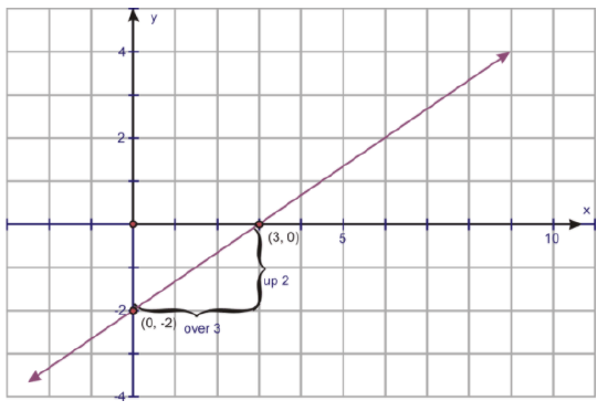
Remember a line graph, by definition, can be the result of a linear function or can simply be a graph of plotted points, where the points are joined together by line segments. Line graphs that are linear functions are normally in the form y=mx+b, where m is the slope and b is the y-intercept. The graph below is an example of a linear equation with a slope of 2/3 and a y-intercept of −2:
The second type of line graph is known as a broken-line graph. In a broken-line graph, the slope represents the rate of change, and the y-intercept is actually the starting point. The graph below is a broken-line graph:
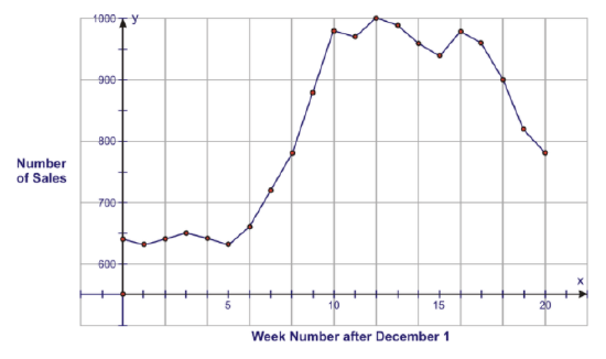
When the measurements began, the number of sales (the y-intercept) was 645. The graph shows a significant increase in the number of sales from weeks 5 through 10 and a significant reduction in the number of sales from weeks 16 through 20.
In this section, you will be learning about comparing 2 line graphs that each contain data points. In statistics, when line graphs are in the form of broken-line graphs, they are of more use. Linear functions (i.e., y=mx+b) are more for algebraic reasoning. Double line graphs, as with any double graphs, are often called parallel graphs, due to the fact that they allow for the quick comparison of 2 sets of data. In this and the following sections , you will see them referred to only as double graphs.
Real-World Application: Cross Country Meet
Thomas and Abby are training for the cross country meet at their school. Both students are in the 100 yard dash. The coach asks them to race 500 yards and time each 100 yard interval. The following graph represents the times for both Thomas and Abby for each of the five 100 yard intervals.
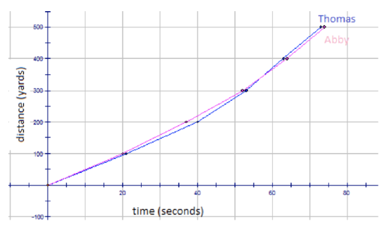
Who won the race? How do you know?
Thomas (blue) won the race, because he finished the 500 yards in the least amount of time.
b. Between what times did Thomas (blue) appear to slow down? How do you know?
Between 20 and 40 seconds, Thomas (blue) seems to slow down, because the slope of the graph is less steep.
c. Between what times was Abby (red) ahead of Thomas? How do you know?
Between 0 and 57 seconds, Abby (pink) is ahead of Thomas (blue). You can see this, because the pink line is above the blue line.
d. At what time did Thomas pass Abby? How do you know?
At 57 seconds, Thomas (blue) passes Abby (pink). From this point onward, the blue line is above the pink line, meaning Thomas is running faster 100 yard intervals.
Real-World Application: Fertilizing Gardens
Brenda and Ervin are each planting corn in a section of garden in their back yard. Brenda says that they need to put fertilizer on the plants 3 to 5 times per week. Ervin contradicts Brenda, saying that they need to fertilize only 1 to 2 times per week. Each gardener plants his or her garden of corn and measures the heights of their plants. The graph for the growth of their corn is found below:
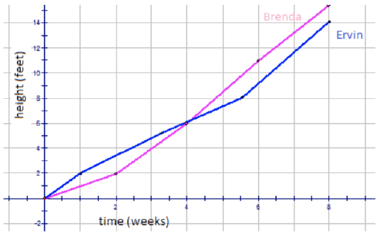
a. Who was right? How do you know?
Brenda (pink) is correct, because her plants grew more in the same amount of time.
b. Between what times did Brenda's (pink) garden appear to grow more? How do you know?
Between 4 and 8 weeks, Brenda’s plants seemed to grow faster (taller) than Ervin’s plants. You can tell this, because the pink line is above the blue line after the 4-week mark.
c. Between what times were Ervin's (blue) heights ahead of Brenda's? How do you know?
From 0 and 4 weeks, Ervin’s plants seemed to grow faster (taller) than Brenda’s plants. You can tell this, because the blue line is above the pink line before the 4-week mark.
Real-World Application: Holidays
Nicholas and Jordan went on holidays with their families. They decided to monitor the mileage they traveled by keeping track of the time and the distance they were on the road. The boys collected the following data:
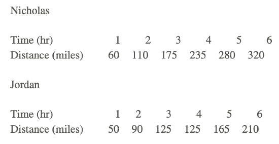
a. Draw a graph to show the trip for each boy.
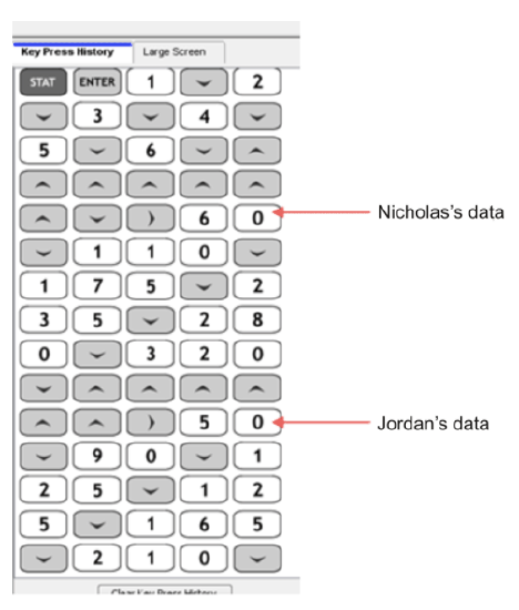
You can also use TI technology to graph this data. First, you need to enter in all of the data Nicholas and Jordan collected.
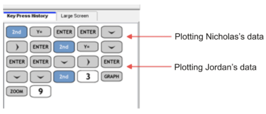
Now you need to graph the 2 sets of data.
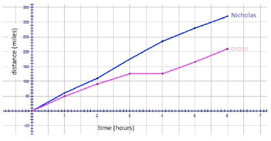
The resulting graph looks like the following:
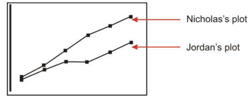
b. What conclusions could you draw by looking at the graphs?
Looking at the speed of Nicholas’s family vehicle and the shape of the graph, it could be concluded that Nicholas’s family was traveling on the highway going toward their family vacation destination. The family did not stop and continued on at a pretty steady speed until they reached where they were going.
Jordan’s trip was more relaxed. The speed indicates they were probably not on a highway, but more on country-type roads, and that they were traveling through a scenic route. In fact, from hours 3 to 4, the family stopped for some reason (maybe lunch), and then they continued on their way.
Examples
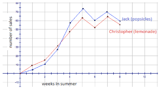
Christopher and Jack are each opening businesses in their neighborhoods for the summer. Christopher is going to sell lemonade for $0.50 per glass. Jack is going to sell popsicles for $1.00 each. The following graph represents the sales for each boy for the 8 weeks in the summer.
Example 1
Explain the slopes of the line segments for Christopher's graph.
The slope of the line segments for Christopher’s graph (red) are positive for the first 5 weeks, meaning he was increasing his sales each week. This is also true from weeks 6 to 7. From weeks 5 to 6 and weeks 7 to 8, the slopes were decreasing, meaning there was a decrease in sales.
Example 2
Explain the slopes of the line segments for Jack's graph.
The same trend that is seen for Christopher’s graph (red) is also seen for Jack’s graph (blue). The slope of the line segments for Jack’s graph (blue) are positive for the first 5 weeks, meaning he was increasing his sales each week. This is also true from weeks 6 to 7. From weeks 5 to 6 and weeks 7 to 8, the slopes were decreasing, meaning there was a decrease in sales.
Example 3
Are they any negative slopes? What does this mean?
Negative sales from weeks 5 to 6 and weeks 7 to 8 (for both boys) mean there was a decrease in sales during these 2-week periods.
Example 4
Where is the highest point of Christopher's graph? What does this tell you?
The highest point on Christopher’s graph occurred in week 7, when he sold 65 glasses of lemonade. This must have been a very good week−nice and hot!
Example 5
Where is the highest point on Jack's graph? What does this tell you?
The highest point on Jack’s graph occurred in week 5, when he sold 74 popsicles. This must have been a very hot week as well!
Example 6
Can you provide some reasons for the shape of Jack's graph?
Popsicles are a great food when you are warm and want a light snack. You can see how as the summer became hotter, the sales increased. Even in the weeks where it looks like Jack had a decrease in sales (maybe a few rainy days occurred, or it was not as hot), his sales still remained at a good level.
Example 7
Can you provide some reasons for the shape of Christopher's graph?
Lemonade is a very refreshing drink when you are warm. You can see how as the summer became hotter, the sales increased. Even in the weeks where it looks like Christopher had a decrease in sales (maybe a few rainy days occurred, or it was not as hot), his sales still remained at a good level, just as Jack's sales did.
Review
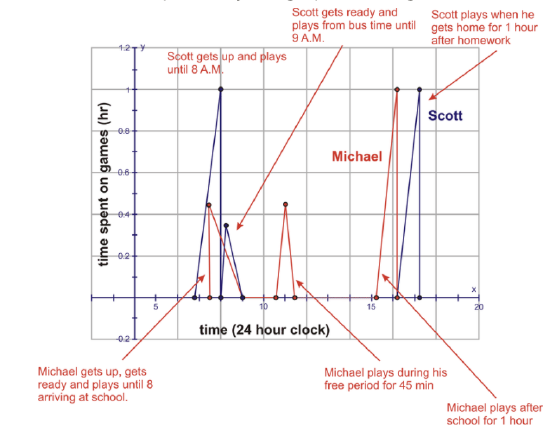
- Scott is asked to track his daily video game playing. He gets up at 7 A.M. and plays for 1 hour. He then eats his breakfast and gets ready for school. He runs to catch the bus at 8:25 A.M. On the bus ride (about 35 minutes), he plays his IPOD until arriving for school. He is not allowed games at school, so he waits for the bus ride home at 3:25 P.M. When he gets home, he does homework for 1 hour and plays games for 1 hour until dinner. There are no games in the evening. Michael gets up at 7:15 A.M., eats breakfast, and gets ready for school. It takes him 30 minutes to get ready. He then plays games until he goes to meet the bus with Scott. Michael is in Scott’s class, but he has a free period from 11:00 A.M. until 11:45 A.M., when he goes outside to play a game. He goes home and plays his 1 hour of games immediately, and he then works on his homework until dinner. He, like Scott, is not allowed to play games in the evening. The following broken-line graph was drawn for each set of data. Explain why the graph is wrong.
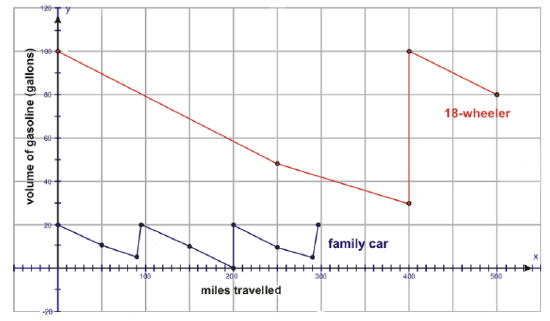
2. The following graph shows the gasoline remaining in a car during a family trip east. Also found on the graph is the gasoline remaining in a truck traveling west to deliver goods. Describe what is happening for each graph. What other conclusions may you draw?
Jack is boiling a pot of water to make hot chocolate, while Thomas is making chocolate chip cookies. Use the graph below to answer the following questions:
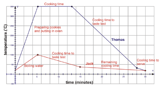
- Approximately what temperature is room temperature?
- About how hot was Thomas' oven?
- For about how many minutes did Thomas bake the cookies?
- For about how many minutes did Thomas let the cookies cool before he taste-tested them?
- What was the approximate temperature of the cookies when Thomas taste-tested them?
- About how long did it take Jack to boil the water?
- Approximately how long did Jack let the water cool before taste-testing his hot chocolate?
- About how hot was Jack's hot chocolate when he taste-tested it?
Vocabulary
| Term | Definition |
|---|---|
| double line graphs | Double line graphs are two line graphs that are graphed on the same coordinate grid for the purpose of comparison and are often called parallel graphs. |
Additional Resources
Video: Double Line Graphs Principles
Activities: Double Line Graphs Discussion Questions
Lesson Plans: Double Line Graphs Lesson Plan
Practice: Double Line Graphs
Real World: Double Line Graphs