
2.6.4: Line Graphs to Display Data Over Time
- Page ID
- 5767
\( \newcommand{\vecs}[1]{\overset { \scriptstyle \rightharpoonup} {\mathbf{#1}} } \)
\( \newcommand{\vecd}[1]{\overset{-\!-\!\rightharpoonup}{\vphantom{a}\smash {#1}}} \)
\( \newcommand{\dsum}{\displaystyle\sum\limits} \)
\( \newcommand{\dint}{\displaystyle\int\limits} \)
\( \newcommand{\dlim}{\displaystyle\lim\limits} \)
\( \newcommand{\id}{\mathrm{id}}\) \( \newcommand{\Span}{\mathrm{span}}\)
( \newcommand{\kernel}{\mathrm{null}\,}\) \( \newcommand{\range}{\mathrm{range}\,}\)
\( \newcommand{\RealPart}{\mathrm{Re}}\) \( \newcommand{\ImaginaryPart}{\mathrm{Im}}\)
\( \newcommand{\Argument}{\mathrm{Arg}}\) \( \newcommand{\norm}[1]{\| #1 \|}\)
\( \newcommand{\inner}[2]{\langle #1, #2 \rangle}\)
\( \newcommand{\Span}{\mathrm{span}}\)
\( \newcommand{\id}{\mathrm{id}}\)
\( \newcommand{\Span}{\mathrm{span}}\)
\( \newcommand{\kernel}{\mathrm{null}\,}\)
\( \newcommand{\range}{\mathrm{range}\,}\)
\( \newcommand{\RealPart}{\mathrm{Re}}\)
\( \newcommand{\ImaginaryPart}{\mathrm{Im}}\)
\( \newcommand{\Argument}{\mathrm{Arg}}\)
\( \newcommand{\norm}[1]{\| #1 \|}\)
\( \newcommand{\inner}[2]{\langle #1, #2 \rangle}\)
\( \newcommand{\Span}{\mathrm{span}}\) \( \newcommand{\AA}{\unicode[.8,0]{x212B}}\)
\( \newcommand{\vectorA}[1]{\vec{#1}} % arrow\)
\( \newcommand{\vectorAt}[1]{\vec{\text{#1}}} % arrow\)
\( \newcommand{\vectorB}[1]{\overset { \scriptstyle \rightharpoonup} {\mathbf{#1}} } \)
\( \newcommand{\vectorC}[1]{\textbf{#1}} \)
\( \newcommand{\vectorD}[1]{\overrightarrow{#1}} \)
\( \newcommand{\vectorDt}[1]{\overrightarrow{\text{#1}}} \)
\( \newcommand{\vectE}[1]{\overset{-\!-\!\rightharpoonup}{\vphantom{a}\smash{\mathbf {#1}}}} \)
\( \newcommand{\vecs}[1]{\overset { \scriptstyle \rightharpoonup} {\mathbf{#1}} } \)
\(\newcommand{\longvect}{\overrightarrow}\)
\( \newcommand{\vecd}[1]{\overset{-\!-\!\rightharpoonup}{\vphantom{a}\smash {#1}}} \)
\(\newcommand{\avec}{\mathbf a}\) \(\newcommand{\bvec}{\mathbf b}\) \(\newcommand{\cvec}{\mathbf c}\) \(\newcommand{\dvec}{\mathbf d}\) \(\newcommand{\dtil}{\widetilde{\mathbf d}}\) \(\newcommand{\evec}{\mathbf e}\) \(\newcommand{\fvec}{\mathbf f}\) \(\newcommand{\nvec}{\mathbf n}\) \(\newcommand{\pvec}{\mathbf p}\) \(\newcommand{\qvec}{\mathbf q}\) \(\newcommand{\svec}{\mathbf s}\) \(\newcommand{\tvec}{\mathbf t}\) \(\newcommand{\uvec}{\mathbf u}\) \(\newcommand{\vvec}{\mathbf v}\) \(\newcommand{\wvec}{\mathbf w}\) \(\newcommand{\xvec}{\mathbf x}\) \(\newcommand{\yvec}{\mathbf y}\) \(\newcommand{\zvec}{\mathbf z}\) \(\newcommand{\rvec}{\mathbf r}\) \(\newcommand{\mvec}{\mathbf m}\) \(\newcommand{\zerovec}{\mathbf 0}\) \(\newcommand{\onevec}{\mathbf 1}\) \(\newcommand{\real}{\mathbb R}\) \(\newcommand{\twovec}[2]{\left[\begin{array}{r}#1 \\ #2 \end{array}\right]}\) \(\newcommand{\ctwovec}[2]{\left[\begin{array}{c}#1 \\ #2 \end{array}\right]}\) \(\newcommand{\threevec}[3]{\left[\begin{array}{r}#1 \\ #2 \\ #3 \end{array}\right]}\) \(\newcommand{\cthreevec}[3]{\left[\begin{array}{c}#1 \\ #2 \\ #3 \end{array}\right]}\) \(\newcommand{\fourvec}[4]{\left[\begin{array}{r}#1 \\ #2 \\ #3 \\ #4 \end{array}\right]}\) \(\newcommand{\cfourvec}[4]{\left[\begin{array}{c}#1 \\ #2 \\ #3 \\ #4 \end{array}\right]}\) \(\newcommand{\fivevec}[5]{\left[\begin{array}{r}#1 \\ #2 \\ #3 \\ #4 \\ #5 \\ \end{array}\right]}\) \(\newcommand{\cfivevec}[5]{\left[\begin{array}{c}#1 \\ #2 \\ #3 \\ #4 \\ #5 \\ \end{array}\right]}\) \(\newcommand{\mattwo}[4]{\left[\begin{array}{rr}#1 \amp #2 \\ #3 \amp #4 \\ \end{array}\right]}\) \(\newcommand{\laspan}[1]{\text{Span}\{#1\}}\) \(\newcommand{\bcal}{\cal B}\) \(\newcommand{\ccal}{\cal C}\) \(\newcommand{\scal}{\cal S}\) \(\newcommand{\wcal}{\cal W}\) \(\newcommand{\ecal}{\cal E}\) \(\newcommand{\coords}[2]{\left\{#1\right\}_{#2}}\) \(\newcommand{\gray}[1]{\color{gray}{#1}}\) \(\newcommand{\lgray}[1]{\color{lightgray}{#1}}\) \(\newcommand{\rank}{\operatorname{rank}}\) \(\newcommand{\row}{\text{Row}}\) \(\newcommand{\col}{\text{Col}}\) \(\renewcommand{\row}{\text{Row}}\) \(\newcommand{\nul}{\text{Nul}}\) \(\newcommand{\var}{\text{Var}}\) \(\newcommand{\corr}{\text{corr}}\) \(\newcommand{\len}[1]{\left|#1\right|}\) \(\newcommand{\bbar}{\overline{\bvec}}\) \(\newcommand{\bhat}{\widehat{\bvec}}\) \(\newcommand{\bperp}{\bvec^\perp}\) \(\newcommand{\xhat}{\widehat{\xvec}}\) \(\newcommand{\vhat}{\widehat{\vvec}}\) \(\newcommand{\uhat}{\widehat{\uvec}}\) \(\newcommand{\what}{\widehat{\wvec}}\) \(\newcommand{\Sighat}{\widehat{\Sigma}}\) \(\newcommand{\lt}{<}\) \(\newcommand{\gt}{>}\) \(\newcommand{\amp}{&}\) \(\definecolor{fillinmathshade}{gray}{0.9}\)Line Graphs to Display Data Over Time
Unknown - https://commons.wikimedia.org/wiki/File:Beagle_puppy_sitting_on_grass.jpg
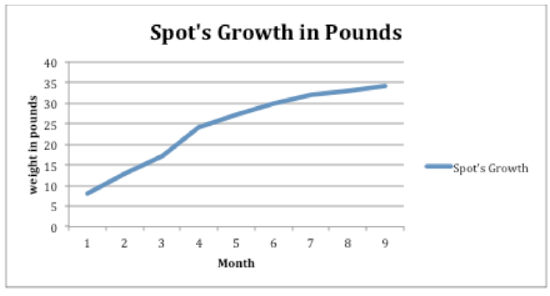
Jane is tracking her dog's weight as he grows from a puppy to an adult dog. Each month, she weighs Spot to see how much weight he has gained until he is 9 months old, when he is supposed to be fully grown. Ultimately, she wants to know how much weight Spot has gained from when he was a puppy to when he was fully grown.
Here is the data she collected on her notepad:
1 month- 8 lb.
2 months- 13 lb.
3 months- 17 lb.
4 months- 24 lb.
5 months- 27 lb.
6 months- 30 lb.
7 months- 32 lb.
8 months- 33 lb.
9 months- 34 lb.
Jane wants to graph this data so she can determine the difference between Spot's weight when he was a tiny puppy to when he was 9 months old.
In this concept, you will learn how to create a line graph and analyze data displayed on a line graph.
Line Graphs
A line graph is a graph that shows how data changes over time.
To make a line graph, you need a collection of data that has changed over time. Data that shows growth over years is a good example of appropriate data for a line graph.
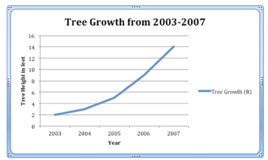
When Jamal was born, his parents planted a tree in the back yard. Here is how tall the tree was in each of the next five years.
2003- 2 ft.
2004- 3 ft.
2005- 5 ft.
2006- 9 ft.
2007- 14 ft.
Like other graphs, line graphs need two axes, one vertical (Y-axis) and one horizontal (X-axis).
The vertical axis represents the range of tree growth. The tree grew from 2 feet to 14 feet. That is the scale. The horizontal axis represents the years when tree growth was calculated.
Here is a finished line graph representing this data:
Melissa Sanders
It is important to know how to create line graphs for the purpose of reading and analyzing the data displayed in the graph. Patterns and trends can be concluded by reading line graphs to answer questions. In the Guided Practice section, you will be practicing answer specific questions related to a new set of data.
Examples
Example 1
Earlier, you were given a problem about Jane and Spot.
Jane wanted to track Spot's growth from 1 month old to 9 months old. She kept track of his weight gain and recorded the following data:
1 month- 8 lb.
2 months- 13 lb.
3 months- 17 lb.
4 months- 24 lb.
5 months- 27 lb.
6 months- 30 lb.
7 months- 32 lb.
8 months- 33 lb.
9 months- 34 lb.
Jane wants to graph this data and then figure out Spot's total weight gain from 1 month to 9 months.
First, Jane creates her line graph. She creates an x axis to represent months and a y axis to represent weight in pounds. She plots her points on the graph and connects them to create a line in the graph.
Melissa Sanders
Next, Jane begins to figure out the difference in weight from 1 month old to 9 months old. She looks for Spot's weight at 1 month first. His weight was about 8 lb.
Then, Jane finds the data showing his weight at 9 months old. Spot weighs about 34 lb. now.
To find the total weight gain, Jane finds the difference between these two data points by subtracting.
34−8=26
The answer is Spot gained a total of 26 pounds from when he was a puppy until he was fully grown at 9 months.
Example 2
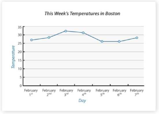
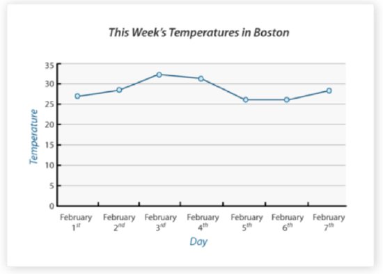
Consider the following line graph.
Melissa Sanders - https://commons.wikimedia.org/wiki/File:Beagle_puppy_sitting_on_grass.jpg;https://commons.wikimedia.org/wiki/File:Cute_beagle_puppy_lilly.jpg - CC BY-NC
Which day of the week had the highest temperature? What was that temperature?
First, analyze the graph to find the highest point in the trend line.
Next, follow down to the X-axis from that highest point to see what time that data represents. The highest point in this graph is data from February 3rd.
Then, go back to the highest point and follow across to the Y-axis for the value that is represented by that point on the graph. This point falls between 30 and 35 degrees somewhere in the middle. So a good estimate is about 33 degrees.
The answer is February 3rd. The temperature on that day was about 33 degrees.
Use the data from the graph "This Week's Temperatures in Boston" to answer the following questions.
Melissa Sanders
- https://commons.wikimedia.org/wiki/File:Beagle_puppy_sitting_on_grass.jpg;https://commons.wikimedia.org/wiki/File:Cute_beagle_puppy_lilly.jpg - CC BY-NC
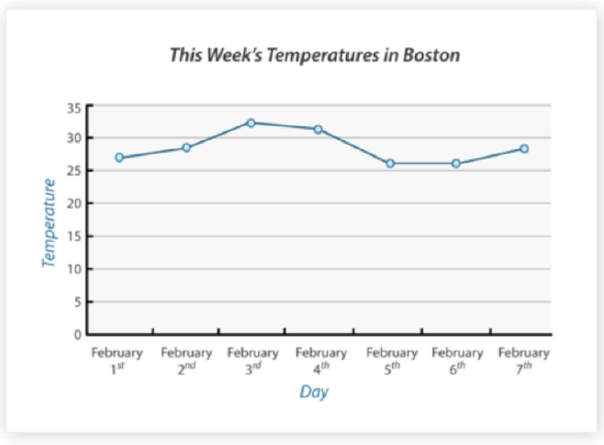
Example 3
What was the temperature in Boston on February 1st?
First, find the data for February 1st on the X-axis.
Next, follow up the graph to the data point for that day.
Then, follow across to the Y-axis to determine the temperature on that day. Some estimating may be necessary if the point does not fall directly on a number but more in between two data ranges.
The answer is about 27 degrees.
Example 4
What day that week had the lowest temperature in Boston?
First, look at the line in the graph to find the lowest data point on the line. In this case, there are two low points that seem to be the same temperature.
Next, follow down to the X-axis to determine the day the lowest point occurred.
Then, do the same with the other low point in the line to see the other day that had the same low temperature.
The answer is that both February 5th and February 6th had the lowest temperature that week.
Example 5
What is the greatest difference in temperature in Boston that week?
First, gather the data for the highest temperature that week. The high temperature was about 33 degrees on February 3rd.
Next, gather the data for the lowest temperature that week so you can find the difference. The lowest temperature that week was about 26 degrees on two different days (February 5th and 6th).
Then, find the difference between the high and low temperatures that week by subtracting.
33−26=7
The answer is there was a difference of 7 degrees.
Review
Use the following line graph to answer each question.
- What is being measured in this line graph?
- What is on the horizontal axis?
- What is on the vertical axis?
- What was the highest temperature recorded?
- What was the lowest temperature recorded?
- What is the difference between the two temperatures?
- On what day did the lowest temperature occur?
- What was the average temperature for the week?
- What was the median temperature for the week?
- Did any two days have the same temperature?
- What was that temperature?
- On which two days did it occur?
- Based on this trend, would the temperature on February 8th be less than 30 degrees or greater than?
- True or false. There isn't a way to figure out the temperature on January 31st.
- What was the temperature on February 5th?
Vocabulary
| Term | Definition |
|---|---|
| x−axis | The x−axis is the horizontal axis in the coordinate plane, commonly representing the value of the input or independent variable. |
| y axis | The y-axis is the vertical number line of the Cartesian plane. |
| Coordinate grid | The coordinate grid is formed by a horizontal number line and a vertical number line that cross at the (0, 0) point, called the origin. The coordinate grid is also called a Cartesian Plane or coordinate plane. |
| Coordinates | The coordinates of a point represent the point's location on the Cartesian plane. Coordinates are written in ordered pairs: (x,y). |
| Line Graph | A line graph is a visual way to show how data changes over time. |
| Ordered Pair | An ordered pair, (x,y), describes the location of a point on a coordinate grid. |
| Origin | The origin is the point of intersection of the x and y axes on the Cartesian plane. The coordinates of the origin are (0, 0). |
Additional Resources
PLIX: Play, Learn, Interact, eXplore - Line Graphs for Data over Time: Strawberry Competition
Video: Reading Line Graphs
Practice: Line Graphs to Display Data Over Time