
2.6.3: Line Plots from Frequency Tables
- Page ID
- 5766
\( \newcommand{\vecs}[1]{\overset { \scriptstyle \rightharpoonup} {\mathbf{#1}} } \)
\( \newcommand{\vecd}[1]{\overset{-\!-\!\rightharpoonup}{\vphantom{a}\smash {#1}}} \)
\( \newcommand{\id}{\mathrm{id}}\) \( \newcommand{\Span}{\mathrm{span}}\)
( \newcommand{\kernel}{\mathrm{null}\,}\) \( \newcommand{\range}{\mathrm{range}\,}\)
\( \newcommand{\RealPart}{\mathrm{Re}}\) \( \newcommand{\ImaginaryPart}{\mathrm{Im}}\)
\( \newcommand{\Argument}{\mathrm{Arg}}\) \( \newcommand{\norm}[1]{\| #1 \|}\)
\( \newcommand{\inner}[2]{\langle #1, #2 \rangle}\)
\( \newcommand{\Span}{\mathrm{span}}\)
\( \newcommand{\id}{\mathrm{id}}\)
\( \newcommand{\Span}{\mathrm{span}}\)
\( \newcommand{\kernel}{\mathrm{null}\,}\)
\( \newcommand{\range}{\mathrm{range}\,}\)
\( \newcommand{\RealPart}{\mathrm{Re}}\)
\( \newcommand{\ImaginaryPart}{\mathrm{Im}}\)
\( \newcommand{\Argument}{\mathrm{Arg}}\)
\( \newcommand{\norm}[1]{\| #1 \|}\)
\( \newcommand{\inner}[2]{\langle #1, #2 \rangle}\)
\( \newcommand{\Span}{\mathrm{span}}\) \( \newcommand{\AA}{\unicode[.8,0]{x212B}}\)
\( \newcommand{\vectorA}[1]{\vec{#1}} % arrow\)
\( \newcommand{\vectorAt}[1]{\vec{\text{#1}}} % arrow\)
\( \newcommand{\vectorB}[1]{\overset { \scriptstyle \rightharpoonup} {\mathbf{#1}} } \)
\( \newcommand{\vectorC}[1]{\textbf{#1}} \)
\( \newcommand{\vectorD}[1]{\overrightarrow{#1}} \)
\( \newcommand{\vectorDt}[1]{\overrightarrow{\text{#1}}} \)
\( \newcommand{\vectE}[1]{\overset{-\!-\!\rightharpoonup}{\vphantom{a}\smash{\mathbf {#1}}}} \)
\( \newcommand{\vecs}[1]{\overset { \scriptstyle \rightharpoonup} {\mathbf{#1}} } \)
\( \newcommand{\vecd}[1]{\overset{-\!-\!\rightharpoonup}{\vphantom{a}\smash {#1}}} \)
\(\newcommand{\avec}{\mathbf a}\) \(\newcommand{\bvec}{\mathbf b}\) \(\newcommand{\cvec}{\mathbf c}\) \(\newcommand{\dvec}{\mathbf d}\) \(\newcommand{\dtil}{\widetilde{\mathbf d}}\) \(\newcommand{\evec}{\mathbf e}\) \(\newcommand{\fvec}{\mathbf f}\) \(\newcommand{\nvec}{\mathbf n}\) \(\newcommand{\pvec}{\mathbf p}\) \(\newcommand{\qvec}{\mathbf q}\) \(\newcommand{\svec}{\mathbf s}\) \(\newcommand{\tvec}{\mathbf t}\) \(\newcommand{\uvec}{\mathbf u}\) \(\newcommand{\vvec}{\mathbf v}\) \(\newcommand{\wvec}{\mathbf w}\) \(\newcommand{\xvec}{\mathbf x}\) \(\newcommand{\yvec}{\mathbf y}\) \(\newcommand{\zvec}{\mathbf z}\) \(\newcommand{\rvec}{\mathbf r}\) \(\newcommand{\mvec}{\mathbf m}\) \(\newcommand{\zerovec}{\mathbf 0}\) \(\newcommand{\onevec}{\mathbf 1}\) \(\newcommand{\real}{\mathbb R}\) \(\newcommand{\twovec}[2]{\left[\begin{array}{r}#1 \\ #2 \end{array}\right]}\) \(\newcommand{\ctwovec}[2]{\left[\begin{array}{c}#1 \\ #2 \end{array}\right]}\) \(\newcommand{\threevec}[3]{\left[\begin{array}{r}#1 \\ #2 \\ #3 \end{array}\right]}\) \(\newcommand{\cthreevec}[3]{\left[\begin{array}{c}#1 \\ #2 \\ #3 \end{array}\right]}\) \(\newcommand{\fourvec}[4]{\left[\begin{array}{r}#1 \\ #2 \\ #3 \\ #4 \end{array}\right]}\) \(\newcommand{\cfourvec}[4]{\left[\begin{array}{c}#1 \\ #2 \\ #3 \\ #4 \end{array}\right]}\) \(\newcommand{\fivevec}[5]{\left[\begin{array}{r}#1 \\ #2 \\ #3 \\ #4 \\ #5 \\ \end{array}\right]}\) \(\newcommand{\cfivevec}[5]{\left[\begin{array}{c}#1 \\ #2 \\ #3 \\ #4 \\ #5 \\ \end{array}\right]}\) \(\newcommand{\mattwo}[4]{\left[\begin{array}{rr}#1 \amp #2 \\ #3 \amp #4 \\ \end{array}\right]}\) \(\newcommand{\laspan}[1]{\text{Span}\{#1\}}\) \(\newcommand{\bcal}{\cal B}\) \(\newcommand{\ccal}{\cal C}\) \(\newcommand{\scal}{\cal S}\) \(\newcommand{\wcal}{\cal W}\) \(\newcommand{\ecal}{\cal E}\) \(\newcommand{\coords}[2]{\left\{#1\right\}_{#2}}\) \(\newcommand{\gray}[1]{\color{gray}{#1}}\) \(\newcommand{\lgray}[1]{\color{lightgray}{#1}}\) \(\newcommand{\rank}{\operatorname{rank}}\) \(\newcommand{\row}{\text{Row}}\) \(\newcommand{\col}{\text{Col}}\) \(\renewcommand{\row}{\text{Row}}\) \(\newcommand{\nul}{\text{Nul}}\) \(\newcommand{\var}{\text{Var}}\) \(\newcommand{\corr}{\text{corr}}\) \(\newcommand{\len}[1]{\left|#1\right|}\) \(\newcommand{\bbar}{\overline{\bvec}}\) \(\newcommand{\bhat}{\widehat{\bvec}}\) \(\newcommand{\bperp}{\bvec^\perp}\) \(\newcommand{\xhat}{\widehat{\xvec}}\) \(\newcommand{\vhat}{\widehat{\vvec}}\) \(\newcommand{\uhat}{\widehat{\uvec}}\) \(\newcommand{\what}{\widehat{\wvec}}\) \(\newcommand{\Sighat}{\widehat{\Sigma}}\) \(\newcommand{\lt}{<}\) \(\newcommand{\gt}{>}\) \(\newcommand{\amp}{&}\) \(\definecolor{fillinmathshade}{gray}{0.9}\)Line Plots from Frequency Tables

Mr. Smith took a survey in his class of how many books his students read over the summer. He first created a list of the data as shown here:
1, 1, 2, 2, 2, 3, 4, 4, 5, 6, 6, 6, 7
Each number represents a student and the number of books they read over the summer. He decides to organize the data further into a frequency table.
| # of Books Read | Frequency (# of students who read that many books) |
|---|---|
| 1 | 2 |
| 2 | 3 |
| 3 | 1 |
| 4 | 2 |
| 5 | 1 |
| 6 | 3 |
| 7 |
1 |
Now, he wants to display the data visually for his students to analyze. How can Mr. Smith visually organize his frequency table for his students?
In this concept, you will learn how to take data in a frequency table and create a line plot to display the data.
Line Plots
A line plot is another display method to organize data.
Like a frequency table, a line plot shows how many times each number appears in the data set. Instead of putting the information into a table, it is placed on a number line. Line plots are especially useful when the data falls over a large range. Take a look at the data and the line plot below.
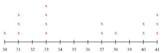
This data represents the number of students in each class at a local community college.
30, 31, 31, 31, 33, 33, 33, 33, 37, 37, 38, 40, 40, 41, 41, 41
The first thing to do is to organize this data into a frequency table. That will show how often each number appears.
| # of students | Frequency (number of classes with that many students) |
|---|---|
| 30 | 1 |
| 31 | 3 |
| 32 | 0 |
| 33 | 4 |
| 34 | 0 |
| 35 | 0 |
| 36 | 0 |
| 37 | 2 |
| 38 | 1 |
| 39 | 0 |
| 40 | 2 |
| 41 | 3 |
Some conclusions can be drawn from this data:
- The range of students in each class is from 30 to 41.
- There aren’t any classes with 32, 34, 35, 36 or 39 students in them.
A line plot can be created to display this same data, only in a different way.
Building the line plot involves counting the number of students and then plotting the information on a number line. The symbol X is used to represent the number of classes that has that number of students in it.
https://www.flickr.com/photos/aheram/449353221/in/photolist-FH44k-chcDm-65W9K5-ciyUUy-k9CJv3-m8KMN9-kS7MVB-o8u7ja-o1ZnHD-h2MT45-kQbuFv-d3CdXm-dRpekF-adgypB-rmMs8P-6kFRLu-4rGioF-dEXFN4-Fa6wm-kqsPuW-8HUH4r-pcgzp-63DndZ-q4dz8r-fkr4Fc-8jH4eb-adwcMk-6ozJcT-5JNnEK-uA7AGu-8oUH34-hZyg6F-aSeEyH-bvRkiE-pZ7HeQ-qGUz4M-5zo8kf-ecXWbk-6Uccv-iDoy2h-rYdds5-dEpG5A-71UN8-pr7NcE-eNamDx-nyXiHz-fTfabp-oC4zi5-4G9TCp-rrTNKk;https://www.flickr.com/photos/aafromaa/3003188568/in/photolist-5zo8kf-ecXWbk-6Uccv-iDoy2h-rYdds5-dEpG5A-71UN8-pr7NcE-eNamDx-nyXiHz-fTfabp-oC4zi5-4G9TCp-rrTNKk-7ceJ2X-qGBeL2-oMcgyR-dXDrCi-aSewJa-8MV6wS-3QLLZG-uFqXxL-bQGRCK-oUcZeY-bQGRtF-qWXj5H-hLFDSN-ozNbcy-7WAGDH-h1yMac-vkQ78d-uB38XL-kh6fcT-cEJDC3-6KgK16-7LHQdT-a3Uq1v-7YiyAN-rpc9fQ-ds1ib5-2jvD2V-8VKAg4-2AjNpa-cDGGrh-cfrjtd-cGThCs-kVKFpt-dYJWCE-dtVQXr-ewg4Zi - CC BY-NC
Notice that even though there is no class with 32 students in it, is was still included on the number line. This is very important. Each value in the range of numbers needs to be represented, even if that value is 0.
Examples
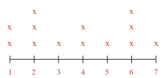
Example 1
Earlier, you were given a problem about Mr. Smith and his data showing the number of books his students read over the summer. This was the data he collected and then organized into a frequency table:
1, 1, 2, 2, 2, 3, 4, 4, 5, 6, 6, 6, 7
| # of Books Read | Frequency (# of students who read that many books) |
|---|---|
| 1 | 2 |
| 2 | 3 |
| 3 | 1 |
| 4 | 2 |
| 5 | 1 |
| 6 | 3 |
| 7 |
1 |
Mr. Smith has done the first step to creating a visual display of data which is to organize the data and create the frequency table.
Next, he creates the line plot.
CC BY-NC
Then, he can analyze the data and draw conclusions. For example:
- 2 students read only 1 book over the summer
- 1 student read 7 books over the summer
- There were no students who did not read at all- that's great!
Example 2
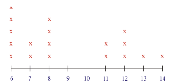
Jeff counted the number of ducks he saw swimming in the pond each morning on his way to school. Here are his results:
6, 8, 12, 14, 5, 6, 7, 8, 12, 11, 12, 5, 6, 6, 8, 11, 8, 7, 6, 13
First, organize the data in numerical order.
6, 6, 6, 6, 6, 7, 7, 8, 8, 8, 8, 11, 11, 12, 12, 12, 13, 14
Next, create a frequency table. There are two columns in the frequency table. The first column shows the number of ducks and the second column shows how many times that number of ducks was on the pond.
| Number of Ducks | Frequency |
|---|---|
| 6 | 5 |
| 7 | 2 |
| 8 | 4 |
| 9 | 0 |
| 10 | 0 |
| 11 | 2 |
| 12 | 3 |
| 13 | 1 |
| 14 | 1 |
Then, turn the frequency table into a line plot.
https://www.flickr.com/photos/aheram/449353221/in/photolist-FH44k-chcDm-65W9K5-ciyUUy-k9CJv3-m8KMN9-kS7MVB-o8u7ja-o1ZnHD-h2MT45-kQbuFv-d3CdXm-dRpekF-adgypB-rmMs8P-6kFRLu-4rGioF-dEXFN4-Fa6wm-kqsPuW-8HUH4r-pcgzp-63DndZ-q4dz8r-fkr4Fc-8jH4eb-adwcMk-6ozJcT-5JNnEK-uA7AGu-8oUH34-hZyg6F-aSeEyH-bvRkiE-pZ7HeQ-qGUz4M-5zo8kf-ecXWbk-6Uccv-iDoy2h-rYdds5-dEpG5A-71UN8-pr7NcE-eNamDx-nyXiHz-fTfabp-oC4zi5-4G9TCp-rrTNKk;https://www.flickr.com/photos/aafromaa/3003188568/in/photolist-5zo8kf-ecXWbk-6Uccv-iDoy2h-rYdds5-dEpG5A-71UN8-pr7NcE-eNamDx-nyXiHz-fTfabp-oC4zi5-4G9TCp-rrTNKk-7ceJ2X-qGBeL2-oMcgyR-dXDrCi-aSewJa-8MV6wS-3QLLZG-uFqXxL-bQGRCK-oUcZeY-bQGRtF-qWXj5H-hLFDSN-ozNbcy-7WAGDH-h1yMac-vkQ78d-uB38XL-kh6fcT-cEJDC3-6KgK16-7LHQdT-a3Uq1v-7YiyAN-rpc9fQ-ds1ib5-2jvD2V-8VKAg4-2AjNpa-cDGGrh-cfrjtd-cGThCs-kVKFpt-dYJWCE-dtVQXr-ewg4Zi - CC BY-NC
Here are some conclusions that can be drawn by looking at both methods of displaying data:
- In both, the range of numbers is shown. There were between 6 and 14 ducks seen, so each number from 6 to 14 is represented.
- There weren’t any days where 9 or 10 ducks were counted, yet both are represented because they fall in the range of ducks counted.
- Both methods help to visually understand data and its meaning.
Use the data below, which shows the enrollment in different college classes, to answer the following questions.
# of Students in the Classes
CC BY-NC
Example 3
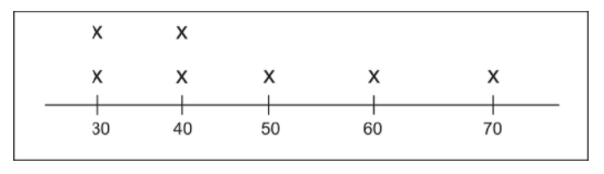
How many classes at the college have 31 students in them?
First, find the data from the question on the line plot.
Next, look at the frequency represented by X's to see how many classes had 31 students.
Then, answer the question with the data that is shown.
The answer is 3 classes have 31 students in them.
Example 4
How many classes at the college have 38 students in them?
First, find the data from the question on the line plot.
Next, look at the frequency represented by X's to see how many classes have 38 students.
Then, answer the question with the data shown.
The answer is 1 class has 38 students in it.
Example 5
How many classes at the college have 33 students in them?
First, find the data from the question on the line plot.
Next, look at the frequency represented by X's to see how many classes have 33 students.
Then, answer the question with the data shown.
The answer is 4 classes have 33 students in them.
Review
Here is a line plot that shows how many seals came into the harbor in La Jolla California during an entire month. Use it to answer the following questions.
- How many times did thirty seals appear on the beach?
- Which two categories have the same frequency?
- How many times were 50 or more seals counted on the beach?
- True or False. This line plot shows us the number of seals that came on each day of the month.
- True or False. There weren’t any days that less than 30 seals appeared on the beach.
- How many times were 60 seals on the beach?
- How many times were 70 seals on the beach?
- What is the smallest number of seals that was counted on the beach?
- What is the greatest number of seals that were counted on the beach?
- Does the frequency table show any number of seals that weren't counted at all?
Organize each list of data. Then create a frequency table to show the results. There are two answers for each question.
- 8, 8, 2, 2, 2, 2, 2, 5, 6, 3, 3, 4
- 20, 18, 18, 19, 19, 19, 17, 17, 17, 17, 17
- 100, 99, 98, 92, 92, 92, 92, 92, 92, 98, 98
- 75, 75, 75, 70, 70, 70, 70, 71, 72, 72, 72, 74, 74, 74
- 1, 1, 1, 1, 2, 2, 2, 3, 3, 5, 5, 5, 5, 5, 5, 5
Vocabulary
| Term | Definition |
|---|---|
| Analyze | To analyze is to look at data and draw conclusions based on patterns or numbers. |
| Data | Data is information that has been collected to represent real life situations, usually in number form. |
| Frequency | In statistics, the frequency of an event is the number of times that event occurred. |
| Frequency table | A frequency table is a table that summarizes a data set by stating the number of times each value occurs within the data set. |
| Line plot | A line plot is a graph that shows the frequency of data over a number line. |
| Organized data | Organized data is data that is listed in numerical order. |
Additional Resources
PLIX: Play, Learn, Interact, eXplore - Line Plots from Frequency Tables: Sleep Cycles
Video: Making Frequency Tables, Line Plots, and Bar Graphs
Practice: Line Plots from Frequency Tables