
2.7.3: Scatter Plots and Linear Correlation
- Page ID
- 5772
Linear Correlation
So far we have learned how to describe distributions of a single variable and how to perform hypothesis tests concerning parameters of these distributions. But what if we notice that two variables seem to be related? We may notice that the values of two variables, such as verbal SAT score and GPA, behave in the same way and that students who have a high verbal SAT score also tend to have a high GPA (see table below). In this case, we would want to study the nature of the connection between the two variables.
| Student | SAT Score | GPA |
|---|---|---|
| 1 | 595 | 3.4 |
| 2 | 520 | 3.2 |
| 3 | 715 | 3.9 |
| 4 | 405 | 2.3 |
| 5 | 680 | 3.9 |
| 6 | 490 | 2.5 |
| 7 | 565 | 3.5 |
These types of studies are quite common, and we can use the concept of correlation to describe the relationship between the two variables.
Bivariate Data, Correlation Between Values, and the Use of Scatterplots
Correlation measures the relationship between bivariate data. Bivariate data are data sets in which each subject has two observations associated with it. In our example above, we notice that there are two observations (verbal SAT score and GPA) for each subject (in this case, a student). Can you think of other scenarios when we would use bivariate data?
If we carefully examine the data in the example above, we notice that those students with high SAT scores tend to have high GPAs, and those with low SAT scores tend to have low GPAs. In this case, there is a tendency for students to score similarly on both variables, and the performance between variables appears to be related.
Scatterplots display these bivariate data sets and provide a visual representation of the relationship between variables. In a scatterplot, each point represents a paired measurement of two variables for a specific subject, and each subject is represented by one point on the scatterplot.
Correlation Patterns in Scatterplot Graphs
Examining a scatterplot graph allows us to obtain some idea about the relationship between two variables.
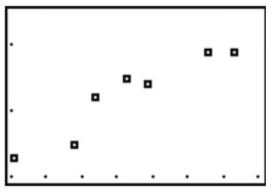
When the points on a scatterplot graph produce a lower-left-to-upper-right pattern (see below), we say that there is a positive correlation between the two variables. This pattern means that when the score of one observation is high, we expect the score of the other observation to be high as well, and vice versa.
When the points on a scatterplot graph produce a upper-left-to-lower-right pattern (see below), we say that there is a negative correlation between the two variables. This pattern means that when the score of one observation is high, we expect the score of the other observation to be low, and vice versa.
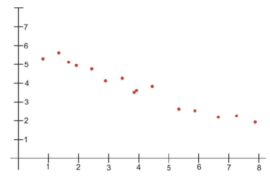
Engage NY, Module 6, Lesson 7, p 85 - http://www.sjsu.edu/faculty/gerstman/StatPrimer/correlation.pdf - CC BY-NC
When all the points on a scatterplot lie on a straight line, you have what is called a perfect correlation between the two variables (see below).
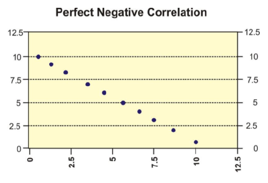
Engage NY, Module 6, Lesson 7, p 85 - http://www.sjsu.edu/faculty/gerstman/StatPrimer/correlation.pdf - CC BY-NC
A scatterplot in which the points do not have a linear trend (either positive or negative) is called a zero correlation or a near-zero correlation (see below).
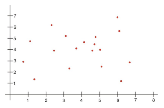
Engage NY, Module 6, Lesson 7, p 85 - http://www.sjsu.edu/faculty/gerstman/StatPrimer/correlation.pdf - CC BY-NC
When examining scatterplots, we also want to look not only at the direction of the relationship (positive, negative, or zero), but also at the magnitude of the relationship. If we drew an imaginary oval around all of the points on the scatterplot, we would be able to see the extent, or the magnitude, of the relationship. If the points are close to one another and the width of the imaginary oval is small, this means that there is a strong correlation between the variables (see below).
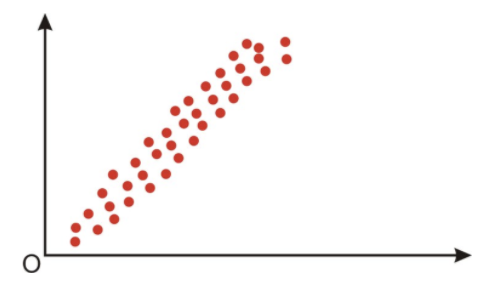
Engage NY, Module 6, Lesson 7, p 85 - http://www.sjsu.edu/faculty/gerstman/StatPrimer/correlation.pdf - CC BY-NC
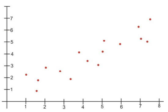
However, if the points are far away from one another, and the imaginary oval is very wide, this means that there is a weak correlation between the variables (see below).
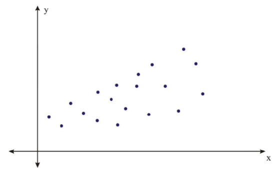
Engage NY, Module 6, Lesson 7, p 85 - http://www.sjsu.edu/faculty/gerstman/StatPrimer/correlation.pdf - CC BY-NC
Correlation Coefficients
While examining scatterplots gives us some idea about the relationship between two variables, we use a statistic called the correlation coefficient to give us a more precise measurement of the relationship between the two variables. The correlation coefficient is an index that describes the relationship and can take on values between −1.0 and +1.0, with a positive correlation coefficient indicating a positive correlation and a negative correlation coefficient indicating a negative correlation.
The absolute value of the coefficient indicates the magnitude, or the strength, of the relationship. The closer the absolute value of the coefficient is to 1, the stronger the relationship. For example, a correlation coefficient of 0.20 indicates that there is a weak linear relationship between the variables, while a coefficient of −0.90 indicates that there is a strong linear relationship.
The value of a perfect positive correlation is 1.0, while the value of a perfect negative correlation is −1.0.
When there is no linear relationship between two variables, the correlation coefficient is 0. It is important to remember that a correlation coefficient of 0 indicates that there is no linear relationship, but there may still be a strong relationship between the two variables. For example, there could be a quadratic relationship between them.
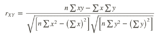
The Pearson product-moment correlation coefficient is a statistic that is used to measure the strength and direction of a linear correlation. It is symbolized by the letter r. To understand how this coefficient is calculated, let’s suppose that there is a positive relationship between two variables, X and Y. If a subject has a score on X that is above the mean, we expect the subject to have a score on Y that is also above the mean. Pearson developed his correlation coefficient by computing the sum of cross products. He multiplied the two scores, X and Y, for each subject and then added these cross products across the individuals. Next, he divided this sum by the number of subjects minus one. This coefficient is, therefore, the mean of the cross products of scores.
Pearson used standard scores (z-scores, t-scores, etc.) when determining the coefficient.
Therefore, the formula for this coefficient is as follows:
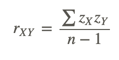
In other words, the coefficient is expressed as the sum of the cross products of the standard z-scores divided by the number of degrees of freedom.
An equivalent formula that uses the raw scores rather than the standard scores is called the raw score formula and is written as follows:
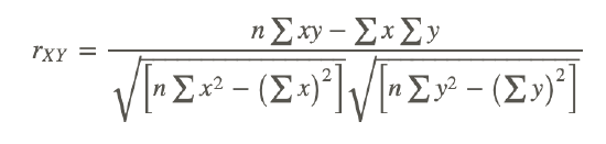
Again, this formula is most often used when calculating correlation coefficients from original data. Note that n is used instead of n−1, because we are using actual data and not z-scores. Let’s use our example from the introduction to demonstrate how to calculate the correlation coefficient using the raw score formula.
Calculating the Pearson Product-Moment Correlation Coefficient
What is the Pearson product-moment correlation coefficient for the two variables represented in the table below?
| Student | SAT Score | GPA |
|---|---|---|
| 1 | 595 | 3.4 |
| 2 | 520 | 3.2 |
| 3 | 715 | 3.9 |
| 4 | 405 | 2.3 |
| 5 | 680 | 3.9 |
| 6 | 490 | 2.5 |
| 7 | 565 | 3.5 |
In order to calculate the correlation coefficient, we need to calculate several pieces of information, including xy, x2, and y2. Therefore, the values of xy, x2, and y2 have been added to the table.
| Student | SAT Score (X) | GPA (Y) | xy | x2 | y2 |
|---|---|---|---|---|---|
| 1 | 595 | 3.4 | 2023 | 354025 | 11.56 |
| 2 | 520 | 3.2 | 1664 | 270400 | 10.24 |
| 3 | 715 | 3.9 | 2789 | 511225 | 15.21 |
| 4 | 405 | 2.3 | 932 | 164025 | 5.29 |
| 5 | 680 | 3.9 | 2652 | 462400 | 15.21 |
| 6 | 490 | 2.5 | 1225 | 240100 | 6.25 |
| 7 | 565 | 3.5 | 1978 | 319225 | 12.25 |
| Sum | 3970 | 22.7 | 13262 | 2321400 | 76.01 |
Applying the formula to these data, we find the following:
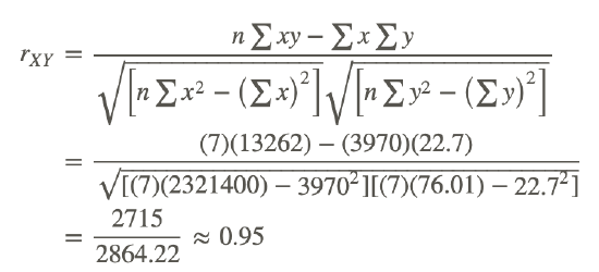
The correlation coefficient not only provides a measure of the relationship between the variables, but it also gives us an idea about how much of the total variance of one variable can be associated with the variance of the other. For example, the correlation coefficient of 0.95 that we calculated above tells us that to a high degree, the variance in the scores on the verbal SAT is associated with the variance in the GPA, and vice versa. For example, we could say that factors that influence the verbal SAT, such as health, parent college level, etc., would also contribute to individual differences in the GPA. The higher the correlation we have between two variables, the larger the portion of the variance that can be explained by the independent variable.
The calculation of this variance is called the coefficient of determination and is calculated by squaring the correlation coefficient. Therefore, the coefficient of determination is written as r2. The result of this calculation indicates the proportion of the variance in one variable that can be associated with the variance in the other variable.
The Properties and Common Errors of Correlation
Correlation is a measure of the linear relationship between two variables-it does not necessarily state that one variable is caused by another. For example, a third variable or a combination of other things may be causing the two correlated variables to relate as they do. Therefore, it is important to remember that we are interpreting the variables and the variance not as causal, but instead as relational.
When examining correlation, there are three things that could affect our results: linearity, homogeneity of the group, and sample size.
Linearity:
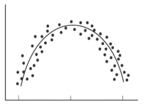
As mentioned, the correlation coefficient is the measure of the linear relationship between two variables. However, while many pairs of variables have a linear relationship, some do not. For example, let’s consider performance anxiety. As a person’s anxiety about performing increases, so does his or her performance up to a point. (We sometimes call this good stress.) However, at some point, the increase in anxiety may cause a person's performance to go down. We call these non-linear relationships curvilinear relationships. We can identify curvilinear relationships by examining scatterplots (see below). One may ask why curvilinear relationships pose a problem when calculating the correlation coefficient. The answer is that if we use the traditional formula to calculate these relationships, it will not be an accurate index, and we will be underestimating the relationship between the variables. If we graphed performance against anxiety, we would see that anxiety has a strong affect on performance. However, if we calculated the correlation coefficient, we would arrive at a figure around zero. Therefore, the correlation coefficient is not always the best statistic to use to understand the relationship between variables.
Homogeneity of the Group:
Another error we could encounter when calculating the correlation coefficient is homogeneity of the group. When a group is homogeneous, or possesses similar characteristics, the range of scores on either or both of the variables is restricted. For example, suppose we are interested in finding out the correlation between IQ and salary. If only members of the Mensa Club (a club for people with IQs over 140) are sampled, we will most likely find a very low correlation between IQ and salary, since most members will have a consistently high IQ, but their salaries will still vary. This does not mean that there is not a relationship-it simply means that the restriction of the sample limited the magnitude of the correlation coefficient.
Sample Size:
Finally, we should consider sample size. One may assume that the number of observations used in the calculation of the correlation coefficient may influence the magnitude of the coefficient itself. However, this is not the case. Yet while the sample size does not affect the correlation coefficient, it may affect the accuracy of the relationship. The larger the sample, the more accurate of a predictor the correlation coefficient will be of the relationship between the two variables.
Looking at the Properties of Correlation
If a pair of variables have a strong curvilinear relationship, which of the following is true:
a. The correlation coefficient will be able to indicate that a nonlinear relationship is present.
False, the correlation coefficient does not indicate that a curvilinear relationship is present – only that there is no linear relationship.
b. A scatterplot will not be needed to indicate that a nonlinear relationship is present.
False, a scatterplot will be needed to indicate that a nonlinear relationship is present.
c. The correlation coefficient will not be able to indicate the relationship is nonlinear.
True, the correlation coefficient will not be able to indicate the relationship is nonlinear.
d. The correlation coefficient will be exactly equal to zero.
True, the correlation coefficient is zero when there is a strong curvilinear relationship because it is a measure of a linear relationship.
Interpreting Correlation
A national consumer magazine reported that the correlation between car weight and car reliability is -0.30. What does this mean?
If the correlation between car weight and car reliability is -.30 it means that as the weight of the car goes up, the reliability of the car goes down. This is not a perfect linear relationship since the absolute value of the correlation coefficient is only .30.
Example
Example 1
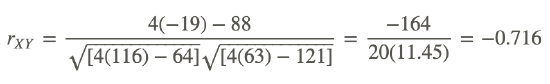
Compute the correlation coefficient for the following data:
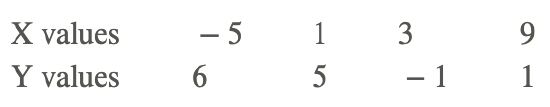
Use the following table to organize the information:
| N | X | Y | XY | X2 | Y2 |
|---|---|---|---|---|---|
| 1 | − 5 | 6 | − 30 | 25 | 36 |
| 2 | 1 | 5 | 5 | 1 | 25 |
| 3 | 3 | − 1 | − 3 | 9 | 1 |
| 4 | 9 | 1 | 9 | 81 | 1 |
| Sum | 8 | 11 | − 19 | 116 | 63 |
Substituting these values into the formula, we get:
Review
- Give 2 scenarios or research questions where you would use bivariate data sets.
- In the space below, draw and label four scatterplot graphs. One should show:
- a positive correlation
- a negative correlation
- a perfect correlation
- a zero correlation
- In the space below, draw and label two scatterplot graphs. One should show:
- a weak correlation
- a strong correlation.
- What does the correlation coefficient measure?
- The following observations were taken for five students measuring grade and reading level.
| Student Number | Grade | Reading Level |
|---|---|---|
| 1 | 2 | 6 |
| 2 | 6 | 14 |
| 3 | 5 | 12 |
| 4 | 4 | 10 |
| 5 | 1 | 4 |
a. Draw a scatterplot for these data. What type of relationship does this correlation have?
b. Use the raw score formula to compute the Pearson correlation coefficient.
- A teacher gives two quizzes to his class of 10 students. The following are the scores of the 10 students.
| Student | Quiz 1 | Quiz 2 |
|---|---|---|
| 1 | 15 | 20 |
| 2 | 12 | 15 |
| 3 | 10 | 12 |
| 4 | 14 | 18 |
| 5 | 10 | 10 |
| 6 | 8 | 13 |
| 7 | 6 | 12 |
| 8 | 15 | 10 |
| 9 | 16 | 18 |
| 10 | 13 | 15 |
a. Compute the Pearson correlation coefficient, r, between the scores on the two quizzes.
b. Find the percentage of the variance, r2, in the scores of Quiz 2 associated with the variance in the scores of Quiz 1.
c. Interpret both r and r2 in words.
- What are the three factors that we should be aware of that affect the magnitude and accuracy of the Pearson correlation coefficient?
- For each of the following pairs of variables, is there likely to be a positive association, a negative association, or no association. Explain.
- Amount of alcohol consumed and result of a breath test.
- Weight and grade point average for high school students.
- Miles of running per week and time in a marathon.
- Identify whether a scatterplot would or would not be an appropriate visual summary of the relationship between the following variables. Explain.
- Blood pressure and age
- Region of the country and opinion about gay marriage.
- Verbal SAT score and math SAT score.
- Which of the numbers 0, 0.45, -1.9, -0.4, 2.6 could not be values of the correlation coefficient. Explain.
- Which of the following implies a stronger linear relationship +0.6 or -0.8. Explain.
- Explain how two variables can have a 0 correlation coefficient but a perfect curved relationship.
- Consider the following data and compute the correlation coefficient:
- Describe what a scatterplot is and explain its importance.
- Sketch and explain the following:
- A scatterplot for a set of data points for which it would be appropriate to fit a regression line.
- A scatterplot for a set of data points for which it is not appropriate to fit a regression line.
- Suppose data are collected for each of several randomly selected high school students for weight, in pounds, and number of calories burned in 30 minutes of walking on a treadmill at 4 mph. How would the value of the correlation coefficient change if all of the weights were converted to ounces?
- Each of the following contains a mistake. In each case, explain what is wrong.
- “There is a high correlation between the gender of a worker and his income.
- “We found a high correlation (1.10) between a high school freshman’s rating of a movie and a high school senior’s rating of the same movie.”
- The correlation between planting rate and yield of potatoes was r=.25 bushels.”
Vocabulary
| Term | Definition |
|---|---|
| bivariate | Bivariate data has two variables |
| correlation | Correlation is a statistical method used to determine if there is a connection or a relationship between two sets of data. |
| curvilinear relationships | Non-linear relationships are called curvilinear relationships. |
| direct relationship | If the line on a line graph rises to the right, it indicates a direct relationship. |
| homogeneity | When a group is homogeneous, or possesses similar characteristics, the range of scores on either or both of the variables is restricted. |
| indirect relationship | If the line on a line graph falls to the right, it indicates an indirect relationship. |
| linear relationship | A linear relationship appears as a straight line either rising or falling as the independent variable values increase. |
| negative correlation | A negative correlation appears as a recognizable line with a negative slope. |
| non-linear relationship | A non-linear relationship may take the form of any number of curved lines but is not a straight line. |
| positive correlation | A positive correlation appears as a recognizable line with a positive slope. |
| scatter plot | A scatter plot is a plot of the dependent variable versus the independent variable and is used to investigate whether or not there is a relationship or connection between 2 sets of data. |
| Slope | Slope is a measure of the steepness of a line. A line can have positive, negative, zero (horizontal), or undefined (vertical) slope. The slope of a line can be found by calculating “rise over run” or “the change in the y over the change in the x.” The symbol for slope is m |
| strong correlation | Two variables with a strong correlation will appear as a number of points occurring in a clear and recognizable linear pattern. |
| trends | Trends in data sets or samples are indicators found by reviewing the data from a general or overall standpoint |
| weak correlation | Two variables with a weak correlation will appear as a much more scattered field of points, with only a little indication of points falling into a line of any sort. |
Additional Resources
PLIX: Play, Learn, Interact, eXplore - Regression and Correlation
Video: Graphical Interpretation of a Scatter Plot and Line of Best Fit
Practice: Scatter Plots and Linear Correlation
Real World: Global Warming