
2.1: Types of Data Representation
- Page ID
- 5696
\( \newcommand{\vecs}[1]{\overset { \scriptstyle \rightharpoonup} {\mathbf{#1}} } \)
\( \newcommand{\vecd}[1]{\overset{-\!-\!\rightharpoonup}{\vphantom{a}\smash {#1}}} \)
\( \newcommand{\dsum}{\displaystyle\sum\limits} \)
\( \newcommand{\dint}{\displaystyle\int\limits} \)
\( \newcommand{\dlim}{\displaystyle\lim\limits} \)
\( \newcommand{\id}{\mathrm{id}}\) \( \newcommand{\Span}{\mathrm{span}}\)
( \newcommand{\kernel}{\mathrm{null}\,}\) \( \newcommand{\range}{\mathrm{range}\,}\)
\( \newcommand{\RealPart}{\mathrm{Re}}\) \( \newcommand{\ImaginaryPart}{\mathrm{Im}}\)
\( \newcommand{\Argument}{\mathrm{Arg}}\) \( \newcommand{\norm}[1]{\| #1 \|}\)
\( \newcommand{\inner}[2]{\langle #1, #2 \rangle}\)
\( \newcommand{\Span}{\mathrm{span}}\)
\( \newcommand{\id}{\mathrm{id}}\)
\( \newcommand{\Span}{\mathrm{span}}\)
\( \newcommand{\kernel}{\mathrm{null}\,}\)
\( \newcommand{\range}{\mathrm{range}\,}\)
\( \newcommand{\RealPart}{\mathrm{Re}}\)
\( \newcommand{\ImaginaryPart}{\mathrm{Im}}\)
\( \newcommand{\Argument}{\mathrm{Arg}}\)
\( \newcommand{\norm}[1]{\| #1 \|}\)
\( \newcommand{\inner}[2]{\langle #1, #2 \rangle}\)
\( \newcommand{\Span}{\mathrm{span}}\) \( \newcommand{\AA}{\unicode[.8,0]{x212B}}\)
\( \newcommand{\vectorA}[1]{\vec{#1}} % arrow\)
\( \newcommand{\vectorAt}[1]{\vec{\text{#1}}} % arrow\)
\( \newcommand{\vectorB}[1]{\overset { \scriptstyle \rightharpoonup} {\mathbf{#1}} } \)
\( \newcommand{\vectorC}[1]{\textbf{#1}} \)
\( \newcommand{\vectorD}[1]{\overrightarrow{#1}} \)
\( \newcommand{\vectorDt}[1]{\overrightarrow{\text{#1}}} \)
\( \newcommand{\vectE}[1]{\overset{-\!-\!\rightharpoonup}{\vphantom{a}\smash{\mathbf {#1}}}} \)
\( \newcommand{\vecs}[1]{\overset { \scriptstyle \rightharpoonup} {\mathbf{#1}} } \)
\(\newcommand{\longvect}{\overrightarrow}\)
\( \newcommand{\vecd}[1]{\overset{-\!-\!\rightharpoonup}{\vphantom{a}\smash {#1}}} \)
\(\newcommand{\avec}{\mathbf a}\) \(\newcommand{\bvec}{\mathbf b}\) \(\newcommand{\cvec}{\mathbf c}\) \(\newcommand{\dvec}{\mathbf d}\) \(\newcommand{\dtil}{\widetilde{\mathbf d}}\) \(\newcommand{\evec}{\mathbf e}\) \(\newcommand{\fvec}{\mathbf f}\) \(\newcommand{\nvec}{\mathbf n}\) \(\newcommand{\pvec}{\mathbf p}\) \(\newcommand{\qvec}{\mathbf q}\) \(\newcommand{\svec}{\mathbf s}\) \(\newcommand{\tvec}{\mathbf t}\) \(\newcommand{\uvec}{\mathbf u}\) \(\newcommand{\vvec}{\mathbf v}\) \(\newcommand{\wvec}{\mathbf w}\) \(\newcommand{\xvec}{\mathbf x}\) \(\newcommand{\yvec}{\mathbf y}\) \(\newcommand{\zvec}{\mathbf z}\) \(\newcommand{\rvec}{\mathbf r}\) \(\newcommand{\mvec}{\mathbf m}\) \(\newcommand{\zerovec}{\mathbf 0}\) \(\newcommand{\onevec}{\mathbf 1}\) \(\newcommand{\real}{\mathbb R}\) \(\newcommand{\twovec}[2]{\left[\begin{array}{r}#1 \\ #2 \end{array}\right]}\) \(\newcommand{\ctwovec}[2]{\left[\begin{array}{c}#1 \\ #2 \end{array}\right]}\) \(\newcommand{\threevec}[3]{\left[\begin{array}{r}#1 \\ #2 \\ #3 \end{array}\right]}\) \(\newcommand{\cthreevec}[3]{\left[\begin{array}{c}#1 \\ #2 \\ #3 \end{array}\right]}\) \(\newcommand{\fourvec}[4]{\left[\begin{array}{r}#1 \\ #2 \\ #3 \\ #4 \end{array}\right]}\) \(\newcommand{\cfourvec}[4]{\left[\begin{array}{c}#1 \\ #2 \\ #3 \\ #4 \end{array}\right]}\) \(\newcommand{\fivevec}[5]{\left[\begin{array}{r}#1 \\ #2 \\ #3 \\ #4 \\ #5 \\ \end{array}\right]}\) \(\newcommand{\cfivevec}[5]{\left[\begin{array}{c}#1 \\ #2 \\ #3 \\ #4 \\ #5 \\ \end{array}\right]}\) \(\newcommand{\mattwo}[4]{\left[\begin{array}{rr}#1 \amp #2 \\ #3 \amp #4 \\ \end{array}\right]}\) \(\newcommand{\laspan}[1]{\text{Span}\{#1\}}\) \(\newcommand{\bcal}{\cal B}\) \(\newcommand{\ccal}{\cal C}\) \(\newcommand{\scal}{\cal S}\) \(\newcommand{\wcal}{\cal W}\) \(\newcommand{\ecal}{\cal E}\) \(\newcommand{\coords}[2]{\left\{#1\right\}_{#2}}\) \(\newcommand{\gray}[1]{\color{gray}{#1}}\) \(\newcommand{\lgray}[1]{\color{lightgray}{#1}}\) \(\newcommand{\rank}{\operatorname{rank}}\) \(\newcommand{\row}{\text{Row}}\) \(\newcommand{\col}{\text{Col}}\) \(\renewcommand{\row}{\text{Row}}\) \(\newcommand{\nul}{\text{Nul}}\) \(\newcommand{\var}{\text{Var}}\) \(\newcommand{\corr}{\text{corr}}\) \(\newcommand{\len}[1]{\left|#1\right|}\) \(\newcommand{\bbar}{\overline{\bvec}}\) \(\newcommand{\bhat}{\widehat{\bvec}}\) \(\newcommand{\bperp}{\bvec^\perp}\) \(\newcommand{\xhat}{\widehat{\xvec}}\) \(\newcommand{\vhat}{\widehat{\vvec}}\) \(\newcommand{\uhat}{\widehat{\uvec}}\) \(\newcommand{\what}{\widehat{\wvec}}\) \(\newcommand{\Sighat}{\widehat{\Sigma}}\) \(\newcommand{\lt}{<}\) \(\newcommand{\gt}{>}\) \(\newcommand{\amp}{&}\) \(\definecolor{fillinmathshade}{gray}{0.9}\)Two common types of graphic displays are bar charts and histograms. Both bar charts and histograms use vertical or horizontal bars to represent the number of data points in each category or interval. The main difference graphically is that in a bar chart there are spaces between the bars and in a histogram there are not spaces between the bars. Why does this subtle difference exist and what does it imply about graphic displays in general?
Displaying Data
It is often easier for people to interpret relative sizes of data when that data is displayed graphically. Note that a categorical variable is a variable that can take on one of a limited number of values and a quantitative variable is a variable that takes on numerical values that represent a measurable quantity. Examples of categorical variables are tv stations, the state someone lives in, and eye color while examples of quantitative variables are the height of students or the population of a city. There are a few common ways of displaying data graphically that you should be familiar with.
Pie Chart
A pie chart shows the relative proportions of data in different categories. Pie charts are excellent ways of displaying categorical data with easily separable groups. The following pie chart shows six categories labeled A−F. The size of each pie slice is determined by the central angle. Since there are 360o in a circle, the size of the central angle θA of category A can be found by:
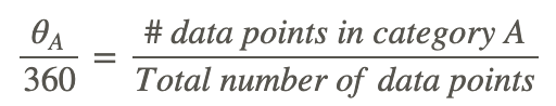
CK-12 Foundation - https://www.flickr.com/photos/slgc/16173880801 - CCSA
Bar Chart
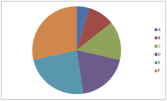
A bar chart displays frequencies of categories of data. The bar chart below has 5 categories, and shows the TV channel preferences for 53 adults. The horizontal axis could have also been labeled News, Sports, Local News, Comedy, Action Movies. The reason why the bars are separated by spaces is to emphasize the fact that they are categories and not continuous numbers. For example, just because you split your time between channel 8 and channel 44 does not mean on average you watch channel 26. Categories can be numbers so you need to be very careful.
CK-12 Foundation - https://www.flickr.com/photos/slgc/16173880801 - CCSA
Histogram
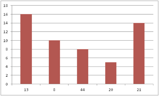
A histogram displays frequencies of quantitative data that has been sorted into intervals. The following is a histogram that shows the heights of a class of 53 students. Notice the largest category is 56-60 inches with 18 people.
CK-12 Foundation - https://www.flickr.com/photos/slgc/16173880801 - CCSA
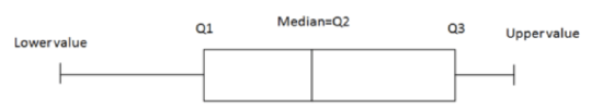
Boxplot
A boxplot (also known as a box and whiskers plot) is another way to display quantitative data. It displays the five 5 number summary (minimum, Q1, median, Q3, maximum). The box can either be vertically or horizontally displayed depending on the labeling of the axis. The box does not need to be perfectly symmetrical because it represents data that might not be perfectly symmetrical.
CK-12 Foundation - https://www.flickr.com/photos/slgc/16173880801 - CCSA
Examples
Example 1
Earlier, you were asked about the difference between histograms and bar charts. The reason for the space in bar charts but no space in histograms is bar charts graph categorical variables while histograms graph quantitative variables. It would be extremely improper to forget the space with bar charts because you would run the risk of implying a spectrum from one side of the chart to the other. Note that in the bar chart where TV stations where shown, the station numbers were not listed horizontally in order by size. This was to emphasize the fact that the stations were categories.
Example 2
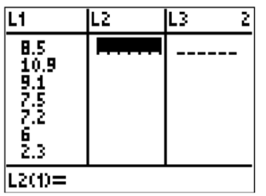
Create a boxplot of the following numbers in your calculator.
8.5, 10.9, 9.1, 7.5, 7.2, 6, 2.3, 5.5
Enter the data into L1 by going into the Stat menu.
CK-12 Foundation - CCSA
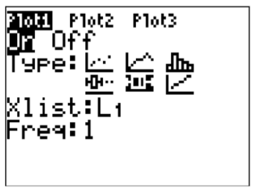
Then turn the statplot on and choose boxplot.
CK-12 Foundation - CCSA
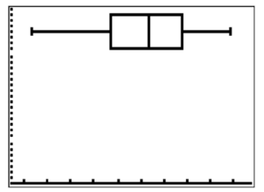
Use Zoomstat to automatically center the window on the boxplot.
CK-12 Foundation - https://www.flickr.com/photos/slgc/16173880801 - CCSA
Example 3
Create a pie chart to represent the preferences of 43 hungry students.
- Other – 5
- Burritos – 7
- Burgers – 9
- Pizza – 22
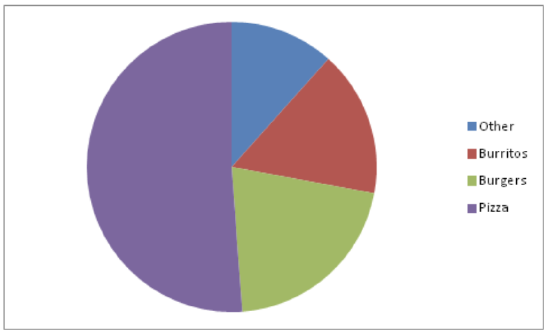
CK-12 Foundation - CCSA
Example 4
Create a bar chart representing the preference for sports of a group of 23 people.
- Football – 12
- Baseball – 10
- Basketball – 8
- Hockey – 3
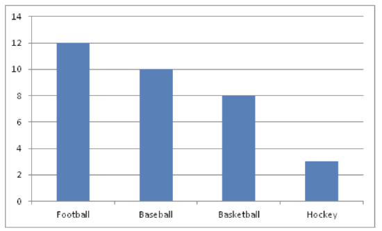
CK-12 Foundation - CCSA
Example 5
Create a histogram for the income distribution of 200 million people.
- Below $50,000 is 100 million people
- Between $50,000 and $100,000 is 50 million people
- Between $100,000 and $150,000 is 40 million people
- Above $150,000 is 10 million people
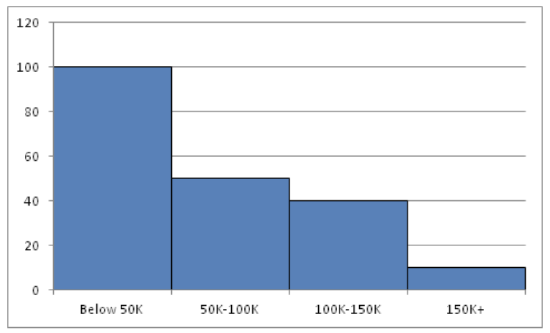
CK-12 Foundation - CCSA
Review
1. What types of graphs show categorical data?
2. What types of graphs show quantitative data?
A math class of 30 students had the following grades:
| Grade | Number of Students with Grade |
| A | 10 |
| B | 10 |
| C | 5 |
| D | 3 |
| F | 2 |
3. Create a bar chart for this data.
4. Create a pie chart for this data.
5. Which graph do you think makes a better visual representation of the data?
A set of 20 exam scores is 67, 94, 88, 76, 85, 93, 55, 87, 80, 81, 80, 61, 90, 84, 75, 93, 75, 68, 100, 98
6. Create a histogram for this data. Use your best judgment to decide what the intervals should be.
7. Find the five number summary for this data.
8. Use the five number summary to create a boxplot for this data.
9. Describe the data shown in the boxplot below.
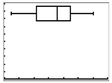
CK-12 Foundation - CCSA
10. Describe the data shown in the histogram below.
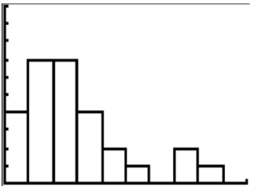
CK-12 Foundation - CCSA
A math class of 30 students has the following eye colors:
| Grade | Number of Students with Grade |
| Brown | 20 |
| Blue | 5 |
| Green | 3 |
| Other | 2 |
11. Create a bar chart for this data.
12. Create a pie chart for this data.
13. Which graph do you think makes a better visual representation of the data?
14. Suppose you have data that shows the breakdown of registered republicans by state. What types of graphs could you use to display this data?
15. From which types of graphs could you obtain information about the spread of the data? Note that spread is a measure of how spread out all of the data is.
Vocabulary
| Term | Definition |
|---|---|
| bar chart | A bar chart is a graphic display of categorical variables that uses bars to represent the frequency of the count in each category. |
| box- and- whisker plot | A box- and- whisker plot is a graphic display of quantitative data that demonstrates the five number summary. |
| boxplot | A boxplot is a graphic display of quantitative data that illustrates the five number summary. |
| categorical variable | A categorical variable is a variable that can take on one of a limited number of values. Examples of categorical variables are tv stations, the state someone lives in, and eye color. |
| continuous variables | A continuous variable is a variable that takes on any value within the limits of the variable. |
| five number summary | The five number summary of a set of data is the minimum, first quartile, second quartile, third quartile, and maximum. |
| frequency polygon | A frequency polygon is a graph constructed by using lines to join the midpoints of each interval, or bin. |
| Histogram | A histogram is a display that indicates the frequency of specified ranges of continuous data values on a graph in the form of immediately adjacent bars. |
| Line plot | A line plot is a graph that shows the frequency of data over a number line. |
| linear regression | In statistics, linear regression is a process that attempts to model the relationship between two variables by fitting a linear equation to the data. |
| pie chart | A pie chart is a graphic display of categorical data where the relative size of each pie slice corresponds to the frequency of each category. |
| quantitative variable | A quantitative variable is a variable that takes on numerical values that represent a measurable quantity. Examples of quantitative variables are the height of students or the population of a city. |
| Scatterplot | A scatterplot is a type of visual display that shows pairs of data for two different variables. |
| Stem-and-leaf plot | A stem-and-leaf plot is a way of organizing data values from least to greatest using place value. Usually, the last digit of each data value becomes the "leaf" and the other digits become the "stem". |
Additional Resources
PLIX: Play, Learn, Interact, eXplore - Baby Due Date Histogram
Practice: Types of Data Representation
Real World: Prepare for Impact