
2.2.2: Circle Graphs to Make Bar Graphs
- Page ID
- 5752
\( \newcommand{\vecs}[1]{\overset { \scriptstyle \rightharpoonup} {\mathbf{#1}} } \)
\( \newcommand{\vecd}[1]{\overset{-\!-\!\rightharpoonup}{\vphantom{a}\smash {#1}}} \)
\( \newcommand{\id}{\mathrm{id}}\) \( \newcommand{\Span}{\mathrm{span}}\)
( \newcommand{\kernel}{\mathrm{null}\,}\) \( \newcommand{\range}{\mathrm{range}\,}\)
\( \newcommand{\RealPart}{\mathrm{Re}}\) \( \newcommand{\ImaginaryPart}{\mathrm{Im}}\)
\( \newcommand{\Argument}{\mathrm{Arg}}\) \( \newcommand{\norm}[1]{\| #1 \|}\)
\( \newcommand{\inner}[2]{\langle #1, #2 \rangle}\)
\( \newcommand{\Span}{\mathrm{span}}\)
\( \newcommand{\id}{\mathrm{id}}\)
\( \newcommand{\Span}{\mathrm{span}}\)
\( \newcommand{\kernel}{\mathrm{null}\,}\)
\( \newcommand{\range}{\mathrm{range}\,}\)
\( \newcommand{\RealPart}{\mathrm{Re}}\)
\( \newcommand{\ImaginaryPart}{\mathrm{Im}}\)
\( \newcommand{\Argument}{\mathrm{Arg}}\)
\( \newcommand{\norm}[1]{\| #1 \|}\)
\( \newcommand{\inner}[2]{\langle #1, #2 \rangle}\)
\( \newcommand{\Span}{\mathrm{span}}\) \( \newcommand{\AA}{\unicode[.8,0]{x212B}}\)
\( \newcommand{\vectorA}[1]{\vec{#1}} % arrow\)
\( \newcommand{\vectorAt}[1]{\vec{\text{#1}}} % arrow\)
\( \newcommand{\vectorB}[1]{\overset { \scriptstyle \rightharpoonup} {\mathbf{#1}} } \)
\( \newcommand{\vectorC}[1]{\textbf{#1}} \)
\( \newcommand{\vectorD}[1]{\overrightarrow{#1}} \)
\( \newcommand{\vectorDt}[1]{\overrightarrow{\text{#1}}} \)
\( \newcommand{\vectE}[1]{\overset{-\!-\!\rightharpoonup}{\vphantom{a}\smash{\mathbf {#1}}}} \)
\( \newcommand{\vecs}[1]{\overset { \scriptstyle \rightharpoonup} {\mathbf{#1}} } \)
\( \newcommand{\vecd}[1]{\overset{-\!-\!\rightharpoonup}{\vphantom{a}\smash {#1}}} \)
\(\newcommand{\avec}{\mathbf a}\) \(\newcommand{\bvec}{\mathbf b}\) \(\newcommand{\cvec}{\mathbf c}\) \(\newcommand{\dvec}{\mathbf d}\) \(\newcommand{\dtil}{\widetilde{\mathbf d}}\) \(\newcommand{\evec}{\mathbf e}\) \(\newcommand{\fvec}{\mathbf f}\) \(\newcommand{\nvec}{\mathbf n}\) \(\newcommand{\pvec}{\mathbf p}\) \(\newcommand{\qvec}{\mathbf q}\) \(\newcommand{\svec}{\mathbf s}\) \(\newcommand{\tvec}{\mathbf t}\) \(\newcommand{\uvec}{\mathbf u}\) \(\newcommand{\vvec}{\mathbf v}\) \(\newcommand{\wvec}{\mathbf w}\) \(\newcommand{\xvec}{\mathbf x}\) \(\newcommand{\yvec}{\mathbf y}\) \(\newcommand{\zvec}{\mathbf z}\) \(\newcommand{\rvec}{\mathbf r}\) \(\newcommand{\mvec}{\mathbf m}\) \(\newcommand{\zerovec}{\mathbf 0}\) \(\newcommand{\onevec}{\mathbf 1}\) \(\newcommand{\real}{\mathbb R}\) \(\newcommand{\twovec}[2]{\left[\begin{array}{r}#1 \\ #2 \end{array}\right]}\) \(\newcommand{\ctwovec}[2]{\left[\begin{array}{c}#1 \\ #2 \end{array}\right]}\) \(\newcommand{\threevec}[3]{\left[\begin{array}{r}#1 \\ #2 \\ #3 \end{array}\right]}\) \(\newcommand{\cthreevec}[3]{\left[\begin{array}{c}#1 \\ #2 \\ #3 \end{array}\right]}\) \(\newcommand{\fourvec}[4]{\left[\begin{array}{r}#1 \\ #2 \\ #3 \\ #4 \end{array}\right]}\) \(\newcommand{\cfourvec}[4]{\left[\begin{array}{c}#1 \\ #2 \\ #3 \\ #4 \end{array}\right]}\) \(\newcommand{\fivevec}[5]{\left[\begin{array}{r}#1 \\ #2 \\ #3 \\ #4 \\ #5 \\ \end{array}\right]}\) \(\newcommand{\cfivevec}[5]{\left[\begin{array}{c}#1 \\ #2 \\ #3 \\ #4 \\ #5 \\ \end{array}\right]}\) \(\newcommand{\mattwo}[4]{\left[\begin{array}{rr}#1 \amp #2 \\ #3 \amp #4 \\ \end{array}\right]}\) \(\newcommand{\laspan}[1]{\text{Span}\{#1\}}\) \(\newcommand{\bcal}{\cal B}\) \(\newcommand{\ccal}{\cal C}\) \(\newcommand{\scal}{\cal S}\) \(\newcommand{\wcal}{\cal W}\) \(\newcommand{\ecal}{\cal E}\) \(\newcommand{\coords}[2]{\left\{#1\right\}_{#2}}\) \(\newcommand{\gray}[1]{\color{gray}{#1}}\) \(\newcommand{\lgray}[1]{\color{lightgray}{#1}}\) \(\newcommand{\rank}{\operatorname{rank}}\) \(\newcommand{\row}{\text{Row}}\) \(\newcommand{\col}{\text{Col}}\) \(\renewcommand{\row}{\text{Row}}\) \(\newcommand{\nul}{\text{Nul}}\) \(\newcommand{\var}{\text{Var}}\) \(\newcommand{\corr}{\text{corr}}\) \(\newcommand{\len}[1]{\left|#1\right|}\) \(\newcommand{\bbar}{\overline{\bvec}}\) \(\newcommand{\bhat}{\widehat{\bvec}}\) \(\newcommand{\bperp}{\bvec^\perp}\) \(\newcommand{\xhat}{\widehat{\xvec}}\) \(\newcommand{\vhat}{\widehat{\vvec}}\) \(\newcommand{\uhat}{\widehat{\uvec}}\) \(\newcommand{\what}{\widehat{\wvec}}\) \(\newcommand{\Sighat}{\widehat{\Sigma}}\) \(\newcommand{\lt}{<}\) \(\newcommand{\gt}{>}\) \(\newcommand{\amp}{&}\) \(\definecolor{fillinmathshade}{gray}{0.9}\)Circle Graphs to Make Bar Graphs
Luke Jones - https://www.flickr.com/photos/befuddledsenses/10604425635
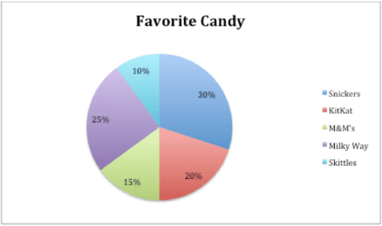
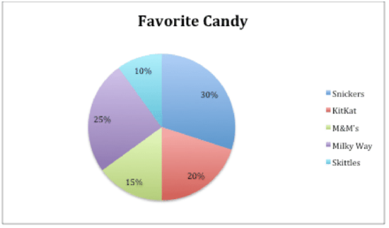
Carrie took a poll of 400 students in her high school to see what their favorite candy choice is. Here is the outcome of her poll displayed in a circle graph:
Melissa Sanders
Carrie wants to display the information in a bar graph, too. The problem is, she lost her data table that shows the exact number of students that liked each candy. She only has the percentages from her circle graph to help her. She will need to convert the percentages to actual number amounts in order to create a bar graph.
In this concept, you will learn how to use data from a circle graph to find number amounts from percentages to create a bar graph of the same data.
Circle Graphs to Bar Graphs
Circle graphs are just one of many different ways to display and organize data in a form that is easy to interpret. Circle graphs are most useful when comparing parts of a whole or total.
Bar graphs also make comparisons easily. Unlike most circle graphs, bar graphs compare exact amounts. Circle graphs are used when dealing with percentages, and the percentages of the pieces add up to 100 percent. In a bar graph, however, a scale is used to show the exact amount of each category.
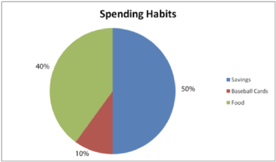
Take a look at the two graphs below.
Melissa Sanders - https://www.flickr.com/photos/befuddledsenses/10604425635;https://pixabay.com/en/chart-graph-graphic-statistics-35773/
Melissa Sanders - https://www.flickr.com/photos/befuddledsenses/10604425635;https://pixabay.com/en/chart-graph-graphic-statistics-35773/
Both graphs show how Trey spends the $40 he earns each month delivering papers.
The circle graph gives this information in percentages.
Trey spends 40 percent of his money on food and 10 percent on buying baseball cards. He saves the other 50% for his new bike.
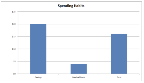
The bar graph shows the same results but in a different format. The “parts” in the circle graph are represented by bars on the bar graph. The categories of how Trey spends his money are shown across the bottom. Along the side, a scale gives actual amounts of money. The height of each category bar tells exactly how much money Trey spends on that category. The food bar shows that Trey spent $16 on food and $4 on baseball cards. He saves $20 each week to put towards the new bike.
Examples
Example 1
Earlier, you were given a problem about Carrie and her data on favorite candy.
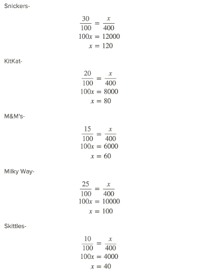
She lost her data table that showed the exact number of students that liked each candy. She only has the percentages of each candy choice and the total number of students she polled, which was 400. She wants to create a bar graph displaying her data.
Melissa Sanders
First, Carrie needs to convert each percentage to a number amount by using proportions.
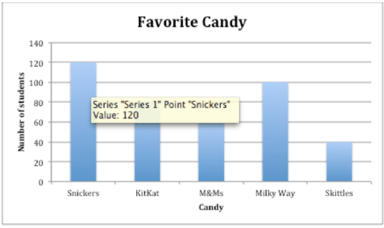
Next, Carrie can set up a bar graph with an X-axis containing each candy and a Y-axis containing a range of 40-120 by 20's starting at 0. This scale will keep the graph not too large but keep the representation accurate.
Then, Carrie inputs all her data into the graph to create her final bar graph to represent her data.
Here is Carrie's final bar graph displaying her data.
Melissa Sanders
Example 2
In the example above, monetary amounts that Trey spent were figured out from the percentages displayed in the circle graph. The way to convert that data is to create a proportion.
Look at the first piece of data-Trey spent 40% of $40.00 on food.
To figure out how much 40% of $40.00 is, write a proportion. A proportion compares two fractions.
First, convert the percentage to a fraction:
40% = 40/100
Next, write a second fraction with the total number of dollars Trey has to spend on the bottom, and a variable on top to represent the part of his total money you want to know:
x/40
Then, set up the proportion and solve for the variable by cross multiplying.
40/100 = x/40
1600 = 100x
x = 16
The answer is Trey spent $16 of his $40.00 on food.
If you look back at the bar graph, you can see that this is the actual amount from the bar graph.
This process of converting percentages to number amounts is used when converting a circle graph to a bar graph. This concept is an important piece to understanding the relationship between these two types of a graph.
Example 3
John spent 15% of $20.00 on candy. How much did he spend?
First, convert the percentage to a fraction.
15/100
Next, write a second fraction with the total amount on the bottom and a variable to represent the unknown amount on top.
x/20
Then, set up the proportion and solve for the variable by cross multiplying.
15/100 = x/20
100x = 300
x = 3
The answer is $3.00 of John's $20 was spent on candy.
Example 4
Susan ate 45% of 20 carrots. How many did she eat?
First, convert the percentage to a fraction.
45/100
Next, write a second fraction with the total amount on the bottom and a variable to represent the unknown amount on top.
x/20
Then, set up the proportion and solve for the variable by cross multiplying.
45/100 = x/20
100x = 900
x = 9
The answer is Susan ate 9 carrots out of 20.
Example 5
Kelly sold 55% of 60 zucchini. How many did she sell?
First, convert the percentage to a fraction.
55/100
Next, write a second fraction with the total amount on the bottom and a variable to represent the unknown amount on top.
x/60
Then, set up the proportion and solve for the variable by cross multiplying.
55/100 = x/60
100x=3300
x=33
The answer is 33 zucchini out of 60 were sold.
Review
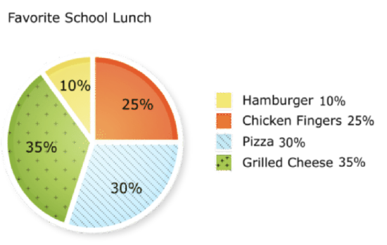
Use the following circle graph and proportions to answer each question.
Melissa Sanders - https://www.flickr.com/photos/befuddledsenses/10604425635;https://pixabay.com/en/chart-graph-graphic-statistics-35773/ - CC BY-NC
Three hundred students were surveyed to find out their favorite school lunch.
- How many students chose hamburgers as their favorite lunch?
- How many students chose chicken fingers as their favorite lunch?
- How many students did not choose hamburgers?
- How many students chose pizza as their favorite lunch?
- How many students chose grilled cheese as their favorite lunch?
- How many students did not choose grilled cheese or pizza?
- How many students did not choose chicken fingers as their favorite lunch?
- How many students were undecided?
- Given your answers to numbers 1 - 8, what interval would make sense to use as the vertical axis of the bar graph?
- What is the range of the data?
- What would you use to label the horizontal axis of the bar graph?
- Would the bar graph use numbers of students or percents?
- What proportion did you use to figure out each value in numbers 1 - 8?
- True or false. Any circle graph can be drawn as a bar graph.
- True or false. Bar graphs use actual numbers and circle graphs use percents.
Vocabulary
| Term | Definition |
|---|---|
| Decimal | In common use, a decimal refers to part of a whole number. The numbers to the left of a decimal point represent whole numbers, and each number to the right of a decimal point represents a fractional part of a power of one-tenth. For instance: The decimal value 1.24 indicates 1 whole unit, 2 tenths, and 4 hundredths (commonly described as 24 hundredths). |
| Percent | Percent means out of 100. It is a quantity written with a % sign. |
| Prediction | A prediction is a statement one makes about the likelihood of a future event. |
Additional Resources
PLIX: Play, Learn, Interact, eXplore - Circle Graphs to Make Bar Graphs: Spending Habits
Video: Reading Bar Graphs
Practice: Circle Graphs to Make Bar Graphs