
1.5.1: Displaying by Type of Data
- Page ID
- 5746
\( \newcommand{\vecs}[1]{\overset { \scriptstyle \rightharpoonup} {\mathbf{#1}} } \)
\( \newcommand{\vecd}[1]{\overset{-\!-\!\rightharpoonup}{\vphantom{a}\smash {#1}}} \)
\( \newcommand{\id}{\mathrm{id}}\) \( \newcommand{\Span}{\mathrm{span}}\)
( \newcommand{\kernel}{\mathrm{null}\,}\) \( \newcommand{\range}{\mathrm{range}\,}\)
\( \newcommand{\RealPart}{\mathrm{Re}}\) \( \newcommand{\ImaginaryPart}{\mathrm{Im}}\)
\( \newcommand{\Argument}{\mathrm{Arg}}\) \( \newcommand{\norm}[1]{\| #1 \|}\)
\( \newcommand{\inner}[2]{\langle #1, #2 \rangle}\)
\( \newcommand{\Span}{\mathrm{span}}\)
\( \newcommand{\id}{\mathrm{id}}\)
\( \newcommand{\Span}{\mathrm{span}}\)
\( \newcommand{\kernel}{\mathrm{null}\,}\)
\( \newcommand{\range}{\mathrm{range}\,}\)
\( \newcommand{\RealPart}{\mathrm{Re}}\)
\( \newcommand{\ImaginaryPart}{\mathrm{Im}}\)
\( \newcommand{\Argument}{\mathrm{Arg}}\)
\( \newcommand{\norm}[1]{\| #1 \|}\)
\( \newcommand{\inner}[2]{\langle #1, #2 \rangle}\)
\( \newcommand{\Span}{\mathrm{span}}\) \( \newcommand{\AA}{\unicode[.8,0]{x212B}}\)
\( \newcommand{\vectorA}[1]{\vec{#1}} % arrow\)
\( \newcommand{\vectorAt}[1]{\vec{\text{#1}}} % arrow\)
\( \newcommand{\vectorB}[1]{\overset { \scriptstyle \rightharpoonup} {\mathbf{#1}} } \)
\( \newcommand{\vectorC}[1]{\textbf{#1}} \)
\( \newcommand{\vectorD}[1]{\overrightarrow{#1}} \)
\( \newcommand{\vectorDt}[1]{\overrightarrow{\text{#1}}} \)
\( \newcommand{\vectE}[1]{\overset{-\!-\!\rightharpoonup}{\vphantom{a}\smash{\mathbf {#1}}}} \)
\( \newcommand{\vecs}[1]{\overset { \scriptstyle \rightharpoonup} {\mathbf{#1}} } \)
\( \newcommand{\vecd}[1]{\overset{-\!-\!\rightharpoonup}{\vphantom{a}\smash {#1}}} \)
\(\newcommand{\avec}{\mathbf a}\) \(\newcommand{\bvec}{\mathbf b}\) \(\newcommand{\cvec}{\mathbf c}\) \(\newcommand{\dvec}{\mathbf d}\) \(\newcommand{\dtil}{\widetilde{\mathbf d}}\) \(\newcommand{\evec}{\mathbf e}\) \(\newcommand{\fvec}{\mathbf f}\) \(\newcommand{\nvec}{\mathbf n}\) \(\newcommand{\pvec}{\mathbf p}\) \(\newcommand{\qvec}{\mathbf q}\) \(\newcommand{\svec}{\mathbf s}\) \(\newcommand{\tvec}{\mathbf t}\) \(\newcommand{\uvec}{\mathbf u}\) \(\newcommand{\vvec}{\mathbf v}\) \(\newcommand{\wvec}{\mathbf w}\) \(\newcommand{\xvec}{\mathbf x}\) \(\newcommand{\yvec}{\mathbf y}\) \(\newcommand{\zvec}{\mathbf z}\) \(\newcommand{\rvec}{\mathbf r}\) \(\newcommand{\mvec}{\mathbf m}\) \(\newcommand{\zerovec}{\mathbf 0}\) \(\newcommand{\onevec}{\mathbf 1}\) \(\newcommand{\real}{\mathbb R}\) \(\newcommand{\twovec}[2]{\left[\begin{array}{r}#1 \\ #2 \end{array}\right]}\) \(\newcommand{\ctwovec}[2]{\left[\begin{array}{c}#1 \\ #2 \end{array}\right]}\) \(\newcommand{\threevec}[3]{\left[\begin{array}{r}#1 \\ #2 \\ #3 \end{array}\right]}\) \(\newcommand{\cthreevec}[3]{\left[\begin{array}{c}#1 \\ #2 \\ #3 \end{array}\right]}\) \(\newcommand{\fourvec}[4]{\left[\begin{array}{r}#1 \\ #2 \\ #3 \\ #4 \end{array}\right]}\) \(\newcommand{\cfourvec}[4]{\left[\begin{array}{c}#1 \\ #2 \\ #3 \\ #4 \end{array}\right]}\) \(\newcommand{\fivevec}[5]{\left[\begin{array}{r}#1 \\ #2 \\ #3 \\ #4 \\ #5 \\ \end{array}\right]}\) \(\newcommand{\cfivevec}[5]{\left[\begin{array}{c}#1 \\ #2 \\ #3 \\ #4 \\ #5 \\ \end{array}\right]}\) \(\newcommand{\mattwo}[4]{\left[\begin{array}{rr}#1 \amp #2 \\ #3 \amp #4 \\ \end{array}\right]}\) \(\newcommand{\laspan}[1]{\text{Span}\{#1\}}\) \(\newcommand{\bcal}{\cal B}\) \(\newcommand{\ccal}{\cal C}\) \(\newcommand{\scal}{\cal S}\) \(\newcommand{\wcal}{\cal W}\) \(\newcommand{\ecal}{\cal E}\) \(\newcommand{\coords}[2]{\left\{#1\right\}_{#2}}\) \(\newcommand{\gray}[1]{\color{gray}{#1}}\) \(\newcommand{\lgray}[1]{\color{lightgray}{#1}}\) \(\newcommand{\rank}{\operatorname{rank}}\) \(\newcommand{\row}{\text{Row}}\) \(\newcommand{\col}{\text{Col}}\) \(\renewcommand{\row}{\text{Row}}\) \(\newcommand{\nul}{\text{Nul}}\) \(\newcommand{\var}{\text{Var}}\) \(\newcommand{\corr}{\text{corr}}\) \(\newcommand{\len}[1]{\left|#1\right|}\) \(\newcommand{\bbar}{\overline{\bvec}}\) \(\newcommand{\bhat}{\widehat{\bvec}}\) \(\newcommand{\bperp}{\bvec^\perp}\) \(\newcommand{\xhat}{\widehat{\xvec}}\) \(\newcommand{\vhat}{\widehat{\vvec}}\) \(\newcommand{\uhat}{\widehat{\uvec}}\) \(\newcommand{\what}{\widehat{\wvec}}\) \(\newcommand{\Sighat}{\widehat{\Sigma}}\) \(\newcommand{\lt}{<}\) \(\newcommand{\gt}{>}\) \(\newcommand{\amp}{&}\) \(\definecolor{fillinmathshade}{gray}{0.9}\)Using Data Displays
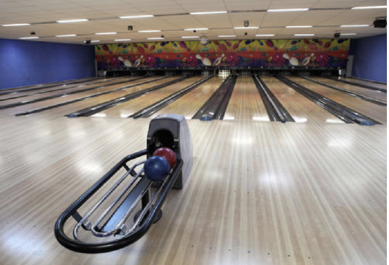
The scores for the two strongest players on the school bowling team are as follows:
| Alex | 173, 166, 156, 183, 190, 161, 258, 169, 170, 146, 247, 176, 162, 151, 212, 191 |
| Thomas | 165, 196, 168, 194, 189, 197, 211, 194, 189, 204, 220, 211, 211, 172, 238, 186 |
- Make a double stem-and-leaf or box-and whisker (whichever is the better to choose) with one axis to compare both sets of data.
- Describe any differences in their patterns of scores.
- If you had to choose one of these people to represent the school, why might you choose Alex? Why might you choose Thomas?
In this concept, you will learn to use data displays.
Data
Data can exist in many forms. A frequent goal of collecting data is drawing conclusions based on the data. The best conclusions correspond with trends that the data shows. Depending on the data you have, certain types of displays are more appropriate, or more effective, than others. You must make good choices of displaying data in a logical way. Of course, in a world so full of data, it must be collected and organized carefully to aid in appropriate decision-making.
Sometimes two people look at the same graph and draw completely different conclusions. Graphs can show us many things but the conclusions that we draw based upon the graphs is oftentimes more a matter of opinion. The idea of graphs is, in part, to make inferences. Those inferences must be based on the data.
Take a look at this situation.
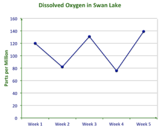
Some scientists from the EPA were studying the amount of dissolved oxygen in a lake over several weeks. This graph was created by the data they found.
Sam Howzit; Horia Varlan - https://www.flickr.com/photos/aloha75/8120676717/in/photolist-dnAAgx-b4ogb8-dQNH1R-brwtX3-7AprFh-84jVAW-5E4RYZ-8vfh7d-b4oekH-6bVFM3-8FejTM-dqEwfZ-77UKRV-5MD25t-bkMkhW-5A1WdU-5A1VSj-5A1Vvf-5A1Va9-5Tuurr-ri9xqR-9stUQ8-pko8HR-kE7mCe-dnAAFt-84gNrD-4hnUxK-9LhUkj-5zWLQe-b4ofyx-oFjmXT-5y5U5j-fDo417-4k2tGP-5A2cVU-9vDTQg-9vGV1G-oVLzQj-5xBk2h-rVC8sT-5f8pRj-9vGXjY-5V7mRf-aHLJdr-eSNMKH-eSNMiP-eT19nh-7P8Y1a-4hnUEa-4hrYzY;https://www.flickr.com/photos/horiavarlan/4513522387/in/photolist-7SQYXv-dnAAgx-b4ogb8-dQNH1R-brwtX3-7AprFh-84jVAW-5E4RYZ-8vfh7d-b4oekH-6bVFM3-8FejTM-dqEwfZ-77UKRV-5MD25t-bkMkhW-5A1WdU-5A1VSj-5A1Vvf-5A1Va9-5Tuurr-ri9xqR-9stUQ8-pko8HR-kE7mCe-dnAAFt-84gNrD-4hnUxK-9LhUkj-5zWLQe-b4ofyx-oFjmXT-5y5U5j-fDo417-4k2tGP-5A2cVU-9vDTQg-9vGV1G-oVLzQj-5xBk2h-rVC8sT-5f8pRj-9vGXjY-5V7mRf-aHLJdr-eSNMKH-eSNMiP-eT19nh-7P8Y1a-4hnUEa
They studied the graph and came up with the following conclusions:
- The amount of dissolved oxygen fluctuated over the 5 weeks.
- The average amount of dissolved oxygen has been about 110 parts per million over 5 weeks.
- The dissolved oxygen in Week 6 will be about 60 parts per million.
Do you agree with their conclusions?
The first two conclusions are clearly shown by the data.
However, the prediction about Week 6, conclusion number 3, is not convincingly shown. The level of dissolved oxygen does seem to fluctuate and has gone slightly higher over time and then lower, but it is not enough evidence to be sure that the Week 6 dissolved oxygen will go even lower.
Here is another example.
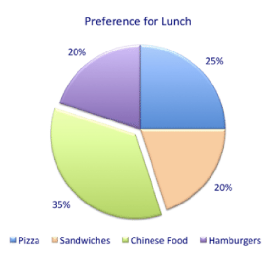
The boss at an office took a survey of people’s preference for lunch because he wanted to treat the office to a lunch for the holidays. His data is shown below.
Sam Howzit; Horia Varlan - https://www.flickr.com/photos/aloha75/8120676717/in/photolist-dnAAgx-b4ogb8-dQNH1R-brwtX3-7AprFh-84jVAW-5E4RYZ-8vfh7d-b4oekH-6bVFM3-8FejTM-dqEwfZ-77UKRV-5MD25t-bkMkhW-5A1WdU-5A1VSj-5A1Vvf-5A1Va9-5Tuurr-ri9xqR-9stUQ8-pko8HR-kE7mCe-dnAAFt-84gNrD-4hnUxK-9LhUkj-5zWLQe-b4ofyx-oFjmXT-5y5U5j-fDo417-4k2tGP-5A2cVU-9vDTQg-9vGV1G-oVLzQj-5xBk2h-rVC8sT-5f8pRj-9vGXjY-5V7mRf-aHLJdr-eSNMKH-eSNMiP-eT19nh-7P8Y1a-4hnUEa-4hrYzY;https://www.flickr.com/photos/horiavarlan/4513522387/in/photolist-7SQYXv-dnAAgx-b4ogb8-dQNH1R-brwtX3-7AprFh-84jVAW-5E4RYZ-8vfh7d-b4oekH-6bVFM3-8FejTM-dqEwfZ-77UKRV-5MD25t-bkMkhW-5A1WdU-5A1VSj-5A1Vvf-5A1Va9-5Tuurr-ri9xqR-9stUQ8-pko8HR-kE7mCe-dnAAFt-84gNrD-4hnUxK-9LhUkj-5zWLQe-b4ofyx-oFjmXT-5y5U5j-fDo417-4k2tGP-5A2cVU-9vDTQg-9vGV1G-oVLzQj-5xBk2h-rVC8sT-5f8pRj-9vGXjY-5V7mRf-aHLJdr-eSNMKH-eSNMiP-eT19nh-7P8Y1a-4hnUEa
He ponders the following conclusions:
- A lot of people like Chinese food.
- Nobody likes Italian food.
- If I order sandwiches, then 80% of the staff will be unhappy.
- If I get some pizzas and some Chinese food, the majority will have their preference.
Do you agree with his conclusions?
According to the graph, Conclusion 1 is supported because the largest number of people selected Chinese food.
The graph does not support Conclusion 2. Perhaps Italian food was not an option on the survey. Also, just because you have a preference does not mean you don’t like the other choices.
For the same reason, Conclusion 3 is not supported, either. Just because you may prefer Chinese food does not mean you do not like sandwiches.
For the same reason, Conclusion 3 is not supported, either. Just because you may prefer Chinese food does not mean you do not like sandwiches
Conclusion 4 is supported because 25% prefer sandwiches and 35% prefer Chinese food so 60%, a majority, will have their preference.
There are many ways to display data so how do you know which is the best way to display given data? Some choices are simply preferential but most types of data have types of displays that suit them best.
Two major types of data are categorical data and numerical data.
Categorical data refers to data to which the independent variable is assigned a name, not a number. For example, you may take data based on the months May, June, July, and August or you may tally people based on males and females. Sometimes categories can be numbers that are used to name the categories. For example, players on a team are given numbers on their shirts. Those numbers are only used to clarify who is who. It would not make sense to use mathematical operations with the numbers. Generally, categorical data is simply tallied.
Numerical data measures some characteristic of the variable. Examples of data that is measured numerically are time, height, weight, length, volume, density, force, etc. Anything that can be measured with a numerical system is numerical data.
You can use different data displays depending on the data. You can use, for example, line graphs, scatterplots, circle graphs, bar graphs, stem-and-leaf plots, box-and whisker plots, and histograms.
Although there are few exact rules about data displays, each type of display has certain instances for which it is ideal. Also, there are instances where certain displays are inappropriate. Furthermore, the best display of data depends on what information you hope to get from it.
Line graphs are generally used to show change over time.
Scatterplots are used to show a trend or a relationship (correlation) between two variables.
Circle graphs are best to show data that represents parts of one whole or one hundred percent of something.
Bar graphs are excellent for categorical data.
Stem-and-leaf plots are useful to represent ranges and can be used to illustrate ranges of two variables.
Box-and-whisker plots are used to show how spread out data is and where the bulk of the data lies.
Examples
Example 1
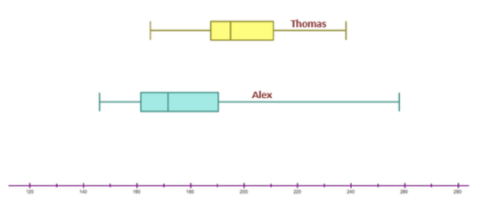
Earlier, you were given a problem about the two bowlers. You need to create a data display to show their scores from the table below.
| Alex | 173, 166, 156, 183, 190, 161, 258, 169, 170, 146, 247, 176, 162, 151, 212, 191 |
| Thomas | 165, 196, 168, 194, 189, 197, 211, 194, 189, 204, 220, 211, 211, 172, 238, 186 |
First, you have to make a double stem-and-leaf or box-and whisker (whichever is the better to choose) with one axis to compare both sets of data.
Stem-and-leaf plots are useful to represent ranges and can be used to illustrate ranges of two variables. Box-and-whisker plots are used to show how spread out data is and where the bulk of the data lies. Both of these graphs would allow you to clearly compare the scores. Let’s draw a double box and whisker.
Sam Howzit; Horia Varlan - https://www.flickr.com/photos/aloha75/8120676717/in/photolist-dnAAgx-b4ogb8-dQNH1R-brwtX3-7AprFh-84jVAW-5E4RYZ-8vfh7d-b4oekH-6bVFM3-8FejTM-dqEwfZ-77UKRV-5MD25t-bkMkhW-5A1WdU-5A1VSj-5A1Vvf-5A1Va9-5Tuurr-ri9xqR-9stUQ8-pko8HR-kE7mCe-dnAAFt-84gNrD-4hnUxK-9LhUkj-5zWLQe-b4ofyx-oFjmXT-5y5U5j-fDo417-4k2tGP-5A2cVU-9vDTQg-9vGV1G-oVLzQj-5xBk2h-rVC8sT-5f8pRj-9vGXjY-5V7mRf-aHLJdr-eSNMKH-eSNMiP-eT19nh-7P8Y1a-4hnUEa-4hrYzY;https://www.flickr.com/photos/horiavarlan/4513522387/in/photolist-7SQYXv-dnAAgx-b4ogb8-dQNH1R-brwtX3-7AprFh-84jVAW-5E4RYZ-8vfh7d-b4oekH-6bVFM3-8FejTM-dqEwfZ-77UKRV-5MD25t-bkMkhW-5A1WdU-5A1VSj-5A1Vvf-5A1Va9-5Tuurr-ri9xqR-9stUQ8-pko8HR-kE7mCe-dnAAFt-84gNrD-4hnUxK-9LhUkj-5zWLQe-b4ofyx-oFjmXT-5y5U5j-fDo417-4k2tGP-5A2cVU-9vDTQg-9vGV1G-oVLzQj-5xBk2h-rVC8sT-5f8pRj-9vGXjY-5V7mRf-aHLJdr-eSNMKH-eSNMiP-eT19nh-7P8Y1a-4hnUEa
Next, you need to describe any differences in their patterns of scores.
Alex’s scores are more spread, less consistent, have a lower mean, (188) and the highest score 258.
Thomas’s scores are more consistent, less spread, have a higher mean (196.5) and the highest score 220
If you had to choose one of these people to represent the school, why might you choose Alex? Why might you choose Thomas?
Alex would be chosen if the team needs one high scoring game.
Thomas would be chosen because he is more consistent and reliable.
Example 2
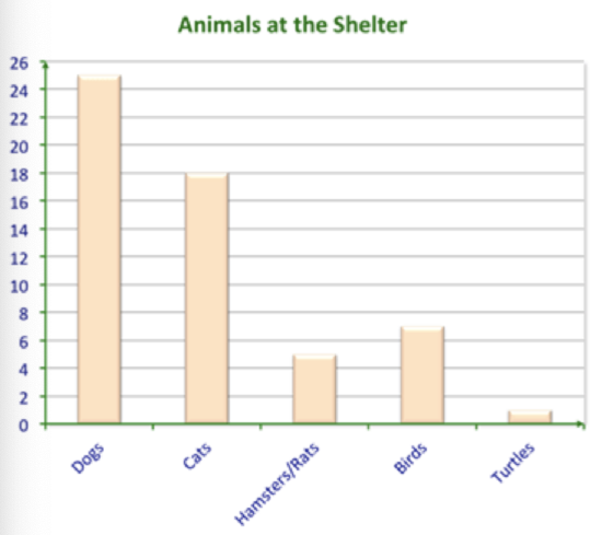
A tally of the animals at a local shelter was taken so that children visiting on a field trip could see.
Here are the results.
Sam Howzit; Horia Varlan - https://www.flickr.com/photos/aloha75/8120676717/in/photolist-dnAAgx-b4ogb8-dQNH1R-brwtX3-7AprFh-84jVAW-5E4RYZ-8vfh7d-b4oekH-6bVFM3-8FejTM-dqEwfZ-77UKRV-5MD25t-bkMkhW-5A1WdU-5A1VSj-5A1Vvf-5A1Va9-5Tuurr-ri9xqR-9stUQ8-pko8HR-kE7mCe-dnAAFt-84gNrD-4hnUxK-9LhUkj-5zWLQe-b4ofyx-oFjmXT-5y5U5j-fDo417-4k2tGP-5A2cVU-9vDTQg-9vGV1G-oVLzQj-5xBk2h-rVC8sT-5f8pRj-9vGXjY-5V7mRf-aHLJdr-eSNMKH-eSNMiP-eT19nh-7P8Y1a-4hnUEa-4hrYzY;https://www.flickr.com/photos/horiavarlan/4513522387/in/photolist-7SQYXv-dnAAgx-b4ogb8-dQNH1R-brwtX3-7AprFh-84jVAW-5E4RYZ-8vfh7d-b4oekH-6bVFM3-8FejTM-dqEwfZ-77UKRV-5MD25t-bkMkhW-5A1WdU-5A1VSj-5A1Vvf-5A1Va9-5Tuurr-ri9xqR-9stUQ8-pko8HR-kE7mCe-dnAAFt-84gNrD-4hnUxK-9LhUkj-5zWLQe-b4ofyx-oFjmXT-5y5U5j-fDo417-4k2tGP-5A2cVU-9vDTQg-9vGV1G-oVLzQj-5xBk2h-rVC8sT-5f8pRj-9vGXjY-5V7mRf-aHLJdr-eSNMKH-eSNMiP-eT19nh-7P8Y1a-4hnUEa
When children looked at the bar graph, they shouted out:
Bobby: “Nobody likes dogs!”
Lisa: “I didn’t know that hamsters and rats were the same thing!”
Miguel: “Everyone must have taken all the turtles!”
Mona: “They must have mostly food for dogs and cats!”
How could a teacher respond? Were the conclusions of the children accurate?
The teacher responded to their comments:
“Bobby, just because they have a lot of dogs doesn’t mean people don’t like them. Since dogs are the most common pet, it makes sense that there would be more dogs at the shelter.”
“Lisa, it looks like hamsters and rats were tallied in the same category, maybe because they are kept in the same cage or given similar food. This bar graph does not mean they are the same, though.”
“Miguel, since turtles are a less common pet, the shelter probably has fewer turtles. It doesn’t mean that they had a lot that were taken already.”
“Yes, Mona. It does make sense that having so many dogs and cats compared to other animals requires much more food for them than for the other animals. Also, they are bigger animals than the others, generally, so they eat more, too. Don’t they?”
Once again, a data display was used to make connections. The children used the graph from the animal shelter to draw conclusions.
Example 3
Which data display is best for categorical data?
The answer is that bar graphs are best for categorical data.
Example 4
Which data display is best for showing how data changes over time?
The answer is that line graphs are best for showing data changes over time.
Example 5
If I had data that was in the 10’s, 20’s, 40’s, 50’s and 60’s, which display would be best?
The answer is that scatterplots would best display this data.
Review
Answer each question about data displays.
1. What is considered numerical data?
2. What is considered categorical data?
3. If you were looking for a relationship between two values, would you use a scatterplot or a line graph?
4. If there was a relationship between the data would you have a positive correlation or a negative correlation?
5. The words positive correlation and negative correlation are associated with which type of data display?
6. If you had an outlier, then would you have a scatterplot or a box-and-whisker plot?
7. What is a quartile?
8. Which type of data display is a quartile associated with?
9. If you were watching a trend over time would you use a line graph or a scatterplot?
10. If you were comparing two trends and their results which data display would make the most sense?
11. What is the mean?
12. What is the median?
13. What is the mode?
Answer each question. Do the conclusions fit the graph? Explain your reasoning.
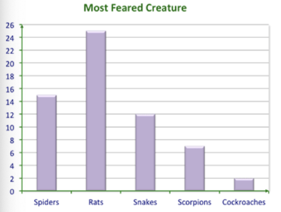
Sam Howzit;Horia Varlan - https://www.flickr.com/photos/aloha75/8120676717/in/photolist-dnAAgx-b4ogb8-dQNH1R-brwtX3-7AprFh-84jVAW-5E4RYZ-8vfh7d-b4oekH-6bVFM3-8FejTM-dqEwfZ-77UKRV-5MD25t-bkMkhW-5A1WdU-5A1VSj-5A1Vvf-5A1Va9-5Tuurr-ri9xqR-9stUQ8-pko8HR-kE7mCe-dnAAFt-84gNrD-4hnUxK-9LhUkj-5zWLQe-b4ofyx-oFjmXT-5y5U5j-fDo417-4k2tGP-5A2cVU-9vDTQg-9vGV1G-oVLzQj-5xBk2h-rVC8sT-5f8pRj-9vGXjY-5V7mRf-aHLJdr-eSNMKH-eSNMiP-eT19nh-7P8Y1a-4hnUEa-4hrYzY;https://www.flickr.com/photos/horiavarlan/4513522387/in/photolist-7SQYXv-dnAAgx-b4ogb8-dQNH1R-brwtX3-7AprFh-84jVAW-5E4RYZ-8vfh7d-b4oekH-6bVFM3-8FejTM-dqEwfZ-77UKRV-5MD25t-bkMkhW-5A1WdU-5A1VSj-5A1Vvf-5A1Va9-5Tuurr-ri9xqR-9stUQ8-pko8HR-kE7mCe-dnAAFt-84gNrD-4hnUxK-9LhUkj-5zWLQe-b4ofyx-oFjmXT-5y5U5j-fDo417-4k2tGP-5A2cVU-9vDTQg-9vGV1G-oVLzQj-5xBk2h-rVC8sT-5f8pRj-9vGXjY-5V7mRf-aHLJdr-eSNMKH-eSNMiP-eT19nh-7P8Y1a-4hnUEa
14. Conclusion 1: Rats are the most feared creature.
Conclusion 2: Rats are the most dangerous creature.
Conclusion 3: Nobody is afraid of bats.
Sam Howzit; Horia Varlan - https://www.flickr.com/photos/aloha75/8120676717/in/photolist-dnAAgx-b4ogb8-dQNH1R-brwtX3-7AprFh-84jVAW-5E4RYZ-8vfh7d-b4oekH-6bVFM3-8FejTM-dqEwfZ-77UKRV-5MD25t-bkMkhW-5A1WdU-5A1VSj-5A1Vvf-5A1Va9-5Tuurr-ri9xqR-9stUQ8-pko8HR-kE7mCe-dnAAFt-84gNrD-4hnUxK-9LhUkj-5zWLQe-b4ofyx-oFjmXT-5y5U5j-fDo417-4k2tGP-5A2cVU-9vDTQg-9vGV1G-oVLzQj-5xBk2h-rVC8sT-5f8pRj-9vGXjY-5V7mRf-aHLJdr-eSNMKH-eSNMiP-eT19nh-7P8Y1a-4hnUEa-4hrYzY;https://www.flickr.com/photos/horiavarlan/4513522387/in/photolist-7SQYXv-dnAAgx-b4ogb8-dQNH1R-brwtX3-7AprFh-84jVAW-5E4RYZ-8vfh7d-b4oekH-6bVFM3-8FejTM-dqEwfZ-77UKRV-5MD25t-bkMkhW-5A1WdU-5A1VSj-5A1Vvf-5A1Va9-5Tuurr-ri9xqR-9stUQ8-pko8HR-kE7mCe-dnAAFt-84gNrD-4hnUxK-9LhUkj-5zWLQe-b4ofyx-oFjmXT-5y5U5j-fDo417-4k2tGP-5A2cVU-9vDTQg-9vGV1G-oVLzQj-5xBk2h-rVC8sT-5f8pRj-9vGXjY-5V7mRf-aHLJdr-eSNMKH-eSNMiP-eT19nh-7P8Y1a-4hnUEa
Additional Resources
PLIX: Play, Learn, Interact, eXplore for Discrete vs. Continuous Data
Practice for Displaying by Type of Data
Real World with Protecting the Unprotected