
1.5.2: Displaying Categorical Variables
- Page ID
- 5747
\( \newcommand{\vecs}[1]{\overset { \scriptstyle \rightharpoonup} {\mathbf{#1}} } \)
\( \newcommand{\vecd}[1]{\overset{-\!-\!\rightharpoonup}{\vphantom{a}\smash {#1}}} \)
\( \newcommand{\id}{\mathrm{id}}\) \( \newcommand{\Span}{\mathrm{span}}\)
( \newcommand{\kernel}{\mathrm{null}\,}\) \( \newcommand{\range}{\mathrm{range}\,}\)
\( \newcommand{\RealPart}{\mathrm{Re}}\) \( \newcommand{\ImaginaryPart}{\mathrm{Im}}\)
\( \newcommand{\Argument}{\mathrm{Arg}}\) \( \newcommand{\norm}[1]{\| #1 \|}\)
\( \newcommand{\inner}[2]{\langle #1, #2 \rangle}\)
\( \newcommand{\Span}{\mathrm{span}}\)
\( \newcommand{\id}{\mathrm{id}}\)
\( \newcommand{\Span}{\mathrm{span}}\)
\( \newcommand{\kernel}{\mathrm{null}\,}\)
\( \newcommand{\range}{\mathrm{range}\,}\)
\( \newcommand{\RealPart}{\mathrm{Re}}\)
\( \newcommand{\ImaginaryPart}{\mathrm{Im}}\)
\( \newcommand{\Argument}{\mathrm{Arg}}\)
\( \newcommand{\norm}[1]{\| #1 \|}\)
\( \newcommand{\inner}[2]{\langle #1, #2 \rangle}\)
\( \newcommand{\Span}{\mathrm{span}}\) \( \newcommand{\AA}{\unicode[.8,0]{x212B}}\)
\( \newcommand{\vectorA}[1]{\vec{#1}} % arrow\)
\( \newcommand{\vectorAt}[1]{\vec{\text{#1}}} % arrow\)
\( \newcommand{\vectorB}[1]{\overset { \scriptstyle \rightharpoonup} {\mathbf{#1}} } \)
\( \newcommand{\vectorC}[1]{\textbf{#1}} \)
\( \newcommand{\vectorD}[1]{\overrightarrow{#1}} \)
\( \newcommand{\vectorDt}[1]{\overrightarrow{\text{#1}}} \)
\( \newcommand{\vectE}[1]{\overset{-\!-\!\rightharpoonup}{\vphantom{a}\smash{\mathbf {#1}}}} \)
\( \newcommand{\vecs}[1]{\overset { \scriptstyle \rightharpoonup} {\mathbf{#1}} } \)
\( \newcommand{\vecd}[1]{\overset{-\!-\!\rightharpoonup}{\vphantom{a}\smash {#1}}} \)
\(\newcommand{\avec}{\mathbf a}\) \(\newcommand{\bvec}{\mathbf b}\) \(\newcommand{\cvec}{\mathbf c}\) \(\newcommand{\dvec}{\mathbf d}\) \(\newcommand{\dtil}{\widetilde{\mathbf d}}\) \(\newcommand{\evec}{\mathbf e}\) \(\newcommand{\fvec}{\mathbf f}\) \(\newcommand{\nvec}{\mathbf n}\) \(\newcommand{\pvec}{\mathbf p}\) \(\newcommand{\qvec}{\mathbf q}\) \(\newcommand{\svec}{\mathbf s}\) \(\newcommand{\tvec}{\mathbf t}\) \(\newcommand{\uvec}{\mathbf u}\) \(\newcommand{\vvec}{\mathbf v}\) \(\newcommand{\wvec}{\mathbf w}\) \(\newcommand{\xvec}{\mathbf x}\) \(\newcommand{\yvec}{\mathbf y}\) \(\newcommand{\zvec}{\mathbf z}\) \(\newcommand{\rvec}{\mathbf r}\) \(\newcommand{\mvec}{\mathbf m}\) \(\newcommand{\zerovec}{\mathbf 0}\) \(\newcommand{\onevec}{\mathbf 1}\) \(\newcommand{\real}{\mathbb R}\) \(\newcommand{\twovec}[2]{\left[\begin{array}{r}#1 \\ #2 \end{array}\right]}\) \(\newcommand{\ctwovec}[2]{\left[\begin{array}{c}#1 \\ #2 \end{array}\right]}\) \(\newcommand{\threevec}[3]{\left[\begin{array}{r}#1 \\ #2 \\ #3 \end{array}\right]}\) \(\newcommand{\cthreevec}[3]{\left[\begin{array}{c}#1 \\ #2 \\ #3 \end{array}\right]}\) \(\newcommand{\fourvec}[4]{\left[\begin{array}{r}#1 \\ #2 \\ #3 \\ #4 \end{array}\right]}\) \(\newcommand{\cfourvec}[4]{\left[\begin{array}{c}#1 \\ #2 \\ #3 \\ #4 \end{array}\right]}\) \(\newcommand{\fivevec}[5]{\left[\begin{array}{r}#1 \\ #2 \\ #3 \\ #4 \\ #5 \\ \end{array}\right]}\) \(\newcommand{\cfivevec}[5]{\left[\begin{array}{c}#1 \\ #2 \\ #3 \\ #4 \\ #5 \\ \end{array}\right]}\) \(\newcommand{\mattwo}[4]{\left[\begin{array}{rr}#1 \amp #2 \\ #3 \amp #4 \\ \end{array}\right]}\) \(\newcommand{\laspan}[1]{\text{Span}\{#1\}}\) \(\newcommand{\bcal}{\cal B}\) \(\newcommand{\ccal}{\cal C}\) \(\newcommand{\scal}{\cal S}\) \(\newcommand{\wcal}{\cal W}\) \(\newcommand{\ecal}{\cal E}\) \(\newcommand{\coords}[2]{\left\{#1\right\}_{#2}}\) \(\newcommand{\gray}[1]{\color{gray}{#1}}\) \(\newcommand{\lgray}[1]{\color{lightgray}{#1}}\) \(\newcommand{\rank}{\operatorname{rank}}\) \(\newcommand{\row}{\text{Row}}\) \(\newcommand{\col}{\text{Col}}\) \(\renewcommand{\row}{\text{Row}}\) \(\newcommand{\nul}{\text{Nul}}\) \(\newcommand{\var}{\text{Var}}\) \(\newcommand{\corr}{\text{corr}}\) \(\newcommand{\len}[1]{\left|#1\right|}\) \(\newcommand{\bbar}{\overline{\bvec}}\) \(\newcommand{\bhat}{\widehat{\bvec}}\) \(\newcommand{\bperp}{\bvec^\perp}\) \(\newcommand{\xhat}{\widehat{\xvec}}\) \(\newcommand{\vhat}{\widehat{\vvec}}\) \(\newcommand{\uhat}{\widehat{\uvec}}\) \(\newcommand{\what}{\widehat{\wvec}}\) \(\newcommand{\Sighat}{\widehat{\Sigma}}\) \(\newcommand{\lt}{<}\) \(\newcommand{\gt}{>}\) \(\newcommand{\amp}{&}\) \(\definecolor{fillinmathshade}{gray}{0.9}\)Graphs for Categorical Data
E-Waste and Bar Graphs
We live in an age of unprecedented access to increasingly sophisticated and affordable personal technology. Cell phones, computers, and televisions now improve so rapidly that, while they may still be in working condition, the drive to make use of the latest technological breakthroughs leads many to discard usable electronic equipment. Much of that ends up in a landfill, where the chemicals from batteries and other electronics add toxins to the environment. Approximately 80% of the electronics discarded in the United States is also exported to third world countries, where it is disposed of under generally hazardous conditions by unprotected workers. The following table shows the amount of tonnage of the most common types of electronic equipment discarded in the United States in 2005.
| Electronic Equipment | Thousands of Tons Discarded |
|---|---|
| Cathode Ray Tube (CRT) TV's | 7591.1 |
| CRT Monitors | 389.8 |
| Printers, Keyboards, Mice | 324.9 |
| Desktop Computers | 259.5 |
| Laptop Computers | 30.8 |
| Projection TV's | 132.8 |
| Cell Phones | 11.7 |
| LCD Monitors | 4.9 |
Figure: Electronics Discarded in the US (2005). Source: National Geographic, January 2008. Volume 213 No.1, pg 73.
The type of electronic equipment is a categorical variable, and therefore, this data can easily be represented using a bar graph.
Creating a Bar Graph
Make a bar graph for the E-waste data.
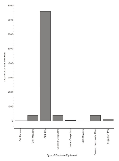
While this looks very similar to a histogram, the bars in a bar graph usually are separated slightly. The graph is just a series of disjoint categories.
Please note that discussions of shape, center, and spread have no meaning for a bar graph, and it is not, in fact, even appropriate to refer to this graph as a distribution. For example, some students misinterpret a graph like this by saying it is skewed right. If we rearranged the categories in a different order, the same data set could be made to look skewed left. Do not try to infer any of these concepts from a bar graph!
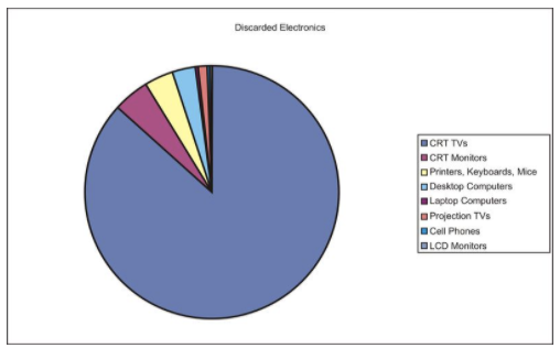
Pie Graphs
Usually, data that can be represented in a bar graph can also be shown using a pie graph (also commonly called a circle graph or pie chart). In this representation, we convert the count into a percentage so we can show each category relative to the total. Each percentage is then converted into a proportionate sector of the circle. To make this conversion, simply multiply the percentage by 3.6, which represents 360 (the total number of degrees in a circle) divided by 100% (the total percentage available).
Here is a table with the percentages and the approximate angle measure of each sector for the E-waste data:
| Electronic Equipment | Thousands of Tons Discarded | Percentage of Total Discarded | Angle Measure of Circle Sector |
|---|---|---|---|
| Cathode Ray Tube (CRT) TV's | 7591.1 | 86.8 | 312.5 |
| CRT Monitors | 389.8 | 4.5 | 16.2 |
| Printers, Keyboards, Mice | 324.9 | 3.7 | 13.4 |
| Desktop Computers | 259.5 | 3.0 | 10.7 |
| Laptop Computers | 30.8 | 0.4 | 1.3 |
| Projection TV's | 132.8 | 1.5 | 5.5 |
| Cell Phones | 11.7 | 0.1 | 0.5 |
| LCD Monitors | 4.9 | ∼0 | 0.2 |
And here is the completed pie graph:
Deciding Which Kind of Graph to Use
A pie graph is not always the best way to display categorical data. In the following example, you will see a pie graph that is not necessarily very helpful for analyzing data.
There are only some states in the USA which have the death penalty. Executions carried out under the death penalty are considered legal executions. The following table gives the number of legal executions in each state with the death penalty in 2005.
| State | Number of Legal Executions in 2005 |
|---|---|
| AL | 4 |
| AR | 1 |
| CA | 2 |
| CT | 1 |
| DE | 1 |
| FL | 1 |
| GA | 3 |
| IN | 5 |
| MD | 1 |
| MO | 5 |
| MS | 1 |
| NC | 5 |
| OH | 4 |
| OK | 4 |
| SC | 3 |
| TX | 19 |
| Total | 60 |
Creating a Pie Graph
Create a pie graph for the data on the number of legal executions per state in 2005.
| State | Number of Legal Executions in 2005 | Percentage of Legal Executions in 2005 | Angle Measure of Circle Sector |
|---|---|---|---|
| AL | 4 | 6.67 | 24 |
| AR | 1 | 1.67 | 6 |
| CA | 2 | 3.33 | 12 |
| CT | 1 | 1.67 | 6 |
| DE | 1 | 1.67 | 6 |
| FL | 1 | 1.67 | 6 |
| GA | 3 | 5.00 | 18 |
| IN | 5 | 8.33 | 30 |
| MD | 1 | 1.67 | 6 |
| MO | 5 | 8.33 | 30 |
| MS | 1 | 1.67 | 6 |
| NC | 5 | 8.33 | 30 |
| OH | 4 | 6.67 | 24 |
| OK | 4 | 6.67 | 24 |
| SC | 3 | 5.00 | 18 |
| TX | 19 | 31.67 | 114 |
| Total | 60 | 100.00 | 360 |
And here is the completed pie graph:
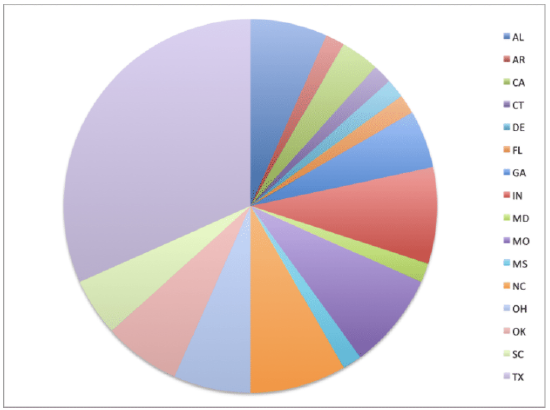
By looking at this pie graph, it is hard to make comparisons; there are too many categories and it is hard to get a good sense of the relative size of the categories. This is a case where a bar graph is easier to analyze visually. Making a bar graph for this data is left as an exercise for the Examples.
Pie graphs are better when you have fewer categories. Bar graphs have a moderate amount of categories, when you want to quickly visualize the different values for each category. If you had many categories, so that there were many repeats in the data, it would be better to use a histogram - you would be more interested in how many categories had the same value, rather than the value of each category.
Example
Example 1
Make a bar graph of the data on legal executions for each state in 2005 (under "Creating a Pie Graph") .
Start by labeling each state as a category along the horizontal axis. Then, draw a bar that has a height that represents the number of legal executions in that state.
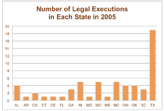
In this graph, you can easily compare the number of executions for each state.
Review
For 1-4, Computer equipment contains many elements and chemicals that are either hazardous, or potentially valuable when recycled. The following data set shows the contents of a typical desktop computer weighing approximately 27 kg. Some of the more hazardous substances, like Mercury, have been included in the 'other' category, because they occur in relatively small amounts that are still dangerous and toxic.
| Material | Kilograms |
|---|---|
| Plastics | 6.21 |
| Lead | 1.71 |
| Aluminum | 3.83 |
| Iron | 5.54 |
| Copper | 2.12 |
| Tin | 0.27 |
| Zinc | 0.60 |
| Nickel | 0.23 |
| Barium | 0.05 |
| Other elements and chemicals | 6.44 |
Figure: Weight of materials that make up the total weight of a typical desktop computer.
- Create a bar graph for this data.
- Complete the chart below to show the approximate percentage of the total weight for each material.
| Material | Kilograms | Approximate Percentage of Total Weight |
|---|---|---|
| Plastics | 6.21 | |
| Lead | 1.71 | |
| Aluminum | 3.83 | |
| Iron | 5.54 | |
| Copper | 2.12 | |
| Tin | 0.27 | |
| Zinc | 0.60 | |
| Nickel | 0.23 | |
| Barium | 0.05 | |
| Other elements and chemicals | 6.44 |
- Create a circle graph for this data.
- Which graph do you think makes a better visual representation of the data?
For 5-8, a statistics class of 30 students had the following grades:
| Grade | Number of Students with Grade |
|---|---|
| A | 14 |
| B | 7 |
| C | 4 |
| D | 3 |
| F | 1 |
- Create a bar graph for this data.
- Complete the chart below to show the approximate percentage of the total number of grades.
| Grade | Number of Students with Grade | Approximate Percentage of Total Grades |
|---|---|---|
| A | 14 | |
| B | 7 | |
| C | 4 | |
| D | 3 | |
| F | 1 |
- Create a pie graph for this data.
- Which graph do you think makes a better visual representation of the data?
For 9-13, the median income of persons age 25+ is given by highest level of education achieved.
| Highest Level of Education | Median Income of Persons age 25+ |
|---|---|
| High School | $20,321 |
| High school graduate | $26,505 |
| Some college | $31,056 |
| Associate's degree | $35,009 |
| Bachelor's degree or higher | $49,303 |
| Bachelor's degree | $43,143 |
| Master's degree | $52,390 |
| Professional degree | $82,473 |
| Doctorate degree | $69,432 |
- Create a bar graph for this data.
- Complete the chart below to show the approximate percentage of the total median income.
| Highest Level of Education | Median Income of Persons age 25+ | Approximate Percentage of Total Median Income. |
|---|---|---|
| High School | $20,321 | |
| High school graduate | $26,505 | |
| Some college | $31,056 | |
| Associate's degree | $35,009 | |
| Bachelor's degree or higher | $49,303 | |
| Bachelor's degree | $43,143 | |
| Master's degree | $52,390 | |
| Professional degree | $82,473 | |
| Doctorate degree | $69,432 |
- Create a pie graph for this data.
- Which graph do you think makes a better visual representation of the data?
- Why is the median used in this example, rather than other measure of center such as the mean, mode, or midrange?
Answers for Review Problems
To view the Review answers, open this PDF file and look for section 2.2.
Additional Resources
PLIX: play, learn, interact, eXplore for Circle Graphs to Make Bar Graphs - Spending Habits