
1.5.3: Displaying Univariate Data
- Page ID
- 5748
\( \newcommand{\vecs}[1]{\overset { \scriptstyle \rightharpoonup} {\mathbf{#1}} } \)
\( \newcommand{\vecd}[1]{\overset{-\!-\!\rightharpoonup}{\vphantom{a}\smash {#1}}} \)
\( \newcommand{\id}{\mathrm{id}}\) \( \newcommand{\Span}{\mathrm{span}}\)
( \newcommand{\kernel}{\mathrm{null}\,}\) \( \newcommand{\range}{\mathrm{range}\,}\)
\( \newcommand{\RealPart}{\mathrm{Re}}\) \( \newcommand{\ImaginaryPart}{\mathrm{Im}}\)
\( \newcommand{\Argument}{\mathrm{Arg}}\) \( \newcommand{\norm}[1]{\| #1 \|}\)
\( \newcommand{\inner}[2]{\langle #1, #2 \rangle}\)
\( \newcommand{\Span}{\mathrm{span}}\)
\( \newcommand{\id}{\mathrm{id}}\)
\( \newcommand{\Span}{\mathrm{span}}\)
\( \newcommand{\kernel}{\mathrm{null}\,}\)
\( \newcommand{\range}{\mathrm{range}\,}\)
\( \newcommand{\RealPart}{\mathrm{Re}}\)
\( \newcommand{\ImaginaryPart}{\mathrm{Im}}\)
\( \newcommand{\Argument}{\mathrm{Arg}}\)
\( \newcommand{\norm}[1]{\| #1 \|}\)
\( \newcommand{\inner}[2]{\langle #1, #2 \rangle}\)
\( \newcommand{\Span}{\mathrm{span}}\) \( \newcommand{\AA}{\unicode[.8,0]{x212B}}\)
\( \newcommand{\vectorA}[1]{\vec{#1}} % arrow\)
\( \newcommand{\vectorAt}[1]{\vec{\text{#1}}} % arrow\)
\( \newcommand{\vectorB}[1]{\overset { \scriptstyle \rightharpoonup} {\mathbf{#1}} } \)
\( \newcommand{\vectorC}[1]{\textbf{#1}} \)
\( \newcommand{\vectorD}[1]{\overrightarrow{#1}} \)
\( \newcommand{\vectorDt}[1]{\overrightarrow{\text{#1}}} \)
\( \newcommand{\vectE}[1]{\overset{-\!-\!\rightharpoonup}{\vphantom{a}\smash{\mathbf {#1}}}} \)
\( \newcommand{\vecs}[1]{\overset { \scriptstyle \rightharpoonup} {\mathbf{#1}} } \)
\( \newcommand{\vecd}[1]{\overset{-\!-\!\rightharpoonup}{\vphantom{a}\smash {#1}}} \)
\(\newcommand{\avec}{\mathbf a}\) \(\newcommand{\bvec}{\mathbf b}\) \(\newcommand{\cvec}{\mathbf c}\) \(\newcommand{\dvec}{\mathbf d}\) \(\newcommand{\dtil}{\widetilde{\mathbf d}}\) \(\newcommand{\evec}{\mathbf e}\) \(\newcommand{\fvec}{\mathbf f}\) \(\newcommand{\nvec}{\mathbf n}\) \(\newcommand{\pvec}{\mathbf p}\) \(\newcommand{\qvec}{\mathbf q}\) \(\newcommand{\svec}{\mathbf s}\) \(\newcommand{\tvec}{\mathbf t}\) \(\newcommand{\uvec}{\mathbf u}\) \(\newcommand{\vvec}{\mathbf v}\) \(\newcommand{\wvec}{\mathbf w}\) \(\newcommand{\xvec}{\mathbf x}\) \(\newcommand{\yvec}{\mathbf y}\) \(\newcommand{\zvec}{\mathbf z}\) \(\newcommand{\rvec}{\mathbf r}\) \(\newcommand{\mvec}{\mathbf m}\) \(\newcommand{\zerovec}{\mathbf 0}\) \(\newcommand{\onevec}{\mathbf 1}\) \(\newcommand{\real}{\mathbb R}\) \(\newcommand{\twovec}[2]{\left[\begin{array}{r}#1 \\ #2 \end{array}\right]}\) \(\newcommand{\ctwovec}[2]{\left[\begin{array}{c}#1 \\ #2 \end{array}\right]}\) \(\newcommand{\threevec}[3]{\left[\begin{array}{r}#1 \\ #2 \\ #3 \end{array}\right]}\) \(\newcommand{\cthreevec}[3]{\left[\begin{array}{c}#1 \\ #2 \\ #3 \end{array}\right]}\) \(\newcommand{\fourvec}[4]{\left[\begin{array}{r}#1 \\ #2 \\ #3 \\ #4 \end{array}\right]}\) \(\newcommand{\cfourvec}[4]{\left[\begin{array}{c}#1 \\ #2 \\ #3 \\ #4 \end{array}\right]}\) \(\newcommand{\fivevec}[5]{\left[\begin{array}{r}#1 \\ #2 \\ #3 \\ #4 \\ #5 \\ \end{array}\right]}\) \(\newcommand{\cfivevec}[5]{\left[\begin{array}{c}#1 \\ #2 \\ #3 \\ #4 \\ #5 \\ \end{array}\right]}\) \(\newcommand{\mattwo}[4]{\left[\begin{array}{rr}#1 \amp #2 \\ #3 \amp #4 \\ \end{array}\right]}\) \(\newcommand{\laspan}[1]{\text{Span}\{#1\}}\) \(\newcommand{\bcal}{\cal B}\) \(\newcommand{\ccal}{\cal C}\) \(\newcommand{\scal}{\cal S}\) \(\newcommand{\wcal}{\cal W}\) \(\newcommand{\ecal}{\cal E}\) \(\newcommand{\coords}[2]{\left\{#1\right\}_{#2}}\) \(\newcommand{\gray}[1]{\color{gray}{#1}}\) \(\newcommand{\lgray}[1]{\color{lightgray}{#1}}\) \(\newcommand{\rank}{\operatorname{rank}}\) \(\newcommand{\row}{\text{Row}}\) \(\newcommand{\col}{\text{Col}}\) \(\renewcommand{\row}{\text{Row}}\) \(\newcommand{\nul}{\text{Nul}}\) \(\newcommand{\var}{\text{Var}}\) \(\newcommand{\corr}{\text{corr}}\) \(\newcommand{\len}[1]{\left|#1\right|}\) \(\newcommand{\bbar}{\overline{\bvec}}\) \(\newcommand{\bhat}{\widehat{\bvec}}\) \(\newcommand{\bperp}{\bvec^\perp}\) \(\newcommand{\xhat}{\widehat{\xvec}}\) \(\newcommand{\vhat}{\widehat{\vvec}}\) \(\newcommand{\uhat}{\widehat{\uvec}}\) \(\newcommand{\what}{\widehat{\wvec}}\) \(\newcommand{\Sighat}{\widehat{\Sigma}}\) \(\newcommand{\lt}{<}\) \(\newcommand{\gt}{>}\) \(\newcommand{\amp}{&}\) \(\definecolor{fillinmathshade}{gray}{0.9}\)Graphs for Univariate Data
Univariate Data is composed of single numerical variables.
Dot Plots
A dot plot is one of the simplest ways to represent numerical data. After choosing an appropriate scale on the axes, each data point is plotted as a single dot. Multiple points at the same value are stacked on top of each other using equal spacing to help convey the shape and center.
Constructing a Dot Plot
The following is a data set representing the percentage of paper packaging manufactured from recycled materials for a select group of countries.
| Country | % of Paper Packaging Recycled |
|---|---|
| Estonia | 34 |
| New Zealand | 40 |
| Poland | 40 |
| Cyprus | 42 |
| Portugal | 56 |
| United States | 59 |
| Italy | 62 |
| Spain | 63 |
| Australia | 66 |
| Greece | 70 |
| Finland | 70 |
| Ireland | 70 |
| Netherlands | 70 |
| Sweden | 70 |
| France | 76 |
| Germany | 83 |
| Austria | 83 |
| Belgium | 83 |
| Japan | 98 |
The dot plot for this data would look like this:
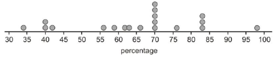
Notice that this data set is centered at a manufacturing rate for using recycled materials of between 65 and 70 percent. It is spread from 34% to 98%, and appears very roughly symmetric, perhaps even slightly skewed left. Dot plots have the advantage of showing all the data points and giving a quick and easy snapshot of the shape, center, and spread. Dot plots are not much help when there is little repetition in the data. They can also be very tedious if you are creating them by hand with large data sets, though computer software can make quick and easy work of creating dot plots from such data sets.
Stem-and-Leaf Plots
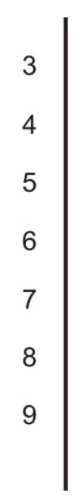
One of the shortcomings of dot plots is that they do not show the actual values of the data. You have to read or infer them from the graph. From the previous example, you might have been able to guess that the lowest value is 34%, but you would have to look in the data table itself to know for sure. A stem-and-leaf plot is a similar plot in which it is much easier to read the actual data values. In a stem-and-leaf plot, each data value is represented by two digits: the stem and the leaf. In this example, it makes sense to use the ten's digits for the stems and the one's digits for the leaves. The stems are on the left of a dividing line as follows:
Once the stems are decided, the leaves representing the one's digits are listed in numerical order from left to right:
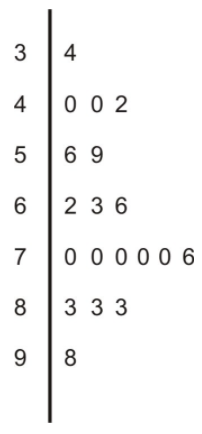
It is important to explain the meaning of the data in the plot for someone who is viewing it without seeing the original data. For example, you could place the following sentence at the bottom of the chart:
Note: 5|69 means 56% and 59% are the two values in the 50's.
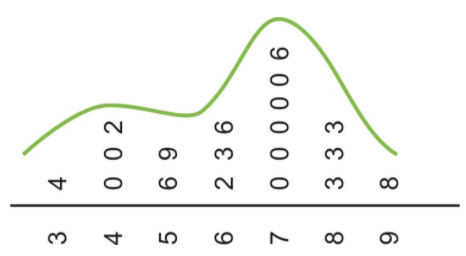
If you could rotate this plot on its side, you would see the similarities with the dot plot. The general shape and center of the plot is easily found, and we know exactly what each point represents. This plot also shows the slight skewing to the left that we suspected from the dot plot. Stem plots can be difficult to create, depending on the numerical qualities and the spread of the data. If the data values contain more than two digits, you will need to remove some of the information by rounding. A data set that has large gaps between values can also make the stem plot hard to create and less useful when interpreting the data.
Creating a Stem-and-Leaf Plot
Consider the following populations of counties in California.
Butte - 220,748
Calaveras - 45,987
Del Norte - 29,547
Fresno - 942,298
Humboldt - 132,755
Imperial - 179,254
San Francisco - 845,999
Santa Barbara - 431,312
To construct a stem and leaf plot, we need to first make sure each piece of data has the same number of digits. In our data, we will add a 0 at the beginning of our 5 digit data points so that all data points have six digits. Then, we can either round or truncate all data points to two digits.
| Value | Value Rounded | Value Truncated |
|---|---|---|
| 149 | 15 | 14 |
| 657 | 66 | 65 |
| 188 | 19 | 18 |
2|2 represents 220,000−229,999 when data has been truncated
2|2 represents 215,000−224,999 when data has been rounded.
If we decide to round the above data, we have:
Butte - 220,000
Calaveras - 050,000
Del Norte - 030,000
Fresno - 940,000
Humboldt - 130,000
Imperial - 180,000
San Francisco - 850,000
Santa Barbara - 430,000
And the stem and leaf will be as follows:

where:
2|2 represents 215,000−224,999.
Source: California State Association of Counties
Back-to-Back Stem Plots
Stem plots can also be a useful tool for comparing two distributions when placed next to each other. These are commonly called back-to-back stem plots.
Constructing a Back-To-Back Stem Plot
In a previous example, we looked at recycling in paper packaging. Here are the same countries and their percentages of recycled material used to manufacture glass packaging:
| Country | % of Glass Packaging Recycled |
|---|---|
| Cyprus | 4 |
| United States | 21 |
| Poland | 27 |
| Greece | 34 |
| Portugal | 39 |
| Spain | 41 |
| Australia | 44 |
| Ireland | 56 |
| Italy | 56 |
| Finland | 56 |
| France | 59 |
| Estonia | 64 |
| New Zealand | 72 |
| Netherlands | 76 |
| Germany | 81 |
| Austria | 86 |
| Japan | 96 |
| Belgium | 98 |
| Sweden | 100 |
In a back-to-back stem plot, one of the distributions simply works off the left side of the stems. In this case, the spread of the glass distribution is wider, so we will have to add a few extra stems. Even if there are no data values in a stem, you must include it to preserve the spacing, or you will not get an accurate picture of the shape and spread.
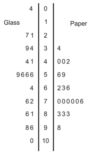
We have already mentioned that the spread was larger in the glass distribution, and it is easy to see this in the comparison plot. You can also see that the glass distribution is more symmetric and is centered lower (around the mid-50's), which seems to indicate that overall, these countries manufacture a smaller percentage of glass from recycled material than they do paper. It is interesting to note in this data set that Sweden actually imports glass from other countries for recycling, so its effective percentage is actually more than 100.
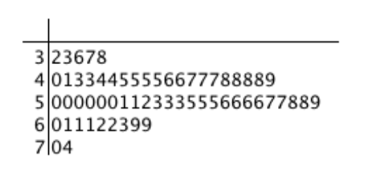
Examples
The following examples uses the data set below.
Here are the ages, arranged order, for the CEOs of the 60 top-ranked small companies in America in 1993:
32, 33, 36, 37, 38, 40, 41, 43, 43, 44, 44, 45, 45, 45, 45,46, 46, 47, 47, 47, 48, 48, 48, 48, 49, 50, 50, 50, 50, 50, 50, 51, 51, 52, 53, 53, 53, 55, 55, 55, 56, 56, 56, 56, 57, 57, 58, 58, 59, 60, 61, 61, 61, 62, 62, 63, 69, 69, 70, 74
Example 1
Create a stem-and-leaf plot for these ages,
Here is the stem-and-leaf plot:
Example 2
Create a dot plot for these ages.
Here is the dot plot:
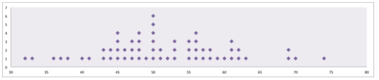
Example 3
Describe the shape of this data set.
The data set is approximately symmetric with most CEOs in their fifties.
Example 4
Are there any outliers in this data set?
There do not appear to be any outliers.
Review
For 1-4, the following table gives the percentages of municipal waste recycled by state in the United States, including the District of Columbia, in 1998. Data was not available for Idaho or Texas.
| State | Percentage |
|---|---|
| Alabama | 23 |
| Alaska | 7 |
| Arizona | 18 |
| Arkansas | 36 |
| California | 30 |
| Colorado | 18 |
| Connecticut | 23 |
| Delaware | 31 |
| District of Columbia | 8 |
| Florida | 40 |
| Georgia | 33 |
| Hawaii | 25 |
| Illinois | 28 |
| Indiana | 23 |
| Iowa | 32 |
| Kansas | 11 |
| Kentucky | 28 |
| Louisiana | 14 |
| Maine | 41 |
| Maryland | 29 |
| Massachusetts | 33 |
| Michigan | 25 |
| Minnesota | 42 |
| Mississippi | 13 |
| Missouri | 33 |
| Montana | 5 |
| Nebraska | 27 |
| Nevada | 15 |
| New Hampshire | 25 |
| New Jersey | 45 |
| New Mexico | 12 |
| New York | 39 |
| North Carolina | 26 |
| North Dakota | 21 |
| Ohio | 19 |
| Oklahoma | 12 |
| Oregon | 28 |
| Pennsylvania | 26 |
| Rhode Island | 23 |
| South Carolina | 34 |
| South Dakota | 42 |
| Tennessee | 40 |
| Utah | 19 |
| Vermont | 30 |
| Virginia | 35 |
| Washington | 48 |
| West Virginia | 20 |
| Wisconsin | 36 |
| Wyoming | 5 |
Source: Zero Waste America
- Create a dot plot for this data.
- Discuss the shape, center, and spread of this distribution.
- Create a stem-and-leaf plot for the data.
- Use your stem-and-leaf plot to find the median percentage for this data.
For 5-8, identify the important features of the shape of the distribution.
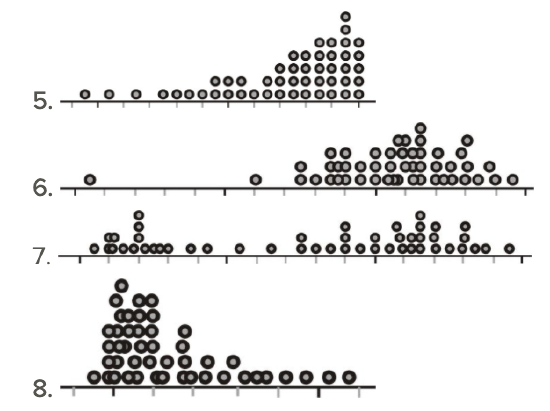
For 9-12, refer to the following dot plots:
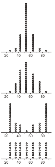
- Identify the overall shape of each distribution.
- How would you characterize the center(s) of these distributions?
- Which of these distributions has the smallest standard deviation?
- Which of these distributions has the largest standard deviation?
- What characteristics of a data set make it easier or harder to represent using dot plots, stem-and-leaf plots, or histograms?
- Here are the ages, arranged order, for the CEOs of the 60 top-ranked small companies in America in 1993 http://lib.stat.cmu.edu/DASL/Datafiles/ceodat.html32, 33, 36, 37, 38, 40, 41, 43, 43, 44, 44, 45, 45, 45, 45,46, 46, 47, 47, 47, 48, 48, 48, 48, 49, 50, 50, 50, 50, 50, 50, 51, 51, 52, 53, 53, 53, 55, 55, 55, 56, 56, 56, 56, 57, 57, 58, 58, 59, 60, 61, 61, 61, 62, 62, 63, 69, 69, 70, 74
- Create a stem-and-leaf plot for these ages.
- Create a dot plot for these ages.
- Describe the shape of this dataset.
- Are there any outliers in this dataset?
- Give an example in which the same measurement taken on the same individual would be considered to be an outlier in one dataset but not in another dataset.
- Does a stem and leaf plot provide enough information to determine if there are any outliers in the dataset? Explain.
- Does a five number summary provide enough information to determine if there are any outliers in the data set? Explain.
- A set of 17 exam scores is 67, 94, 88, 76, 85, 93, 55, 87, 80, 81, 80, 61, 90 ,84, 75, 93, 75
- Draw a stem-and-leaf plot of the scores.
- Draw a dotplot of the scores.
- Make a stem and leaf plot of the mean high temperature in December (Farenheit) in 15 cities in California. The “stem” gives the first digit of a temperature, while the “leaf” gives the second digit. You can find the data at: http://countrystudies.us/united-states/weather/California/beverly-hills.htm
- Describe the shape of the dataset. Is it skewed or is it symmetric?
- What is the highest temperature in the dataset?
- What is the lowest temperature in the dataset?
- What percent of the 15 cities have a mean high December temperature in the 60s?
Additional Resources
PLIX: play, learn, interact, and eXplore for Ordering Leaves
Practice for Displaying Univariate Data