
1.5.4: Displaying Bivariate Data
- Page ID
- 5749
\( \newcommand{\vecs}[1]{\overset { \scriptstyle \rightharpoonup} {\mathbf{#1}} } \)
\( \newcommand{\vecd}[1]{\overset{-\!-\!\rightharpoonup}{\vphantom{a}\smash {#1}}} \)
\( \newcommand{\id}{\mathrm{id}}\) \( \newcommand{\Span}{\mathrm{span}}\)
( \newcommand{\kernel}{\mathrm{null}\,}\) \( \newcommand{\range}{\mathrm{range}\,}\)
\( \newcommand{\RealPart}{\mathrm{Re}}\) \( \newcommand{\ImaginaryPart}{\mathrm{Im}}\)
\( \newcommand{\Argument}{\mathrm{Arg}}\) \( \newcommand{\norm}[1]{\| #1 \|}\)
\( \newcommand{\inner}[2]{\langle #1, #2 \rangle}\)
\( \newcommand{\Span}{\mathrm{span}}\)
\( \newcommand{\id}{\mathrm{id}}\)
\( \newcommand{\Span}{\mathrm{span}}\)
\( \newcommand{\kernel}{\mathrm{null}\,}\)
\( \newcommand{\range}{\mathrm{range}\,}\)
\( \newcommand{\RealPart}{\mathrm{Re}}\)
\( \newcommand{\ImaginaryPart}{\mathrm{Im}}\)
\( \newcommand{\Argument}{\mathrm{Arg}}\)
\( \newcommand{\norm}[1]{\| #1 \|}\)
\( \newcommand{\inner}[2]{\langle #1, #2 \rangle}\)
\( \newcommand{\Span}{\mathrm{span}}\) \( \newcommand{\AA}{\unicode[.8,0]{x212B}}\)
\( \newcommand{\vectorA}[1]{\vec{#1}} % arrow\)
\( \newcommand{\vectorAt}[1]{\vec{\text{#1}}} % arrow\)
\( \newcommand{\vectorB}[1]{\overset { \scriptstyle \rightharpoonup} {\mathbf{#1}} } \)
\( \newcommand{\vectorC}[1]{\textbf{#1}} \)
\( \newcommand{\vectorD}[1]{\overrightarrow{#1}} \)
\( \newcommand{\vectorDt}[1]{\overrightarrow{\text{#1}}} \)
\( \newcommand{\vectE}[1]{\overset{-\!-\!\rightharpoonup}{\vphantom{a}\smash{\mathbf {#1}}}} \)
\( \newcommand{\vecs}[1]{\overset { \scriptstyle \rightharpoonup} {\mathbf{#1}} } \)
\( \newcommand{\vecd}[1]{\overset{-\!-\!\rightharpoonup}{\vphantom{a}\smash {#1}}} \)
\(\newcommand{\avec}{\mathbf a}\) \(\newcommand{\bvec}{\mathbf b}\) \(\newcommand{\cvec}{\mathbf c}\) \(\newcommand{\dvec}{\mathbf d}\) \(\newcommand{\dtil}{\widetilde{\mathbf d}}\) \(\newcommand{\evec}{\mathbf e}\) \(\newcommand{\fvec}{\mathbf f}\) \(\newcommand{\nvec}{\mathbf n}\) \(\newcommand{\pvec}{\mathbf p}\) \(\newcommand{\qvec}{\mathbf q}\) \(\newcommand{\svec}{\mathbf s}\) \(\newcommand{\tvec}{\mathbf t}\) \(\newcommand{\uvec}{\mathbf u}\) \(\newcommand{\vvec}{\mathbf v}\) \(\newcommand{\wvec}{\mathbf w}\) \(\newcommand{\xvec}{\mathbf x}\) \(\newcommand{\yvec}{\mathbf y}\) \(\newcommand{\zvec}{\mathbf z}\) \(\newcommand{\rvec}{\mathbf r}\) \(\newcommand{\mvec}{\mathbf m}\) \(\newcommand{\zerovec}{\mathbf 0}\) \(\newcommand{\onevec}{\mathbf 1}\) \(\newcommand{\real}{\mathbb R}\) \(\newcommand{\twovec}[2]{\left[\begin{array}{r}#1 \\ #2 \end{array}\right]}\) \(\newcommand{\ctwovec}[2]{\left[\begin{array}{c}#1 \\ #2 \end{array}\right]}\) \(\newcommand{\threevec}[3]{\left[\begin{array}{r}#1 \\ #2 \\ #3 \end{array}\right]}\) \(\newcommand{\cthreevec}[3]{\left[\begin{array}{c}#1 \\ #2 \\ #3 \end{array}\right]}\) \(\newcommand{\fourvec}[4]{\left[\begin{array}{r}#1 \\ #2 \\ #3 \\ #4 \end{array}\right]}\) \(\newcommand{\cfourvec}[4]{\left[\begin{array}{c}#1 \\ #2 \\ #3 \\ #4 \end{array}\right]}\) \(\newcommand{\fivevec}[5]{\left[\begin{array}{r}#1 \\ #2 \\ #3 \\ #4 \\ #5 \\ \end{array}\right]}\) \(\newcommand{\cfivevec}[5]{\left[\begin{array}{c}#1 \\ #2 \\ #3 \\ #4 \\ #5 \\ \end{array}\right]}\) \(\newcommand{\mattwo}[4]{\left[\begin{array}{rr}#1 \amp #2 \\ #3 \amp #4 \\ \end{array}\right]}\) \(\newcommand{\laspan}[1]{\text{Span}\{#1\}}\) \(\newcommand{\bcal}{\cal B}\) \(\newcommand{\ccal}{\cal C}\) \(\newcommand{\scal}{\cal S}\) \(\newcommand{\wcal}{\cal W}\) \(\newcommand{\ecal}{\cal E}\) \(\newcommand{\coords}[2]{\left\{#1\right\}_{#2}}\) \(\newcommand{\gray}[1]{\color{gray}{#1}}\) \(\newcommand{\lgray}[1]{\color{lightgray}{#1}}\) \(\newcommand{\rank}{\operatorname{rank}}\) \(\newcommand{\row}{\text{Row}}\) \(\newcommand{\col}{\text{Col}}\) \(\renewcommand{\row}{\text{Row}}\) \(\newcommand{\nul}{\text{Nul}}\) \(\newcommand{\var}{\text{Var}}\) \(\newcommand{\corr}{\text{corr}}\) \(\newcommand{\len}[1]{\left|#1\right|}\) \(\newcommand{\bbar}{\overline{\bvec}}\) \(\newcommand{\bhat}{\widehat{\bvec}}\) \(\newcommand{\bperp}{\bvec^\perp}\) \(\newcommand{\xhat}{\widehat{\xvec}}\) \(\newcommand{\vhat}{\widehat{\vvec}}\) \(\newcommand{\uhat}{\widehat{\uvec}}\) \(\newcommand{\what}{\widehat{\wvec}}\) \(\newcommand{\Sighat}{\widehat{\Sigma}}\) \(\newcommand{\lt}{<}\) \(\newcommand{\gt}{>}\) \(\newcommand{\amp}{&}\) \(\definecolor{fillinmathshade}{gray}{0.9}\)Using Scatterplots and Line Plots
Scatterplots and Line Plots
Bivariate simply means two variables. All our previous work was with univariate, or single-variable data. The goal of examining bivariate data is usually to show some sort of relationship or association between the two variables.
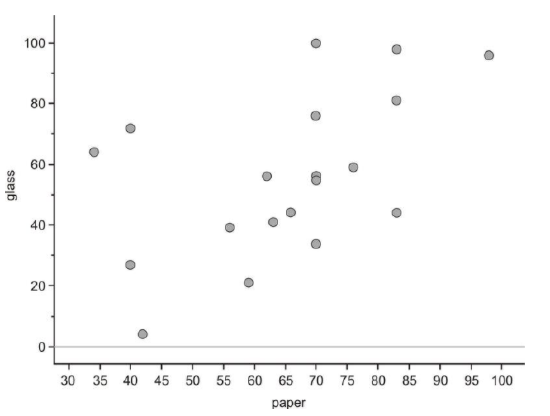
We have looked at recycling rates for paper packaging and glass. It would be interesting to see if there is a predictable relationship between the percentages of each material that a country recycles. Following is a data table that includes both percentages.
| Country | % of Paper Packaging Recycled | % of Glass Packaging Recycled |
|---|---|---|
| Estonia | 34 | 64 |
| New Zealand | 40 | 72 |
| Poland | 40 | 27 |
| Cyprus | 42 | 4 |
| Portugal | 56 | 39 |
| United States | 59 | 21 |
| Italy | 62 | 56 |
| Spain | 63 | 41 |
| Australia | 66 | 44 |
| Greece | 70 | 34 |
| Finland | 70 | 56 |
| Ireland | 70 | 55 |
| Netherlands | 70 | 76 |
| Sweden | 70 | 100 |
| France | 76 | 59 |
| Germany | 83 | 81 |
| Austria | 83 | 44 |
| Belgium | 83 | 98 |
| Japan | 98 | 96 |
Figure: Paper and Glass Packaging Recycling Rates for 19 countries
Scatterplots
We will place the paper recycling rates on the horizontal axis and those for glass on the vertical axis. Next, we will plot a point that shows each country's rate of recycling for the two materials. This series of disconnected points is referred to as a scatterplot.
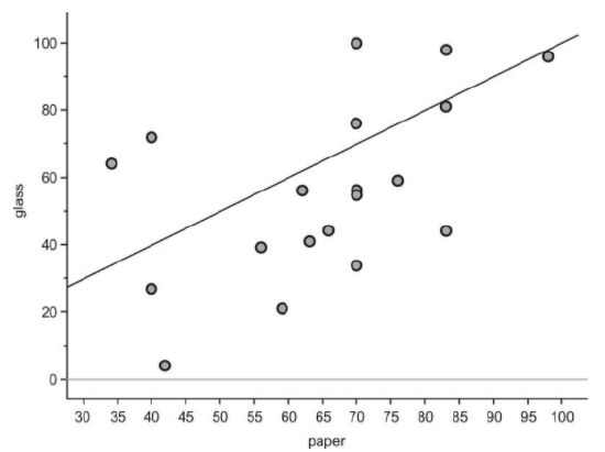
Recall that one of the things you saw from the stem-and-leaf plot is that, in general, a country's recycling rate for glass is lower than its paper recycling rate. On the next graph, we have plotted a line that represents the paper and glass recycling rates being equal. If all the countries had the same paper and glass recycling rates, each point in the scatterplot would be on the line. Because most of the points are actually below this line, you can see that the glass rate is lower than would be expected if they were similar.
With univariate data, we initially characterize a data set by describing its shape, center, and spread. For bivariate data, we will also discuss three important characteristics: shape, direction, and strength. These characteristics will inform us about the association between the two variables. The easiest way to describe these traits for this scatterplot is to think of the data as a cloud. If you draw an ellipse around the data, the general trend is that the ellipse is rising from left to right.
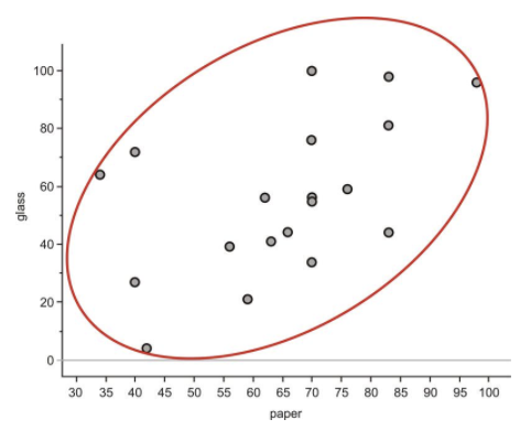
Data that are oriented in this manner are said to have a positive linear association. That is, as one variable increases, the other variable also increases. In this example, it is mostly true that countries with higher paper recycling rates have higher glass recycling rates. Lines that rise in this direction have a positive slope, and lines that trend downward from left to right have a negative slope. If the ellipse cloud were trending down in this manner, we would say the data had a negative linear association. For example, we might expect this type of relationship if we graphed a country's glass recycling rate with the percentage of glass that ends up in a landfill. As the recycling rate increases, the landfill percentage would have to decrease.
The ellipse cloud also gives us some information about the strength of the linear association. If there were a strong linear relationship between the glass and paper recycling rates, the cloud of data would be much longer than it is wide. Long and narrow ellipses mean a strong linear association, while shorter and wider ones show a weaker linear relationship. In this example, there are some countries for which the glass and paper recycling rates do not seem to be related.
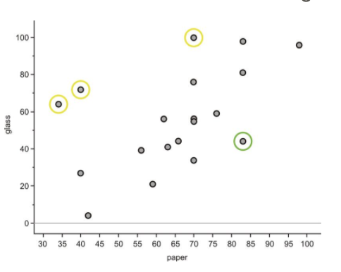
New Zealand, Estonia, and Sweden (circled in yellow) have much lower paper recycling rates than their glass recycling rates, and Austria (circled in green) is an example of a country with a much lower glass recycling rate than its paper recycling rate. These data points are spread away from the rest of the data enough to make the ellipse much wider, weakening the association between the variables.
Line Plots
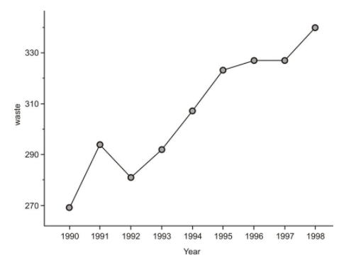
The following data set shows the change in the total amount of municipal waste generated in the United States during the 1990's:
| Year | Municipal Waste Generated (Millions of Tons) |
|---|---|
| 1990 | 269 |
| 1991 | 294 |
| 1992 | 281 |
| 1993 | 292 |
| 1994 | 307 |
| 1995 | 323 |
| 1996 | 327 |
| 1997 | 327 |
| 1998 | 340 |
Figure: Total Municipal Waste Generated in the US by Year in Millions of Tons.
In this example, the time in years is considered the explanatory variable, or independent variable, and the amount of municipal waste is the response variable, or dependent variable. It is not only the passage of time that causes our waste to increase. Other factors, such as population growth, economic conditions, and societal habits and attitudes also contribute as causes. However, it would not make sense to view the relationship between time and municipal waste in the opposite direction.
When one of the variables is time, it will almost always be the explanatory variable. Because time is a continuous variable, and we are very often interested in the change a variable exhibits over a period of time, there is some meaning to the connection between the points in a plot involving time as an explanatory variable. In this case, we use a line plot. A line plot is simply a scatterplot in which we connect successive chronological observations with a line segment to give more information about how the data values are changing over a period of time. Here is the line plot for the US Municipal Waste data:
Interpreting Graphs for Bivariate Data
It is easy to see general trends from scatter plots or line plots. For Example B, we can spot the year in which the most dramatic increase occurred (1990) by looking at the steepest line. We can also spot the years in which the waste output decreased and/or remained about the same (1991 and 1996). It would be interesting to investigate some possible reasons for the behaviors of these individual years.
Interpreting the Trend
Following is a scatterplot of the number of lives births per 10,000 23-year-old women in the United States between 1917 and 1975. Comment on the pattern this shows of birthrate over time.
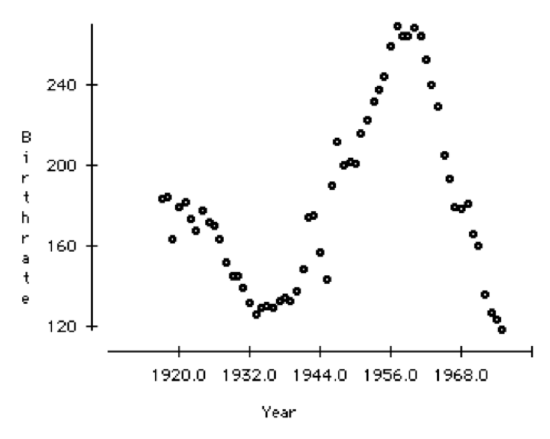
Birthrate, over time, appears to be cyclic. There was a dip in birthrate in 1932, then a gradual increase to a high in 1956. After that there was a drop in the birthrate.
Technology Notes
Scatterplots on the TI-83/84 Graphing Calculator
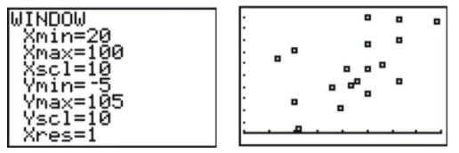
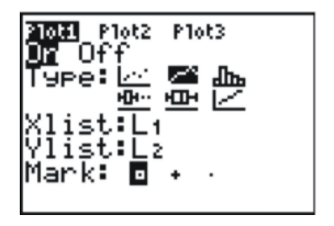
Press [STAT][ENTER], and enter the following data, with the explanatory variable in L1 and the response variable in L2. (Note that this data set contains 18 points- not all are visible on the screen at once). Next, press [2ND][STAT-PLOT] to enter the STAT-PLOTS menu, and choose the first plot.
Change the settings to match the following screenshot:
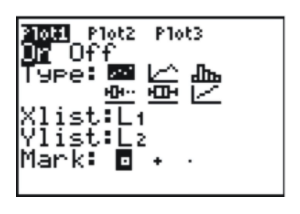
This selects a scatterplot with the explanatory variable in L1 and the response variable in L2. In order to see the points better, you should choose either the square or the plus sign for the mark. The square has been chosen in the screenshot. Finally, set the window as shown below to match the data. In this case, we looked at our lowest and highest data values in each variable and added a bit of room to create a pleasant window. Press [GRAPH] to see the result, shown below.
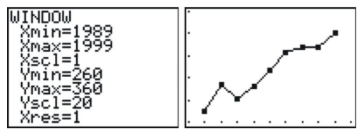
Line Plots on the TI-83/84 Graphing Calculator
Your graphing calculator will also draw a line plot, and the process is almost identical to that for creating a scatterplot. Enter the data into your lists, and choose a line plot in the Plot1 menu, as in the following screenshot.
Next, set an appropriate window (not necessarily the one shown below), and graph the resulting plot.
Example
The following example using the information below:
Data from a British government survey of household spending may be used to examine the relationship between household spending on tobacco products and alcoholic beverages. The data gathered is included in the following table.
| Region | Alcohol | Tobacco |
|---|---|---|
| North | 6.47 | 4.03 |
| Yorkshire | 6.13 | 3.76 |
| Northeast | 6.19 | 3.77 |
| East Midlands | 4.89 | 3.34 |
| West Midlands | 5.63 | 3.47 |
| East Anglia | 4.52 | 2.92 |
| Southeast | 5.89 | 3.20 |
| Southwest | 4.79 | 2.71 |
| Wales | 5.27 | 3.53 |
| Scotland | 6.08 | 4.51 |
| No. Ireland | 4.02 | 4.56 |
Source: Carnegie Mellon University
Example 1
Use the Technology Notes at the end of the section to make a scatter plot of this data. Comment of the relationship between household spending on alcohol and tobacco products
Here is what the image on your graphing calculator should look like for your scatter plot:
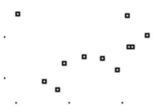
It appears that household spending on alcohol productions and household spending on tobacco products are directly related. That is, as one goes up, the other goes up.
Review
For 1-4, remember a previous practice problem where you looked at the percentage of waste recycled in each state. Do you think there is a relationship between the percentage recycled and the total amount of waste that a state generates? Here are the data, including both variables.
| State | Percentage | Total Amount of Municipal Waste in Thousands of Tons |
|---|---|---|
| Alabama | 23 | 5549 |
| Alaska | 7 | 560 |
| Arizona | 18 | 5700 |
| Arkansas | 36 | 4287 |
| California | 30 | 45000 |
| Colorado | 18 | 3084 |
| Connecticut | 23 | 2950 |
| Delaware | 31 | 1189 |
| District of Columbia | 8 | 246 |
| Florida | 40 | 23617 |
| Georgia | 33 | 14645 |
| Hawaii | 25 | 2125 |
| Illinois | 28 | 13386 |
| Indiana | 23 | 7171 |
| Iowa | 32 | 3462 |
| Kansas | 11 | 4250 |
| Kentucky | 28 | 4418 |
| Louisiana | 14 | 3894 |
| Maine | 41 | 1339 |
| Maryland | 29 | 5329 |
| Massachusetts | 33 | 7160 |
| Michigan | 25 | 13500 |
| Minnesota | 42 | 4780 |
| Mississippi | 13 | 2360 |
| Missouri | 33 | 7896 |
| Montana | 5 | 1039 |
| Nebraska | 27 | 2000 |
| Nevada | 15 | 3955 |
| New Hampshire | 25 | 1200 |
| New Jersey | 45 | 8200 |
| New Mexico | 12 | 1400 |
| New York | 39 | 28800 |
| North Carolina | 26 | 9843 |
| North Dakota | 21 | 510 |
| Ohio | 19 | 12339 |
| Oklahoma | 12 | 2500 |
| Oregon | 28 | 3836 |
| Pennsylvania | 26 | 9440 |
| Rhode Island | 23 | 477 |
| South Carolina | 34 | 8361 |
| South Dakota | 42 | 510 |
| Tennessee | 40 | 9496 |
| Utah | 19 | 3760 |
| Vermont | 30 | 600 |
| Virginia | 35 | 9000 |
| Washington | 48 | 6527 |
| West Virginia | 20 | 2000 |
| Wisconsin | 36 | 3622 |
| Wyoming | 5 | 530 |
- Identify the variables in this example, and specify which one is the explanatory variable and which one is the response variable.
- How much municipal waste was created in Illinois?
- Draw a scatterplot for this data.
- Describe the direction and strength of the association between the two variables.
For 5-8, the following line graph shows the recycling rates of two different types of plastic bottles in the US from 1995 to
2001.
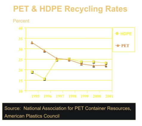
- Explain the general trends for both types of plastics over these years.
- What was the total change in PET bottle recycling from 1995 to 2001?
- Can you think of a reason to explain this change?
- During what years was this change the most rapid?
References
National Geographic, January 2008. Volume 213 No.1
- Which plots are most useful to interpret the ideas of shape, center, and spread?
- What effects does the shape of a data set have on the statistical measures of center and spread
Additional Resources
Practice for Displaying Bivariate Data