
1.5.5: Misleading Graphs (Identify Misleading Statistics)
- Page ID
- 5750
\( \newcommand{\vecs}[1]{\overset { \scriptstyle \rightharpoonup} {\mathbf{#1}} } \)
\( \newcommand{\vecd}[1]{\overset{-\!-\!\rightharpoonup}{\vphantom{a}\smash {#1}}} \)
\( \newcommand{\id}{\mathrm{id}}\) \( \newcommand{\Span}{\mathrm{span}}\)
( \newcommand{\kernel}{\mathrm{null}\,}\) \( \newcommand{\range}{\mathrm{range}\,}\)
\( \newcommand{\RealPart}{\mathrm{Re}}\) \( \newcommand{\ImaginaryPart}{\mathrm{Im}}\)
\( \newcommand{\Argument}{\mathrm{Arg}}\) \( \newcommand{\norm}[1]{\| #1 \|}\)
\( \newcommand{\inner}[2]{\langle #1, #2 \rangle}\)
\( \newcommand{\Span}{\mathrm{span}}\)
\( \newcommand{\id}{\mathrm{id}}\)
\( \newcommand{\Span}{\mathrm{span}}\)
\( \newcommand{\kernel}{\mathrm{null}\,}\)
\( \newcommand{\range}{\mathrm{range}\,}\)
\( \newcommand{\RealPart}{\mathrm{Re}}\)
\( \newcommand{\ImaginaryPart}{\mathrm{Im}}\)
\( \newcommand{\Argument}{\mathrm{Arg}}\)
\( \newcommand{\norm}[1]{\| #1 \|}\)
\( \newcommand{\inner}[2]{\langle #1, #2 \rangle}\)
\( \newcommand{\Span}{\mathrm{span}}\) \( \newcommand{\AA}{\unicode[.8,0]{x212B}}\)
\( \newcommand{\vectorA}[1]{\vec{#1}} % arrow\)
\( \newcommand{\vectorAt}[1]{\vec{\text{#1}}} % arrow\)
\( \newcommand{\vectorB}[1]{\overset { \scriptstyle \rightharpoonup} {\mathbf{#1}} } \)
\( \newcommand{\vectorC}[1]{\textbf{#1}} \)
\( \newcommand{\vectorD}[1]{\overrightarrow{#1}} \)
\( \newcommand{\vectorDt}[1]{\overrightarrow{\text{#1}}} \)
\( \newcommand{\vectE}[1]{\overset{-\!-\!\rightharpoonup}{\vphantom{a}\smash{\mathbf {#1}}}} \)
\( \newcommand{\vecs}[1]{\overset { \scriptstyle \rightharpoonup} {\mathbf{#1}} } \)
\( \newcommand{\vecd}[1]{\overset{-\!-\!\rightharpoonup}{\vphantom{a}\smash {#1}}} \)
\(\newcommand{\avec}{\mathbf a}\) \(\newcommand{\bvec}{\mathbf b}\) \(\newcommand{\cvec}{\mathbf c}\) \(\newcommand{\dvec}{\mathbf d}\) \(\newcommand{\dtil}{\widetilde{\mathbf d}}\) \(\newcommand{\evec}{\mathbf e}\) \(\newcommand{\fvec}{\mathbf f}\) \(\newcommand{\nvec}{\mathbf n}\) \(\newcommand{\pvec}{\mathbf p}\) \(\newcommand{\qvec}{\mathbf q}\) \(\newcommand{\svec}{\mathbf s}\) \(\newcommand{\tvec}{\mathbf t}\) \(\newcommand{\uvec}{\mathbf u}\) \(\newcommand{\vvec}{\mathbf v}\) \(\newcommand{\wvec}{\mathbf w}\) \(\newcommand{\xvec}{\mathbf x}\) \(\newcommand{\yvec}{\mathbf y}\) \(\newcommand{\zvec}{\mathbf z}\) \(\newcommand{\rvec}{\mathbf r}\) \(\newcommand{\mvec}{\mathbf m}\) \(\newcommand{\zerovec}{\mathbf 0}\) \(\newcommand{\onevec}{\mathbf 1}\) \(\newcommand{\real}{\mathbb R}\) \(\newcommand{\twovec}[2]{\left[\begin{array}{r}#1 \\ #2 \end{array}\right]}\) \(\newcommand{\ctwovec}[2]{\left[\begin{array}{c}#1 \\ #2 \end{array}\right]}\) \(\newcommand{\threevec}[3]{\left[\begin{array}{r}#1 \\ #2 \\ #3 \end{array}\right]}\) \(\newcommand{\cthreevec}[3]{\left[\begin{array}{c}#1 \\ #2 \\ #3 \end{array}\right]}\) \(\newcommand{\fourvec}[4]{\left[\begin{array}{r}#1 \\ #2 \\ #3 \\ #4 \end{array}\right]}\) \(\newcommand{\cfourvec}[4]{\left[\begin{array}{c}#1 \\ #2 \\ #3 \\ #4 \end{array}\right]}\) \(\newcommand{\fivevec}[5]{\left[\begin{array}{r}#1 \\ #2 \\ #3 \\ #4 \\ #5 \\ \end{array}\right]}\) \(\newcommand{\cfivevec}[5]{\left[\begin{array}{c}#1 \\ #2 \\ #3 \\ #4 \\ #5 \\ \end{array}\right]}\) \(\newcommand{\mattwo}[4]{\left[\begin{array}{rr}#1 \amp #2 \\ #3 \amp #4 \\ \end{array}\right]}\) \(\newcommand{\laspan}[1]{\text{Span}\{#1\}}\) \(\newcommand{\bcal}{\cal B}\) \(\newcommand{\ccal}{\cal C}\) \(\newcommand{\scal}{\cal S}\) \(\newcommand{\wcal}{\cal W}\) \(\newcommand{\ecal}{\cal E}\) \(\newcommand{\coords}[2]{\left\{#1\right\}_{#2}}\) \(\newcommand{\gray}[1]{\color{gray}{#1}}\) \(\newcommand{\lgray}[1]{\color{lightgray}{#1}}\) \(\newcommand{\rank}{\operatorname{rank}}\) \(\newcommand{\row}{\text{Row}}\) \(\newcommand{\col}{\text{Col}}\) \(\renewcommand{\row}{\text{Row}}\) \(\newcommand{\nul}{\text{Nul}}\) \(\newcommand{\var}{\text{Var}}\) \(\newcommand{\corr}{\text{corr}}\) \(\newcommand{\len}[1]{\left|#1\right|}\) \(\newcommand{\bbar}{\overline{\bvec}}\) \(\newcommand{\bhat}{\widehat{\bvec}}\) \(\newcommand{\bperp}{\bvec^\perp}\) \(\newcommand{\xhat}{\widehat{\xvec}}\) \(\newcommand{\vhat}{\widehat{\vvec}}\) \(\newcommand{\uhat}{\widehat{\uvec}}\) \(\newcommand{\what}{\widehat{\wvec}}\) \(\newcommand{\Sighat}{\widehat{\Sigma}}\) \(\newcommand{\lt}{<}\) \(\newcommand{\gt}{>}\) \(\newcommand{\amp}{&}\) \(\definecolor{fillinmathshade}{gray}{0.9}\)Let's Think About It
Ashley has asked all the students in 8th grade whether they had eaten pizza in the last week. She organized her data into a table and then created the graph below.
CK-12 Foundation
Ashley showed the graph to her friend, Lakki, who told her it was incorrect. What is wrong with Ashley's graph?
In this concept, you will learn how to analyze and identify misleading statistics that are represented in graphical displays.
Guidance
Graphs are visual representations of data. Graphs can be used to present, persuade, or even mislead the viewer. The same set of data can be presented on a graph in different ways. Sometimes, the way that a graph is drawn can present only one side of the statistics.
Graphs that are misleading either try to persuade the reader or inaccurately present data. For example, political groups may show graphs that show drastic economic changes, however upon careful inspection it becomes clear that the graph is poorly drawn or purposely misleading.
When reading, analyzing, and interpreting graphs, you should consider:
- the type of graph used.
- how the axes have been drawn, in particular the scale used.
- the characteristics and similarity of the data presented.
Let's look at an example.
The two graphs below show the average monthly water temperature in Hawaii. Compare the two graphs and determine which one presents the most reliable view of the data.
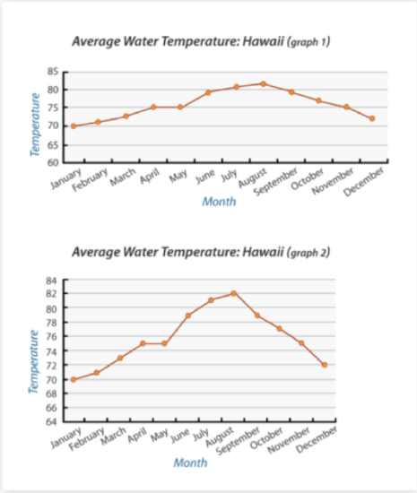
CK-12 Foundation - CC BY-NC
First, compare and contrast the different graphs. Determine what is the same and what is different. Based on these characteristics, select which one is more reliable.
The answer is: graph 1 presents a more reliable view of the data. Graph 2 shows drastic changes in the temperature, which is not accurate. The change in temperature does not vary greatly from month to month and the graph should illustrate this.
Guided Practice
Explain why the data compared on the bar graph below is misleading. Then propose how to correct the misleading information in the graph.
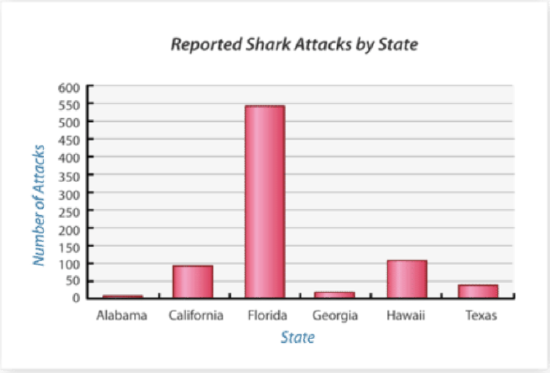
CK-12 Foundation - CC BY-NC
First, analyze the graph. Look at what kind of data is presented and if it's related, the values along the horizontal and vertical axes, and what kind of message the graph is trying to send.
The answer is the graph is misleading because each state on the graph has a different size coastline. For example, Florida’s vast amount of coastline may contribute to the fact that it has a far higher incidence of shark attacks than any other U.S. state. As well, California, Florida, and Hawaii are all big beach destination states; therefore the incidence of shark attacks will be greater than sates such as Alabama. Lastly, the likelihood of sharks being off the stated coastlines must be considered. Sharks may be more likely to be off certain portions of the Florida coastline, than Alabama. To fix the graph, the data presented should be replaced by more comparable data. Specifically, data that compares the incidence of shark attacks among states that are more geographically similar.
Examples
Example 1
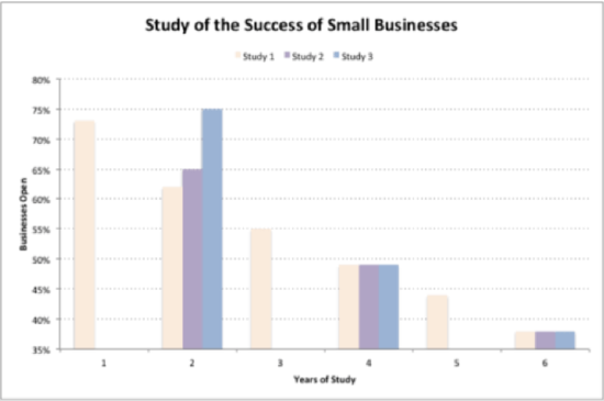
The graph below illustrates the findings of a research study that investigated the success rate of small businesses. State two things that are misleading about this graph.
CK-12 Foundation - CK-12 Foundation
First, analyze the graph to determine what could be misleading about the data presented. Then write two statements describing the misleading characteristics.
The answer is two characteristics that are misleading are:
- the vertical axis is broken off and does not begin at 0. When axes are drawn like this the data can look more spread out than it really is.
- the three studies reported collected data at different intervals. Said another way, study 1 collected data every year for 6 years, but studies 2 and 3 collected data every other year for 6 years. Study 1 shows a gradual decline in the percentage of small businesses open every year whereas studies 2 and 3 show greater declines every other year.
Example 2
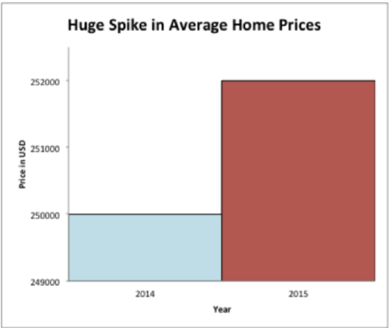
The graph below shows the average home prices from 2014 to 2015. What are two misleading characteristics of this graph?
CK-12 Foundation - CK-12 Foundation
First, analyze the graph to determine what could be misleading about the data presented. Then write two statements describing what is incorrect in the graph.
The answer is two characteristics that are misleading are:
- the vertical axis is purposely drawn to show a great difference among the values $250,000 and $252,000. This difference is highlighted by the title of the graph, which states there was a huge spike in house prices.
- the data reported in the table is taken out of context. Housing prices can vary widely depending on where they are located. The graph does not provide any detailed information about the housing prices reported, such as location or home size.
Example 3
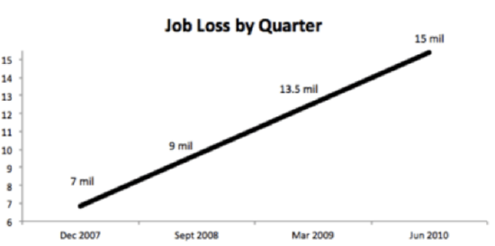
The graph below shows the number of jobs lost by quarter. The describe three things that make this graph misleading.
CK-12 Foundation - CK-12 Foundation
First, analyze the graph to determine what could be misleading about the data presented. Then write three statements describing what is misleading about the data in the graph.
The answer is three characteristics that are misleading are:
- the data presented is by quarter, however the dates listed are not each quarter. For example, between December 2007 and September 2008 there are 3 quarters between, however between September 2008 and March 2009 there are 2 quarters.
- the data is presented in a line, however the data does not increase by the same amount each time. For example, the difference between 7 mil and 9 mil is 2 mil, but the difference between 9 mil and 13.5 mil is 4.5 mil.
- the vertical axis is broken off, it begins at 6 and ends just above 15. The line is meant to look like it is close to 0 and rises dramatically, however the data does not match this representation.
Follow Up
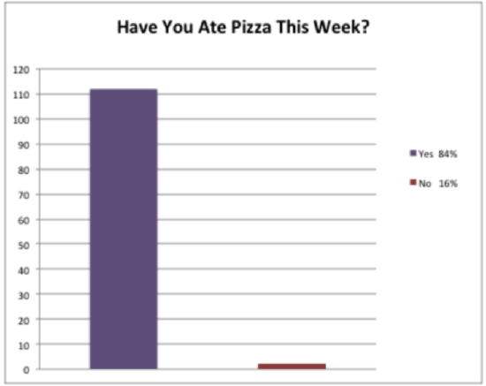
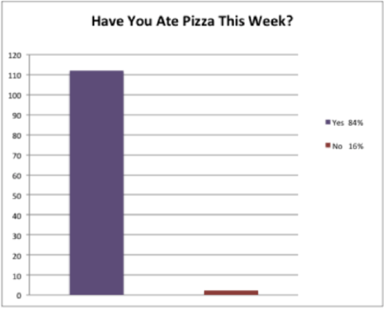
Remember Ashley and her graph?
Ashley created the graph below after asking the other 8th graders if they ate pizza this week.
CK-12 Foundation - CK-12 Foundation
Ashley showed the graph to her friend, Lakki, who told her it was incorrect. What is wrong with her graph?
To answer this question, analyze the graph Ashley created.
First, look at what the graph is saying. This graph should tell the reader how many people or what percent of people ate pizza this week. Ashley's graph actually says both, which is incorrect.
Next, compare the sizes of the columns to the information contained in the legend. This information should match, but in Ashley's graph it does not. This is incorrect.
The answer is Ashley's graph has two inaccuracies.
The first inaccuracy is the information the graph is presenting. The graph should either say how many people ate pizza this past week or what percent of people ate pizza this past week. Ashley should change the data presented in her graph to reflect one of these questions. Ashley should also make sure the graph title is accurate and correct - "Have you ate pizza this week?" is grammatically incorrect.
The second inaccuracy is the values represented in the columns and the legend. The legend states that the percent of people that didn't eat pizza was 16%, however the graph does not accurately show this in the red column. The two columns are not in proportion to each other, meaning that 16% should be closer to 20 than 0. Ashley should check her calculations to ensure the 16% is accurate. To correct this mistake, Ashley should either correct the red column to show the actual number of people that represent 16% or update the legend to reflect the true percent of people.
Explore More
Answer each question regarding misleading data.
CK-12 Foundation;recipegreat.com - CC BY-NC
1. Is this a misleading graph?
2. What is one thing that makes it a misleading graph?
3. What is one thing that you could do to fix this graph?
The data table below depicts the amount of time students at different grade levels spend on homework and studying. Ensure that the second graph shows that time spent on homework in twelfth grade is triple that of sixth grade.
| Grade | Time |
|---|---|
| 6th | 1.75 |
| 7th | 2 |
| 8th | 2.25 |
| 9th | 2.5 |
| 10th | 2.75 |
| 11th | 3 |
| 12th | 3.5 |
4. Use the data below to create two bar graphs. One that shows the data accurately, that time spent on homework in twelfth grade is double that of sixth grade.
5. Ensure that the second graph shows that time spent on homework in twelfth grade is triple that of sixth grade.
6. If the students doubled the time that they spend on homework in the 7th grade, how many hours would they be spending?
7. If the students in the 11th grade spent half as much time on homework, how many more hours of free time would they gain?
8. True or false. All students spend at least one hour on homework.
The data table below depicts the sales tax rate for several U.S. states.
| State | Sales Tax Rate (%) |
|---|---|
| Alaska | 0 |
| Alabama | 4.0 |
| Arizona | 5.6 |
| California | 6.25 |
| New Jersey | 7.0 |
9. Use the information on the data table to create two graphs. One graph should depict the data accurately. On this graph, the sales tax rate for New Jersey is almost double the sales tax rate in Alabama.
10. The second graph should present the data in a misleading manner to suggest that the sales tax rate in New Jersey is more than triple the tax rate in Alabama.
11. Which state has the highest state tax?
12. If Alaska doesn’t have a state tax, does it make sense to put it on the list?
The data below depicts the daily temperature in Juneau, Alaska for ten days.
64605755495758605956
13. Draw a line graph that depicts a sharp decrease in temperature.
14. Draw another line graph that depicts the decrease accurately.
15. What is the highest temperature on the list?
16. What is the lowest temperature on the list?
17. – 20. Look through a newspaper and choose three different graphs. Then write a few sentences about each one explaining how the data represented is or is not misleading and why.
Answers for Explore More Problems
To view the Explore More answers, open this PDF file and look for section 11.13.
Additional Resources
PLIX: Play, Learn, Interact, eXplore for Are Virgos Cursed?
Practice for Misleading Graphs (Identify Misleading Statistics)