
2.3.1: Single Bar Graphs
- Page ID
- 5755
\( \newcommand{\vecs}[1]{\overset { \scriptstyle \rightharpoonup} {\mathbf{#1}} } \)
\( \newcommand{\vecd}[1]{\overset{-\!-\!\rightharpoonup}{\vphantom{a}\smash {#1}}} \)
\( \newcommand{\id}{\mathrm{id}}\) \( \newcommand{\Span}{\mathrm{span}}\)
( \newcommand{\kernel}{\mathrm{null}\,}\) \( \newcommand{\range}{\mathrm{range}\,}\)
\( \newcommand{\RealPart}{\mathrm{Re}}\) \( \newcommand{\ImaginaryPart}{\mathrm{Im}}\)
\( \newcommand{\Argument}{\mathrm{Arg}}\) \( \newcommand{\norm}[1]{\| #1 \|}\)
\( \newcommand{\inner}[2]{\langle #1, #2 \rangle}\)
\( \newcommand{\Span}{\mathrm{span}}\)
\( \newcommand{\id}{\mathrm{id}}\)
\( \newcommand{\Span}{\mathrm{span}}\)
\( \newcommand{\kernel}{\mathrm{null}\,}\)
\( \newcommand{\range}{\mathrm{range}\,}\)
\( \newcommand{\RealPart}{\mathrm{Re}}\)
\( \newcommand{\ImaginaryPart}{\mathrm{Im}}\)
\( \newcommand{\Argument}{\mathrm{Arg}}\)
\( \newcommand{\norm}[1]{\| #1 \|}\)
\( \newcommand{\inner}[2]{\langle #1, #2 \rangle}\)
\( \newcommand{\Span}{\mathrm{span}}\) \( \newcommand{\AA}{\unicode[.8,0]{x212B}}\)
\( \newcommand{\vectorA}[1]{\vec{#1}} % arrow\)
\( \newcommand{\vectorAt}[1]{\vec{\text{#1}}} % arrow\)
\( \newcommand{\vectorB}[1]{\overset { \scriptstyle \rightharpoonup} {\mathbf{#1}} } \)
\( \newcommand{\vectorC}[1]{\textbf{#1}} \)
\( \newcommand{\vectorD}[1]{\overrightarrow{#1}} \)
\( \newcommand{\vectorDt}[1]{\overrightarrow{\text{#1}}} \)
\( \newcommand{\vectE}[1]{\overset{-\!-\!\rightharpoonup}{\vphantom{a}\smash{\mathbf {#1}}}} \)
\( \newcommand{\vecs}[1]{\overset { \scriptstyle \rightharpoonup} {\mathbf{#1}} } \)
\( \newcommand{\vecd}[1]{\overset{-\!-\!\rightharpoonup}{\vphantom{a}\smash {#1}}} \)
\(\newcommand{\avec}{\mathbf a}\) \(\newcommand{\bvec}{\mathbf b}\) \(\newcommand{\cvec}{\mathbf c}\) \(\newcommand{\dvec}{\mathbf d}\) \(\newcommand{\dtil}{\widetilde{\mathbf d}}\) \(\newcommand{\evec}{\mathbf e}\) \(\newcommand{\fvec}{\mathbf f}\) \(\newcommand{\nvec}{\mathbf n}\) \(\newcommand{\pvec}{\mathbf p}\) \(\newcommand{\qvec}{\mathbf q}\) \(\newcommand{\svec}{\mathbf s}\) \(\newcommand{\tvec}{\mathbf t}\) \(\newcommand{\uvec}{\mathbf u}\) \(\newcommand{\vvec}{\mathbf v}\) \(\newcommand{\wvec}{\mathbf w}\) \(\newcommand{\xvec}{\mathbf x}\) \(\newcommand{\yvec}{\mathbf y}\) \(\newcommand{\zvec}{\mathbf z}\) \(\newcommand{\rvec}{\mathbf r}\) \(\newcommand{\mvec}{\mathbf m}\) \(\newcommand{\zerovec}{\mathbf 0}\) \(\newcommand{\onevec}{\mathbf 1}\) \(\newcommand{\real}{\mathbb R}\) \(\newcommand{\twovec}[2]{\left[\begin{array}{r}#1 \\ #2 \end{array}\right]}\) \(\newcommand{\ctwovec}[2]{\left[\begin{array}{c}#1 \\ #2 \end{array}\right]}\) \(\newcommand{\threevec}[3]{\left[\begin{array}{r}#1 \\ #2 \\ #3 \end{array}\right]}\) \(\newcommand{\cthreevec}[3]{\left[\begin{array}{c}#1 \\ #2 \\ #3 \end{array}\right]}\) \(\newcommand{\fourvec}[4]{\left[\begin{array}{r}#1 \\ #2 \\ #3 \\ #4 \end{array}\right]}\) \(\newcommand{\cfourvec}[4]{\left[\begin{array}{c}#1 \\ #2 \\ #3 \\ #4 \end{array}\right]}\) \(\newcommand{\fivevec}[5]{\left[\begin{array}{r}#1 \\ #2 \\ #3 \\ #4 \\ #5 \\ \end{array}\right]}\) \(\newcommand{\cfivevec}[5]{\left[\begin{array}{c}#1 \\ #2 \\ #3 \\ #4 \\ #5 \\ \end{array}\right]}\) \(\newcommand{\mattwo}[4]{\left[\begin{array}{rr}#1 \amp #2 \\ #3 \amp #4 \\ \end{array}\right]}\) \(\newcommand{\laspan}[1]{\text{Span}\{#1\}}\) \(\newcommand{\bcal}{\cal B}\) \(\newcommand{\ccal}{\cal C}\) \(\newcommand{\scal}{\cal S}\) \(\newcommand{\wcal}{\cal W}\) \(\newcommand{\ecal}{\cal E}\) \(\newcommand{\coords}[2]{\left\{#1\right\}_{#2}}\) \(\newcommand{\gray}[1]{\color{gray}{#1}}\) \(\newcommand{\lgray}[1]{\color{lightgray}{#1}}\) \(\newcommand{\rank}{\operatorname{rank}}\) \(\newcommand{\row}{\text{Row}}\) \(\newcommand{\col}{\text{Col}}\) \(\renewcommand{\row}{\text{Row}}\) \(\newcommand{\nul}{\text{Nul}}\) \(\newcommand{\var}{\text{Var}}\) \(\newcommand{\corr}{\text{corr}}\) \(\newcommand{\len}[1]{\left|#1\right|}\) \(\newcommand{\bbar}{\overline{\bvec}}\) \(\newcommand{\bhat}{\widehat{\bvec}}\) \(\newcommand{\bperp}{\bvec^\perp}\) \(\newcommand{\xhat}{\widehat{\xvec}}\) \(\newcommand{\vhat}{\widehat{\vvec}}\) \(\newcommand{\uhat}{\widehat{\uvec}}\) \(\newcommand{\what}{\widehat{\wvec}}\) \(\newcommand{\Sighat}{\widehat{\Sigma}}\) \(\newcommand{\lt}{<}\) \(\newcommand{\gt}{>}\) \(\newcommand{\amp}{&}\) \(\definecolor{fillinmathshade}{gray}{0.9}\)Bar Graphs
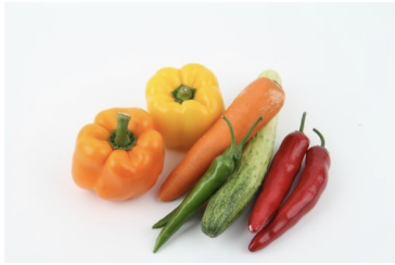
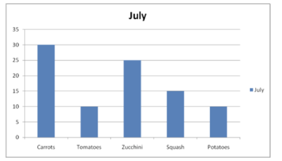
Judy has planted a garden in her backyard. She decided to keep track of how many vegetables were growing each month in her garden. The data table below shows the amounts of vegetables she grew in July and August.
| July | August |
|---|---|
| 30 carrots | 60 carrots |
| 10 tomatoes | 20 tomatoes |
| 25 zucchini | 30 zucchini |
| 15 squash | 25 squash |
| 10 potatoes | 20 potatoes |
Judy wants to visually display her data in a way that she can show the community board to earn recognition for her growing garden. She wants the data to be easy to read and understand.
In this concept, you will learn how to create a bar graph from data and answer questions about the data represented.
Guidance
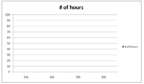
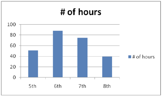
Bar graphs are created from a set of data. It is called a bar graph because it is a visual display of data using bars. The number of items tells us how many bars the graph will have. The amount of each item tells us how long each bar will be. Look at the following data. A bar graph can be used to represent the data, which tells how many hours students in the fifth, sixth, seventh, and eighth grade classes volunteered in a month.
| Class | Number of Hours |
|---|---|
| 5th | 51 |
| 6th | 88 |
| 7th | 75 |
| 8th | 39 |
You can see that this information has been written in the form of a frequency table. It shows us how many hours each class has worked.
Now a bar graph can be created to display the information.
A bar graph contains two axes. One axis represents the items, which goes across the bottom on what is called the X-axis. The other represents the amounts of each item, which goes along the side on what is called the Y-axis. The “items” in this case are each class. The amounts are the number of hours the classes worked. Axes always need to be labeled to show what each axis represents.
Richard Croft - https://commons.wikimedia.org/wiki/File:Vegetable_garden_-_geograph.org.uk_-_821006.jpg;https://pixabay.com/en/photos/vegetables/ - CC BY-NC
Next, a scale needs to be chosen for the amounts on the left side of the bar graph. Scales of 1, 2, 5, 10, 20, 50, 100, 1,000, or more a typically used because they are easy numbers to count by. To choose the scale, look at the amounts you’ll be graphing, especially the largest amount. In the example, the greatest value is 88. If a scale of 100 is used, the scale marks on the left side of the graph would be 0, 100, 200, and so on. It would be very difficult to read most of the amounts on this scale because it is too big. On the other hand, if a small scale is used, such as 5, the graph would have to be very large to get all the way up to 90 (since the greatest value is 88).
It makes the most sense to use a scale that goes from 0 to 90 counting by 10’s. That way each value can easily represent the hours that each class worked.
Here is what the graph looks like with the scale filled in.
USGS - http://earthquake.usgs.gov/earthquakes/eqarchives/year/graphs.php;http://pixabay.com/en/server-computer-case-controller-40240/ - CC BY-NC
Now the bars can be drawn in to represent each number of hours that the students worked.
USGS - http://earthquake.usgs.gov/earthquakes/eqarchives/year/graphs.php;http://pixabay.com/en/server-computer-case-controller-40240/ - CC BY-NC
Guided Practice
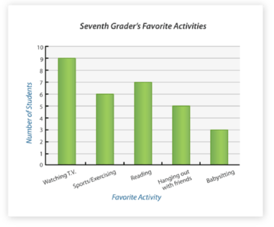
What number of 7th graders have a favorite activity of watching television?
Richard Croft - https://commons.wikimedia.org/wiki/File:Vegetable_garden_-_geograph.org.uk_-_821006.jpg;https://pixabay.com/en/photos/vegetables/ - CC BY-NC
First, look for the column that refers to television. This is the activity that the question is referring to; therefore, is the data you are targeting.
Next, look at the vertical axis. This will show you where the data falls on the scale representing the number of students who enjoy that activity.
Then, answer the question with the exact number for the Y-axis that matches up with the bar in the graph representing television.
The answer is 9 seventh graders have "watching TV" as their favorite activity.
Examples
Example 1
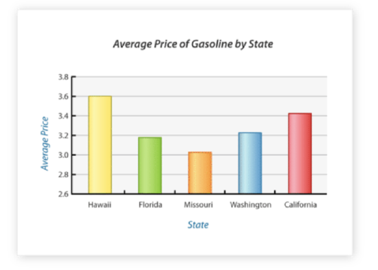
Which state has the highest average price for gasoline?
Richard Croft - https://commons.wikimedia.org/wiki/File:Vegetable_garden_-_geograph.org.uk_-_821006.jpg;https://pixabay.com/en/photos/vegetables/ - CC BY-NC
First, look at the bar graph to determine the longest bar in the graph (which would represent the highest price for gas).
Next, look at the X-axis to see which state the longest bar belongs to. Also check the Y-axis to make sure that bar in the graph is matched to the highest amount on the Y-axis.
Then, answer the question with the data bar that you found to have the highest price of gasoline as represented in the graph.
The answer is Hawaii.
Example 2
Using the same bar graph above, which state has the lowest average price?
First, look at the bar graph to determine the shortest bar in the graph.
Next, look at the X-axis to see which state is represented by the shortest bar. Check the Y-axis as well to make sure the bar is matched to the lowest amount of all states on the graph.
Then, answer the question with the data bar that displays the lowest price of gasoline.
The answer is Missouri.
Example 3
Which state has the second highest average price?
First, look at the graph to find not the highest or lowest price, but the 2nd highest bar in the graph. The highest price is in Hawaii, so then look for the bar that is next highest to Hawaii.
Next, look at the X-axis to see which state is represented by the bar that is 2nd highest.
Then, answer the question with the data you find on X-axis that shows which state has 2nd highest gasoline prices.
The answer is California.
Follow Up
Richard Croft - https://commons.wikimedia.org/wiki/File:Vegetable_garden_-_geograph.org.uk_-_821006.jpg
Remember Judy and her growing garden that she wants to display to the community board? She kept track of the amounts of vegetables that grew in her garden each month and she now wants to visually display that data. A bar graph is a great way to represent her data.
First, Judy collects and organizes her data. In July, Judy grew:
30 carrots
10 tomatoes
25 zucchini
15 squash
10 potatoes
Next, Judy can make the bar graph. Her amounts range from 10 to 30, so she can start her graph at 0 and use a scale that has increments of five. Here is the bar graph.
Richard Croft - https://commons.wikimedia.org/wiki/File:Vegetable_garden_-_geograph.org.uk_-_821006.jpg;https://pixabay.com/en/photos/vegetables/ - CC BY-NC
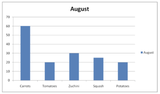
Judy can do the same thing with her data from August.
60 carrots
20 tomatoes
30 zucchini
25 squash
20 potatoes
Judy has a range of 20 to 60 in her August data, so she uses a different scale in her August bar graph. She uses increments of 10 on her Y-axis up to 70.
Richard Croft - https://commons.wikimedia.org/wiki/File:Vegetable_garden_-_geograph.org.uk_-_821006.jpg;https://pixabay.com/en/photos/vegetables/ - CC BY-NC
Then, Judy can display her data to the board and prove her garden is growing and producing vegetables that would earn her the recognition she is seeking. The board may ask her questions, or Judy can make conclusions using the data in her graph such as:
In both months, Judy grew the most carrots of any vegetable in her garden. Judy could also exactly explain the amount of carrots that were grown in both months by reading the Y-axis next to the carrots data bar.
Video Review
Explore More
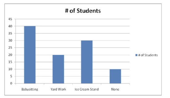
Use the bar graph to answer the following questions.
USGS - http://earthquake.usgs.gov/earthquakes/eqarchives/year/graphs.php - CC BY-NC
1. How many students were asked if they have summer jobs?
2. What is the range of the data?
3. What are the three jobs that students have?
4. How many students do not have a summer job?
5. How many students babysit?
6. How many students do yard work in the summer?
7. How many students work at an ice cream stand in the summer?
8. If ten more students got a job this summer, how many students would have summer jobs?
9. If each category had double the number of students in it, how many students would have summer jobs?
10. How many students would babysit?
11. How many students would work at an ice cream stand?
12. How many students wouldn’t have a summer job?
13. What scale was used for this graph?
14. What interval was used in the scale?
15. What is the difference between working at an ice cream stand and doing yard work?
Answers for Explore More Problems
To view the Explore More answers, open this PDF file and look for section 2.11.
Vocabulary
| Term | Definition |
|---|---|
| bar graph | A bar graph is a plot made of bars whose heights (vertical bars) or lengths (horizontal bars) represent the frequencies of each category, with space between each bar. |
| Analyze | To analyze is to look at data and draw conclusions based on patterns or numbers. |
Additional Resources
PLIX: Play, Learn, Interact, eXplore - Bar Graphs: Hockey Teams
Video: Reading Bar Graphs
Activities: Bar Graphs Discussion Questions
Study Aid: Presenting Univariate Data
Lesson Plan: Bar Graphs Lesson Plan
Practice: Single Bar Graphs
Real World: Babe Ruth and Home Runs