
2.3.2: Double Bar Graphs
- Page ID
- 5756
\( \newcommand{\vecs}[1]{\overset { \scriptstyle \rightharpoonup} {\mathbf{#1}} } \)
\( \newcommand{\vecd}[1]{\overset{-\!-\!\rightharpoonup}{\vphantom{a}\smash {#1}}} \)
\( \newcommand{\dsum}{\displaystyle\sum\limits} \)
\( \newcommand{\dint}{\displaystyle\int\limits} \)
\( \newcommand{\dlim}{\displaystyle\lim\limits} \)
\( \newcommand{\id}{\mathrm{id}}\) \( \newcommand{\Span}{\mathrm{span}}\)
( \newcommand{\kernel}{\mathrm{null}\,}\) \( \newcommand{\range}{\mathrm{range}\,}\)
\( \newcommand{\RealPart}{\mathrm{Re}}\) \( \newcommand{\ImaginaryPart}{\mathrm{Im}}\)
\( \newcommand{\Argument}{\mathrm{Arg}}\) \( \newcommand{\norm}[1]{\| #1 \|}\)
\( \newcommand{\inner}[2]{\langle #1, #2 \rangle}\)
\( \newcommand{\Span}{\mathrm{span}}\)
\( \newcommand{\id}{\mathrm{id}}\)
\( \newcommand{\Span}{\mathrm{span}}\)
\( \newcommand{\kernel}{\mathrm{null}\,}\)
\( \newcommand{\range}{\mathrm{range}\,}\)
\( \newcommand{\RealPart}{\mathrm{Re}}\)
\( \newcommand{\ImaginaryPart}{\mathrm{Im}}\)
\( \newcommand{\Argument}{\mathrm{Arg}}\)
\( \newcommand{\norm}[1]{\| #1 \|}\)
\( \newcommand{\inner}[2]{\langle #1, #2 \rangle}\)
\( \newcommand{\Span}{\mathrm{span}}\) \( \newcommand{\AA}{\unicode[.8,0]{x212B}}\)
\( \newcommand{\vectorA}[1]{\vec{#1}} % arrow\)
\( \newcommand{\vectorAt}[1]{\vec{\text{#1}}} % arrow\)
\( \newcommand{\vectorB}[1]{\overset { \scriptstyle \rightharpoonup} {\mathbf{#1}} } \)
\( \newcommand{\vectorC}[1]{\textbf{#1}} \)
\( \newcommand{\vectorD}[1]{\overrightarrow{#1}} \)
\( \newcommand{\vectorDt}[1]{\overrightarrow{\text{#1}}} \)
\( \newcommand{\vectE}[1]{\overset{-\!-\!\rightharpoonup}{\vphantom{a}\smash{\mathbf {#1}}}} \)
\( \newcommand{\vecs}[1]{\overset { \scriptstyle \rightharpoonup} {\mathbf{#1}} } \)
\(\newcommand{\longvect}{\overrightarrow}\)
\( \newcommand{\vecd}[1]{\overset{-\!-\!\rightharpoonup}{\vphantom{a}\smash {#1}}} \)
\(\newcommand{\avec}{\mathbf a}\) \(\newcommand{\bvec}{\mathbf b}\) \(\newcommand{\cvec}{\mathbf c}\) \(\newcommand{\dvec}{\mathbf d}\) \(\newcommand{\dtil}{\widetilde{\mathbf d}}\) \(\newcommand{\evec}{\mathbf e}\) \(\newcommand{\fvec}{\mathbf f}\) \(\newcommand{\nvec}{\mathbf n}\) \(\newcommand{\pvec}{\mathbf p}\) \(\newcommand{\qvec}{\mathbf q}\) \(\newcommand{\svec}{\mathbf s}\) \(\newcommand{\tvec}{\mathbf t}\) \(\newcommand{\uvec}{\mathbf u}\) \(\newcommand{\vvec}{\mathbf v}\) \(\newcommand{\wvec}{\mathbf w}\) \(\newcommand{\xvec}{\mathbf x}\) \(\newcommand{\yvec}{\mathbf y}\) \(\newcommand{\zvec}{\mathbf z}\) \(\newcommand{\rvec}{\mathbf r}\) \(\newcommand{\mvec}{\mathbf m}\) \(\newcommand{\zerovec}{\mathbf 0}\) \(\newcommand{\onevec}{\mathbf 1}\) \(\newcommand{\real}{\mathbb R}\) \(\newcommand{\twovec}[2]{\left[\begin{array}{r}#1 \\ #2 \end{array}\right]}\) \(\newcommand{\ctwovec}[2]{\left[\begin{array}{c}#1 \\ #2 \end{array}\right]}\) \(\newcommand{\threevec}[3]{\left[\begin{array}{r}#1 \\ #2 \\ #3 \end{array}\right]}\) \(\newcommand{\cthreevec}[3]{\left[\begin{array}{c}#1 \\ #2 \\ #3 \end{array}\right]}\) \(\newcommand{\fourvec}[4]{\left[\begin{array}{r}#1 \\ #2 \\ #3 \\ #4 \end{array}\right]}\) \(\newcommand{\cfourvec}[4]{\left[\begin{array}{c}#1 \\ #2 \\ #3 \\ #4 \end{array}\right]}\) \(\newcommand{\fivevec}[5]{\left[\begin{array}{r}#1 \\ #2 \\ #3 \\ #4 \\ #5 \\ \end{array}\right]}\) \(\newcommand{\cfivevec}[5]{\left[\begin{array}{c}#1 \\ #2 \\ #3 \\ #4 \\ #5 \\ \end{array}\right]}\) \(\newcommand{\mattwo}[4]{\left[\begin{array}{rr}#1 \amp #2 \\ #3 \amp #4 \\ \end{array}\right]}\) \(\newcommand{\laspan}[1]{\text{Span}\{#1\}}\) \(\newcommand{\bcal}{\cal B}\) \(\newcommand{\ccal}{\cal C}\) \(\newcommand{\scal}{\cal S}\) \(\newcommand{\wcal}{\cal W}\) \(\newcommand{\ecal}{\cal E}\) \(\newcommand{\coords}[2]{\left\{#1\right\}_{#2}}\) \(\newcommand{\gray}[1]{\color{gray}{#1}}\) \(\newcommand{\lgray}[1]{\color{lightgray}{#1}}\) \(\newcommand{\rank}{\operatorname{rank}}\) \(\newcommand{\row}{\text{Row}}\) \(\newcommand{\col}{\text{Col}}\) \(\renewcommand{\row}{\text{Row}}\) \(\newcommand{\nul}{\text{Nul}}\) \(\newcommand{\var}{\text{Var}}\) \(\newcommand{\corr}{\text{corr}}\) \(\newcommand{\len}[1]{\left|#1\right|}\) \(\newcommand{\bbar}{\overline{\bvec}}\) \(\newcommand{\bhat}{\widehat{\bvec}}\) \(\newcommand{\bperp}{\bvec^\perp}\) \(\newcommand{\xhat}{\widehat{\xvec}}\) \(\newcommand{\vhat}{\widehat{\vvec}}\) \(\newcommand{\uhat}{\widehat{\uvec}}\) \(\newcommand{\what}{\widehat{\wvec}}\) \(\newcommand{\Sighat}{\widehat{\Sigma}}\) \(\newcommand{\lt}{<}\) \(\newcommand{\gt}{>}\) \(\newcommand{\amp}{&}\) \(\definecolor{fillinmathshade}{gray}{0.9}\)Let's Think About It
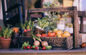
Public Domain Archive - https://pixabay.com/en/vegetable-basket-fruit-basket-349667/
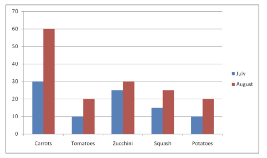
Judy has data for two different months that she grew vegetables in her garden. She has made single bar graphs with the data but thinks there must be a way to combine the data into one graph for easier readability.
This is the data Judy has for the months of July and August showing how many vegetables she grew.
| July | August |
|---|---|
| 30 carrots | 60 carrots |
| 10 tomatoes | 20 tomatoes |
| 25 zucchini | 30 zucchini |
| 15 squash | 25 squash |
| 10 potatoes | 20 potatoes |
Judy does not want 2 separate graphs displaying this data. She wants both months to be displayed in the same graph. She also wants to find out which vegetable had the most gain in growth from July to August.
In this concept, you will learn how to create double bar graphs to display more than one set of data.
Guidance
A double bar graph is used to display two sets of data on the same graph. For example, if you wanted to show the number of hours that students worked in one month compared to another month, we would use a double bar graph.
The information in a double bar graph is related, and it compares one set of data to another.
A double bar graph is made in the same way that a single bar graph is made except that instead of one bar of data there will be two bars of data. Here are the steps involved:
- Draw in the two axes. One with items being counted (x axis) and one with the scale that is going to be used to count (y axis).
- Decide on the best scale to use given the data.
- Draw in the bars to show the data.
- Draw one category in one color and the other category in another color.
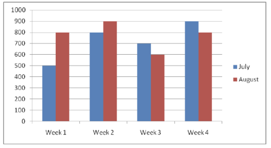
Here is the data for the number of ice cream cones sold each week at an ice cream stand during the months of July and August.
| July | August | |
|---|---|---|
| Week 1 | 500 | 800 |
| Week 2 | 800 | 900 |
| Week 3 | 700 | 600 |
| Week 4 | 900 | 800 |
A bar graph can be created to compare the data for July and August. First, draw in the axes.
https://www.flickr.com/photos/dafnecholet/5374200948/in/photolist-9bUbH3-52bbqE-bnZKrV-71TkY-bmz9Re-5jLKHc-5izHCT-4mDhZd-7op1pU-7pZMFo-3KGehw-i2NaxZ-yt9Lw-4jkjPw-7qsDEP-xmLLQ-4BrUQV-bub9vY-oK2G5o-bnZLkt-ymHeT-sY9ob-2hBtdR-4LYY7a-6hEsk-5t23c-b6s56x-5Xeyhr-5BpaJN-bmjWNZ-5Z92rv-dcq3uf-5qJkcU-aTQLeX-5PUQrL-7d1DXc-5RHQEm-4v96RA-5PQBiZ-82PPG-49yqbV-8Wtrmv-h9tzby-rUyG8-8VCZGy-4h17qT-8ntABt-zBgjg-8nryJ3-bkJdaF;https://pixabay.com/en/vegetable-basket-fruit-basket-349667/ - CC BY-NC
Next, write in the week numbers at the bottom and use a scale for the side. Since ice cream cone sales are in the hundreds, it makes sense to use a scale from 0 to 1000 counting by hundreds. Now, draw in the bars. Use blue for July and red for August.
CC BY-NC
This double bar graph displays the number of ice cream cones sold in two different months of July and August, using only one graph instead of two separate graphs.
Guided Practice
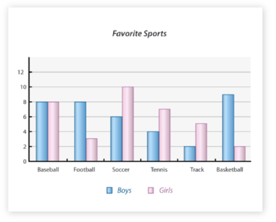
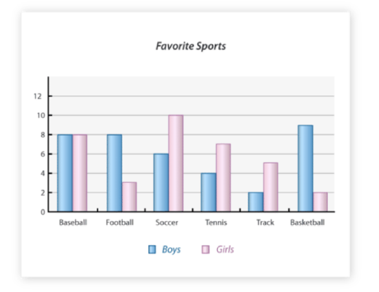
This bar graph displays the number of boys and girls who have a favorite sport. Since the graph shows both boys and girls, you can compare the data as well.
https://www.flickr.com/photos/dafnecholet/5374200948/in/photolist-9bUbH3-52bbqE-bnZKrV-71TkY-bmz9Re-5jLKHc-5izHCT-4mDhZd-7op1pU-7pZMFo-3KGehw-i2NaxZ-yt9Lw-4jkjPw-7qsDEP-xmLLQ-4BrUQV-bub9vY-oK2G5o-bnZLkt-ymHeT-sY9ob-2hBtdR-4LYY7a-6hEsk-5t23c-b6s56x-5Xeyhr-5BpaJN-bmjWNZ-5Z92rv-dcq3uf-5qJkcU-aTQLeX-5PUQrL-7d1DXc-5RHQEm-4v96RA-5PQBiZ-82PPG-49yqbV-8Wtrmv-h9tzby-rUyG8-8VCZGy-4h17qT-8ntABt-zBgjg-8nryJ3-bkJdaF;https://pixabay.com/en/vegetable-basket-fruit-basket-349667/ - CC BY-NC
What is the difference between the number of boys who chose track as their favorite sport and the number of girls who did?
First, find the sport being asked about. In this case it is track.
Next, compare the amount of boys and girls who like track by comparing the pink and blue bars representing track data. Five girls chose track while only 2 boys chose track as their favorite sport.
Then, subtract the data from one another to find the different between the data. Because more girls chose track than boys, you can subtract the number of boys from the number of girls.
5−2=3
The answer is 3. There is a difference of 3 girls compared with boys who chose track as their favorite sport.
Examples
Use each of the graphs in each example to answer the questions.
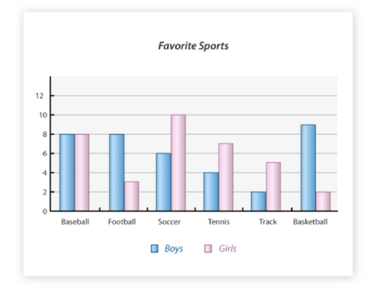
Example 1

https://www.flickr.com/photos/dafnecholet/5374200948/in/photolist-9bUbH3-52bbqE-bnZKrV-71TkY-bmz9Re-5jLKHc-5izHCT-4mDhZd-7op1pU-7pZMFo-3KGehw-i2NaxZ-yt9Lw-4jkjPw-7qsDEP-xmLLQ-4BrUQV-bub9vY-oK2G5o-bnZLkt-ymHeT-sY9ob-2hBtdR-4LYY7a-6hEsk-5t23c-b6s56x-5Xeyhr-5BpaJN-bmjWNZ-5Z92rv-dcq3uf-5qJkcU-aTQLeX-5PUQrL-7d1DXc-5RHQEm-4v96RA-5PQBiZ-82PPG-49yqbV-8Wtrmv-h9tzby-rUyG8-8VCZGy-4h17qT-8ntABt-zBgjg-8nryJ3-bkJdaF;https://pixabay.com/en/vegetable-basket-fruit-basket-349667/ - CC BY-NC
What is the favorite sport of girls?
First, look for the highest bar in the graph in pink. This bar color represents girl's favorite sports.
Next, look at the x axis to see what data is represented by that bar.
Then, double check that the y axis amount is indeed the highest amount of any favorite sport among girls. In this case, soccer is the favorite with 10 girls choosing it, which is also the highest amount on the graph for girls favorite sports.
The answer is soccer.
Example 2
https://www.flickr.com/photos/dafnecholet/5374200948/in/photolist-9bUbH3-52bbqE-bnZKrV-71TkY-bmz9Re-5jLKHc-5izHCT-4mDhZd-7op1pU-7pZMFo-3KGehw-i2NaxZ-yt9Lw-4jkjPw-7qsDEP-xmLLQ-4BrUQV-bub9vY-oK2G5o-bnZLkt-ymHeT-sY9ob-2hBtdR-4LYY7a-6hEsk-5t23c-b6s56x-5Xeyhr-5BpaJN-bmjWNZ-5Z92rv-dcq3uf-5qJkcU-aTQLeX-5PUQrL-7d1DXc-5RHQEm-4v96RA-5PQBiZ-82PPG-49yqbV-8Wtrmv-h9tzby-rUyG8-8VCZGy-4h17qT-8ntABt-zBgjg-8nryJ3-bkJdaF;https://pixabay.com/en/vegetable-basket-fruit-basket-349667/ - CC BY-NC
What is the favorite sport of boys?
First, look at the graph to find the highest bar in the graph in blue. This represents the favorite sports among boys.
Next, look at the x axis to see which sport is represented by the highest bar in blue.
Then, double check that the bar indeed matches with the highest data amount on the y axis.
The answer is basketball.
Example 3
https://www.flickr.com/photos/dafnecholet/5374200948/in/photolist-9bUbH3-52bbqE-bnZKrV-71TkY-bmz9Re-5jLKHc-5izHCT-4mDhZd-7op1pU-7pZMFo-3KGehw-i2NaxZ-yt9Lw-4jkjPw-7qsDEP-xmLLQ-4BrUQV-bub9vY-oK2G5o-bnZLkt-ymHeT-sY9ob-2hBtdR-4LYY7a-6hEsk-5t23c-b6s56x-5Xeyhr-5BpaJN-bmjWNZ-5Z92rv-dcq3uf-5qJkcU-aTQLeX-5PUQrL-7d1DXc-5RHQEm-4v96RA-5PQBiZ-82PPG-49yqbV-8Wtrmv-h9tzby-rUyG8-8VCZGy-4h17qT-8ntABt-zBgjg-8nryJ3-bkJdaF;https://pixabay.com/en/vegetable-basket-fruit-basket-349667/ - CC BY-NC
Which sport is liked equally by both boys and girls?
First, understand the questions by realizing you are looking for two bars that are representing equal data.
Next, find the two bars on the graph that line up equally with one another. Both the blue and pink will be at the same height on the graph.
Then, look at the x axis to determine which sport is represented by the equal data among boys and girls.
The answer is baseball.
Follow Up

Judy wanted to find a way to display her data from both months of July and August in one graph. She has her data organized showing how many vegetables were grown in both July and August:
| July | August |
|---|---|
| 30 carrots | 60 carrots |
| 10 tomatoes | 20 tomatoes |
| 25 zucchini | 30 zucchini |
| 15 squash | 25 squash |
| 10 potatoes | 20 potatoes |
First, Judy can create her bar graph by deciding on a scale and titles for her X-axis. Her range of data is between 10 and 60, so a scale of 0-70 counting by tens is an appropriate scale. Her X-axis will be labeled by each vegetable she grows in her garden.
Next, Judy decides to let a blue bar represent July and a red bar represent August. This will separate the data so it does not get mixed up, but allows the data to be shown in the same graph.
Then, Judy can put the graph all together and use the graph to describe patterns she sees in her vegetable growing. The question she wanted answered was, which vegetable had gained the most growth between July and August. To find the answer, look for the bars that have the biggest difference in amounts of vegetables grown.
CC BY-NC
The answer is carrots. There were only 30 carrots grown in July, but 60 carrots were grown in August. That is the most growth out of any vegetable in Judy's garden.
Video Review
Explore More
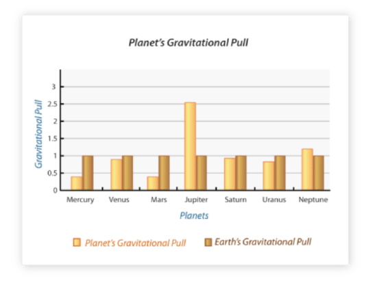
Use the following double bar graph to answer the following questions.
https://www.flickr.com/photos/dafnecholet/5374200948/in/photolist-9bUbH3-52bbqE-bnZKrV-71TkY-bmz9Re-5jLKHc-5izHCT-4mDhZd-7op1pU-7pZMFo-3KGehw-i2NaxZ-yt9Lw-4jkjPw-7qsDEP-xmLLQ-4BrUQV-bub9vY-oK2G5o-bnZLkt-ymHeT-sY9ob-2hBtdR-4LYY7a-6hEsk-5t23c-b6s56x-5Xeyhr-5BpaJN-bmjWNZ-5Z92rv-dcq3uf-5qJkcU-aTQLeX-5PUQrL-7d1DXc-5RHQEm-4v96RA-5PQBiZ-82PPG-49yqbV-8Wtrmv-h9tzby-rUyG8-8VCZGy-4h17qT-8ntABt-zBgjg-8nryJ3-bkJdaF;https://pixabay.com/en/vegetable-basket-fruit-basket-349667/ - CC BY-NC
1. What is this graph measuring?
2. What does the horizontal axis represent?
3. What does the vertical axis represent?
4. What is being compared?
5. Is this a single bar graph or a double bar graph?
6. What is the scale of measurement?
7. What is the interval of the scale?
8. Which planet has the greatest gravitational pull?
9. What is it's measure?
10. Which planet has the least gravitational pull?
11. What is it's measure?
12. Which planet has the greatest difference between its gravitational pull and earth's gravitational pull?
13. What is the measure of Neptune's gravitational pull?
14. What is the measure of Venus' gravitational pull?
15. Which planet has a gravitational pull that is closest to earth's gravitational pull?
Answers for Explore More Problems
To view the Explore More answers, open this PDF file and look for section 2.12.
Vocabulary
| Term | Definition |
|---|---|
| double bar graphs | Double bar graphs are two bar graphs plotted side by side. |
Additional Resources
PLIX: Play, Learn, Interact, eXplore - Double Bar Graphs: Favorite Cookies Chart
Video: Reading Bar Graphs
Activities: Double Bar Graphs Discussion Questions
Lesson Plans: Double Bar Graphs Lesson Plan
Practice: Double Bar Graphs
Real World: Double Bar Graphs