2.3.3: Multiple Bar Graphs
- Page ID
- 5757
\( \newcommand{\vecs}[1]{\overset { \scriptstyle \rightharpoonup} {\mathbf{#1}} } \)
\( \newcommand{\vecd}[1]{\overset{-\!-\!\rightharpoonup}{\vphantom{a}\smash {#1}}} \)
\( \newcommand{\id}{\mathrm{id}}\) \( \newcommand{\Span}{\mathrm{span}}\)
( \newcommand{\kernel}{\mathrm{null}\,}\) \( \newcommand{\range}{\mathrm{range}\,}\)
\( \newcommand{\RealPart}{\mathrm{Re}}\) \( \newcommand{\ImaginaryPart}{\mathrm{Im}}\)
\( \newcommand{\Argument}{\mathrm{Arg}}\) \( \newcommand{\norm}[1]{\| #1 \|}\)
\( \newcommand{\inner}[2]{\langle #1, #2 \rangle}\)
\( \newcommand{\Span}{\mathrm{span}}\)
\( \newcommand{\id}{\mathrm{id}}\)
\( \newcommand{\Span}{\mathrm{span}}\)
\( \newcommand{\kernel}{\mathrm{null}\,}\)
\( \newcommand{\range}{\mathrm{range}\,}\)
\( \newcommand{\RealPart}{\mathrm{Re}}\)
\( \newcommand{\ImaginaryPart}{\mathrm{Im}}\)
\( \newcommand{\Argument}{\mathrm{Arg}}\)
\( \newcommand{\norm}[1]{\| #1 \|}\)
\( \newcommand{\inner}[2]{\langle #1, #2 \rangle}\)
\( \newcommand{\Span}{\mathrm{span}}\) \( \newcommand{\AA}{\unicode[.8,0]{x212B}}\)
\( \newcommand{\vectorA}[1]{\vec{#1}} % arrow\)
\( \newcommand{\vectorAt}[1]{\vec{\text{#1}}} % arrow\)
\( \newcommand{\vectorB}[1]{\overset { \scriptstyle \rightharpoonup} {\mathbf{#1}} } \)
\( \newcommand{\vectorC}[1]{\textbf{#1}} \)
\( \newcommand{\vectorD}[1]{\overrightarrow{#1}} \)
\( \newcommand{\vectorDt}[1]{\overrightarrow{\text{#1}}} \)
\( \newcommand{\vectE}[1]{\overset{-\!-\!\rightharpoonup}{\vphantom{a}\smash{\mathbf {#1}}}} \)
\( \newcommand{\vecs}[1]{\overset { \scriptstyle \rightharpoonup} {\mathbf{#1}} } \)
\( \newcommand{\vecd}[1]{\overset{-\!-\!\rightharpoonup}{\vphantom{a}\smash {#1}}} \)
\(\newcommand{\avec}{\mathbf a}\) \(\newcommand{\bvec}{\mathbf b}\) \(\newcommand{\cvec}{\mathbf c}\) \(\newcommand{\dvec}{\mathbf d}\) \(\newcommand{\dtil}{\widetilde{\mathbf d}}\) \(\newcommand{\evec}{\mathbf e}\) \(\newcommand{\fvec}{\mathbf f}\) \(\newcommand{\nvec}{\mathbf n}\) \(\newcommand{\pvec}{\mathbf p}\) \(\newcommand{\qvec}{\mathbf q}\) \(\newcommand{\svec}{\mathbf s}\) \(\newcommand{\tvec}{\mathbf t}\) \(\newcommand{\uvec}{\mathbf u}\) \(\newcommand{\vvec}{\mathbf v}\) \(\newcommand{\wvec}{\mathbf w}\) \(\newcommand{\xvec}{\mathbf x}\) \(\newcommand{\yvec}{\mathbf y}\) \(\newcommand{\zvec}{\mathbf z}\) \(\newcommand{\rvec}{\mathbf r}\) \(\newcommand{\mvec}{\mathbf m}\) \(\newcommand{\zerovec}{\mathbf 0}\) \(\newcommand{\onevec}{\mathbf 1}\) \(\newcommand{\real}{\mathbb R}\) \(\newcommand{\twovec}[2]{\left[\begin{array}{r}#1 \\ #2 \end{array}\right]}\) \(\newcommand{\ctwovec}[2]{\left[\begin{array}{c}#1 \\ #2 \end{array}\right]}\) \(\newcommand{\threevec}[3]{\left[\begin{array}{r}#1 \\ #2 \\ #3 \end{array}\right]}\) \(\newcommand{\cthreevec}[3]{\left[\begin{array}{c}#1 \\ #2 \\ #3 \end{array}\right]}\) \(\newcommand{\fourvec}[4]{\left[\begin{array}{r}#1 \\ #2 \\ #3 \\ #4 \end{array}\right]}\) \(\newcommand{\cfourvec}[4]{\left[\begin{array}{c}#1 \\ #2 \\ #3 \\ #4 \end{array}\right]}\) \(\newcommand{\fivevec}[5]{\left[\begin{array}{r}#1 \\ #2 \\ #3 \\ #4 \\ #5 \\ \end{array}\right]}\) \(\newcommand{\cfivevec}[5]{\left[\begin{array}{c}#1 \\ #2 \\ #3 \\ #4 \\ #5 \\ \end{array}\right]}\) \(\newcommand{\mattwo}[4]{\left[\begin{array}{rr}#1 \amp #2 \\ #3 \amp #4 \\ \end{array}\right]}\) \(\newcommand{\laspan}[1]{\text{Span}\{#1\}}\) \(\newcommand{\bcal}{\cal B}\) \(\newcommand{\ccal}{\cal C}\) \(\newcommand{\scal}{\cal S}\) \(\newcommand{\wcal}{\cal W}\) \(\newcommand{\ecal}{\cal E}\) \(\newcommand{\coords}[2]{\left\{#1\right\}_{#2}}\) \(\newcommand{\gray}[1]{\color{gray}{#1}}\) \(\newcommand{\lgray}[1]{\color{lightgray}{#1}}\) \(\newcommand{\rank}{\operatorname{rank}}\) \(\newcommand{\row}{\text{Row}}\) \(\newcommand{\col}{\text{Col}}\) \(\renewcommand{\row}{\text{Row}}\) \(\newcommand{\nul}{\text{Nul}}\) \(\newcommand{\var}{\text{Var}}\) \(\newcommand{\corr}{\text{corr}}\) \(\newcommand{\len}[1]{\left|#1\right|}\) \(\newcommand{\bbar}{\overline{\bvec}}\) \(\newcommand{\bhat}{\widehat{\bvec}}\) \(\newcommand{\bperp}{\bvec^\perp}\) \(\newcommand{\xhat}{\widehat{\xvec}}\) \(\newcommand{\vhat}{\widehat{\vvec}}\) \(\newcommand{\uhat}{\widehat{\uvec}}\) \(\newcommand{\what}{\widehat{\wvec}}\) \(\newcommand{\Sighat}{\widehat{\Sigma}}\) \(\newcommand{\lt}{<}\) \(\newcommand{\gt}{>}\) \(\newcommand{\amp}{&}\) \(\definecolor{fillinmathshade}{gray}{0.9}\)
A farmer takes his produce to the farmers market each weekend. The farmers market runs on three days (Friday, Saturday, Sunday). The farmer keeps track of the amount of produce he sells each day from each vegetable. Here is data from the weekend:
| Type of Vegetable: | Pounds Sold: Day One | Pounds Sold: Day Two | Pounds Sold: Day Three |
|---|---|---|---|
| Squash | 32 lbs. | 36 lbs. | 36 lbs. |
| Zucchini | 40 lbs. | 33 lbs. | 37 lbs. |
| Corn | 56 lbs. | 65 lbs. | 67 lbs. |
| Carrots | 28 lbs. | 25 lbs. | 23 lbs. |
| Romaine Lettuce | 27 lbs. | 31 lbs. | 34 lbs. |
| Tomatoes | 44 lbs. | 54 lbs. | 58 lbs. |
The farmer wants to compare his data and look for his best selling vegetable and which day that sale occurred, so he can be sure to plant more to sell. He will need to display his data and then compare.
In this concept, you will learn how to create multiple data set bar graphs and compare them to draw conclusions.
Multiple Bar Graphs
Sometimes there are more than two sets of data to be compared in a bar graph. In that case, a multiple bar graph can be used. A multiple bar graph compares as many sets of data you want. The process for creating a multiple bar graph is just like creating any other bar graph, only you will have more colors to represent different sets of data.
To create a multiple bar graph:
- Draw the horizontal (x) and vertical (y) axis.
- Give the graph a title.
- Label the horizontal x axis.
- Label the vertical y axis.
- Look at the range in data and decide how the units on the vertical axis (y) should be labeled.
- For each item on the horizontal (x) axis, draw a vertical column to the appropriate value however many times as you have sets of data. For example, if you are looking at 3 days worth of data, you will have 3 bars per item.
- Choose three colors to represent each different data set. Make sure to label the data sets in a key alongside the graph.
Sometimes comparing data can also be done by comparing data sets across multiple different bar graphs. The difference is the data is split versus all being compared in one graph. Either method allows you to analyze and compare the data being displayed.
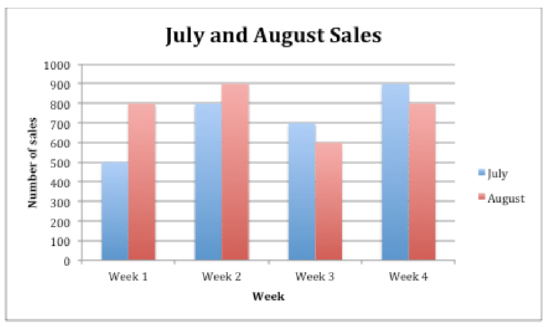
The following is an example of a bar graph showing ice cream sales in the months of July and August.
Melissa Sanders
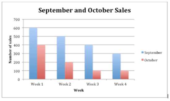
Another bar graph displaying the ice cream sales in September and October can be compared to the sales in July and August.
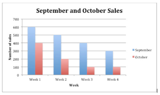
When you are comparing data across two bar graphs, keeping the scale the same will allow for better comparison. Below is the data set for September and October ice cream sales which can be turned into another double bar graph.
| September | October | |
|---|---|---|
| Week 1 | 600 | 400 |
| Week 2 | 500 | 200 |
| Week 3 | 400 | 100 |
| Week 4 | 300 |
100 |
Melissa Sanders
Examples
Example 1
Earlier, you were given a problem about the farmer and his produce that he sells at the farmers market.
Here is the data he collected from the weekend at the market:
| Type of Vegetable: | Pounds Sold: Day One | Pounds Sold: Day Two | Pounds Sold: Day Three |
|---|---|---|---|
| Squash | 32 lbs. | 36 lbs. | 36 lbs. |
| Zucchini | 40 lbs. | 33 lbs. | 37 lbs. |
| Corn | 56 lbs. | 65 lbs. | 67 lbs. |
| Carrots | 28 lbs. | 25 lbs. | 23 lbs. |
| Romaine Lettuce | 27 lbs. | 31 lbs. | 34 lbs. |
| Tomatoes | 44 lbs. | 54 lbs. | 58 lbs. |
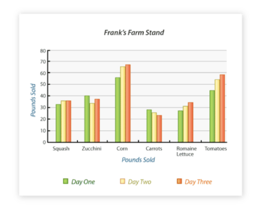
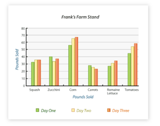
He now wants to display his data and figure out which vegetable sold the most pounds and on which day this occurred. He decides to display his data in a bar graph to compare each vegetable each day.
First, the farmer takes his data from the data table and creates a multiple bar graph. These are the steps he took.
- Draw the horizontal (x) and vertical (y) axis.
- Give the graph the title “Frank’s Farm Stand.”
- Label the horizontal axis “Vegetables.”
- Label the vertical axis “Pounds Sold.”
- Look at the range in data and decide how the units on the vertical axis (y) should be labeled. In this case, label the vertical axis 0 - 80 by tens.
- For each vegetable on the horizontal (x) axis, draw a vertical column to the appropriate value three times, one column representing day one, a second column for day two, and a third column for day three.
- Choose three colors, one to represent the values for day one, one for the values for day two, and finally one to represent the values for day three.
Melissa Sanders;Brian Giesen - https://en.wikipedia.org/wiki/Farmers_Market,_Dallas#/media/File:The_Farmers_Market_of_Dallas,_Texas.jpg;https://www.flickr.com/photos/briangiesen/4308014481/in/photolist-7yFGBK-3CJPvo-73QFQ5-ocNQzn-4Kjqac-4qspyy-cqAifm-mPBzs-dkrrGH-7325t1-djZw2h-6Ycuuk-3kkXJZ-dmbp-9PKts6-9PNiDy-ohX1pU-afd1Fs-dkrrFR-9PNixC-9PKnT6-8yiAFD-a6KekB-cy3fpA-9PNfnW-rs7fNL-eZZLFZ-5eF8dk-8JaRPE-9PKqUF-9PNhDy-9PKqdx-duEj24-ajqGia-a2B4K4-7h4Qjb-a2B5wi-6ZEZn2-9PNfLo-vD17vc-8UF9cK-8UF94k-9PNiqb-9PNiky-azww6H-a2E1Ah-329EJ2-a5Y1M2-9PNkYJ-8nuFbR - CC BY-NC
Next, he looks for the bar in the graph that shows the highest amount sold in pounds. The highest amount sold according to the graph is the orange bar in the Corn column.
Then, he uses the key in his graph to determine the day of the market in which that amount of corn sold. The orange bar represents Day 3 of the farmers market.
The answer is that the farmer sold the most corn of any produce on Day 3 of the market.
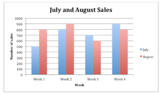
Use the following graph for the next few questions.
Melissa Sanders
Melissa Sanders
Example 2
Determine which month and week, of all total ice cream sales, was the highest amount sold.
First, pick one graph to analyze first. For July and August, there is a tie of $900 of ice cream sales in August Week 2 and July Week 4.
Next, analyze the other graph. In September and October, the highest sales week was $600 in September Week 1.
Then, compare the two findings to determine which month and week had the overall highest sales. September Week 1, while the highest sales in that graph, was lower in sales than August Week 2 and July Week 4.
The answer is both August Week 2 and July Week 4 had the highest ice cream sales.
Use the Ice Cream Sales data to answer the following questions.
Example 3
Which week in the month of September had the best sales and what was the sale total?
First, look for the graph which contains the data set in the question.
Next, find the week in September (represented in blue) with the highest sales.
Then, look at the Y-axis to determine to total amount in sales for that highest week.
The answer is Week One with $600 in sales.
Example 4
What conclusion can you draw about the direction of ice cream sales during the month of October?
First, look for the graph which contains the data set being asked about.
Next, analyze the October data only (represented in red).
Then, look at the pattern in the sales from Week 1 through Week 4. There is a decrease in sales each week as the month goes on.
The answer is ice cream sales in the month of October decreased steadily week by week.
Example 5
Did week 2 in September or week 2 in July have better sales?
First, look at the graphs that contain the data necessary to answer. This question compares both graphs, so both will need to be analyzed. Pick one to start with, for example, July Week 2, and check the Y-axis for sales total. July Week 2 sales totaled $800.
Next, look at the other graph and find September Week 2. Sales totaled $500 in September Week 2.
Then, compare the two sets of data from each graph to determine which week and month had better sales. July Week 2 had $600 in sales versus September Week 2 having only $500 in sales.
The answer is Week 2 in July.
Review
Use this bar graph to answer the following questions.
Melissa Sanders;Brian Giesen - https://en.wikipedia.org/wiki/Farmers_Market,_Dallas#/media/File:The_Farmers_Market_of_Dallas,_Texas.jpg;https://www.flickr.com/photos/briangiesen/4308014481/in/photolist-7yFGBK-3CJPvo-73QFQ5-ocNQzn-4Kjqac-4qspyy-cqAifm-mPBzs-dkrrGH-7325t1-djZw2h-6Ycuuk-3kkXJZ-dmbp-9PKts6-9PNiDy-ohX1pU-afd1Fs-dkrrFR-9PNixC-9PKnT6-8yiAFD-a6KekB-cy3fpA-9PNfnW-rs7fNL-eZZLFZ-5eF8dk-8JaRPE-9PKqUF-9PNhDy-9PKqdx-duEj24-ajqGia-a2B4K4-7h4Qjb-a2B5wi-6ZEZn2-9PNfLo-vD17vc-8UF9cK-8UF94k-9PNiqb-9PNiky-azww6H-a2E1Ah-329EJ2-a5Y1M2-9PNkYJ-8nuFbR - CC BY-NC
- Which day had the greatest pounds of carrots sold?
- Which vegetable was the most popular over all?
- Which vegetable was the least popular over all?
- Which vegetable had the smallest difference between the number of pounds sold per day?
- Which vegetable was the most popular on day one?
- Which vegetable was the most popular on day two?
- Which vegetable was the most popular on day three?
- About how many pounds of zucchini were sold on day two?
- About how many pounds of tomatoes were sold on day one?
- About how many pounds of carrots were sold on day three?
- About how many pounds of squash was sold on day one?
- How many total pounds of squash was sold on days 1, 2 and 3?
- How many total pounds of zucchini was sold on days 1, 2 and 3?
- How many total pounds of carrots was sold on days 1, 2, and 3?
- How many total pounds of lettuce was sold on day 3?
Vocabulary
| Term | Definition |
|---|---|
| Bar graph | This graph represents data in a visual way by using columns to compare quantities or amounts. |
| Multiple Bar Graph | A multiple bar graph is a graph that has multiple bars for each category. Multiple bar graphs are designed to compare the data collected during multiple times or events. |
Additional Resources
PLIX: Play, Learn, Interact, eXplore - Multiple Bar Graphs
Video: Reading Bar Graphs
Practice: Multiple Bar Graphs

