
2.4.1: Understand and Create Histograms
- Page ID
- 5758
\( \newcommand{\vecs}[1]{\overset { \scriptstyle \rightharpoonup} {\mathbf{#1}} } \)
\( \newcommand{\vecd}[1]{\overset{-\!-\!\rightharpoonup}{\vphantom{a}\smash {#1}}} \)
\( \newcommand{\id}{\mathrm{id}}\) \( \newcommand{\Span}{\mathrm{span}}\)
( \newcommand{\kernel}{\mathrm{null}\,}\) \( \newcommand{\range}{\mathrm{range}\,}\)
\( \newcommand{\RealPart}{\mathrm{Re}}\) \( \newcommand{\ImaginaryPart}{\mathrm{Im}}\)
\( \newcommand{\Argument}{\mathrm{Arg}}\) \( \newcommand{\norm}[1]{\| #1 \|}\)
\( \newcommand{\inner}[2]{\langle #1, #2 \rangle}\)
\( \newcommand{\Span}{\mathrm{span}}\)
\( \newcommand{\id}{\mathrm{id}}\)
\( \newcommand{\Span}{\mathrm{span}}\)
\( \newcommand{\kernel}{\mathrm{null}\,}\)
\( \newcommand{\range}{\mathrm{range}\,}\)
\( \newcommand{\RealPart}{\mathrm{Re}}\)
\( \newcommand{\ImaginaryPart}{\mathrm{Im}}\)
\( \newcommand{\Argument}{\mathrm{Arg}}\)
\( \newcommand{\norm}[1]{\| #1 \|}\)
\( \newcommand{\inner}[2]{\langle #1, #2 \rangle}\)
\( \newcommand{\Span}{\mathrm{span}}\) \( \newcommand{\AA}{\unicode[.8,0]{x212B}}\)
\( \newcommand{\vectorA}[1]{\vec{#1}} % arrow\)
\( \newcommand{\vectorAt}[1]{\vec{\text{#1}}} % arrow\)
\( \newcommand{\vectorB}[1]{\overset { \scriptstyle \rightharpoonup} {\mathbf{#1}} } \)
\( \newcommand{\vectorC}[1]{\textbf{#1}} \)
\( \newcommand{\vectorD}[1]{\overrightarrow{#1}} \)
\( \newcommand{\vectorDt}[1]{\overrightarrow{\text{#1}}} \)
\( \newcommand{\vectE}[1]{\overset{-\!-\!\rightharpoonup}{\vphantom{a}\smash{\mathbf {#1}}}} \)
\( \newcommand{\vecs}[1]{\overset { \scriptstyle \rightharpoonup} {\mathbf{#1}} } \)
\( \newcommand{\vecd}[1]{\overset{-\!-\!\rightharpoonup}{\vphantom{a}\smash {#1}}} \)
\(\newcommand{\avec}{\mathbf a}\) \(\newcommand{\bvec}{\mathbf b}\) \(\newcommand{\cvec}{\mathbf c}\) \(\newcommand{\dvec}{\mathbf d}\) \(\newcommand{\dtil}{\widetilde{\mathbf d}}\) \(\newcommand{\evec}{\mathbf e}\) \(\newcommand{\fvec}{\mathbf f}\) \(\newcommand{\nvec}{\mathbf n}\) \(\newcommand{\pvec}{\mathbf p}\) \(\newcommand{\qvec}{\mathbf q}\) \(\newcommand{\svec}{\mathbf s}\) \(\newcommand{\tvec}{\mathbf t}\) \(\newcommand{\uvec}{\mathbf u}\) \(\newcommand{\vvec}{\mathbf v}\) \(\newcommand{\wvec}{\mathbf w}\) \(\newcommand{\xvec}{\mathbf x}\) \(\newcommand{\yvec}{\mathbf y}\) \(\newcommand{\zvec}{\mathbf z}\) \(\newcommand{\rvec}{\mathbf r}\) \(\newcommand{\mvec}{\mathbf m}\) \(\newcommand{\zerovec}{\mathbf 0}\) \(\newcommand{\onevec}{\mathbf 1}\) \(\newcommand{\real}{\mathbb R}\) \(\newcommand{\twovec}[2]{\left[\begin{array}{r}#1 \\ #2 \end{array}\right]}\) \(\newcommand{\ctwovec}[2]{\left[\begin{array}{c}#1 \\ #2 \end{array}\right]}\) \(\newcommand{\threevec}[3]{\left[\begin{array}{r}#1 \\ #2 \\ #3 \end{array}\right]}\) \(\newcommand{\cthreevec}[3]{\left[\begin{array}{c}#1 \\ #2 \\ #3 \end{array}\right]}\) \(\newcommand{\fourvec}[4]{\left[\begin{array}{r}#1 \\ #2 \\ #3 \\ #4 \end{array}\right]}\) \(\newcommand{\cfourvec}[4]{\left[\begin{array}{c}#1 \\ #2 \\ #3 \\ #4 \end{array}\right]}\) \(\newcommand{\fivevec}[5]{\left[\begin{array}{r}#1 \\ #2 \\ #3 \\ #4 \\ #5 \\ \end{array}\right]}\) \(\newcommand{\cfivevec}[5]{\left[\begin{array}{c}#1 \\ #2 \\ #3 \\ #4 \\ #5 \\ \end{array}\right]}\) \(\newcommand{\mattwo}[4]{\left[\begin{array}{rr}#1 \amp #2 \\ #3 \amp #4 \\ \end{array}\right]}\) \(\newcommand{\laspan}[1]{\text{Span}\{#1\}}\) \(\newcommand{\bcal}{\cal B}\) \(\newcommand{\ccal}{\cal C}\) \(\newcommand{\scal}{\cal S}\) \(\newcommand{\wcal}{\cal W}\) \(\newcommand{\ecal}{\cal E}\) \(\newcommand{\coords}[2]{\left\{#1\right\}_{#2}}\) \(\newcommand{\gray}[1]{\color{gray}{#1}}\) \(\newcommand{\lgray}[1]{\color{lightgray}{#1}}\) \(\newcommand{\rank}{\operatorname{rank}}\) \(\newcommand{\row}{\text{Row}}\) \(\newcommand{\col}{\text{Col}}\) \(\renewcommand{\row}{\text{Row}}\) \(\newcommand{\nul}{\text{Nul}}\) \(\newcommand{\var}{\text{Var}}\) \(\newcommand{\corr}{\text{corr}}\) \(\newcommand{\len}[1]{\left|#1\right|}\) \(\newcommand{\bbar}{\overline{\bvec}}\) \(\newcommand{\bhat}{\widehat{\bvec}}\) \(\newcommand{\bperp}{\bvec^\perp}\) \(\newcommand{\xhat}{\widehat{\xvec}}\) \(\newcommand{\vhat}{\widehat{\vvec}}\) \(\newcommand{\uhat}{\widehat{\uvec}}\) \(\newcommand{\what}{\widehat{\wvec}}\) \(\newcommand{\Sighat}{\widehat{\Sigma}}\) \(\newcommand{\lt}{<}\) \(\newcommand{\gt}{>}\) \(\newcommand{\amp}{&}\) \(\definecolor{fillinmathshade}{gray}{0.9}\)Histograms
An extension of the bar graph is the histogram. A histogram is a type of vertical bar graph in which the bars represent grouped continuous data. The shape of a histogram can tell you a lot about the distribution of the data, as well as provide you with information about the mean, median, and mode of the data set. The following are some typical histograms, with a caption below each one explaining the distribution of the data, as well as the characteristics of the mean, median, and mode. Distributions can have other shapes besides the ones shown below, but these represent the most common ones that you will see when analyzing data. In each of the graphs below, the distributions are not perfectly shaped, but are shaped enough to identify an overall pattern.
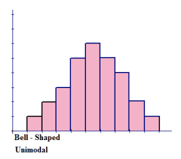
Figure above represents a bell-shaped distribution, which has a single peak and tapers off to both the left and to the right of the peak. The shape appears to be symmetric about the center of the histogram. The single peak indicates that the distribution is unimodal. The highest peak of the histogram represents the location of the mode of the data set. The mode is the data value that occurs the most often in a data set. For a symmetric histogram, the values of the mean, median, and mode are all the same and are all located at the center of the distribution.
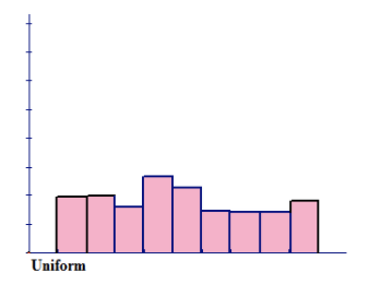
Figure above represents a distribution that is approximately uniform and forms a rectangular, flat shape. The frequency of each class is approximately the same.
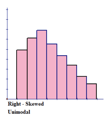
Figure above represents a right-skewed distribution, which has a peak to the left of the distribution and data values that taper off to the right. This distribution has a single peak and is also unimodal. For a histogram that is skewed to the right, the mean is located to the right on the distribution and is the largest value of the measures of central tendency. The mean has the largest value because it is strongly affected by the outliers on the right tail that pull the mean to the right. The mode is the smallest value, and it is located to the left on the distribution. The mode always occurs at the highest point of the peak. The median is located between the mode and the mean.
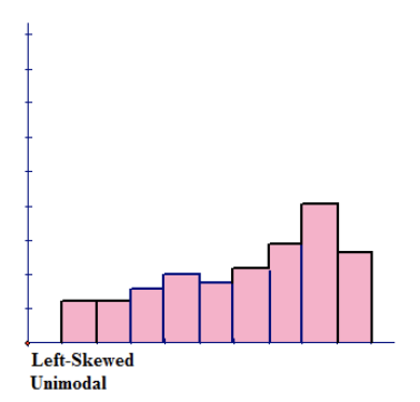
Figure above represents a left-skewed distribution, which has a peak to the right of the distribution and data values that taper off to the left. This distribution has a single peak and is also unimodal. For a histogram that is skewed to the left, the mean is located to the left on the distribution and is the smallest value of the measures of central tendency. The mean has the smallest value because it is strongly affected by the outliers on the left tail that pull the mean to the left. The median is located between the mode and the mean.
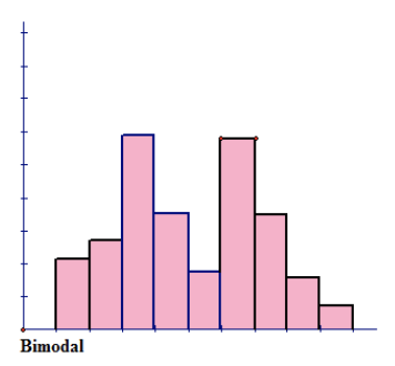
Figure above has no shape that can be defined. The only defining characteristic about this distribution is that it has 2 peaks of the same height. This means that the distribution is bimodal.
While there are similarities between a bar graph and a histogram, such as each bar being the same width, a histogram has no spaces between the bars. The quantitative data is grouped according to a determined bin size, or interval. The bin size refers to the width of each bar, and the data is placed in the appropriate bin.
The bins, or groups of data, are plotted on the x-axis, and the frequencies of the bins are plotted on the y-axis. A grouped frequency distribution is constructed for the numerical data, and this table is used to create the histogram. In most cases, the grouped frequency distribution is designed so there are no breaks in the intervals. The last value of one bin is actually the first value counted in the next bin. This means that if you had groups of data with a bin size of 10, the bins would be represented by the notation [0-10), [10-20), [20-30), etc. Each bin appears to contain 11 values, which is 1 more than the desired bin size of 10. Therefore, the last digit of each bin is counted as the first digit of the following bin.
The first bin includes the values 0 through 9, and the next bin includes the values 9 through 19. This makes the bins the proper size. Bin sizes are written in this manner to simplify the process of grouping the data. The first bin can begin with the smallest number of the data set and end with the value determined by adding the bin width to this value, or the bin can begin with a reasonable value that is smaller than the smallest data value.
Constructing a Frequency Distribution Table
1. Construct a frequency distribution table with a bin size of 10 for the following data, which represents the ages of 30 lottery winners:
384129334074664560552552546146515957666232476550392235727749
Step 1: Determine the range of the data by subtracting the smallest value from the largest value.
Range: 77−22=55
Step 2: Divide the range by the bin size to ensure that you have at least 5 groups of data. A histogram should have from 5 to 10 bins to make it meaningful: 5510=5.5≈6. Since you cannot have 0.5 of a bin, the result indicates that you will have at least 6 bins.
Step 3: Construct the table.
| Bin | Frequency |
|---|---|
| [20−30) | 3 |
| [30−40) | 5 |
| [40−50) | 6 |
| [50−60) | 8 |
| [60−70) | 5 |
| [70−80) | 3 |
Step 4: Determine the sum of the frequency column to ensure that all the data has been grouped.
3+5+6+8+5+3=30
When data is grouped in a frequency distribution table, the actual data values are lost. The table indicates how many values are in each group, but it doesn't show the actual values.
There are many different ways to create a distribution table and many different distribution tables that can be created. However, for the purpose of constructing a histogram, the method shown works very well, and it is not difficult to complete.
2. The numbers of years of service for 75 teachers in a small town are listed below:
1, 6, 11, 26, 21, 18, 2, 5, 27, 33, 7, 15, 22, 30, 831, 5, 25, 20, 19, 4, 9, 19, 34, 3, 16, 23, 31, 10, 42, 31, 26, 19, 3, 12, 14, 28, 32, 1, 17, 24, 34, 16, 1,18, 29, 10, 12, 30, 13, 7, 8, 27, 3, 11, 26, 33, 29, 207, 21, 11, 19, 35, 16, 5, 2, 19, 24, 13, 14, 28, 10, 31
Using the above data, construct a frequency distribution table with a bin size of 5.
Range: 35−1345=34=6.8≈7
You will have 7 bins.
When the number of data values is very large, another column is often inserted in the distribution table. This column is a tally column, and it is used to account for the number of values within a bin. A tally column facilitates the creation of the distribution table and usually allows the task to be completed more quickly. For each value that is in a bin, draw a stroke in the Tally column. To make counting the strokes easier, draw 4 strokes and cross them out with the fifth stroke. This process bundles the strokes in groups of 5, and the frequency can be readily determined.
| Bin | Tally | Frequency |
|---|---|---|
| [0−5) | |||| |||| | | 11 |
| [5−10) | |||| |||| | 9 |
| [10−15) | |||| |||| || | 12 |
| [15−20) | |||| |||| |||| | 14 |
| [20−25) | |||| || | 7 |
| [25−30) | |||| |||| | 10 |
| [30−35) | |||| |||| || | 12 |
11+9+12+14+7+10+12=75
Now that you have constructed the frequency table, the grouped data can be used to draw a histogram. Like a bar graph, a histogram requires a title and properly labeled x- and y-axes.
Constructing a Histogram
Use the data from the first example that displays the ages of the lottery winners to construct a histogram. The data is shown again below. What percentage of the winners were 50 years of age or older?
| Bin | Frequency |
|---|---|
| [20−30) | 3 |
| [30−40) | 5 |
| [40−50) | 6 |
| [50−60) | 8 |
| [60−70) | 5 |
| [70−80) | 3 |
Use the data as it is represented in the distribution table to construct the histogram.
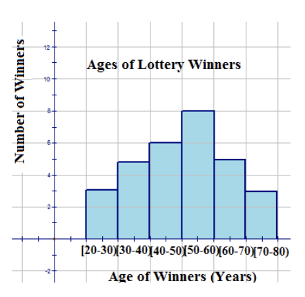
From looking at the tops of the bars, you can see how many winners were in each category, and by adding these numbers, you can determine the total number of winners. You can also determine how many winners were within a specific category. For example, you can see that 8 winners were 60 years of age or older. The graph can also be used to determine percentages. For example, it can answer the question, “What percentage of the winners were 50 years of age or older?” as follows:
16/30=0.533
(0.533)(100%)≈5.3%.
Examples
Example 1
Use the data and the distribution table that represent the ages of teachers from Example B to construct a histogram to display the data. The distribution table is shown again below:
| Bin | Tally | Frequency |
|---|---|---|
| [0−5) | 11 | |
| [5−10) | |
9 |
| [10−15) | 12 | |
| [15−20) | 14 | |
| [20−25) | 7 | |
| [25−30) | 10 | |
| [30−35) | 12 |
Example 2
11+9+12+14+7+10+12=75
In this small town, 75 teachers are teaching.
How many teachers teach in this small town?
Example 3
11 teachers have taught for less than 5 years.
How many teachers have worked for less than 5 years?
Example 4
If teachers are able to retire when they have taught for 30 years or more, how many are eligible to retire?
12 teachers are eligible to retire.
Example 5
What percentage of the teachers still have to teach for 10 years or fewer before they are eligible to retire?
17/75=0.2266⎯⎯⎯⎯⎯⎯(0.2266)(100%)≈23%
Approximately 23% of the teachers must teach for 10 years or fewer before they are eligible to retire.
Example 6
Do you think that the majority of the teachers are young or old? Justify your answer.
Answers will vary, but one possible answer is that the majority of the teachers are young, because 46 have taught for less than 20 years.
Review
- What name is given to a distribution that has 2 peaks of the same height?
- uniform
- unimodal
- bimodal
- discrete
The following histogram shows data collected during a recent fishing derby. The number of fish caught is being compared to the size of the fish caught. Use the histogram to answer the following questions:
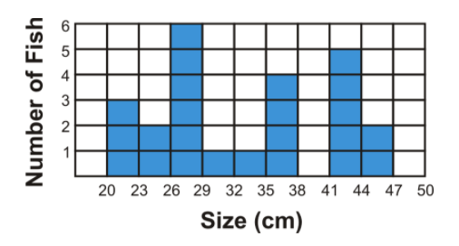
- How many fish were caught?
- How many fish caught were over 35 cm in length?
- How many fish caught were between 20 cm and 29 cm in length?
- Why is there a blank space between 38 cm and 41 cm on the histogram?
The following histogram displays the heights of students in a classroom. Use the information represented in the histogram to answer the following questions:
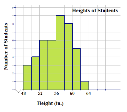
- How many students are in the class?
- How many students are over 60 inches in height?
- How many students have a height between 54 in and 62 in?
- Is the distribution unimodal or bimodal? How do you know?
- The following data represents the results of a test taken by a group of students: 955670835966885250776980547568785164556774577353 Construct a frequency distribution table using a bin size of 10 and display the results in a properly labeled histogram.
Vocabulary
| Term | Definition |
|---|---|
| frequency distribution | A table that lists all of the classes and the number of data values that belong to each of the classes. A distribution in which most of the data values are located to the right of the mean is called a left-skewed distribution, while a distribution in which most of the data values are located to the left of the mean is called a right-skewed distribution. |
| bar graph | A bar graph is a plot made of bars whose heights (vertical bars) or lengths (horizontal bars) represent the frequencies of each category, with space between each bar. |
| frequency density | The vertical axis of a histogram is labelled frequency density. |
| Frequency table | A frequency table is a table that summarizes a data set by stating the number of times each value occurs within the data set. |
| Histogram | A histogram is a display that indicates the frequency of specified ranges of continuous data values on a graph in the form of immediately adjacent bars. |
| Interval | An interval is a range of data in a data set. |
| Range | The range of a data set is the difference between the smallest value and the greatest value in the data set. |
| right-skewed distribution | A right-skewed distribution has a peak to the left of the distribution and data values that taper off to the right. |
| unimodal | If a data set has only 1 value that occurs most often, the set is called unimodal. |
Additional Resources
PLIX: Play, Learn, Interact, eXplore - Histograms
Video: Histograms
Activities: Histograms Discussion Questions
Study Aids: Presenting Univariate Data
Practice: Understand and Create Histograms