
2.5.3: Frequency Tables and Histograms
- Page ID
- 5763
\( \newcommand{\vecs}[1]{\overset { \scriptstyle \rightharpoonup} {\mathbf{#1}} } \)
\( \newcommand{\vecd}[1]{\overset{-\!-\!\rightharpoonup}{\vphantom{a}\smash {#1}}} \)
\( \newcommand{\id}{\mathrm{id}}\) \( \newcommand{\Span}{\mathrm{span}}\)
( \newcommand{\kernel}{\mathrm{null}\,}\) \( \newcommand{\range}{\mathrm{range}\,}\)
\( \newcommand{\RealPart}{\mathrm{Re}}\) \( \newcommand{\ImaginaryPart}{\mathrm{Im}}\)
\( \newcommand{\Argument}{\mathrm{Arg}}\) \( \newcommand{\norm}[1]{\| #1 \|}\)
\( \newcommand{\inner}[2]{\langle #1, #2 \rangle}\)
\( \newcommand{\Span}{\mathrm{span}}\)
\( \newcommand{\id}{\mathrm{id}}\)
\( \newcommand{\Span}{\mathrm{span}}\)
\( \newcommand{\kernel}{\mathrm{null}\,}\)
\( \newcommand{\range}{\mathrm{range}\,}\)
\( \newcommand{\RealPart}{\mathrm{Re}}\)
\( \newcommand{\ImaginaryPart}{\mathrm{Im}}\)
\( \newcommand{\Argument}{\mathrm{Arg}}\)
\( \newcommand{\norm}[1]{\| #1 \|}\)
\( \newcommand{\inner}[2]{\langle #1, #2 \rangle}\)
\( \newcommand{\Span}{\mathrm{span}}\) \( \newcommand{\AA}{\unicode[.8,0]{x212B}}\)
\( \newcommand{\vectorA}[1]{\vec{#1}} % arrow\)
\( \newcommand{\vectorAt}[1]{\vec{\text{#1}}} % arrow\)
\( \newcommand{\vectorB}[1]{\overset { \scriptstyle \rightharpoonup} {\mathbf{#1}} } \)
\( \newcommand{\vectorC}[1]{\textbf{#1}} \)
\( \newcommand{\vectorD}[1]{\overrightarrow{#1}} \)
\( \newcommand{\vectorDt}[1]{\overrightarrow{\text{#1}}} \)
\( \newcommand{\vectE}[1]{\overset{-\!-\!\rightharpoonup}{\vphantom{a}\smash{\mathbf {#1}}}} \)
\( \newcommand{\vecs}[1]{\overset { \scriptstyle \rightharpoonup} {\mathbf{#1}} } \)
\( \newcommand{\vecd}[1]{\overset{-\!-\!\rightharpoonup}{\vphantom{a}\smash {#1}}} \)
\(\newcommand{\avec}{\mathbf a}\) \(\newcommand{\bvec}{\mathbf b}\) \(\newcommand{\cvec}{\mathbf c}\) \(\newcommand{\dvec}{\mathbf d}\) \(\newcommand{\dtil}{\widetilde{\mathbf d}}\) \(\newcommand{\evec}{\mathbf e}\) \(\newcommand{\fvec}{\mathbf f}\) \(\newcommand{\nvec}{\mathbf n}\) \(\newcommand{\pvec}{\mathbf p}\) \(\newcommand{\qvec}{\mathbf q}\) \(\newcommand{\svec}{\mathbf s}\) \(\newcommand{\tvec}{\mathbf t}\) \(\newcommand{\uvec}{\mathbf u}\) \(\newcommand{\vvec}{\mathbf v}\) \(\newcommand{\wvec}{\mathbf w}\) \(\newcommand{\xvec}{\mathbf x}\) \(\newcommand{\yvec}{\mathbf y}\) \(\newcommand{\zvec}{\mathbf z}\) \(\newcommand{\rvec}{\mathbf r}\) \(\newcommand{\mvec}{\mathbf m}\) \(\newcommand{\zerovec}{\mathbf 0}\) \(\newcommand{\onevec}{\mathbf 1}\) \(\newcommand{\real}{\mathbb R}\) \(\newcommand{\twovec}[2]{\left[\begin{array}{r}#1 \\ #2 \end{array}\right]}\) \(\newcommand{\ctwovec}[2]{\left[\begin{array}{c}#1 \\ #2 \end{array}\right]}\) \(\newcommand{\threevec}[3]{\left[\begin{array}{r}#1 \\ #2 \\ #3 \end{array}\right]}\) \(\newcommand{\cthreevec}[3]{\left[\begin{array}{c}#1 \\ #2 \\ #3 \end{array}\right]}\) \(\newcommand{\fourvec}[4]{\left[\begin{array}{r}#1 \\ #2 \\ #3 \\ #4 \end{array}\right]}\) \(\newcommand{\cfourvec}[4]{\left[\begin{array}{c}#1 \\ #2 \\ #3 \\ #4 \end{array}\right]}\) \(\newcommand{\fivevec}[5]{\left[\begin{array}{r}#1 \\ #2 \\ #3 \\ #4 \\ #5 \\ \end{array}\right]}\) \(\newcommand{\cfivevec}[5]{\left[\begin{array}{c}#1 \\ #2 \\ #3 \\ #4 \\ #5 \\ \end{array}\right]}\) \(\newcommand{\mattwo}[4]{\left[\begin{array}{rr}#1 \amp #2 \\ #3 \amp #4 \\ \end{array}\right]}\) \(\newcommand{\laspan}[1]{\text{Span}\{#1\}}\) \(\newcommand{\bcal}{\cal B}\) \(\newcommand{\ccal}{\cal C}\) \(\newcommand{\scal}{\cal S}\) \(\newcommand{\wcal}{\cal W}\) \(\newcommand{\ecal}{\cal E}\) \(\newcommand{\coords}[2]{\left\{#1\right\}_{#2}}\) \(\newcommand{\gray}[1]{\color{gray}{#1}}\) \(\newcommand{\lgray}[1]{\color{lightgray}{#1}}\) \(\newcommand{\rank}{\operatorname{rank}}\) \(\newcommand{\row}{\text{Row}}\) \(\newcommand{\col}{\text{Col}}\) \(\renewcommand{\row}{\text{Row}}\) \(\newcommand{\nul}{\text{Nul}}\) \(\newcommand{\var}{\text{Var}}\) \(\newcommand{\corr}{\text{corr}}\) \(\newcommand{\len}[1]{\left|#1\right|}\) \(\newcommand{\bbar}{\overline{\bvec}}\) \(\newcommand{\bhat}{\widehat{\bvec}}\) \(\newcommand{\bperp}{\bvec^\perp}\) \(\newcommand{\xhat}{\widehat{\xvec}}\) \(\newcommand{\vhat}{\widehat{\vvec}}\) \(\newcommand{\uhat}{\widehat{\uvec}}\) \(\newcommand{\what}{\widehat{\wvec}}\) \(\newcommand{\Sighat}{\widehat{\Sigma}}\) \(\newcommand{\lt}{<}\) \(\newcommand{\gt}{>}\) \(\newcommand{\amp}{&}\) \(\definecolor{fillinmathshade}{gray}{0.9}\)Frequency Tables and Histograms
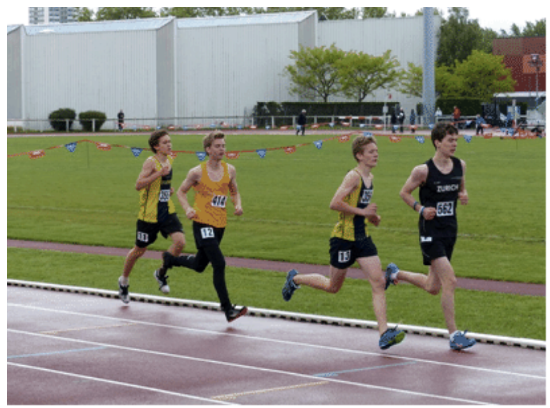
The coach of the Markwell Cougars track team wants to compare the heights of his team to that of their rivals, the Sampson Hawks. He was wondering if there is a correlation between speed and height.
The coach wrote the following heights from smallest to largest.
Markwell Cougars:
170, 172, 175, 176, 176, 176, 178, 181, 182, 183, 183, 183, 185, 185, 187, 188, 188, 189, 190, 195
Sampson Hawks:
169, 175, 176, 176, 178, 179, 180, 183, 183, 186, 186, 186, 187, 187, 187, 187, 187, 188, 190, 191, 192
Create a visual display of this data.
In this concept, you will learn to use frequency tables and histograms.
Frequency
A visual display is used to show data. Each type of visual tool has advantages and the best type of plot or graph depends on the situation. Indeed, sometimes it is a matter of preference as many different graphs could be used to illustrate the same data.
Let’s take a look at frequency tables and histograms.
Frequency is a measure of how often something occurs. A frequency table is used to measure and visually show how often a data value occurs.
Let’s look at an example.
A teacher is preparing for parent conferences. In order to provide parents with the most information possible about their children, he wants to organize the grades of the class so that they can compare the grades to the rest of the class.
The math percentages have been calculated and his students earned the following grades:
88, 86, 92, 65, 72, 75, 81, 84, 85, 93, 99, 50, 78, 80, 86, 76, 74, 95, 81, 87, 90, 72, 76, 61, 85, 84, 78, 83.
Grades are determined by percent where 0-59% is an F, 60-69% is a D, 70-79% is a C, 80-89% is a B, and 90-100% is an A. These values make the most logical intervals. Intervals are always chosen depending on the range of the data. He will make a frequency table to illustrate the information.
First, for each student who scored in the given range, he puts an X. Sometimes, frequency tables use X’s and other times, they can use lines for tally marks.
| Interval | Tally | Frequency |
| 90 - 100 | XXXXX | 5 |
| 80 - 89 | XXXXXXXXXXXX | 12 |
| 70 - 79 | XXXXXXXX | 8 |
| 60 - 69 | XX | 2 |
| 0 - 59 | X | 1 |
This tally is useful in the sense that it communicates to parents how many students in the class scored in the A range, B range, etc. It would not be as important for the parents to see the individual scores of each student as it would be to see the total number of students in each interval. That way, if their child earned a B, then they would know that the child falls in a category that most other students scored in. If a child earned a D, for example, it would indicate that they are below the general level of the other students and might need additional help.
Next, he creates a histogram. A histogram is similar to a bar graph in that it uses columns to illustrate data on x- and y-axes. In a histogram, you can use the same intervals as you did for the frequency table. The bars in the histogram will have no space between them.
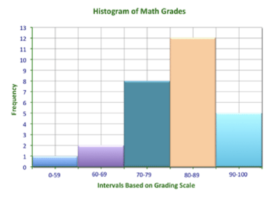
The histogram shows the same information as the frequency table does. However, the histogram is a type of graph, meaning that it is visual representation. The bars on the histogram are interpreted more easily by size than numerical data.
Examples
Example 1
Earlier, you were given a problem about the track teams and the heights of the runners.
The coach is comparing the heights of his team, the Markwell Cougars to the rival team, the Sampson Hawks. You need to create a double histogram for the data. The data collected is:
Markwell Cougars:
170, 172, 175, 176, 176, 176, 178, 181, 182, 183, 183, 183, 185, 185, 187, 188, 188, 189, 190, 195
Sampson Hawks:
169, 175, 176, 176, 178, 179, 180, 183, 183, 186, 186, 186, 187, 187, 187, 187, 187, 188, 190, 191, 192
First, create a frequency table for the data. Since you are comparing two sets of data, you have to put both data sets into the frequency table.
| Markwell Cougars | Sampson Hawks | |||
| Interval | Tally | Frequency | Tally | Frequency |
| 160 - 169 | | | 1 | ||
| 170 - 179 | 7 | 5 | ||
| 180 - 189 | 11 | 12 | ||
| 190 - 199 | || | 2 | ||| | 3 |
Next, use this data to create a histogram that compares the data.
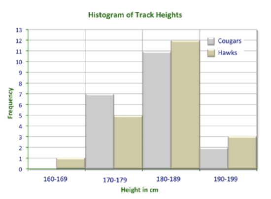
You can see from the histogram that both teams have more players in the 180 - 189 interval. However, while the Cougars have more players in the 170 - 179 interval, the Hawks have slightly more in the taller interval. The Hawks have a slight height advantage.
Example 2
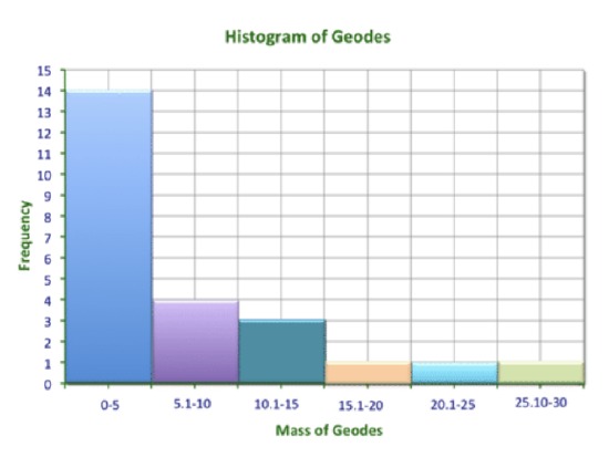
Create a histogram of the mass of geodes found at a volcanic site. Scientists measured 24 geodes in kilograms and got the following data:
0.8, 0.9, 1.1, 1.1, 1.2, 1.5, 1.5, 1.6, 1.7, 1.7, 1.7, 1.9, 2.0, 2.3, 5.3, 6.8, 7.5, 9.6, 10.5, 11.2, 12.0, 17.6, 23.9, and 26.8.
First, let’s think about intervals.
The minimum item is 0.8 kg and the maximum is 26.8. To get a good idea of the data, you could use intervals that encompass perhaps 4 kg intervals, 5 kg intervals, or 6 kg intervals. Let’s try intervals of 5 kg.
Begin with a frequency table.
| Interval | Tally | Frequency |
| 0 - 5 | 14 | |
| 5.1 - 10 | |||| | 4 |
| 10.1 - 15 | ||| | 3 |
| 15.1 - 20 | | | 1 |
| 20.1 - 25 | | | 1 |
| 25.1 - 30 | | | 1 |
Next, create a histogram for this data.
Example 3
True or false: An interval is the frequency that an event happens.
The answer is false.
Intervals are always chosen depending on the range of the data.
Example 4
True or false: To create a histogram, you first need a frequency table.
The answer is true.
Example 5
True or false: If I wanted to create a histogram on the number of people who went to the town movie theater on the weekend, I would first need to figure out how many people went to the movies on each weekend day and night.
The answer is true.
The data collected would help create a frequency table and then you could create your histogram.
Review
Use what you have learned about histograms to answer each question.
| Number of Hours Slept | Tally | Frequency |
| 5 | I | 1 |
| 6 | I I | 2 |
| 7 | I I I I | 4 |
| 8 | I I I | 3 |
| 9 | I I I | 3 |
| 10 | I I I | 3 |
| 11 | I I | 2 |
| 12 | I I | 2 |
1. Create a histogram that illustrates this data.
2. Explain why you chose the intervals that you chose.
3. What can you interpret from your histogram?
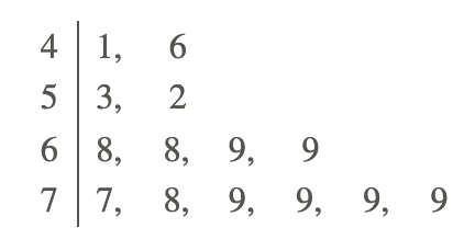
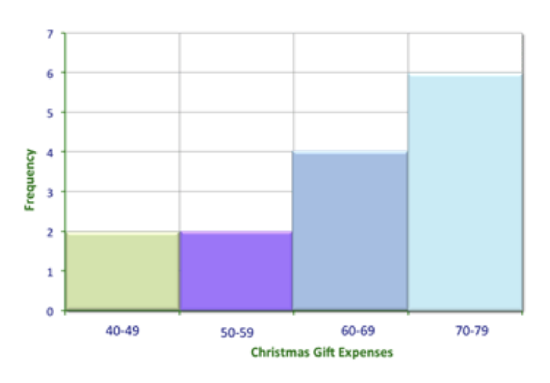
Compare the stem-and-leaf plot to the histogram of Melanie’s Christmas gift expenses. She told her husband, “Most of the gifts were about $60.”
4. Is she telling the truth?
5. Which tool is more useful in making a decision about her truthfulness?
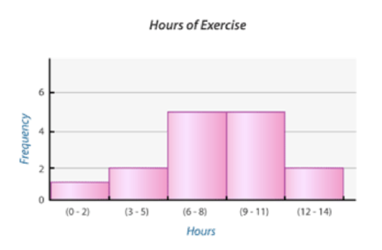
6. Looking at this histogram, can you conclude that most people exercise between 6 - 11 hours per week?
7. What is the fewest number of hours?
8. What is the range of hours?
9. Why do you think they chose the interval that they did?
10 - 15
Conduct your own survey and collect data. Choose attendance rates in your class or vacation days per year for example. Then create a frequency table, histogram and analyze your data. Explain why you chose the interval that you did and which data set had the greatest and least results.
Vocabulary
| Term | Definition |
|---|---|
| frequency distribution table | A frequency distribution table lists the data values, as well as the number of times each value appears in the data set. |
| Histogram | A histogram is a display that indicates the frequency of specified ranges of continuous data values on a graph in the form of immediately adjacent bars. |
Additional Resources
PLIX: Play, Learn, Interact, eXplore - Comparing Heights
Video: Histograms
Practice: Frequency Tables and Histograms
Real World: On the Charts