
2.6.1: Understand and Create Line Graphs
- Page ID
- 5764
\( \newcommand{\vecs}[1]{\overset { \scriptstyle \rightharpoonup} {\mathbf{#1}} } \)
\( \newcommand{\vecd}[1]{\overset{-\!-\!\rightharpoonup}{\vphantom{a}\smash {#1}}} \)
\( \newcommand{\id}{\mathrm{id}}\) \( \newcommand{\Span}{\mathrm{span}}\)
( \newcommand{\kernel}{\mathrm{null}\,}\) \( \newcommand{\range}{\mathrm{range}\,}\)
\( \newcommand{\RealPart}{\mathrm{Re}}\) \( \newcommand{\ImaginaryPart}{\mathrm{Im}}\)
\( \newcommand{\Argument}{\mathrm{Arg}}\) \( \newcommand{\norm}[1]{\| #1 \|}\)
\( \newcommand{\inner}[2]{\langle #1, #2 \rangle}\)
\( \newcommand{\Span}{\mathrm{span}}\)
\( \newcommand{\id}{\mathrm{id}}\)
\( \newcommand{\Span}{\mathrm{span}}\)
\( \newcommand{\kernel}{\mathrm{null}\,}\)
\( \newcommand{\range}{\mathrm{range}\,}\)
\( \newcommand{\RealPart}{\mathrm{Re}}\)
\( \newcommand{\ImaginaryPart}{\mathrm{Im}}\)
\( \newcommand{\Argument}{\mathrm{Arg}}\)
\( \newcommand{\norm}[1]{\| #1 \|}\)
\( \newcommand{\inner}[2]{\langle #1, #2 \rangle}\)
\( \newcommand{\Span}{\mathrm{span}}\) \( \newcommand{\AA}{\unicode[.8,0]{x212B}}\)
\( \newcommand{\vectorA}[1]{\vec{#1}} % arrow\)
\( \newcommand{\vectorAt}[1]{\vec{\text{#1}}} % arrow\)
\( \newcommand{\vectorB}[1]{\overset { \scriptstyle \rightharpoonup} {\mathbf{#1}} } \)
\( \newcommand{\vectorC}[1]{\textbf{#1}} \)
\( \newcommand{\vectorD}[1]{\overrightarrow{#1}} \)
\( \newcommand{\vectorDt}[1]{\overrightarrow{\text{#1}}} \)
\( \newcommand{\vectE}[1]{\overset{-\!-\!\rightharpoonup}{\vphantom{a}\smash{\mathbf {#1}}}} \)
\( \newcommand{\vecs}[1]{\overset { \scriptstyle \rightharpoonup} {\mathbf{#1}} } \)
\( \newcommand{\vecd}[1]{\overset{-\!-\!\rightharpoonup}{\vphantom{a}\smash {#1}}} \)
\(\newcommand{\avec}{\mathbf a}\) \(\newcommand{\bvec}{\mathbf b}\) \(\newcommand{\cvec}{\mathbf c}\) \(\newcommand{\dvec}{\mathbf d}\) \(\newcommand{\dtil}{\widetilde{\mathbf d}}\) \(\newcommand{\evec}{\mathbf e}\) \(\newcommand{\fvec}{\mathbf f}\) \(\newcommand{\nvec}{\mathbf n}\) \(\newcommand{\pvec}{\mathbf p}\) \(\newcommand{\qvec}{\mathbf q}\) \(\newcommand{\svec}{\mathbf s}\) \(\newcommand{\tvec}{\mathbf t}\) \(\newcommand{\uvec}{\mathbf u}\) \(\newcommand{\vvec}{\mathbf v}\) \(\newcommand{\wvec}{\mathbf w}\) \(\newcommand{\xvec}{\mathbf x}\) \(\newcommand{\yvec}{\mathbf y}\) \(\newcommand{\zvec}{\mathbf z}\) \(\newcommand{\rvec}{\mathbf r}\) \(\newcommand{\mvec}{\mathbf m}\) \(\newcommand{\zerovec}{\mathbf 0}\) \(\newcommand{\onevec}{\mathbf 1}\) \(\newcommand{\real}{\mathbb R}\) \(\newcommand{\twovec}[2]{\left[\begin{array}{r}#1 \\ #2 \end{array}\right]}\) \(\newcommand{\ctwovec}[2]{\left[\begin{array}{c}#1 \\ #2 \end{array}\right]}\) \(\newcommand{\threevec}[3]{\left[\begin{array}{r}#1 \\ #2 \\ #3 \end{array}\right]}\) \(\newcommand{\cthreevec}[3]{\left[\begin{array}{c}#1 \\ #2 \\ #3 \end{array}\right]}\) \(\newcommand{\fourvec}[4]{\left[\begin{array}{r}#1 \\ #2 \\ #3 \\ #4 \end{array}\right]}\) \(\newcommand{\cfourvec}[4]{\left[\begin{array}{c}#1 \\ #2 \\ #3 \\ #4 \end{array}\right]}\) \(\newcommand{\fivevec}[5]{\left[\begin{array}{r}#1 \\ #2 \\ #3 \\ #4 \\ #5 \\ \end{array}\right]}\) \(\newcommand{\cfivevec}[5]{\left[\begin{array}{c}#1 \\ #2 \\ #3 \\ #4 \\ #5 \\ \end{array}\right]}\) \(\newcommand{\mattwo}[4]{\left[\begin{array}{rr}#1 \amp #2 \\ #3 \amp #4 \\ \end{array}\right]}\) \(\newcommand{\laspan}[1]{\text{Span}\{#1\}}\) \(\newcommand{\bcal}{\cal B}\) \(\newcommand{\ccal}{\cal C}\) \(\newcommand{\scal}{\cal S}\) \(\newcommand{\wcal}{\cal W}\) \(\newcommand{\ecal}{\cal E}\) \(\newcommand{\coords}[2]{\left\{#1\right\}_{#2}}\) \(\newcommand{\gray}[1]{\color{gray}{#1}}\) \(\newcommand{\lgray}[1]{\color{lightgray}{#1}}\) \(\newcommand{\rank}{\operatorname{rank}}\) \(\newcommand{\row}{\text{Row}}\) \(\newcommand{\col}{\text{Col}}\) \(\renewcommand{\row}{\text{Row}}\) \(\newcommand{\nul}{\text{Nul}}\) \(\newcommand{\var}{\text{Var}}\) \(\newcommand{\corr}{\text{corr}}\) \(\newcommand{\len}[1]{\left|#1\right|}\) \(\newcommand{\bbar}{\overline{\bvec}}\) \(\newcommand{\bhat}{\widehat{\bvec}}\) \(\newcommand{\bperp}{\bvec^\perp}\) \(\newcommand{\xhat}{\widehat{\xvec}}\) \(\newcommand{\vhat}{\widehat{\vvec}}\) \(\newcommand{\uhat}{\widehat{\uvec}}\) \(\newcommand{\what}{\widehat{\wvec}}\) \(\newcommand{\Sighat}{\widehat{\Sigma}}\) \(\newcommand{\lt}{<}\) \(\newcommand{\gt}{>}\) \(\newcommand{\amp}{&}\) \(\definecolor{fillinmathshade}{gray}{0.9}\)Line Graphs
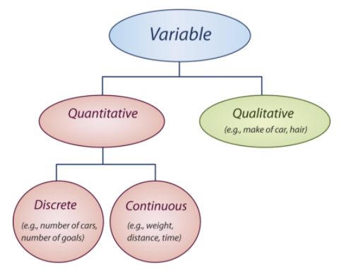
Before you continue to explore the concept of representing data graphically, it is very important to understand the meaning of some basic terms that will often be used in this concept. The first such definition is that of a variable. In statistics, a variable is simply a characteristic that is being studied. This characteristic assumes different values for different elements, or members, of the population, whether it is the entire population or a sample. The value of the variable is referred to as an observation, or a measurement. A collection of these observations of the variable is a data set.
Variables can be quantitative or qualitative. A quantitative variable is one that can be measured numerically. Some examples of a quantitative variable are wages, prices, weights, numbers of vehicles, and numbers of goals. All of these examples can be expressed numerically. A quantitative variable can be classified as discrete or continuous. A discrete variable is one whose values are all countable and does not include any values between 2 consecutive values of a data set. An example of a discrete variable is the number of goals scored by a team during a hockey game. A continuous variable is one that can assume any countable value, as well as all the values between 2 consecutive numbers of a data set. An example of a continuous variable is the number of gallons of gasoline used during a trip to the beach.
A qualitative variable is one that cannot be measured numerically but can be placed in a category. Some examples of a qualitative variable are months of the year, hair color, color of cars, a person’s status, and favorite vacation spots. The following flow chart should help you to better understand the above terms.
Variables can also be classified as dependent or independent. When there is a linear relationship between 2 variables, the values of one variable depend upon the values of the other variable. In a linear relation, the values of y depend upon the values of x. Therefore, the dependent variable is represented by the values that are plotted on the y-axis, and the independent variable is represented by the values that are plotted on the x-axis.
Linear graphs are important in statistics when several data sets are used to represent information about a single topic. An example would be data sets that represent different plans available for cell phone users. These data sets can be plotted on the same grid. The resulting graph will show intersection points for the plans. These intersection points indicate a coordinate where 2 plans are equal. An observer can easily interpret the graph to decide which plan is best, and when. If the observer is trying to choose a plan to use, the choice can be made easier by seeing a graphical representation of the data.
Describing Variables
Select the best descriptions for the following variables and indicate your selections by marking an ‘x’ in the appropriate boxes.
| Variable | Quantitative | Qualitative | Discrete | Continuous |
|---|---|---|---|---|
| Number of members in a family | ||||
| A person’s marital status | ||||
| Length of a person’s arm | ||||
| Color of cars | ||||
| Number of errors on a math test |
The variables can be described as follows:
| Variable | Quantitative | Qualitative | Discrete | Continuous |
|---|---|---|---|---|
| Number of members in a family | x | x | ||
| A person’s marital status | x | |||
| Length of a person’s arm | x | x | ||
| Color of cars | x | |||
| Number of errors on a math test | x | x |
Creating a Table of Values
Sally works at the local ballpark stadium selling lemonade. She is paid $15.00 each time she works, plus $0.75 for each glass of lemonade she sells. Create a table of values to represent Sally’s earnings if she sells 8 glasses of lemonade. Use this table of values to represent her earnings on a graph.
The first step is to write an equation to represent her earnings and then to use this equation to create a table of values.
y=0.75x+15, where y represents her earnings and x represents the number of glasses of lemonade she sells.
| Number of Glasses of Lemonade | Earnings |
|---|---|
| 0 | $15.00 |
| 1 | $15.75 |
| 2 | $16.50 |
| 3 | $17.25 |
| 4 | $18.00 |
| 5 | $18.75 |
| 6 | $19.50 |
| 7 | $20.25 |
| 8 | $21.00 |
The dependent variable is the money earned, and the independent variable is the number of glasses of lemonade sold. Therefore, money is on the y-axis, and the number of glasses of lemonade is on the x-axis.
From the table of values, Sally will earn $21.00 if she sells 8 glasses of lemonade.
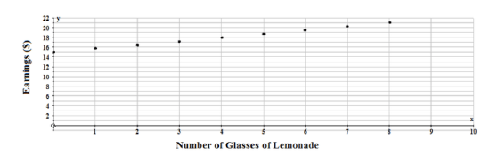
Now that the points have been plotted, the decision has to be made as to whether or not to join them. Between every 2 points plotted on the graph are an infinite number of values. If these values are meaningful to the problem, then the plotted points can be joined. This type of data is called continuous data. If the values between the 2 plotted points are not meaningful to the problem, then the points should not be joined. This type of data is called discrete data. Since glasses of lemonade are represented by whole numbers, and since fractions or decimals are not appropriate values, the points between 2 consecutive values are not meaningful in this problem. Therefore, the points should not be joined. The data is discrete.
Interpreting a Graph
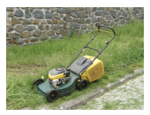
The following graph represents 3 plans that are available to customers interested in hiring a maintenance company to tend to their lawn. Using the graph, explain when it would be best to use each plan for lawn maintenance.
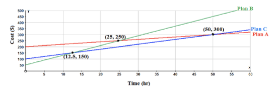
From the graph, the base fee that is charged for each plan is obvious. These values are found on the y-axis. Plan A charges a base fee of $200.00, Plan C charges a base fee of $100.00, and Plan B charges a base fee of $50.00. The cost per hour can be calculated by using the values of the intersection points and the base fee in the equation y=mx+b and solving for m. Plan B is the best plan to choose if the lawn maintenance takes less than 12.5 hours. At 12.5 hours, Plan B and Plan C both cost $150.00 for lawn maintenance. After 12.5 hours, Plan C is the best deal, until 50 hours of lawn maintenance is needed. At 50 hours, Plan A and Plan C both cost $300.00 for lawn maintenance. For more than 50 hours of lawn maintenance, Plan A is the best plan. All of the above information was obvious from the graph and would enhance the decision-making process for any interested client.
Example
Example 1
The local arena is trying to attract as many participants as possible to attend the community’s “Skate for Scoliosis” event. Participants pay a fee of $10.00 for registering, and, in addition, the arena will donate $3.00 for each hour a participant skates, up to a maximum of 6 hours. Create a table of values and draw a graph to represent a participant who skates for the entire 6 hours. How much money can a participant raise for the community if he/she skates for the maximum length of time?
The equation for this scenario is y=3x+10, where y represents the money made by the participant, and x represents the number of hours the participant skates.

| Numbers of Hours Skating | Money Earned |
|---|---|
| 0 | $10.00 |
| 1 | $13.00 |
| 2 | $16.00 |
| 3 | $19.00 |
| 4 | $22.00 |
| 5 | $25.00 |
| 6 | $28.00 |
The dependent variable is the money made, and the independent variable is the number of hours the participant skated. Therefore, money is on the y-axis, and time is on the x-axis as shown below:
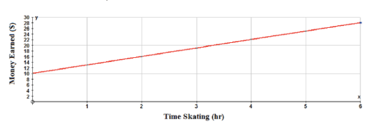
A participant who skates for the entire 6 hours can make $28.00 for the "Skate for Scoliosis" event. The points are joined, because the fractions and decimals between 2 consecutive points are meaningful for this problem. A participant could skate for 30 minutes, and the arena would pay that skater $1.50 for the time skating. The data is continuous.
Review
- What term is used to describe a data set in which all points between 2 consecutive points are meaningful?
- discrete data
- continuous data
- random data
- fractional data
- What type of variable is represented by the number of pets owned by families?
- qualitative
- quantitative
- independent
- continuous
- What type of data, when plotted on a graph, does not have the points joined?
- discrete data
- continuous data
- random data
- independent data
- Select the best descriptions for the following variables and indicate your selections by marking an ‘x’ in the appropriate boxes.
| Variable | Quantitative | Qualitative | Discrete | Continuous |
|---|---|---|---|---|
| Men’s favorite TV shows | ||||
| Salaries of baseball players | ||||
| Number of children in a family | ||||
| Favorite color of cars | ||||
| Number of hours worked weekly |
You are selling your motorcycle, and you decide to advertise it on the Internet on Walton’s Web Ads. He has 3 plans from which you may choose. The plans are shown on the following graph. Use the graph and explain when it is best to use each plan.
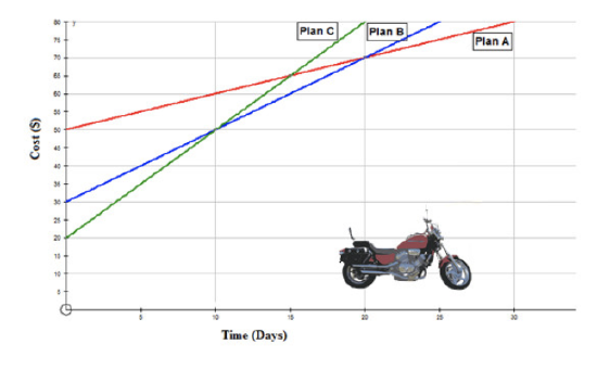
- When would it be best to use Plan A?
- When would it be best to use Plan B?
- When would it be best to use Plan C?
- What is the dependent variable in the following relationship? The time it takes to run the 100 yard dash and the fitness level of the runner.
a. fitness level
b. time
c. length of the track
d. age of the runner - If the relationship in question 8 were graphed on a coordinate grid, what variable would be on the x-axis?
- If the relationship in question 8 were graphed on a coordinate grid, what variable would be on the y-axis?
Vocabulary
| Term | Definition |
|---|---|
| bar chart | A bar chart is a graphic display of categorical variables that uses bars to represent the frequency of the count in each category. |
| broken line graph | A broken line graph is a graph that is used to show changes over time. A line is used to join the values but the line has no defined slope. |
| continuous variables | A continuous variable is a variable that takes on any value within the limits of the variable. |
| data set | A collection of these observations of the variable is a data set. |
| dependent variable | The dependent variable is the output variable in an equation or function, commonly represented by y or f(x). |
| discrete random variables | Discrete random variables represent the number of distinct values that can be counted of an event. |
| independent variable | The independent variable is the input variable in an equation or function, commonly represented by x. |
| qualitative variable | A qualitative variable is one that cannot be measured numerically but can be placed in a category. |
| quantitative variable | A quantitative variable is a variable that takes on numerical values that represent a measurable quantity. Examples of quantitative variables are the height of students or the population of a city. |
| variable | In statistics, a variable is simply a characteristic that is being studied. |
Additional Resources
PLIX: Play, Learn, Interact, eXplore - Line Graphs
Video: Line Graphs Principles
Activities: Line Graphs Discussion Questions
Lesson Plans: Line Graphs Lesson Plan
Practice: Understand and Create Line Graphs