
2.9.1: Create and Understand Box-and-Whisker Plots
- Page ID
- 5778
\( \newcommand{\vecs}[1]{\overset { \scriptstyle \rightharpoonup} {\mathbf{#1}} } \)
\( \newcommand{\vecd}[1]{\overset{-\!-\!\rightharpoonup}{\vphantom{a}\smash {#1}}} \)
\( \newcommand{\id}{\mathrm{id}}\) \( \newcommand{\Span}{\mathrm{span}}\)
( \newcommand{\kernel}{\mathrm{null}\,}\) \( \newcommand{\range}{\mathrm{range}\,}\)
\( \newcommand{\RealPart}{\mathrm{Re}}\) \( \newcommand{\ImaginaryPart}{\mathrm{Im}}\)
\( \newcommand{\Argument}{\mathrm{Arg}}\) \( \newcommand{\norm}[1]{\| #1 \|}\)
\( \newcommand{\inner}[2]{\langle #1, #2 \rangle}\)
\( \newcommand{\Span}{\mathrm{span}}\)
\( \newcommand{\id}{\mathrm{id}}\)
\( \newcommand{\Span}{\mathrm{span}}\)
\( \newcommand{\kernel}{\mathrm{null}\,}\)
\( \newcommand{\range}{\mathrm{range}\,}\)
\( \newcommand{\RealPart}{\mathrm{Re}}\)
\( \newcommand{\ImaginaryPart}{\mathrm{Im}}\)
\( \newcommand{\Argument}{\mathrm{Arg}}\)
\( \newcommand{\norm}[1]{\| #1 \|}\)
\( \newcommand{\inner}[2]{\langle #1, #2 \rangle}\)
\( \newcommand{\Span}{\mathrm{span}}\) \( \newcommand{\AA}{\unicode[.8,0]{x212B}}\)
\( \newcommand{\vectorA}[1]{\vec{#1}} % arrow\)
\( \newcommand{\vectorAt}[1]{\vec{\text{#1}}} % arrow\)
\( \newcommand{\vectorB}[1]{\overset { \scriptstyle \rightharpoonup} {\mathbf{#1}} } \)
\( \newcommand{\vectorC}[1]{\textbf{#1}} \)
\( \newcommand{\vectorD}[1]{\overrightarrow{#1}} \)
\( \newcommand{\vectorDt}[1]{\overrightarrow{\text{#1}}} \)
\( \newcommand{\vectE}[1]{\overset{-\!-\!\rightharpoonup}{\vphantom{a}\smash{\mathbf {#1}}}} \)
\( \newcommand{\vecs}[1]{\overset { \scriptstyle \rightharpoonup} {\mathbf{#1}} } \)
\( \newcommand{\vecd}[1]{\overset{-\!-\!\rightharpoonup}{\vphantom{a}\smash {#1}}} \)
\(\newcommand{\avec}{\mathbf a}\) \(\newcommand{\bvec}{\mathbf b}\) \(\newcommand{\cvec}{\mathbf c}\) \(\newcommand{\dvec}{\mathbf d}\) \(\newcommand{\dtil}{\widetilde{\mathbf d}}\) \(\newcommand{\evec}{\mathbf e}\) \(\newcommand{\fvec}{\mathbf f}\) \(\newcommand{\nvec}{\mathbf n}\) \(\newcommand{\pvec}{\mathbf p}\) \(\newcommand{\qvec}{\mathbf q}\) \(\newcommand{\svec}{\mathbf s}\) \(\newcommand{\tvec}{\mathbf t}\) \(\newcommand{\uvec}{\mathbf u}\) \(\newcommand{\vvec}{\mathbf v}\) \(\newcommand{\wvec}{\mathbf w}\) \(\newcommand{\xvec}{\mathbf x}\) \(\newcommand{\yvec}{\mathbf y}\) \(\newcommand{\zvec}{\mathbf z}\) \(\newcommand{\rvec}{\mathbf r}\) \(\newcommand{\mvec}{\mathbf m}\) \(\newcommand{\zerovec}{\mathbf 0}\) \(\newcommand{\onevec}{\mathbf 1}\) \(\newcommand{\real}{\mathbb R}\) \(\newcommand{\twovec}[2]{\left[\begin{array}{r}#1 \\ #2 \end{array}\right]}\) \(\newcommand{\ctwovec}[2]{\left[\begin{array}{c}#1 \\ #2 \end{array}\right]}\) \(\newcommand{\threevec}[3]{\left[\begin{array}{r}#1 \\ #2 \\ #3 \end{array}\right]}\) \(\newcommand{\cthreevec}[3]{\left[\begin{array}{c}#1 \\ #2 \\ #3 \end{array}\right]}\) \(\newcommand{\fourvec}[4]{\left[\begin{array}{r}#1 \\ #2 \\ #3 \\ #4 \end{array}\right]}\) \(\newcommand{\cfourvec}[4]{\left[\begin{array}{c}#1 \\ #2 \\ #3 \\ #4 \end{array}\right]}\) \(\newcommand{\fivevec}[5]{\left[\begin{array}{r}#1 \\ #2 \\ #3 \\ #4 \\ #5 \\ \end{array}\right]}\) \(\newcommand{\cfivevec}[5]{\left[\begin{array}{c}#1 \\ #2 \\ #3 \\ #4 \\ #5 \\ \end{array}\right]}\) \(\newcommand{\mattwo}[4]{\left[\begin{array}{rr}#1 \amp #2 \\ #3 \amp #4 \\ \end{array}\right]}\) \(\newcommand{\laspan}[1]{\text{Span}\{#1\}}\) \(\newcommand{\bcal}{\cal B}\) \(\newcommand{\ccal}{\cal C}\) \(\newcommand{\scal}{\cal S}\) \(\newcommand{\wcal}{\cal W}\) \(\newcommand{\ecal}{\cal E}\) \(\newcommand{\coords}[2]{\left\{#1\right\}_{#2}}\) \(\newcommand{\gray}[1]{\color{gray}{#1}}\) \(\newcommand{\lgray}[1]{\color{lightgray}{#1}}\) \(\newcommand{\rank}{\operatorname{rank}}\) \(\newcommand{\row}{\text{Row}}\) \(\newcommand{\col}{\text{Col}}\) \(\renewcommand{\row}{\text{Row}}\) \(\newcommand{\nul}{\text{Nul}}\) \(\newcommand{\var}{\text{Var}}\) \(\newcommand{\corr}{\text{corr}}\) \(\newcommand{\len}[1]{\left|#1\right|}\) \(\newcommand{\bbar}{\overline{\bvec}}\) \(\newcommand{\bhat}{\widehat{\bvec}}\) \(\newcommand{\bperp}{\bvec^\perp}\) \(\newcommand{\xhat}{\widehat{\xvec}}\) \(\newcommand{\vhat}{\widehat{\vvec}}\) \(\newcommand{\uhat}{\widehat{\uvec}}\) \(\newcommand{\what}{\widehat{\wvec}}\) \(\newcommand{\Sighat}{\widehat{\Sigma}}\) \(\newcommand{\lt}{<}\) \(\newcommand{\gt}{>}\) \(\newcommand{\amp}{&}\) \(\definecolor{fillinmathshade}{gray}{0.9}\)Box-and-Whisker Plots
IBO - Math HL Exam May 2012
In traditional statistics, data is organized by using a frequency distribution. The results of the frequency distribution can then be used to create various graphs, such as a histogram or a frequency polygon, which indicate the shape or nature of the distribution. The shape of the distribution will allow you to confirm various conjectures about the nature of the data.
To examine data in order to identify patterns, trends, or relationships, exploratory data analysis is used. In exploratory data analysis, organized data is displayed in order to make decisions or suggestions regarding further actions. A box-and-whisker plot (often called a box plot) can be used to graphically represent the data set, and the graph involves plotting 5 specific values. The 5 specific values are often referred to as a five-number summary of the organized data set. The five-number summary consists of the following:
- The lowest number in the data set (minimum value)
- The median of the lower quartile: Q1 (median of the first half of the data set)
- The median of the entire data set (median)
- The median of the upper quartile: Q3 (median of the second half of the data set)
- The highest number in the data set (maximum value)
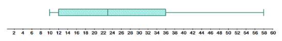
The display of the five-number summary produces a box-and-whisker plot as shown below:
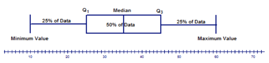
The above model of a box-and-whisker plot shows 2 horizontal lines (the whiskers) that each contain 25% of the data and are of the same length. In addition, it shows that the median of the data set is in the middle of the box, which contains 50% of the data. The lengths of the whiskers and the location of the median with respect to the center of the box are used to describe the distribution of the data. It's important to note that this is just an example. Not all box-and-whisker plots have the median in the middle of the box and whiskers of the same size.
Information about the data set that can be determined from the box-and-whisker plot with respect to the location of the median includes the following:
a. If the median is located in the center or near the center of the box, the distribution is approximately symmetric.
b. If the median is located to the left of the center of the box, the distribution is positively skewed.
c. If the median is located to the right of the center of the box, the distribution is negatively skewed.
Information about the data set that can be determined from the box-and-whisker plot with respect to the length of the whiskers includes the following:
a. If the whiskers are the same or almost the same length, the distribution is approximately symmetric.
b. If the right whisker is longer than the left whisker, the distribution is positively skewed.
c. If the left whisker is longer than the right whisker, the distribution is negatively skewed.
The length of the whiskers also gives you information about how spread out the data is.
A box-and-whisker plot is often used when the number of data values is large. The center of the distribution, the nature of the distribution, and the range of the data are very obvious from the graph. The five-number summary divides the data into quarters by use of the medians of the upper and lower halves of the data. Many data sets contain values that are either extremely high values or extremely low values compared to the rest of the data values. These values are called outliers. There are several reasons why a data set may contain an outlier. Some of these are listed below:
- The value may be the result of an error made in measurement or in observation. The researcher may have measured the variable incorrectly.
- The value may simply be an error made by the researcher in recording the value. The value may have been written or typed incorrectly.
- The value could be a result obtained from a subject not within the defined population. A researcher recording marks from a math 12 examination may have recorded a mark by a student in grade 11 who was taking math 12.
- The value could be one that is legitimate but is extreme compared to the other values in the data set. (This rarely occurs, but it is a possibility.)
If an outlier is present because of an error in measurement, observation, or recording, then either the error should be corrected, or the outlier should be omitted from the data set. If the outlier is a legitimate value, then the statistician must make a decision as to whether or not to include it in the set of data values. There is no rule that tells you what to do with an outlier in this case.
One method for checking a data set for the presence of an outlier is to follow the procedure below:
- Organize the given data set and determine the values of Q1 and Q3.
- Calculate the difference between Q1 and Q3. This difference is called the interquartile range (IQR): IQR=Q3−Q1.
- Multiply the difference by 1.5, subtract this result from Q1, and add it to Q3.
- The results from Step 3 will be the range into which all values of the data set should fit. Any values that are below or above this range are considered outliers.
Listing a Five-Number Summary and Describing the Distribution
For each box-and-whisker plot, list the five-number summary and describe the distribution based on the location of the median.
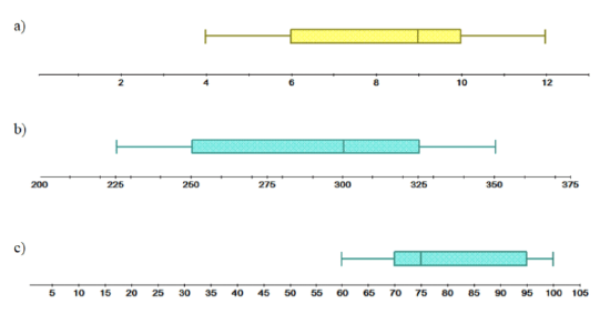
a. Minimum value →4
Q1→6
Median →9
Q3→10
Maximum value →12
The median of the data set is located to the right of the center of the box, which indicates that the distribution is negatively skewed.
b. Minimum value →225
Q1→250
Median →300
Q3→325
Maximum value →350
The median of the data set is located to the right of the center of the box, which indicates that the distribution is negatively skewed.
c. Minimum value →60
Q1→70
Median →75
Q3→95
Maximum value →100
The median of the data set is located to the left of the center of the box, which indicates that the distribution is positively skewed.
Constructing a Box-and-Whisker Plot
The numbers of square feet (in 100s) of 10 of the largest museums in the world are shown below:
650, 547, 204, 213, 343, 288, 222, 250, 287, 269
Construct a box-and-whisker plot for the above data set and describe the distribution.
The first step is to organize the data values as follows:
20,400 21,300 22,200 25,000 26,900 28,700 28,800 34,300 54,700 65,000
Now calculate the median, Q1, and Q3.
20,400 21,300 22,200 25,000 26,900 28,700 28,800 34,300 54,700 65,000
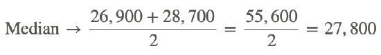
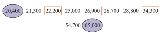
Q1=22,200
Q3=34,300
Next, complete the following list:
Minimum value →20,400
Q1→22,200
Median →27,800
Q3→34,300
Maximum value →65,000
The right whisker is longer than the left whisker, which indicates that the distribution is positively skewed.
Checking for Outliers
Using the procedure outlined above, check the following data sets for outliers:
a. 18, 20, 24, 21, 5, 23, 19, 22
Organize the given data set as follows:
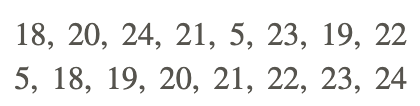
Determine the values for Q1 and Q3.
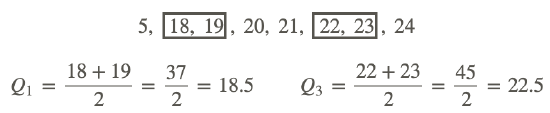
Calculate the difference between Q1 and Q3:
Q3 − Q1 = 22.5 − 18.5 = 4.0.
Multiply this difference by 1.5: (4.0)(1.5)=6.0.
Finally, compute the range.
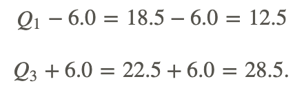
Are there any data values below 12.5? Yes, the value of 5 is below 12.5 and is, therefore, an outlier.
Are there any values above 28.5? No, there are no values above 28.5.
b. 12, 15, 19, 14, 26, 17, 12, 42, 18
Organize the given data set as follows:
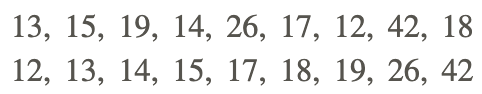
Determine the values for Q1 and Q3.
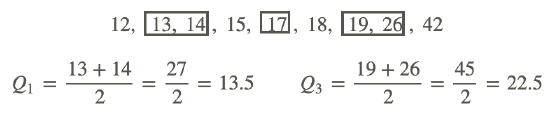
Calculate the difference between Q1 and Q3:
Q3 − Q1 = 22.5 − 13.5 = 9.0.
Multiply this difference by 1.5: (9.0)(1.5)=13.5.
Finally, compute the range.
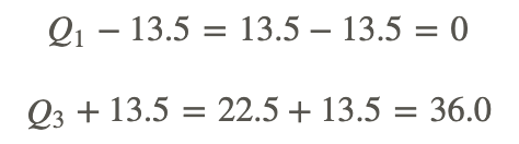
Are there any data values below 0? No, there are no values below 0.
Are there any values above 36.0? Yes, the value of 42 is above 36.0 and is, therefore, an outlier.
Points to Consider
- Are there still other ways to represent data graphically?
- Are there other uses for a box-and-whisker plot?
- Can box-and-whisker plots be used for comparing data sets?
Examples
For the following data sets, determine the five-number summaries:
Example 1
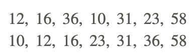
12, 16, 36, 10, 31, 23, 58
The first step is to organize the values in the data set as shown below:
Now complete the following list:
Minimum value →10
Q1→12
Median →23
Q3→36
Maximum value →58
Example 2
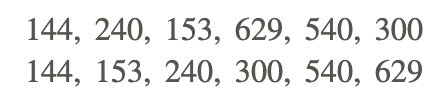
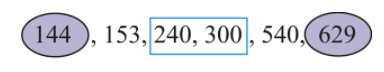
144, 240, 153, 629, 540, 300
The first step is to organize the values in the data set as shown below:
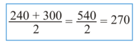
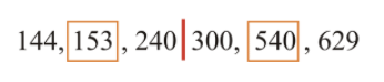
Now complete the following list:
Minimum value →144
Q1→153
Median →270
Q3→540
Maximum value →629
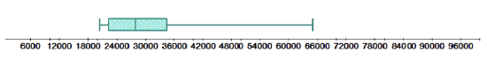
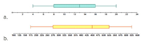
Example 3
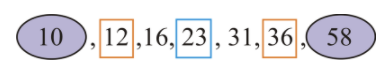
Use the data set from Example 1 and the five-number summary to construct a box-and-whisker plot to model the data set.
The five-number summary can now be used to construct a box-and-whisker plot for part i. Be sure to provide a scale on the number line that includes the range from the minimum value to the maximum value.
Minimum value →10
Q1→12
Median →23
Q3→36
Maximum value →58
It is very visible that the right whisker is much longer than the left whisker. This indicates that the distribution is positively skewed.
Review
- Which of the following is not a part of the five-number summary?
a. Q1 and Q3
b. the mean
c. the median
d. minimum and maximum values - What percent of the data is contained in the box of a box-and-whisker plot?
a. 25%
b. 100%
c. 50%
d. 75% - What name is given to the horizontal lines to the left and right of the box of a box-and-whisker plot?
a. axis
b. whisker
c. range
d. plane - What term describes the distribution of a data set if the median of the data set is located to the left of the center of the box in a box-and-whisker plot?
a. positively skewed
b. negatively skewed
c. approximately symmetric
d. not skewed - What 2 values of the five-number summary are connected with 2 horizontal lines on a box-and-whisker plot?
a. Minimum value and the median
b. Maximum value and the median
c. Minimum and maximum values
d. Q1 and Q3 - For the following data sets, determine the five-number summaries:
a. 74, 69, 83, 79, 60, 75, 67, 71
b. 6, 9, 3, 12, 11, 9, 15, 5, 7 - For each of the following box-and-whisker plots, list the five-number summary and comment on the distribution of the data:
8. The following data represents the number of coins that 12 randomly selected people had in their piggy banks:
35 58 29 44 104 39 72 34 50 41 64 54
Construct a box-and-whisker plot for the above data.
9. The following data represent the time (in minutes) that each of 20 people waited in line at a local book store to purchase the latest Harry Potter book:
15 8 5 10 14 17 21 23 6 19 31 34 30 31 3 22 17 25 5 16
Construct a box-and-whisker plot for the above data. Are the data skewed in any direction?
10. Firman’s Fitness Factory is a new gym that offers reasonably-priced family packages. The following table represents the number of family packages sold during the opening month:
11. Construct a box-and-whisker plot for the data. Are the data symmetric or skewed?
12. Shown below is the number of new stage shows that appeared in Las Vegas for each of the past several years. Construct a box-and-whisker plot for the data and comment of the shape of the distribution. 3129343038403638323935
13. The following data represent the average snowfall (in centimeters) for 18 Canadian cities for the month of January. Construct a box-and-whisker plot to model the data. Is the data skewed? Justify your answer.
| Name of City | Amount of Snow(cm) |
|---|---|
| Calgary | 123.4 |
| Charlottetown | 74.5 |
| Edmonton | 80.6 |
| Fredericton | 73.8 |
| Halifax | 64.0 |
| Labrador City | 110.4 |
| Moncton | 82.4 |
| Montreal | 63.6 |
| Ottawa | 48.9 |
| Quebec City | 53.8 |
| Regina | 35.9 |
| Saskatoon | 25.4 |
| St. John’s | 97.5 |
| Sydney | 44.2 |
| Toronto | 21.8 |
| Vancouver | 12.8 |
| Victoria | 8.3 |
| Winnipeg | 76.2 |
13. Using the procedure outlined in this concept, check the following data sets for outliers:
a. 25, 33, 55, 32, 17, 19, 15, 18, 21
b. 149, 123, 126, 122, 129, 120
Vocabulary
| Term | Definition |
|---|---|
| box-and-whisker plot | A box-and-whisker plot is a graph based upon medians. It shows the minimum value, the lower median, the median, the upper median, and the maximum value of a data set. It is also known as a box plot. |
| five-number summary | The numbers needed to construct a box-and-whisker plot are called the five-number summary. The five-number summary are: the minimum value, Q1, the median, Q2, and the maximum value. |
| Extremes | The extremes are the maximum and minimum values in a data set. |
| five point summary | The numbers needed to construct a box-and-whisker plot are called the five-point-summary. The five points are the minimum, the lower median (Q1), the median, the upper median (Q3), and the maximum. |
| line of fit | A line of fit is a straight or continuously curved line representing the trend of changes in the comparison of two data sets (or one set of bivariate data). |
| Median | The median of a data set is the middle value of an organized data set. |
| observed data | Observed data are the values that result from computations performed on the input variable. |
| Outlier | In statistics, an outlier is a data value that is far from other data values. |
| Quartile | A quartile is each of four equal groups that a data set can be divided into. |
| skewed | As with the horizontal skewing of a histogram, stem plots with a obvious skew toward one end or the other tend to indicate an increased number of outliers either lesser than or greater than the mode. |
| statistical correlation | Statistical correlation is a representation of possible related changes in values between the two sets of data. |
| trends | Trends in data sets or samples are indicators found by reviewing the data from a general or overall standpoint |
| uniform | A uniform shaped histogram indicates data that is very consistent; the frequency of each class is very similar to that of the others. |
Additional Resources
PLIX: Play, Learn, Interact, eXplore - Box-and-Whisker Plot: Babies in a Waiting Room
Video: Data Analysis - Creating A Box And Whisker Plot
Activities: Box-and-Whisker Plots Discussion Questions
Study Aids: Presenting Univariate Data
Lesson Plans: Box and Whisker Plots Lesson Plan
Practice: Create and Understand Box-and-Whisker Plots
Real World: Box and Whisker Plots