
2.9.4: Double Box-and-Whisker Plots
- Page ID
- 5781
\( \newcommand{\vecs}[1]{\overset { \scriptstyle \rightharpoonup} {\mathbf{#1}} } \)
\( \newcommand{\vecd}[1]{\overset{-\!-\!\rightharpoonup}{\vphantom{a}\smash {#1}}} \)
\( \newcommand{\dsum}{\displaystyle\sum\limits} \)
\( \newcommand{\dint}{\displaystyle\int\limits} \)
\( \newcommand{\dlim}{\displaystyle\lim\limits} \)
\( \newcommand{\id}{\mathrm{id}}\) \( \newcommand{\Span}{\mathrm{span}}\)
( \newcommand{\kernel}{\mathrm{null}\,}\) \( \newcommand{\range}{\mathrm{range}\,}\)
\( \newcommand{\RealPart}{\mathrm{Re}}\) \( \newcommand{\ImaginaryPart}{\mathrm{Im}}\)
\( \newcommand{\Argument}{\mathrm{Arg}}\) \( \newcommand{\norm}[1]{\| #1 \|}\)
\( \newcommand{\inner}[2]{\langle #1, #2 \rangle}\)
\( \newcommand{\Span}{\mathrm{span}}\)
\( \newcommand{\id}{\mathrm{id}}\)
\( \newcommand{\Span}{\mathrm{span}}\)
\( \newcommand{\kernel}{\mathrm{null}\,}\)
\( \newcommand{\range}{\mathrm{range}\,}\)
\( \newcommand{\RealPart}{\mathrm{Re}}\)
\( \newcommand{\ImaginaryPart}{\mathrm{Im}}\)
\( \newcommand{\Argument}{\mathrm{Arg}}\)
\( \newcommand{\norm}[1]{\| #1 \|}\)
\( \newcommand{\inner}[2]{\langle #1, #2 \rangle}\)
\( \newcommand{\Span}{\mathrm{span}}\) \( \newcommand{\AA}{\unicode[.8,0]{x212B}}\)
\( \newcommand{\vectorA}[1]{\vec{#1}} % arrow\)
\( \newcommand{\vectorAt}[1]{\vec{\text{#1}}} % arrow\)
\( \newcommand{\vectorB}[1]{\overset { \scriptstyle \rightharpoonup} {\mathbf{#1}} } \)
\( \newcommand{\vectorC}[1]{\textbf{#1}} \)
\( \newcommand{\vectorD}[1]{\overrightarrow{#1}} \)
\( \newcommand{\vectorDt}[1]{\overrightarrow{\text{#1}}} \)
\( \newcommand{\vectE}[1]{\overset{-\!-\!\rightharpoonup}{\vphantom{a}\smash{\mathbf {#1}}}} \)
\( \newcommand{\vecs}[1]{\overset { \scriptstyle \rightharpoonup} {\mathbf{#1}} } \)
\(\newcommand{\longvect}{\overrightarrow}\)
\( \newcommand{\vecd}[1]{\overset{-\!-\!\rightharpoonup}{\vphantom{a}\smash {#1}}} \)
\(\newcommand{\avec}{\mathbf a}\) \(\newcommand{\bvec}{\mathbf b}\) \(\newcommand{\cvec}{\mathbf c}\) \(\newcommand{\dvec}{\mathbf d}\) \(\newcommand{\dtil}{\widetilde{\mathbf d}}\) \(\newcommand{\evec}{\mathbf e}\) \(\newcommand{\fvec}{\mathbf f}\) \(\newcommand{\nvec}{\mathbf n}\) \(\newcommand{\pvec}{\mathbf p}\) \(\newcommand{\qvec}{\mathbf q}\) \(\newcommand{\svec}{\mathbf s}\) \(\newcommand{\tvec}{\mathbf t}\) \(\newcommand{\uvec}{\mathbf u}\) \(\newcommand{\vvec}{\mathbf v}\) \(\newcommand{\wvec}{\mathbf w}\) \(\newcommand{\xvec}{\mathbf x}\) \(\newcommand{\yvec}{\mathbf y}\) \(\newcommand{\zvec}{\mathbf z}\) \(\newcommand{\rvec}{\mathbf r}\) \(\newcommand{\mvec}{\mathbf m}\) \(\newcommand{\zerovec}{\mathbf 0}\) \(\newcommand{\onevec}{\mathbf 1}\) \(\newcommand{\real}{\mathbb R}\) \(\newcommand{\twovec}[2]{\left[\begin{array}{r}#1 \\ #2 \end{array}\right]}\) \(\newcommand{\ctwovec}[2]{\left[\begin{array}{c}#1 \\ #2 \end{array}\right]}\) \(\newcommand{\threevec}[3]{\left[\begin{array}{r}#1 \\ #2 \\ #3 \end{array}\right]}\) \(\newcommand{\cthreevec}[3]{\left[\begin{array}{c}#1 \\ #2 \\ #3 \end{array}\right]}\) \(\newcommand{\fourvec}[4]{\left[\begin{array}{r}#1 \\ #2 \\ #3 \\ #4 \end{array}\right]}\) \(\newcommand{\cfourvec}[4]{\left[\begin{array}{c}#1 \\ #2 \\ #3 \\ #4 \end{array}\right]}\) \(\newcommand{\fivevec}[5]{\left[\begin{array}{r}#1 \\ #2 \\ #3 \\ #4 \\ #5 \\ \end{array}\right]}\) \(\newcommand{\cfivevec}[5]{\left[\begin{array}{c}#1 \\ #2 \\ #3 \\ #4 \\ #5 \\ \end{array}\right]}\) \(\newcommand{\mattwo}[4]{\left[\begin{array}{rr}#1 \amp #2 \\ #3 \amp #4 \\ \end{array}\right]}\) \(\newcommand{\laspan}[1]{\text{Span}\{#1\}}\) \(\newcommand{\bcal}{\cal B}\) \(\newcommand{\ccal}{\cal C}\) \(\newcommand{\scal}{\cal S}\) \(\newcommand{\wcal}{\cal W}\) \(\newcommand{\ecal}{\cal E}\) \(\newcommand{\coords}[2]{\left\{#1\right\}_{#2}}\) \(\newcommand{\gray}[1]{\color{gray}{#1}}\) \(\newcommand{\lgray}[1]{\color{lightgray}{#1}}\) \(\newcommand{\rank}{\operatorname{rank}}\) \(\newcommand{\row}{\text{Row}}\) \(\newcommand{\col}{\text{Col}}\) \(\renewcommand{\row}{\text{Row}}\) \(\newcommand{\nul}{\text{Nul}}\) \(\newcommand{\var}{\text{Var}}\) \(\newcommand{\corr}{\text{corr}}\) \(\newcommand{\len}[1]{\left|#1\right|}\) \(\newcommand{\bbar}{\overline{\bvec}}\) \(\newcommand{\bhat}{\widehat{\bvec}}\) \(\newcommand{\bperp}{\bvec^\perp}\) \(\newcommand{\xhat}{\widehat{\xvec}}\) \(\newcommand{\vhat}{\widehat{\vvec}}\) \(\newcommand{\uhat}{\widehat{\uvec}}\) \(\newcommand{\what}{\widehat{\wvec}}\) \(\newcommand{\Sighat}{\widehat{\Sigma}}\) \(\newcommand{\lt}{<}\) \(\newcommand{\gt}{>}\) \(\newcommand{\amp}{&}\) \(\definecolor{fillinmathshade}{gray}{0.9}\)Double Box-and-Whisker Plots
Double box-and-whisker plots give you a quick visual comparison of 2 sets of data, as was also found with other double graph forms covered in previous sections . The difference with double box-and-whisker plots is that you are also able to quickly visually compare the means, the medians, the maximums (upper range), and the minimums (lower range) of the data.
The double box-and-whisker plots in the first 2 examples were drawn using a program called Autograph. You can also draw double box-and-whisker plots by hand using pencil and paper or by using your TI-84 calculator, as was done in the third example.
Drawing Box-and-Whisker Plots
1. Emma and Daniel are surveying the times it takes students to arrive at school from home. There are 2 main groups of commuters who were in the survey. There were those who drove their own cars to school, and there were those who took the school bus. Emma and Daniel collected the following data:
Bus times (min) 14 18 16 22 25 12 32 16 15 18
Car times (min) 12 10 13 14 9 17 11 10 8 11
Draw a box-and-whisker plot for both sets of data on the same number line. Use the double box-and-whisker plots to compare the times it takes for students to arrive at school either by car or by bus.
When plotted, the box-and-whisker plots look like the following:
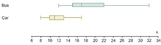
Using the medians, 50% of the cars arrive at school in 11 minutes or less, whereas 50% of the students arrive by bus in 17 minutes or less. The range for the car times is 17−8=9 minutes. For the bus times, the range is 32−12=20 minutes. Since the range for the driving times is smaller, it means the times to arrive by car are less spread out. This would, therefore, mean that the times are more predictable and reliable.
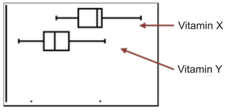
2. A new drug study was conducted by a drug company in Medical Town. In the study, 15 people were chosen at random to take Vitamin X for 2 months and then have their cholesterol levels checked. In addition, 15 different people were randomly chosen to take Vitamin Y for 2 months and then have their cholesterol levels checked. All 30 people had cholesterol levels between 8 and 10 before taking one of the vitamins. The drug company wanted to see which of the 2 vitamins had the greatest impact on lowering people’s cholesterol. The following data was collected:
Vitamin X 7.2 7.5 5.2 6.5 7.7 10 6.4 7.6 7.7 7.8 8.1 8.3 7.2 7.1 6.5
Vitamin Y 4.8 4.4 4.5 5.1 6.5 8 3.1 4.6 5.2 6.1 5.5 4.2 4.5 5.9 5.2
Draw a box-and-whisker plot for both sets of data on the same number line. Use the double box-and-whisker plots to compare the 2 vitamins and provide a conclusion for the drug company.
When plotted, the box-and-whisker plots look like the following:
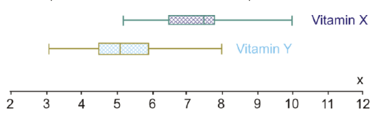
Using the medians, 50% of the people in the study had cholesterol levels of 7.5 or lower after being on Vitamin X for 2 months. Also 50% of the people in the study had cholesterol levels of 5.1 or lower after being on Vitamin Y for 2 months. Knowing that the participants of the survey had cholesterol levels between 8 and 10 before beginning the study, it appears that Vitamin Y had a bigger impact on lowering the cholesterol levels. The range for the cholesterol levels for people taking Vitamin X was 10−5.2=4.8 points, while the range for the cholesterol levels for people taking Vitamin Y was 8−3.1=4.9 points. Therefore, the range is not useful in making any conclusions.
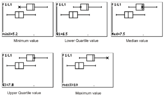
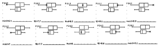
Drawing a Double Box-and-Whisker Plot Using a Calculator
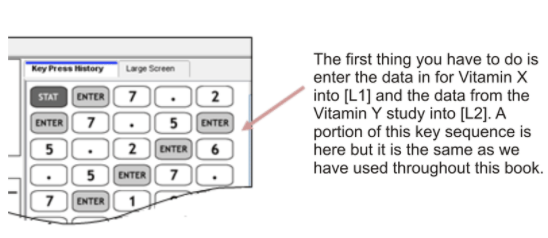
Draw the double box-and-whisker plots in Example B using the TI-84 calculator.
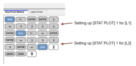
Follow the key sequence below to draw the double box-and-whisker plots:
After entering the data into L1 and L2, the next step is to graph the data by using STAT PLOT.
The resulting graph looks like the following:
You can then press TRACE and find the five-number summary. The five-number summary is shown below for Vitamin X. By pressing the ▾ button, you can get to the second box-and-whisker plot (for Vitamin Y) and collect the five-number summary for this box-and-whisker plot.
Points to Consider
- How is comparing double graphs (i.e., double box-and-whisker plots) useful when doing statistics?
Example
2 campus bookstores are having a price war on the prices of their first-year math books. James, a first-year math major, is going into each store to try to find the cheapest books he can find. He looks at 5 randomly chosen first-year books for first-year math courses in each store to determine where he should buy the 5 textbooks he needs for his courses this coming year. He collects the following data:
Example 1
Draw a box-and-whisker plot for both sets of data on the same number line. Use the double box-and-whisker plots to compare the 2 bookstores' prices, and provide a conclusion for James as to where to buy his books for his first-year math courses.
The box-and-whisker plots are plotted and look like the following:
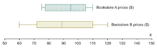
Using the medians, 50% of the books at Bookstore A are likely to be in the price range of $95 or less, whereas at Bookstore B, 50% of the books are likely to be around $89 or less. At first glance, you would probably recommend to James that he go to Bookstore B. Let’s look at the ranges for the 2 bookstores to see the spread of data. For Bookstore A, the range is $110−$75=$35, and for Bookstore B, the range is $120−$60=$60. With the spread of the data much greater at Bookstore B than at Bookstore A, (i.e., the range for Bookstore B is greater than that for Bookstore A), to say that it would be cheaper to buy James’s books at Bookstore A would be more predictable and reliable. You would, therefore, suggest to James that he is probably better off going to Bookstore A.
Review
- International Baccalaureate has 2 levels of courses, which are standard level (SL) and higher level (HL). Students say that study times are the same for both the standard level exams and the higher level exams. The following data represents the results of a survey conducted to determine how many hours a random sample of students studied for their final exams at each level: HL Exams1516161719105655810 81217SL Exams 106 6 7 9 12 2625720188 18 Draw a box-and-whisker plot for both sets of data on the same number line. Use the double box-and-whisker plots to determine the five-number summary for both sets of data. Compare the times students prepare for each level of exam.
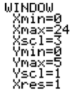
- Create the double box-and-whisker plots in question 1 using a TI calculator. Use the following WINDOW settings:
3. Students in the AP math class at BCU High School took their SATs for university entrance. The following scores were obtained for the math and verbal sections:
Math 529 533 544 562 513 519 560 575 568 537 561 522 563 571
Verbal 499 509 524 530 550 499 545 560 579 524 478 487 482 570
Draw a box-and-whisker plot for both sets of data on the same number line. Use the double box-and-whisker plots to determine the five-number summary for both sets of data. Compare the data for the 2 sections of the SAT using the five-number summary data.
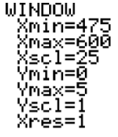
4. Create the double box-and-whisker plots in question 3 using a TI calculator. Use the following WINDOW settings:
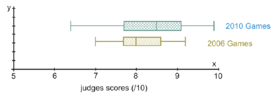
The following box-and-whisker plots were drawn to analyze the data collected in a survey of scores for the doubles performances in the figure skating competitions at 2 Winter Olympic games. The box-and-whisker plot on the top represents the scores obtained at the 2010 winter games in Whistler, BC. The box-and-whisker plot on the bottom represents the scores obtained at the 2006 winter games in Torino, Italy.
Here is what the double box-and-whisker plots look like when created with a TI-84 calculator:
Use the double box-and-whisker plots to answer the following questions:
- What is the five-number summary for the 2006 games?
- What is the five-number summary for the 2010 games?
- 50% of the judge’s scores were at least what for the 2006 games? 50% of the judge’s scores were at least what for the 2010 games?
- What was the range for the scores in the 2006 games? What was the range for the scores in the 2010 games?
- In which of the winter games would you say that the data is more equally spread out?
- In which of the winter games would you say that the scoring was more predictable and reliable?
Vocabulary
| Term | Definition |
|---|---|
| double box-and-whisker plots | Two box-and-whisker plots that are plotted on the same number line. |
| double box-and-whisker plot | Double box-and-whisker plots are two box-and-whisker plotted on the same number line. |
Additional Resources
PLIX: Play, Learn, Interact, eXplore - Double Box and Whisker Plots Principles
Activities: Double Box-and-Whisker Plots Discussion Questions
Lesson Plans: Double Box and Whisker Plots Lesson Plan
Practice: Double Box-and-Whisker Plots
Real World: Double Box and Whisker Plots