
4.7: VII. Developing Mathematical Representations of Changing Quantities
- Page ID
- 15139
\( \newcommand{\vecs}[1]{\overset { \scriptstyle \rightharpoonup} {\mathbf{#1}} } \)
\( \newcommand{\vecd}[1]{\overset{-\!-\!\rightharpoonup}{\vphantom{a}\smash {#1}}} \)
\( \newcommand{\id}{\mathrm{id}}\) \( \newcommand{\Span}{\mathrm{span}}\)
( \newcommand{\kernel}{\mathrm{null}\,}\) \( \newcommand{\range}{\mathrm{range}\,}\)
\( \newcommand{\RealPart}{\mathrm{Re}}\) \( \newcommand{\ImaginaryPart}{\mathrm{Im}}\)
\( \newcommand{\Argument}{\mathrm{Arg}}\) \( \newcommand{\norm}[1]{\| #1 \|}\)
\( \newcommand{\inner}[2]{\langle #1, #2 \rangle}\)
\( \newcommand{\Span}{\mathrm{span}}\)
\( \newcommand{\id}{\mathrm{id}}\)
\( \newcommand{\Span}{\mathrm{span}}\)
\( \newcommand{\kernel}{\mathrm{null}\,}\)
\( \newcommand{\range}{\mathrm{range}\,}\)
\( \newcommand{\RealPart}{\mathrm{Re}}\)
\( \newcommand{\ImaginaryPart}{\mathrm{Im}}\)
\( \newcommand{\Argument}{\mathrm{Arg}}\)
\( \newcommand{\norm}[1]{\| #1 \|}\)
\( \newcommand{\inner}[2]{\langle #1, #2 \rangle}\)
\( \newcommand{\Span}{\mathrm{span}}\) \( \newcommand{\AA}{\unicode[.8,0]{x212B}}\)
\( \newcommand{\vectorA}[1]{\vec{#1}} % arrow\)
\( \newcommand{\vectorAt}[1]{\vec{\text{#1}}} % arrow\)
\( \newcommand{\vectorB}[1]{\overset { \scriptstyle \rightharpoonup} {\mathbf{#1}} } \)
\( \newcommand{\vectorC}[1]{\textbf{#1}} \)
\( \newcommand{\vectorD}[1]{\overrightarrow{#1}} \)
\( \newcommand{\vectorDt}[1]{\overrightarrow{\text{#1}}} \)
\( \newcommand{\vectE}[1]{\overset{-\!-\!\rightharpoonup}{\vphantom{a}\smash{\mathbf {#1}}}} \)
\( \newcommand{\vecs}[1]{\overset { \scriptstyle \rightharpoonup} {\mathbf{#1}} } \)
\( \newcommand{\vecd}[1]{\overset{-\!-\!\rightharpoonup}{\vphantom{a}\smash {#1}}} \)
\(\newcommand{\avec}{\mathbf a}\) \(\newcommand{\bvec}{\mathbf b}\) \(\newcommand{\cvec}{\mathbf c}\) \(\newcommand{\dvec}{\mathbf d}\) \(\newcommand{\dtil}{\widetilde{\mathbf d}}\) \(\newcommand{\evec}{\mathbf e}\) \(\newcommand{\fvec}{\mathbf f}\) \(\newcommand{\nvec}{\mathbf n}\) \(\newcommand{\pvec}{\mathbf p}\) \(\newcommand{\qvec}{\mathbf q}\) \(\newcommand{\svec}{\mathbf s}\) \(\newcommand{\tvec}{\mathbf t}\) \(\newcommand{\uvec}{\mathbf u}\) \(\newcommand{\vvec}{\mathbf v}\) \(\newcommand{\wvec}{\mathbf w}\) \(\newcommand{\xvec}{\mathbf x}\) \(\newcommand{\yvec}{\mathbf y}\) \(\newcommand{\zvec}{\mathbf z}\) \(\newcommand{\rvec}{\mathbf r}\) \(\newcommand{\mvec}{\mathbf m}\) \(\newcommand{\zerovec}{\mathbf 0}\) \(\newcommand{\onevec}{\mathbf 1}\) \(\newcommand{\real}{\mathbb R}\) \(\newcommand{\twovec}[2]{\left[\begin{array}{r}#1 \\ #2 \end{array}\right]}\) \(\newcommand{\ctwovec}[2]{\left[\begin{array}{c}#1 \\ #2 \end{array}\right]}\) \(\newcommand{\threevec}[3]{\left[\begin{array}{r}#1 \\ #2 \\ #3 \end{array}\right]}\) \(\newcommand{\cthreevec}[3]{\left[\begin{array}{c}#1 \\ #2 \\ #3 \end{array}\right]}\) \(\newcommand{\fourvec}[4]{\left[\begin{array}{r}#1 \\ #2 \\ #3 \\ #4 \end{array}\right]}\) \(\newcommand{\cfourvec}[4]{\left[\begin{array}{c}#1 \\ #2 \\ #3 \\ #4 \end{array}\right]}\) \(\newcommand{\fivevec}[5]{\left[\begin{array}{r}#1 \\ #2 \\ #3 \\ #4 \\ #5 \\ \end{array}\right]}\) \(\newcommand{\cfivevec}[5]{\left[\begin{array}{c}#1 \\ #2 \\ #3 \\ #4 \\ #5 \\ \end{array}\right]}\) \(\newcommand{\mattwo}[4]{\left[\begin{array}{rr}#1 \amp #2 \\ #3 \amp #4 \\ \end{array}\right]}\) \(\newcommand{\laspan}[1]{\text{Span}\{#1\}}\) \(\newcommand{\bcal}{\cal B}\) \(\newcommand{\ccal}{\cal C}\) \(\newcommand{\scal}{\cal S}\) \(\newcommand{\wcal}{\cal W}\) \(\newcommand{\ecal}{\cal E}\) \(\newcommand{\coords}[2]{\left\{#1\right\}_{#2}}\) \(\newcommand{\gray}[1]{\color{gray}{#1}}\) \(\newcommand{\lgray}[1]{\color{lightgray}{#1}}\) \(\newcommand{\rank}{\operatorname{rank}}\) \(\newcommand{\row}{\text{Row}}\) \(\newcommand{\col}{\text{Col}}\) \(\renewcommand{\row}{\text{Row}}\) \(\newcommand{\nul}{\text{Nul}}\) \(\newcommand{\var}{\text{Var}}\) \(\newcommand{\corr}{\text{corr}}\) \(\newcommand{\len}[1]{\left|#1\right|}\) \(\newcommand{\bbar}{\overline{\bvec}}\) \(\newcommand{\bhat}{\widehat{\bvec}}\) \(\newcommand{\bperp}{\bvec^\perp}\) \(\newcommand{\xhat}{\widehat{\xvec}}\) \(\newcommand{\vhat}{\widehat{\vvec}}\) \(\newcommand{\uhat}{\widehat{\uvec}}\) \(\newcommand{\what}{\widehat{\wvec}}\) \(\newcommand{\Sighat}{\widehat{\Sigma}}\) \(\newcommand{\lt}{<}\) \(\newcommand{\gt}{>}\) \(\newcommand{\amp}{&}\) \(\definecolor{fillinmathshade}{gray}{0.9}\)34
VII. Developing Mathematical Representations of Changing Quantities
Emily van Zee and Elizabeth Gire
The world is full of changing quantities. Key to becoming aware of what is happening is measuring how much a quantity is changing. That knowledge can provide the basis for thinking about what might be happening next and perhaps for perceiving ways to increase positive outcomes or at least minimize negative ones.
This section develops a mathematical way of representing changing quantities. The first activity explores changing quantities in an everyday context, a tossed ball. The next presents evidence for a changing quantity relevant to global climate change and its impact, estimates of how fast glaciers are melting. Development of an analogy between motion and melting graphs guides making projections for how fast glacial ice may be melting in the future.
A. Developing familiarity with motion graphs for a tossed ball
Rolling, kicking, throwing, and catching a ball are familiar activities for most people. To describe mathematically what is happening to the ball, however, one needs some technical skills: ways to label where the ball is, its position, to describe how that position is changing, the ball’s velocity, and to think about how that velocity is changing, its acceleration. By looking at graphs of how a ball’s position, velocity, and acceleration are changing with time, one can learn a lot about a ball’s motion – is it at rest? Moving with constant speed? Speeding up? Slowing down? Similarly, one can learn a lot about how a quantity of interest is changing by looking at analogous graphs for that quantity, such as how fast are the world’s glaciers melting?
Question 4.14 How do position, velocity, and acceleration of a tossed ball change with time?
To explore this question, use:
- whiteboard,
- basketball,
- motion detector connected to a computer or graphing calculator
- If a motion detector is not available, use:
- Basketball
- Stopwatch,
- Flat board,
- Meter stick or yard stick
- Book or wood block to incline the flat board
A motion detector works by emitting ultrasound waves that are reflected from an object back to the detector. The detector reports how far away the object is and makes a graph of position (where the object is) versus time (the instant it was there). We use a Go Motion! detector that connects directly to a computer (https://www.vernier.com/products/sensors/motion-detectors/).
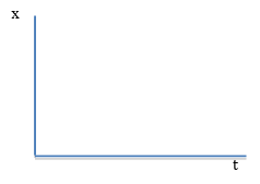
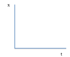
- Start by exploring what a motion looks like on a position versus time graph (x vs t) with the vertical axis representing where the object is (x, its position with respect to the motion detector’s position), and the horizontal axis representing the time the object was there (t, a clock reading). What can you find out about position vs. time graphs by standing still as well as by moving back and forth in front of the motion detector?
- What does the position versus time graph look like if you stand still in front of the motion detector? (If you do not have access to a motion detector, lay a meter or yard stick along a flat board, place the ball next to a numbered mark, and note its position there for multiple instants of time read on the stopwatch. Plot that position on a position vs. time graph.)
- What does the position versus time graph look like if you also stand farther away from the motion detector (or place the ball farther away from the end of the meter stick)?
- What does the height of a point on a position versus time graph represent?
-
- What does the position versus time graph look like if you hold a large white board in front of you in front of the motion detector and move back and forth? The large white board makes it easier for the motion detector to ‘see’ you. If you do not have a motion detector, design a way to measure positions and associated clock readings to create a position vs time graph by rolling the ball along the board when the board is flat and also when the board is inclined.
- What does the position versus time graph look like if you (or the ball) move away from the motion detector at a constant velocity? Move away at a higher constant velocity?
- Move toward the detector at a constant velocity? Toward at a higher constant velocity?
- What does the position versus time graph look like if you move away from the detector while speeding up? Move away from the detector while slowing down?
- Move toward the motion detector while speeding up? Move toward the detector while slowing down?
- What does the slope at a point on a position versus time graph represent?
- What does the position versus time graph look like if you turn around (change direction)?
- If you are looking at a position versus time graph for a motion in which someone turns around, how can you tell which point on the graph represents the turn around?
- Take pictures or make accurate drawings of the resulting graphs.
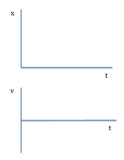
- Click on “insert graph” in the menu bar of the computer screen and choose velocity to add a velocity versus time graph to the computer screen. Adjust the size of the x vs t and v vs t graphs until both fit on the screen, with the velocity graph underneath the position graph. Line up the origins of these graphs so that an event, such as a turn around, that is represented as happening on the position graph is also represented as happening right underneath on the velocity graph. Change the vertical axis of the velocity graph to go from -2 meters to +2 meters.
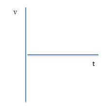
- Explore what a motion looks like on a velocity versus time graph (v vs t) with the vertical axis representing how fast the object is moving toward or away from the motion detector (v, its velocity), and the horizontal axis representing the instant the object was passing a point (t, a clock reading). What can you find out about velocity vs. time graphs by standing still as well as by moving back and forth in front of the motion detector?
- What does the velocity versus time graph look like if you stand still at various positions in front of the motion detector?
- What does the velocity versus time graph look like if you move back and forth in front of the motion detector? (Or you place the meter stick along the flat board, roll the ball along the board, and record the board’s position at particular times, both one way and then the other on the board; then incline the board and roll the ball up the incline so that it turns around and rolls back down. Use your data to calculate the average velocity Δx/Δt between each set of positions.)
- What does the velocity versus time graph look like if you (or the ball) move away from the motion detector at a constant velocity? Move away at a higher constant velocity?
- Move toward the detector at a constant velocity? Toward at a higher constant velocity?
- What does a positive velocity represent? What does a negative velocity represent?
- What does the height of a point on a velocity versus time graph represent?
- What does the velocity versus time graph look like if you move away from the detector while speeding up? Move away from the detector while slowing down?
- If you move toward the detector while speeding up? Move toward while slowing down?
- What does the slope at a point on a velocity versus time graph represent?
- What does the velocity versus time graph look like if you turn around (change direction)?
- Take pictures or make accurate drawings of the resulting graphs.
- What are some connections between the position vs time and velocity vs time graphs?
- How is a turn around (changing direction) represented on a position vs time graph? On a velocity vs time graph?
- How is speeding up represented on a position vs time graph? a velocity vs time graph?
- How is slowing down represented on a position vs time graph? a velocity vs time graph?
To explore the connections among position vs time, velocity vs time, and acceleration vs time graphs, use: motion detector connected to a computer or calculator and a basketball.
- Click on “insert graph” in the menu bar of the computer screen and choose acceleration to add an acceleration versus time graph to the computer screen. Adjust the size of the x vs t, v vs t, and a vs t graphs until all fit on the screen, with the acceleration graph underneath the velocity graph, which is underneath the position graph. Line up the origins so that an event, such as a turn around, that is happening on the position graph is also happening right underneath on the velocity graph and underneath on the acceleration graph. Change the vertical axis of the acceleration graph to read from +12 m/s2 to -12 m/s2 .
- Explore what a motion looks like on position versus time, velocity versus time, and acceleration versus time graphs with the vertical axis representing where the ball is (x vs t), how fast and in what direction it is moving (v vs t), and how its velocity is changing (a vs t) while moving away from or toward the motion detector, with the horizontal axis representing the instant the object was passing a point (t, a clock reading).
- What can you find out about the connections among these graphs by tossing a ball directly up vertically and then catching it as it falls down within the view of a motion detector?
-
- Place the motion detector flat on the floor or a table. Hold the ball over the motion detector. Click on the computer to start the graph.
- Toss the ball straight up above the motion detector so it stays in the detector’s view.
- Catch the ball before it falls all the way back down onto the motion detector!
- Make multiple tosses until the computer stops drawing the graph.
- Look at the position vs time, velocity vs time, and acceleration vs time graphs for each toss. Select the best example from a set of the multiple graphs of the tosses.
- (If you do not have a motion detector, look at the graphs shown in Fig. 4.44.)
-
- Draw the x vs t, v vs t, and a vs t graphs vertically aligned on a white board
- As you draw, talk with one another about what each feature of each graph means:
What does the height of a point on each graph represent? The slope? How do these three types of graphs represent an ‘event’ such as the ball’s turning around at the top of a toss?
- How is the ball toss represented on the position versus time graph? the v vs t graph? the a vs t graph?
- What is the shape of each kind of graph?
- What does the height at a point represent on each graph? The slope?
- How is a turn around (change direction) represented on each kind of graph?
- What are some connections among these graphs?
- Sketch a set of vertically aligned position, velocity, and acceleration graphs for a tossed ball.
- Summarize your understandings by “telling the story” for each graph.
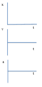
The designers of the Logger Lite computer program chose to use the convention that a toss vertically “up” is in the positive direction and that a fall “down” is in the negative direction. Figure 4.44 shows a set of position, velocity, and acceleration graphs for a ball that was tossed vertically, then caught and tossed vertically again, for four tosses.
The analysis below focuses on the tosses, that is, the time periods during which the ball was in the air after the ball left the hand and before it was caught. These tosses are represented by the parabolas in the position versus time graph, the straight diagonal lines in the velocity versus time graph, and the flat portions of the acceleration versus time graph.
What story is the x vs t graph telling about where the ball is, its position, during a toss?
Height: The height of a point on the position versus time graph represents the ball’s position, how far it is from the motion detector. During the toss, the curved line is a parabola whose height is changing, increasing to a maximum, then decreasing. The parabola represents the changing position of the ball as the ball moves up, away from the motion detector, to a maximum height, turns around (but does NOT stop at the top), and falls back down toward the motion detector until caught. The flat regions of the position versus time graph represent the time during which the ball is held in the person’s hand in the same low position above the motion detector between tosses.
Slope: The slope at a point on the position versus time graph represents the rate at which the ball’s position is changing, its velocity at that point: During the toss, the slope is changing, the ball is moving a different distance during each unit of time. On the trip “up,” the slope is getting less and less steep; the ball is moving shorter and shorter distances during each unit of time. While still moving in the positive direction, “up,” the magnitude of the ball’s velocity is decreasing, that is, the ball is slowing down while moving “up” in the positive direction. On the trip “down,” the slope is getting steeper and steeper; the ball is moving longer and longer distances during each unit of time. While now moving in the negative direction, “down,” the magnitude of the ball’s velocity is increasing, that is, the ball is speeding up while falling “down” in the negative direction.
What story is the v vs t graph telling about how fast the ball is moving and in what direction, its velocity, during a toss?
Height: The height at a point on the velocity versus time graph represents the ball’s velocity: During the toss, the line is a straight diagonal with negative slope: when thrown “up,” the ball starts out at a high velocity in the positive direction, slows down in a regular way while still moving “up” in the positive direction, turns around (v = 0), and speeds up in a regular way while falling “down” in the negative direction until caught.
A positive velocity means that the ball is moving in the positive direction, “up” in this case. As the ball moves “up,” however, it slows down so the initially large positive velocity from the throw gets smaller and smaller until the ball turns around (v=0) and starts falling “down”.
Note that there is no extended time period during which the velocity is zero during the toss; the ball does not “stop” at the top during the turn around. This contrasts with the short time period when the line representing the velocity remains on the horizontal axis, at zero, while the ball is being caught and briefly held before being tossed again.
A negative velocity means that the ball is moving in the negative direction, back toward the motion detector. Although -8 on a number line represents less than -1 on a number line, a velocity of –8 meters/second is much faster than a velocity of -1 meters/second. The minus sign only indicates the direction the ball is going, “down” in this case; the number indicates the magnitude of the velocity, how fast the ball is moving.
In physics, the word speed refers to the magnitude of how fast the ball is moving; the word velocity refers to both the magnitude and direction of motion. If the ball’s velocity is –8 meters/second, its speed is 8 meters/second while the ball is moving in the negative direction.
Slope: The slope at a point on the velocity versus time graph represents the rate at which the ball’s velocity is changing, its acceleration at that point: If the slope is constant, the ball’s velocity is changing by the same amount during each unit of time. If the slope is constant and negative, the ball’s positive velocity is getting slower and slower in a regular way during the “up” portion of the toss; the ball’s negative velocity is getting faster and faster in a regular way during the “down” portion of the toss.
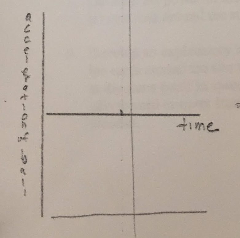
What story is the a vs t graph telling about how fast the ball’s velocity is changing, its acceleration, during the toss?
Height: The height of a point on the acceleration versus time graph represents the ball’s acceleration: During the toss, the line is flat, a straight horizontal line, below the horizontal axis: the ball’s acceleration is negative and constant (about -10 meters/second, every second) throughout the motion, whether the ball is going up or down. This means that during the toss, the velocity of the ball decreased by about 10 meters/second during each second of the trip “up” and increased by about 10/second during each second of the trip “down.” Thus interpreting this graph provides an estimate of the quantity known as the acceleration of gravity, which is often referred to as -9.8 meters/second2, where the minus sign indicates that the direction of the acceleration is toward the center of the Earth.
Slope: The slope at a point on the acceleration versus time graph represents the ball’s change in acceleration. During the toss, the slope is zero, the ball’s acceleration is not changing, its velocity changes by the same negative amount for each unit of time during the entire toss. In accordance with Newton’s second law, F=ma, the force on the ball is constant, the Earth is pulling on the ball in the same way, with the same gravitational force, in the negative direction toward the center of the Earth, during the entire trip, both up and down. (The jagged peaks on this acceleration versus time graph represent the varying acceleration caused by upward forces exerted on the ball by the thrower in catching the ball, holding it briefly, and then tossing it again.)
One connection among these graphs is that the ‘event’ of the ball turning around is represented by the maximum height of the curved line on the position versus time graph and by the straight diagonal line crossing the horizontal axis at zero on the velocity versus time graph but is not represented at all on the acceleration versus time graph.
These graphs are very powerful tools for understanding what is happening when change is occurring. In particular, is something happening slower and slower or faster and faster?
Whenever you see a curve like the tossed ball (downward curved parabola) something is happening either slower and slower, if the curve is like the first half of the toss (“up”), or faster and faster if the curve is like the second half of the toss (“down”)! Seeing a graph with this shape is an alert that not only is change happening but the rate of change is changing, accelerating. It may be hard to detect a pattern when provided columns of numbers; asking for a graph of the data may make visually salient the need for taking informed action.
B. Becoming aware of melting glaciers
One challenge scientists face is communicating to the public what seems to be happening to the global climate and its impacts. One approach is to develop and provide visual images that vividly convey the changes that are occurring.
Question 4.15 What is the evidence that glaciers are melting?
An example of a change occurring in nature is the melting of glaciers on land. According to the National Snow and Ice Data Center, glacial ice currently covers about 10 percent of the land on Earth. If all the ice on Earth melted, sea levels would rise about 70 meters (230 feet) (see https://nsidc.org/cryosphere/glaciers/quickfacts.html).
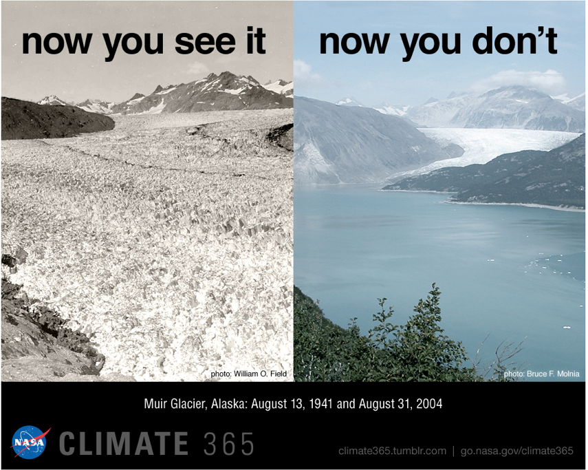
When ice melts within a glacier, liquid water flows as streams into the ocean. Glaciers also flow like rivers of ice very slowly toward the ocean. Calving occurs when large chunks of ice break off the edge of a glacier. Some glaciers have retreated substantially during the past century, as shown by photographs taken in roughly the same place many years apart. Figure 4.45, for example, shows photographs of Muir Glacier, Alaska, taken in 1941 and 2004 from roughly the same place. These photos were included in the National Aeronautics and Space Administration (NASA) Climate 365 project to inform the public about evidence of climate change ( https://climate365.tumblr.com/)
https://climate.nasa.gov/climate_resources/4/graphic-dramatic-glacier-melt/
According to the National Snow and Ice Data Center, this glacier retreated about seven miles during the 63 years between these photographs. The NASA Climate 365 project is a collaboration of the NASA Earth Science News Team, NASA Goddard and Jet Propulsion Laboratory communications teams, and NASA websites Earth Observatory and Global Climate Change. These photographs were taken by William O. Field on Aug. 13, 1941 (left) and by Bruce F. Molnia on Aug. 31, 2004 (right) and are from the Glacier Photograph Collection. Boulder, Colorado USA: National Snow and Ice Data Center/World Data Center for Glaciology.
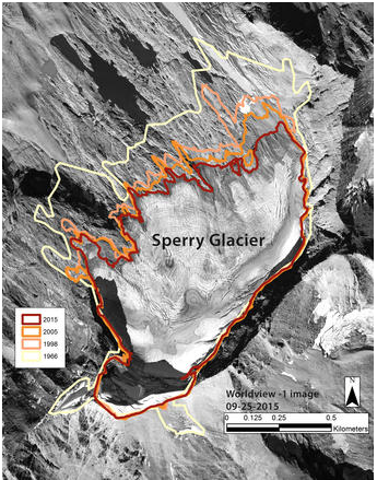
Glacier National Park in Montana also has had major losses of glacial ice. There were about 150 glaciers larger than 25 acres there a century ago; now there are only 26 of at least that size (https://www.usgs.gov/news/glaciers-rapidly-shrinking-and-disappearing-50-years-glacier-change-montana). Decreases in the extent of glacial ice are most evident at the time of maximum melt before new snow and ice form during late fall and winter. Fig. 4.46, for example, shows an aerial photograph of Sperry Glacier in late summer with outlines of its perimeter at similar times in 1966, 1998, 2005, and 2015.
• What impact might the decline in the number and extent of glaciers have on water resources in the region?
Data from satellite images have greatly enhanced scientists’ ability to document changes in the forming and melting of sea ice on the oceans as well as glacial ice on land. The National Snow and Ice Data Center (NSIDC) uses satellite data, for example, to monitor daily, monthly, and yearly the extent to which sea ice covers the Arctic Ocean (See: http://nsidc.org/soac/sea-ice-more-information).
Figure 4.47, for example, compares how much sea ice covered the Arctic Ocean during October in 1981 (left) and during October in 2012 (right). Blue represents regions where sea ice covered more area than normal during October, where normal was defined as the average sea ice coverage during the month of October for the period from 1979 to 2015. Red represents regions where sea ice covered less area than normal for the month of October, that is, areas with more open sea water than in the past. Click on http://nsidc.org/soac/sea-ice.html#seaice and the triangle to watch a graphic display of changes from October 1981 to October 2016.
• What impact would more open sea water have on the Arctic Ocean?
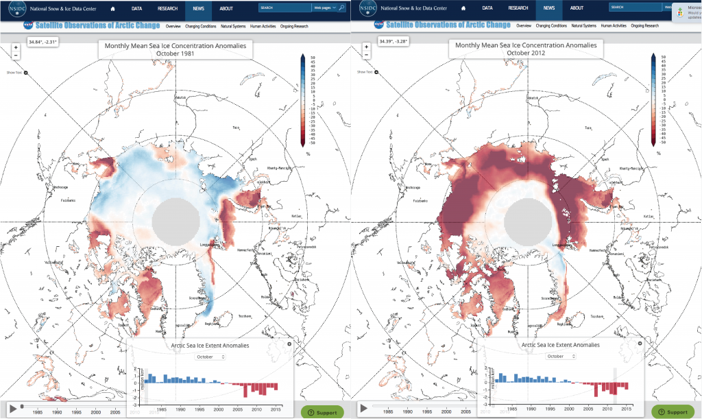
Ice reflects up to 70% of incoming solar radiation; open water, however, reflects less than 10%. Therefore, changes in how much sea ice covers Arctic waters, particularly during the summer, have a big impact on how much energy is reflected back out to space or absorbed. Energy absorbed increases both sea surface and atmospheric temperatures. See http://nsidc.org/arcticseaicenews/ for the latest Arctic Sea Ice News and Analysis.
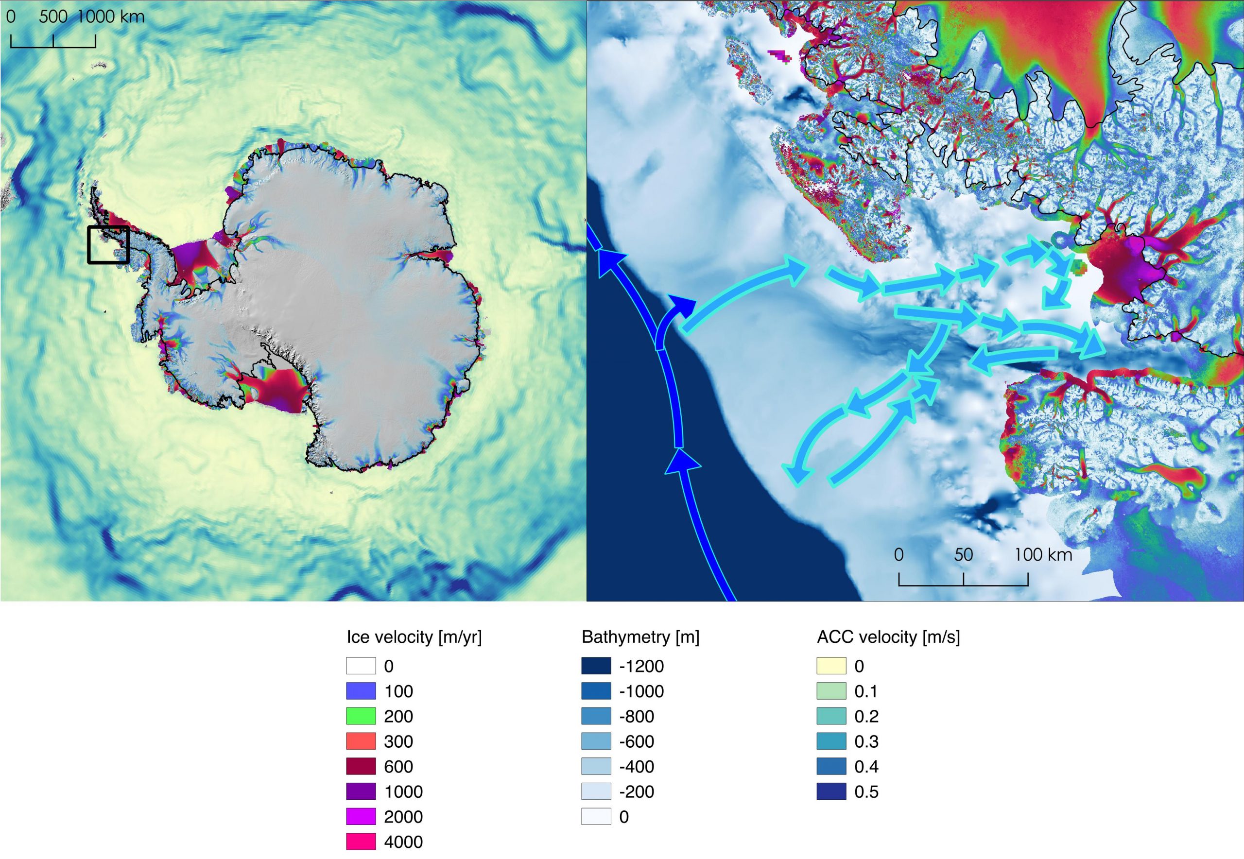
Satellite data also have enabled scientists to document recent acceleration of the movement of glaciers on land toward the Antarctic Ocean due to winds and warm water currents (See: https://climate.nasa.gov/news/2631/wind-warm-water-revved-up-melting-antarctic-glaciers/.) Figure 4.48, for example, represents the velocity of glaciers varying from zero to 4000 meters per year. The area represented by the small black box on the left is shown in detail on the right, with ocean depth (Bathymetry in meters) and arrows representing Antarctic Circumpolar Currents (ACC) bringing warmer ocean water into Marguerite Bay.
• What impact would accelerating glacial ice flow in Antarctica have on global sea levels?
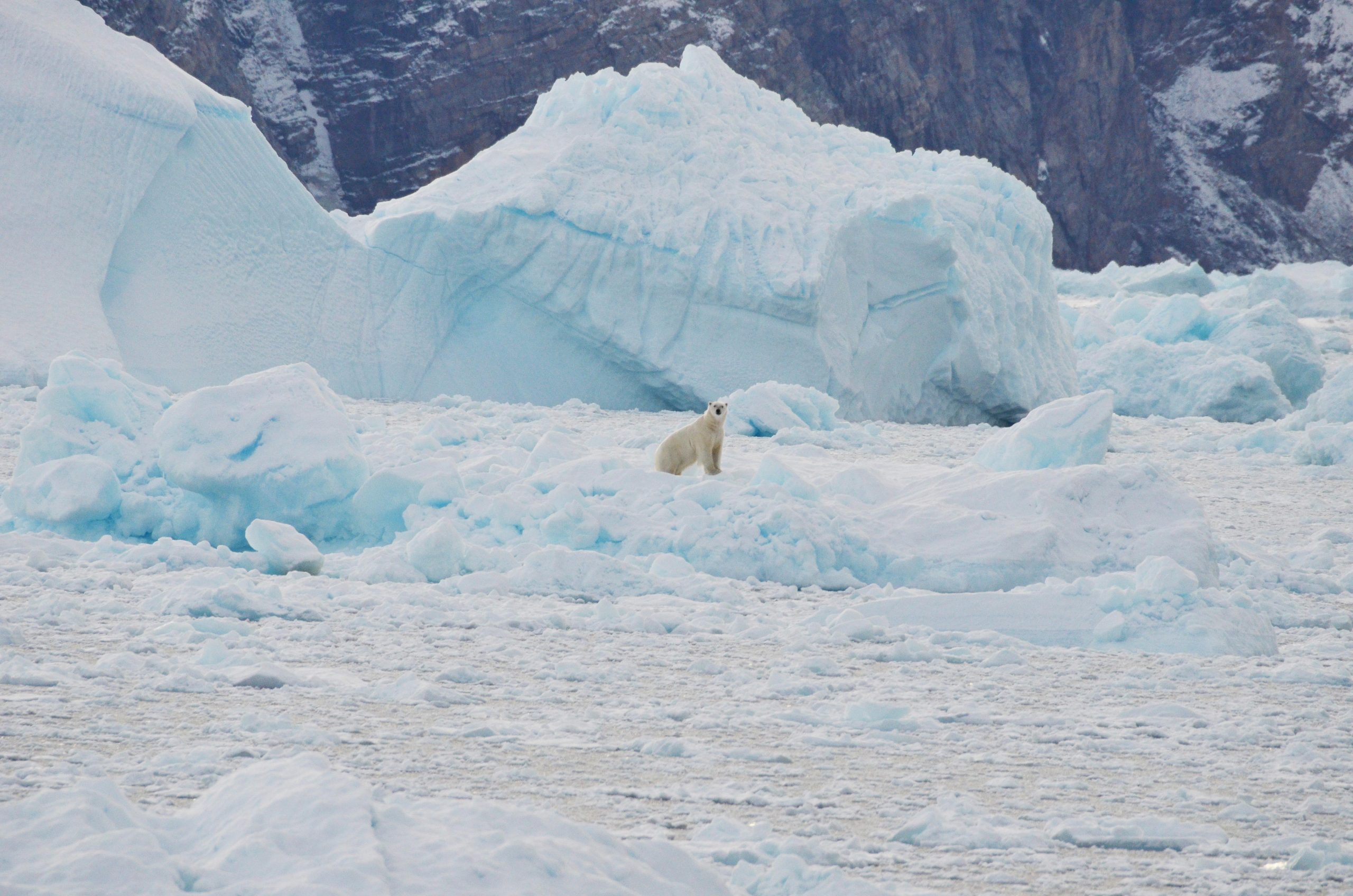
At the interface where glaciers meet open water, large ice chucks can break off and fall into the water as shown in Fig. 4.49. The Oceans Melting Greenland mission explores the role of warm salty Atlantic Ocean in melting Greenland’s glaciers from below (https://omg.jpl.nasa.gov/portal/).
- Watch the trailer for the film at: https://www.youtube.com/watch?v=eIZTMVNBjc4 (2.15 minutes). You may be able to watch the complete one-hour Chasing Ice documentary on a streaming service on the Internet. Additional information is available at http://extremeicesurvey.org .
- Also watch part of a TED (Technology, Entertainment, and Design) talk from 14.24 to 18.27 (4 minutes) at http://ed.ted.com/lessons/james-balog-time-lapse-proof-of-extreme-ice-loss . In this Ted talk, Time-lapse Proof of Extreme Ice Loss, James Balog presents and interprets the extent of melting ice observed at the Ilulissat Glacier, Greenland from 1851 to 2008. What did he and his colleagues find out about this glacier?
A video update showing additional ice loss by this glacier in Greenland, from June 2007 to August 2017, is at https://vimeo.com/168243534. In closing the TED talk, James Balog said, “I believe we have an opportunity right now…to face the greatest challenge of our generation, of our century,…to do the right thing for ourselves and for the future, and I hope we have the wisdom to…rise to the occasion and do what needs to be done.”
C. Making an analogy between falling balls and melting glaciers
A big question in the 1990s and early 2000s was whether the glaciers on Greenland were growing or shrinking. See a story about scientists’ attempts to resolve this issue at https://earthobservatory.nasa.gov/Features/Greenland/greenland.php . New data from the GRACE (Gravity Recovery and Climate Experiment) satellite project were interpreted by Isabella Velicogna (see https://earthobservatory.nasa.gov/Features/Greenland/greenland3.php and https://earthobservatory.nasa.gov/Features/Greenland/greenland4.php ).
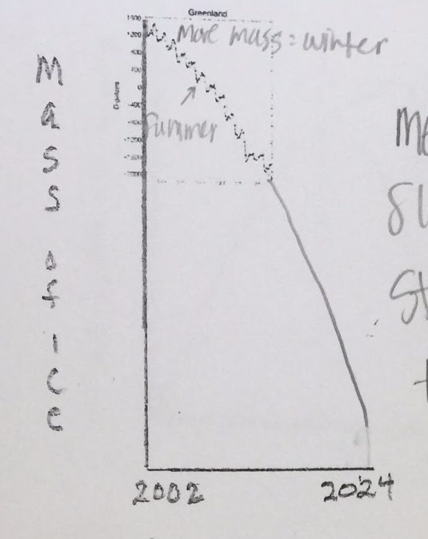
The graph in FIG. 4.50 presents data derived from the GRACE satellite from 2002 to 2014. The red stars represent June values of the mass of ice.
- What do the downward black lines starting at a red star represent?
- What do the upward black lines ending in the red stars represent?
- In which cycles was more ice formed during the cold season than melted during the warm season?
- In which cycles was more ice melted during the warm season than formed during the cold season?
- The blue curve fits the overall trend of these data. Was the slope of the trend getting steeper? About the same? Getting less steep?
What does that imply about the rate of melting during this time period?
Melting faster and faster? Melting about the same? Melting slower and slower?
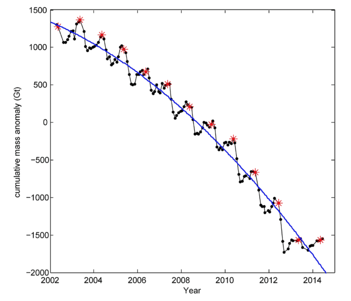
Note that the vertical axis of Fig. 4.50 represents the cumulative mass anomaly in gigatons of ice. An anomaly is a difference with respect to a reference, often an average value over an extended time period. This graph represents the difference between the total mass of ice on a particular date and a reference total mass represented by the 0 on the vertical axis.
By looking at the graph, for example, one can estimate that the mass of ice in June 2002 was about 1300 gigatons more than the reference mass whereas the mass of ice in June 2013 was about 1500 gigatons less than the reference mass of ice. Between 2002 and 2013, about 2800 gigatons of ice on Greenland melted. The absolute mass of ice in gigatons that is the reference is not provided here.
For a discussion of why changing amounts often are analyzed via anomalies rather than changes in absolute amounts, see http://www.realclimate.org/index.php/archives/2014/12/absolute-temperatures-and-relative-anomalies/ . Note also that something interesting happened during the ice melts for 2012 and 2014, which raises the interesting issue of what might happen next!
Analysis of ice melting in Greenland is one case. What is happening to glaciers world wide? As shown in Fig. 4.51, the World Glacier Monitoring Service (WGMS) produced similarly shaped graphs representing cumulative mass change for glaciers based on measurements from 1950 to 2018, compared to their masses in 1976 (https://wgms.ch/global-glacier-state/).
Interpret Fig. 4.51:
- What does the horizontal axis represent?
- What does the vertical axis represent?
- What do the lines represent?
- What does the shape of the lines imply about world-wide changes in the mass of glaciers?
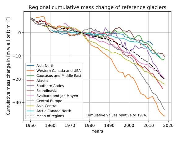
The colored line graphs represent data from reference glaciers in ten regions world wide. The dashed black line represents the average cumulative mass change for all ten regions. During 2015-2016, the World Glacier Monitoring Service collected data from more than 130 glaciers around the world (http://wgms.ch/latest-glacier-mass-balance-data/). Of these, 40 were “reference” glaciers for which they had continuous data for more than 30 years.
The difference between the mass of ice gained during the cold season and the mass of ice that melted during the warm season is the annual net mass balance. The plots are cumulative, increasing or decreasing the reference total by how much mass of ice has been added or lost each year since 1950.
• In which parts of the world are the glaciers melting the fastest? The slowest?
Question 4.16 How can familiarity with motion graphs guide making projections for the way glaciers likely will be melting over the next decade(s)?
- Figures 4.50 and 4.51 present data about the amount of glacial ice melt over more than a decade. What do you think will happen in the next decade(s)?
- Compare the position versus time graph for a tossed ball in Fig. 4.44 and the graph representing the mass of forming and melting ice on Greenland in Fig. 4.50.
- Draw the axes for a mass versus time graph as shown in Fig. 4.52. Draw a line on the mass of ice versus time graph to show what has been happening and your projection of what is likely to happen in the next decade(s) based on this analogy with the position versus time graph for a falling ball.
- Below your mass of ice versus time graph, draw the axes for a velocity of melting versus time graph as shown in Fig. 4.52.
- Draw a line on the velocity of melting graph that is analogous to the shape of the graph of velocity versus time graph for a falling ball to make a projection for how the velocity of melting will change in the next decade(s).
- Below your velocity of melting versus time graph, draw the axes for an acceleration of melting versus time graph as shown in Fig. 4.52.
- Draw a line on the acceleration of melting graph that is analogous to the acceleration versus time graph for a falling ball to make a projection for how the acceleration of melting will change in the next decade(s). Assume that melting ice is a natural process like that of the gravitational pull by the earth on a falling object. It may be or it may not be; the acceleration of the rate of melting ice may decrease OR increase if the people who on live on this Earth do or do not change their ways.
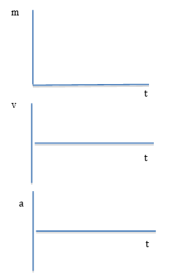
- Use Table IV.4a to summarize the analogy between moving and melting phenomena:
Draw each graph observed for a tossed ball as well as each graph projected for the melting ice in Greenland. - What does the height represent for each graph? The slope?
| TABLE IV.4a Summary of analogy between moving and melting phenomena | |||||
|---|---|---|---|---|---|
| Falling Ball Observations | Melting Ice Observation and Projections | ||||
| Graph | Height | Slope | Graph | Height | Slope |
| Position vs time |
Mass of ice vs time*
|
||||
| Velocity vs time | Velocity of melting vs time | ||||
| Acceleration vs time | Acceleration of melting vs time | ||||
| • Khan et al., “Greenland Ice sheet balance: a review.,” Reports on Progress in Physics 78(4), 046801 (2015). * See also: http://wgms.ch/latest-glacier-mass-balance-data/ |
|||||

1. Example of student work making an analogy between moving and melting phenomena
Developing and using mathematical model of changing phenomena. By watching the trailer and the TED talk we are able to learn about the changes that are happening in Greenland. The glaciers are melting and falling off into the ocean, through the trailer you could see actual images of this happening and it was unlike anything I had ever seen before. These live images really put climate change into perspective for me and make me realize how quickly it is changing.
A position versus time graph represents where a tossed ball is during a time interval.
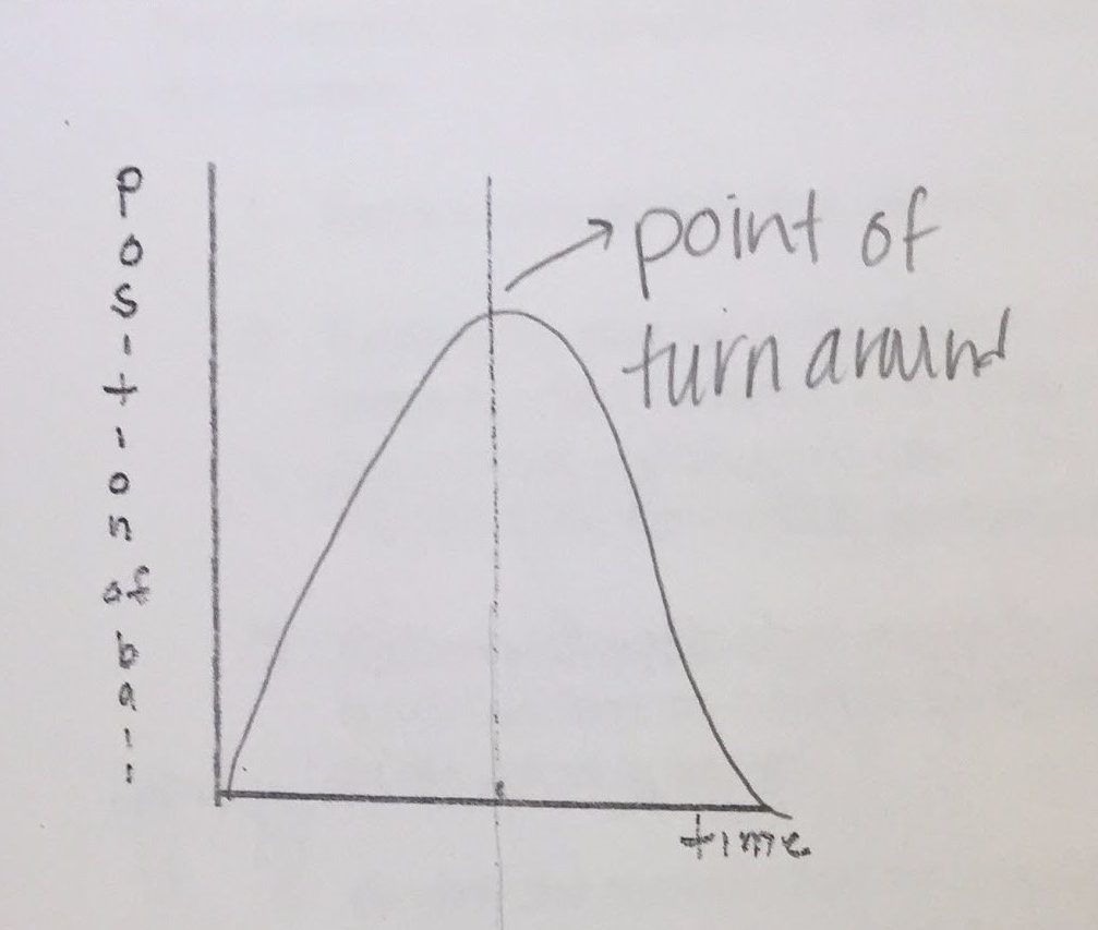
The shape of this graph is a parabola, which looks like an upside down U. The position of the ball after it leaves the person’s hand goes up so the line on the graph has an upward slope and at the point of turnaround it comes back down to the person’s hand and the graph goes into a downward motion.
A velocity versus time graph represents how quickly the position of a tossed ball is changing during a time interval.
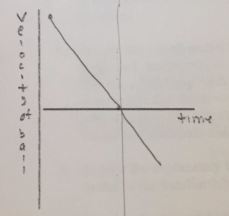
Velocity is how quickly the position the ball is in is changing. Velocity started at a high point but as the ball is being thrown in an upward direction, the velocity is decreasing. When the ball hits the point of turnaround the velocity is zero. When the ball starts going in a downward direction the velocity is increasing in the negative direction.
An acceleration versus time graph represents how quickly the velocity of a tossed ball is changing during a time interval.
The force of Earth is always pulling the ball down, which is why the line is in the negative position on the graph. It doesn’t change because Earth is always pulling down on the ball during any point of the ball’s flight. The “loggerlite” program represents this constant downward pull by having the line be in the negative position.
A mass of ice versus time graph represents how much mass of ice there is during a time interval.
This graph starts half way because this is when they just started taking data from 2002-2014. The slope is increasing. The height of the peak is the winter months because once it is frozen again the mass increases. The low point represents more of the ice melt because there is less ice during the warm summer months. Based on the data that has been collected, showing that there is increasingly more ice melting I can predict that by 2024 the graph will continue in the downward slope as I have shown above…
A velocity of ice melting versus time graph represents how quickly the mass of ice is changing during a time interval.
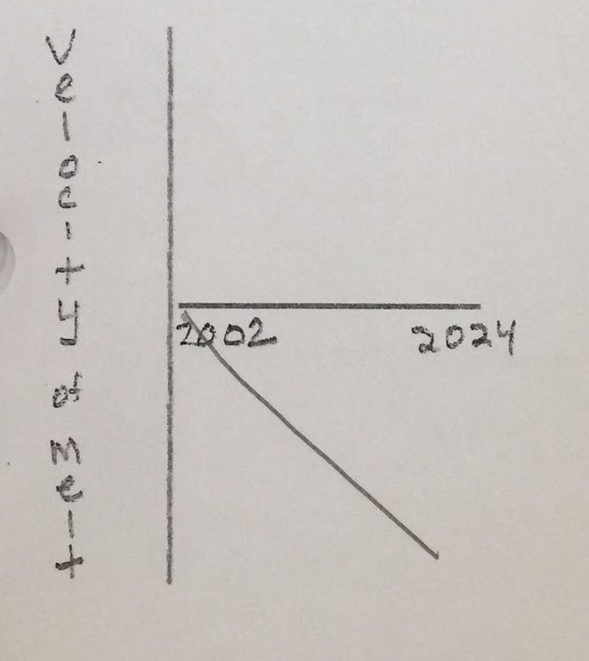
The slope (on the mass vs time graph) is increasing when you compare the years 2002-2004 and 2012-2014. The magnitude of the velocity (of ice melting) in this case is increasing, which in return means that the mass is decreasing. This graph shows that every year there is becoming less mass of ice.
Acceleration of the melting ice melting versus time graph represents how quickly the velocity of ice melting is changing during a time interval.
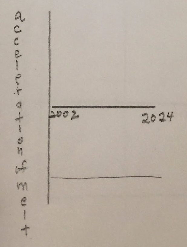
The shape of this graph is a straight line in the negative region of the graph. The acceleration is constant, the line does not have any changes to it. Something is causing the ice to melt but in this case we can change it, unlike the force of gravity pulling down the ball.
Making an analogy to a known process can help one predict a similar process in a different context. Using the information we have gathered from these graphs, we can predict other trends as well. In the business world predicting graphs is used all the time to predict the success of businesses or stocks.
Physics student, Spring 2017
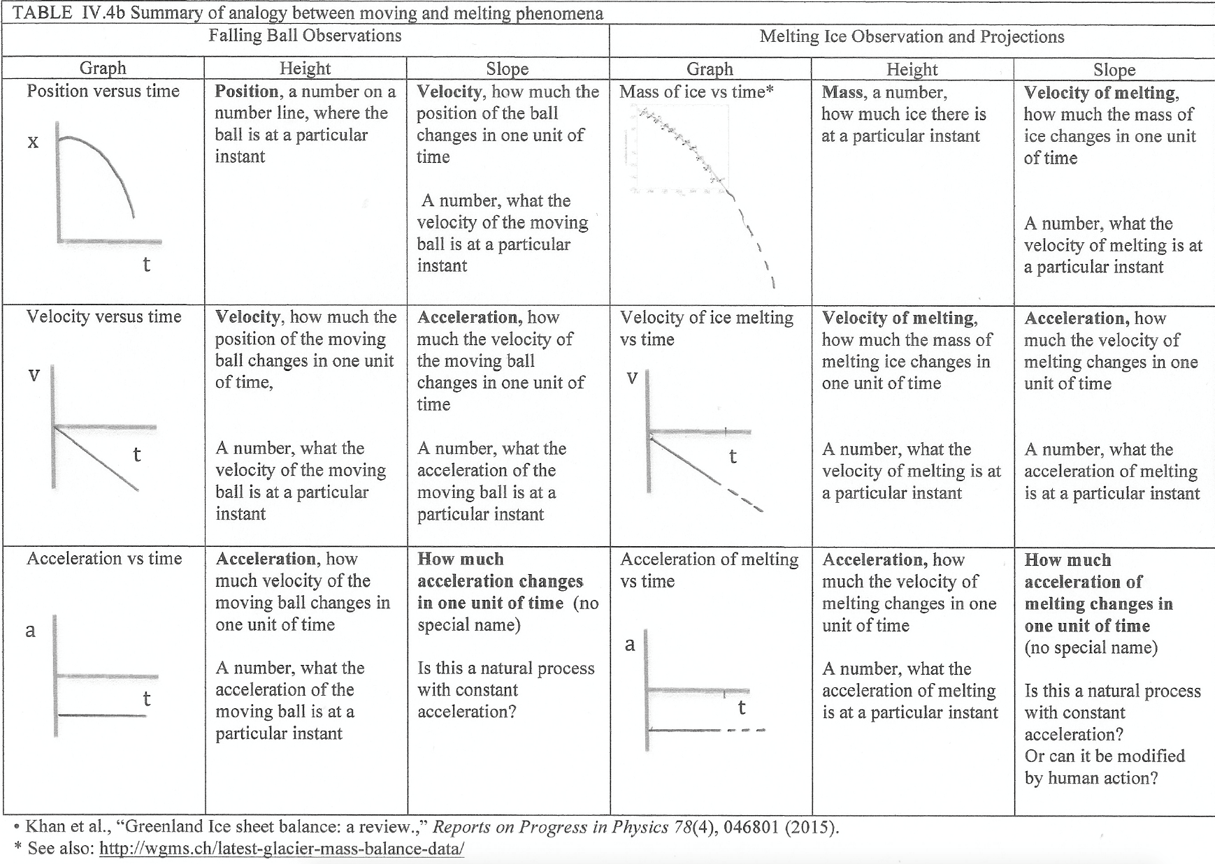
2. Summary of the analogy between moving and melting phenomena
Table IV.4b provides a summary of the analogy between moving and melting phenomena. The position versus time, velocity versus time, and acceleration versus time graphs on the left represent the motion of a ball tossed vertically in the air from the instant that the ball starts falling back down until the instant that it is caught before hitting the ground. The heights and slopes of these graphs provide information about this motion as described in the left columns. The ball speeds up as it falls, accelerating at a constant rate because the Earth is pulling on the ball in the same way throughout the toss.
The mass of ice versus time graph on the right represents the observed decrease in the mass of the Greenland ice sheet as observed from 2002 to 2014 (Khan et al., 2015). The dotted line represents a projection for how this ice sheet might continue melting in the future. The heights and slopes of the melting ice graphs provide projections for increasing rate and acceleration of this melting phenomena as described in the right columns. If the shape of the line representing the rate of ice melting is similar to the rate of the ball falling, the rate of ice melting will speed up, accelerating as time goes by. Although the acceleration of the ball is constant, due to the natural process of the Earth pulling on the ball in the same way throughout its fall, the acceleration of the loss of mass due to melting may be modified by human actions, to reduce (or increase) the amount of greenhouse gases in the atmosphere.
The purpose of this section has been to illustrate the power of mathematics. One can use mathematics to represent something one understands, such as motion phenomena, and then by analogy make projections for interesting phenomena that seem to be behaving in a similar way.
The above projections were for increasing loss of ice in Greenland during the next decade. The graph in Fig. 4.50, however, showed an apparent “lull” in the accelerating loss of ice in Greenland when the mass of freezing of ice during the 2014 winter appeared to have matched the mass of melting ice during the summer of 2013. What has happened since then? See https://www.euronews.com/2019/08/06/before-and-after-pictures-show-greenland-s-rapid-ice-melt-from-space for a news cast during August 2019. See http://nsidc.org/greenland-today/ to find out what is happening “now” when you are reading about this topic. See https://www.nasa.gov/feature/jpl/greenland-antarctica-melting-six-times-faster-than-in-the-1990s for a comparison of melting of ice in Greenland and Antarctica over several decades.
3. Example of student work reflecting upon engaging a friend or family member in learning about global climate change’s impact on melting glaciers.
For this activity, I had my friend watch Chasing Ice so that they could see the drastic effects that are happening to ice shelves. She first asked me where this was and I told her that it was in Greenland. She then made a statement and said, “so this doesn’t really matter for us then since it is so far away?” I asked her if she really thinks that if the Earth is warming up so much that it is melting this ice, that it is not going to affect us and she said, “well when you put it that way I guess it will.” She was very surprised that she didn’t already know about this because it seems like an important thing. I told her it is important and many countries are taking steps to stop the effects of global warming because many scientists have said that it is because of human’s effects on the Earth. She then asked what she could do and I took her to the website that talked about ways that she could reduce her carbon footprint. She liked the idea of biking places instead of driving. She told me that she couldn’t believe how big her carbon footprint was.
The NGSS standard that goes with this is engaging in argument from evidence and we did a little bit of this because at first, she didn’t think that the melting of the ice would be affecting her and through my argument from evidence of warming, I was able to teach her that it wasn’t true. I also used cause and effect because we could see the effect that our carbon footprint and global warming was causing these huge ice shelves to melt in Greenland.
Physics student, Spring 2017