
2.8.2: Stem-and-Leaf Plots and Histograms
- Page ID
- 5775
\( \newcommand{\vecs}[1]{\overset { \scriptstyle \rightharpoonup} {\mathbf{#1}} } \)
\( \newcommand{\vecd}[1]{\overset{-\!-\!\rightharpoonup}{\vphantom{a}\smash {#1}}} \)
\( \newcommand{\id}{\mathrm{id}}\) \( \newcommand{\Span}{\mathrm{span}}\)
( \newcommand{\kernel}{\mathrm{null}\,}\) \( \newcommand{\range}{\mathrm{range}\,}\)
\( \newcommand{\RealPart}{\mathrm{Re}}\) \( \newcommand{\ImaginaryPart}{\mathrm{Im}}\)
\( \newcommand{\Argument}{\mathrm{Arg}}\) \( \newcommand{\norm}[1]{\| #1 \|}\)
\( \newcommand{\inner}[2]{\langle #1, #2 \rangle}\)
\( \newcommand{\Span}{\mathrm{span}}\)
\( \newcommand{\id}{\mathrm{id}}\)
\( \newcommand{\Span}{\mathrm{span}}\)
\( \newcommand{\kernel}{\mathrm{null}\,}\)
\( \newcommand{\range}{\mathrm{range}\,}\)
\( \newcommand{\RealPart}{\mathrm{Re}}\)
\( \newcommand{\ImaginaryPart}{\mathrm{Im}}\)
\( \newcommand{\Argument}{\mathrm{Arg}}\)
\( \newcommand{\norm}[1]{\| #1 \|}\)
\( \newcommand{\inner}[2]{\langle #1, #2 \rangle}\)
\( \newcommand{\Span}{\mathrm{span}}\) \( \newcommand{\AA}{\unicode[.8,0]{x212B}}\)
\( \newcommand{\vectorA}[1]{\vec{#1}} % arrow\)
\( \newcommand{\vectorAt}[1]{\vec{\text{#1}}} % arrow\)
\( \newcommand{\vectorB}[1]{\overset { \scriptstyle \rightharpoonup} {\mathbf{#1}} } \)
\( \newcommand{\vectorC}[1]{\textbf{#1}} \)
\( \newcommand{\vectorD}[1]{\overrightarrow{#1}} \)
\( \newcommand{\vectorDt}[1]{\overrightarrow{\text{#1}}} \)
\( \newcommand{\vectE}[1]{\overset{-\!-\!\rightharpoonup}{\vphantom{a}\smash{\mathbf {#1}}}} \)
\( \newcommand{\vecs}[1]{\overset { \scriptstyle \rightharpoonup} {\mathbf{#1}} } \)
\( \newcommand{\vecd}[1]{\overset{-\!-\!\rightharpoonup}{\vphantom{a}\smash {#1}}} \)
\(\newcommand{\avec}{\mathbf a}\) \(\newcommand{\bvec}{\mathbf b}\) \(\newcommand{\cvec}{\mathbf c}\) \(\newcommand{\dvec}{\mathbf d}\) \(\newcommand{\dtil}{\widetilde{\mathbf d}}\) \(\newcommand{\evec}{\mathbf e}\) \(\newcommand{\fvec}{\mathbf f}\) \(\newcommand{\nvec}{\mathbf n}\) \(\newcommand{\pvec}{\mathbf p}\) \(\newcommand{\qvec}{\mathbf q}\) \(\newcommand{\svec}{\mathbf s}\) \(\newcommand{\tvec}{\mathbf t}\) \(\newcommand{\uvec}{\mathbf u}\) \(\newcommand{\vvec}{\mathbf v}\) \(\newcommand{\wvec}{\mathbf w}\) \(\newcommand{\xvec}{\mathbf x}\) \(\newcommand{\yvec}{\mathbf y}\) \(\newcommand{\zvec}{\mathbf z}\) \(\newcommand{\rvec}{\mathbf r}\) \(\newcommand{\mvec}{\mathbf m}\) \(\newcommand{\zerovec}{\mathbf 0}\) \(\newcommand{\onevec}{\mathbf 1}\) \(\newcommand{\real}{\mathbb R}\) \(\newcommand{\twovec}[2]{\left[\begin{array}{r}#1 \\ #2 \end{array}\right]}\) \(\newcommand{\ctwovec}[2]{\left[\begin{array}{c}#1 \\ #2 \end{array}\right]}\) \(\newcommand{\threevec}[3]{\left[\begin{array}{r}#1 \\ #2 \\ #3 \end{array}\right]}\) \(\newcommand{\cthreevec}[3]{\left[\begin{array}{c}#1 \\ #2 \\ #3 \end{array}\right]}\) \(\newcommand{\fourvec}[4]{\left[\begin{array}{r}#1 \\ #2 \\ #3 \\ #4 \end{array}\right]}\) \(\newcommand{\cfourvec}[4]{\left[\begin{array}{c}#1 \\ #2 \\ #3 \\ #4 \end{array}\right]}\) \(\newcommand{\fivevec}[5]{\left[\begin{array}{r}#1 \\ #2 \\ #3 \\ #4 \\ #5 \\ \end{array}\right]}\) \(\newcommand{\cfivevec}[5]{\left[\begin{array}{c}#1 \\ #2 \\ #3 \\ #4 \\ #5 \\ \end{array}\right]}\) \(\newcommand{\mattwo}[4]{\left[\begin{array}{rr}#1 \amp #2 \\ #3 \amp #4 \\ \end{array}\right]}\) \(\newcommand{\laspan}[1]{\text{Span}\{#1\}}\) \(\newcommand{\bcal}{\cal B}\) \(\newcommand{\ccal}{\cal C}\) \(\newcommand{\scal}{\cal S}\) \(\newcommand{\wcal}{\cal W}\) \(\newcommand{\ecal}{\cal E}\) \(\newcommand{\coords}[2]{\left\{#1\right\}_{#2}}\) \(\newcommand{\gray}[1]{\color{gray}{#1}}\) \(\newcommand{\lgray}[1]{\color{lightgray}{#1}}\) \(\newcommand{\rank}{\operatorname{rank}}\) \(\newcommand{\row}{\text{Row}}\) \(\newcommand{\col}{\text{Col}}\) \(\renewcommand{\row}{\text{Row}}\) \(\newcommand{\nul}{\text{Nul}}\) \(\newcommand{\var}{\text{Var}}\) \(\newcommand{\corr}{\text{corr}}\) \(\newcommand{\len}[1]{\left|#1\right|}\) \(\newcommand{\bbar}{\overline{\bvec}}\) \(\newcommand{\bhat}{\widehat{\bvec}}\) \(\newcommand{\bperp}{\bvec^\perp}\) \(\newcommand{\xhat}{\widehat{\xvec}}\) \(\newcommand{\vhat}{\widehat{\vvec}}\) \(\newcommand{\uhat}{\widehat{\uvec}}\) \(\newcommand{\what}{\widehat{\wvec}}\) \(\newcommand{\Sighat}{\widehat{\Sigma}}\) \(\newcommand{\lt}{<}\) \(\newcommand{\gt}{>}\) \(\newcommand{\amp}{&}\) \(\definecolor{fillinmathshade}{gray}{0.9}\)Stem-and-Leaf Plots and Histograms
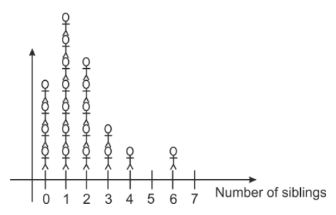
Imagine asking a class of 20 algebra students how many brothers and sisters they had. You would probably get a range of answers from zero on up. Some students would have no siblings, but most would have at least one. The results might look like this:
1, 4, 2, 1, 0, 2, 1, 0, 1, 2, 1, 0, 0, 2, 2, 3, 1, 1, 3, 6
We could organize this information in many ways. The first way might just be to create an ordered list, relisting all the numbers in order, starting with the smallest:
0, 0, 0, 0, 1, 1, 1, 1, 1, 1, 1, 2, 2, 2, 2, 2, 3, 3, 4, 6
Another way to list the results is in a table:
| Number of siblings | Number of matching students |
|---|---|
| 0 | 4 |
| 1 | 7 |
| 2 | 5 |
| 3 | 2 |
| 4 | 1 |
| 5 | 0 |
| 6 | 1 |
We could also make a visual representation of the data by making categories for the number of siblings on the x−axis, and stacking representations of each student above the category marker. We could use crosses, stick-men or even photographs of the students to show how many students are in each category.
Make and Interpret Stem-and-Leaf Plots
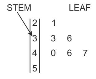
Another useful way to display data is with a stem-and-leaf plot. Stem-and-leaf plots are especially useful because they give a visual representation of how the data is clustered, but preserve all of the numerical information. A stem-and-leaf plot consists of a vertical “stem” containing the first digit of each number, with the rest of each number written to the right of the stem like a “leaf.” In the stem and leaf plot below, the first number represented is 21. It is the only number with a stem of 2, so that makes it the only number in the 20’s. The next two numbers have a common stem of 3. They are 33 and 36. The next numbers are 40, 46 and 47.
Stem-and-leaf plots have a number of advantages over simply listing the data in a single line.
- They show how data is distributed, and whether it is symmetric around the center.
- They can be used as the data is being collected.
- They make it easy to determine the median and mode.
Stem-and-leaf plots are not ideal for all situations; in particular they are not practical when the data is too tightly clustered. For example, with the data above about students’ siblings, all the data points would occupy the same stem (zero). In that case, no additional information could be gained from a stem-and-leaf plot.
Creating a Stem-and-Leaf Plot
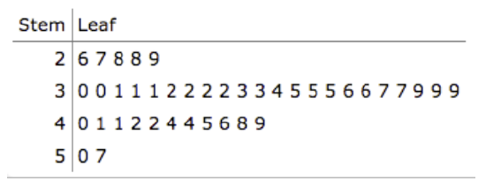
While traveling on a long train journey, Rowena collected the ages of all the passengers traveling in her carriage. The ages for the passengers are shown below. Arrange the data into a stem-and-leaf plot, and use the plot to find the median and mode ages.
35, 42, 38, 57, 2, 24, 27, 36, 45, 60, 38, 40, 40, 44, 1, 44, 48, 84, 38, 20, 4, 2, 48, 58, 3, 20, 6, 40, 22, 26, 17, 18, 40, 51, 62, 31, 27, 48, 35, 27, 37, 58, 21
The first step is to determine a sensible stem. Since all the values fall between 1 and 84, the stem should represent the tens column, and run from 0 to 8 so that the numbers represented can range from 00 (which we would represent by placing a leaf of 0 next to the 0 on the stem) to 89 (a leaf of 9 next to the 8 on the stem). We then go through the data and fill out our plot:
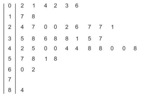
You can see immediately that the interval with the most number of passengers is the 40-49 group. In order to correctly determine the median and the mode, it is helpful to construct a second, ordered stem and leaf plot, placing the leaves on each branch in ascending order
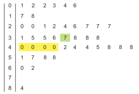
The mode is now apparent—there are 4 zeros in a row on the 4-branch, so the mode is 40. The median is the middle value; since there are 43 data points, the median is the 22nd value. (Using our formula from earlier, (43+1)/2=22.) So the median is 37.
Make and Interpret Histograms
Look again at the example of the algebra students and their siblings. The data was collected in the following list.
1, 4, 2, 1, 0, 2, 1, 0, 1, 2, 1, 0, 0, 2, 2, 3, 1, 1, 3, 6
We were able to organize the data into a table. Here is the table again, but this time we will use the word frequency as a header to indicate the number of times each value occurs in the list.
| Number of siblings | Frequency |
|---|---|
| 0 | 4 |
| 1 | 7 |
| 2 | 5 |
| 3 | 2 |
| 4 | 1 |
| 5 | 0 |
| 6 | 1 |
Now we could use this table as an (x,y) coordinate list to plot a line diagram like this one:
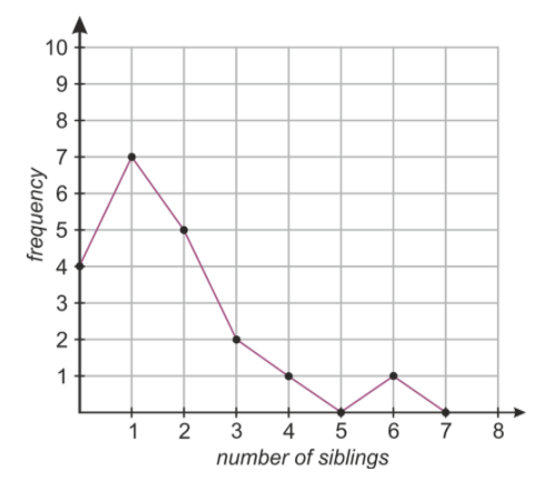
While this diagram does indeed show the data, it is somewhat misleading. For example, the continuous line joining the number of students with one and two siblings makes it look like we know something about how many students have 1.5 siblings (which of course, is impossible). In this case, where the data points are all integers, it’s wrong to suggest that the function is continuous between the points!
When the data we are representing falls into well defined categories (such as the integers 1, 2, 3, 4, 5 & 6) it is more appropriate to use a histogram to display that data. A histogram for this data is shown below.
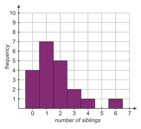
Each number on the x−axis has an associated column, whose height shows how many students have that number of siblings. For example, the column at x=2 is 5 units high, indicating that there are 5 students with 2 siblings.
The categories on the x−axis are called bins. Histograms differ from bar charts in that they don’t necessarily have fixed widths for the bins. They are also useful for displaying continuous data (data that varies continuously rather than in integer amounts). To illustrate this, here are some examples.
Displaying Data in a Histogram
Monthly rainfall (in millimeters) for Beaver Creek Oregon was collected over a five year period, and the data is shown below. Display the data in a histogram.
41.1, 254.7, 91.6, 60.9, 75.6, 36.0, 16.5, 10.6, 62.2, 89.4, 124.9, 176.7, 121.6, 135.6, 141.6, 77.0, 82.8, 28.9, 6.7, 22.1, 29.9, 110.0, 179.3, 97.6, 176.8, 143.5, 129.8, 94.9, 77.0, 60.8, 60.0, 32.5, 61.7, 117.2, 194.5, 208.6, 176.8, 143.5, 129.8, 94.9, 77.0, 60.8, 20.0, 32.5, 61.7, 117.2, 194.5, 208.6, 133.1, 105.2, 92.0, 60.7, 52.8, 37.8, 14.8, 23.1, 41.3, 75.7, 134.6, 148.8
Notice the similarity between histograms and stem-and-leaf plots. A stem-and-leaf plot resembles a histogram on its side. We could start by making a stem-and-leaf plot of our data.
For our data above our stem would be the tens, and run from 1 to 25. Instead of rounding the decimals in the data, we truncate them, meaning we simply remove the decimal. For example, 165.7 would have a stem of 16 and a leaf of 5, and we would just leave out the seven tenths.
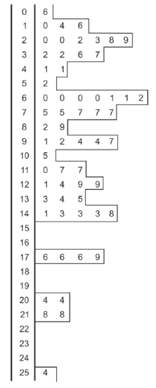
By outlining the numbers on the stem and leaf plot, we can see what a histogram with a bin-width of 10 would look like. You can see that with so many bins, the histogram looks random, with no clear pattern visible. In a situation like this we need to reduce the number of bins. We will increase the bin width to 25 and collect the data in a table:
| Rainfall (mm) | Frequency |
|---|---|
| 0≤x<25 | 7 |
| 25≤x<50 | 8 |
| 50≤x<75 | 9 |
| 75≤x<100 | 12 |
| 100≤x<125 | 6 |
| 125≤x<150 | 9 |
| 150≤x<175 | 0 |
| 175≤x<200 | 6 |
| 200≤x<225 | 2 |
| 225≤x<250 | 0 |
| 250≤x<275 | 1 |
The histogram associated with this bin width is below.
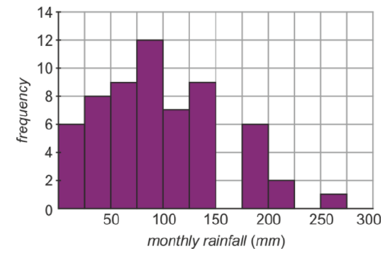
The pattern in the distribution is far more apparent with fewer bins. So let's look at what the histogram would look like with even fewer bins. We will combine bins by pairs to give 6 bins with a bin-width of 50. Our table and histogram now looks like this.
| Rainfall (mm) | Frequency |
|---|---|
| 0≤x<50 | 15 |
| 50≤x<100 | 21 |
| 100≤x<150 | 15 |
| 150≤x<200 | 6 |
| 200≤x<250 | 2 |
| 250≤x<300 | 1 |
The pattern is much clearer now. The normal monthly rainfall is around 75 mm, but sometimes it will be a very wet month and be higher (even much higher).
You can see that although it may be counter-intuitive, sometimes you can see more information by reducing the number of intervals (or bins) in a histogram. It’s a bit like zooming out on a picture; you can’t see as many of the details, but the overall shape of what you are looking at may become clearer.
Make Histograms Using a Graphing Calculator
Look again at the data from the first example. We’ve seen how to manipulate raw data to give a stem-and-leaf plot and a histogram. Now let’s take some of the tedious sorting work out of the process by using a graphing calculator to automatically sort our data into bins.
The following unordered data represents the ages of passengers on a train carriage.
35, 42, 38, 57, 2, 24, 27, 36, 45, 60, 38, 40, 40, 44, 1, 44, 48, 84, 38, 20, 4, 2, 48, 58, 3, 20, 6, 40, 22, 26, 17, 18, 40, 51, 62, 31, 27, 48, 35, 27, 37, 58, 21.
Use a graphing calculator to display the data as a histogram with bin-widths of 10, 5 and 20.
Input the data in your calculator:
Press [START] and choose the [EDIT] option.
Input all 43 data points into the table in column L1.
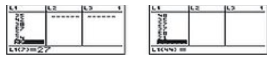
CC BY-NC-SA
Select plot type:
Bring up the [STATPLOT] option by pressing [2nd], [Y=].
Highlight 1:Plot1 and press [ENTER]. This will bring up the plot options screen. Highlight the histogram and press [ENTER]. Make sure the Xlist is the list that contains your data.
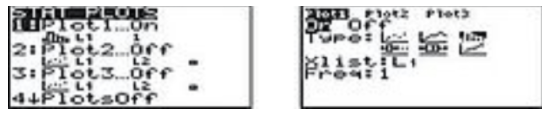
CC BY-NC-SA
Select bin widths and plot:
Press [WINDOW] and ensure that Xmin and Xmax allow for all data points to be shown. The Xscl value determines the bin width.
Press [GRAPH] to display the histogram.
You can change bin widths and see how the histogram changes, by varying Xscl. Below are histograms with bin widths of 10, 5 and 20. (In this example Xmin=0 and Xmax=100 will work whatever bin width we choose, but notice that to display the histogram correctly we need to use a different Ymax value for each.)
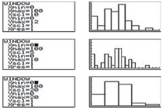
CC BY-NC-SA
Example
Example 1
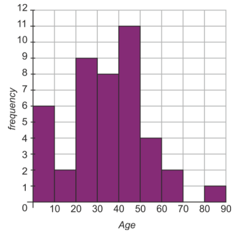
Rowena made a survey of the ages of passengers in a train carriage, and collected the results in a frequency table. Display the results as a histogram.
| Age range | Frequency |
|---|---|
| 0 – 9 | 6 |
| 10 – 19 | 2 |
| 20 – 29 | 9 |
| 30 – 39 | 8 |
| 40 – 49 | 11 |
| 50 – 59 | 4 |
| 60 – 69 | 2 |
| 70 – 79 | 0 |
| 80 – 89 | 1 |
Solution
Since the data is already collected into intervals we will use these as our bins for the histogram. Even though the top end of the first interval is 9, the bin on our histogram will extend to 10. This is because, as we move to continuous data, we have a range of numbers that goes right up to the lower end of the following bin, even if it doesn’t include that number. The range of values for the first bin would therefore be 0≤x<10, and all the other bins would have similarly described ranges.
Review
- Create a stem-and-leaf plot for the following data. Use the first digit (hundreds) as the stem, and the second (tens) as the leaf. Truncate any units and decimals. Order the plot to find the median and the mode. data: 607.4, 886.0, 822.2, 755.7, 900.6, 770.9, 780.8, 760.1, 936.9, 962.9, 859.9, 848.3, 898.7, 670.9, 946.7, 817.8, 868.1, 887.1, 881.3, 744.6, 984.9, 941.5, 851.8, 905.4, 810.6, 765.3, 881.9, 851.6, 815.7, 989.7, 723.4, 869.3, 951.0, 794.7, 807.6, 841.3, 741.5, 822.2, 966.2, 950.1.
- Make a frequency table for the data in Question 1. Use a bin width of 50.
- Plot the data from Question 1 as a histogram with a bin width of
- 50
- 100
For 4-6, use the following stem-and-leaf plot which shows data collected for the speed of 40 cars in a 35 mph limit zone in Culver City, California.
- Find the mean, median and mode speed.
- Create a frequency table, starting at 25 mph with a bin width of 5 mph.
- Use the table to construct a histogram with the intervals from your frequency table.
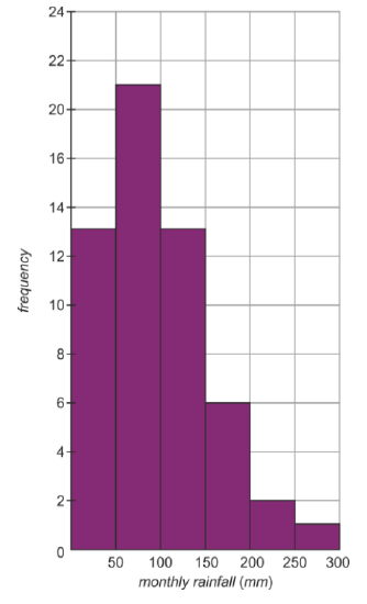
For 7-11 use the histogram shown below. The data is the result of a survey of each subject's number of siblings.
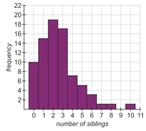
- The median of the data.
- The mean of the data.
- The mode of the data.
- The number of people who have an odd number of siblings.
- The percentage of the people surveyed who have 4 or more siblings.
Vocabulary
| Term | Definition |
|---|---|
| bins | Bins are groups of data plotted on the x-axis. |
| Continuous | Continuity for a point exists when the left and right sided limits match the function evaluated at that point. For a function to be continuous, the function must be continuous at every single point in an unbroken domain. |
| outliers | An outlier is an observation that lies an abnormal distance from other values in a random sample from a population. |
| Range | The range of a data set is the difference between the smallest value and the greatest value in the data set. |
| rank | The rank of an observation is the number of observations that are less than or equal to the value of that observation. |
| standard deviation | The square root of the variance is the standard deviation. Standard deviation is one way to measure the spread of a set of data. |
Additional Resources
PLIX: Play, Learn, Interact, eXplore - Stem-and-Leaf Plots and Histograms: Digital Photography
Video: Stem-and-Leaf Plots and Histograms - A Sample Application
Practice: Stem-and-Leaf Plots and Histograms
Real World: Histograms in Photography