
10.2: Least-Squares Regression Line
- Page ID
- 5798
\( \newcommand{\vecs}[1]{\overset { \scriptstyle \rightharpoonup} {\mathbf{#1}} } \)
\( \newcommand{\vecd}[1]{\overset{-\!-\!\rightharpoonup}{\vphantom{a}\smash {#1}}} \)
\( \newcommand{\id}{\mathrm{id}}\) \( \newcommand{\Span}{\mathrm{span}}\)
( \newcommand{\kernel}{\mathrm{null}\,}\) \( \newcommand{\range}{\mathrm{range}\,}\)
\( \newcommand{\RealPart}{\mathrm{Re}}\) \( \newcommand{\ImaginaryPart}{\mathrm{Im}}\)
\( \newcommand{\Argument}{\mathrm{Arg}}\) \( \newcommand{\norm}[1]{\| #1 \|}\)
\( \newcommand{\inner}[2]{\langle #1, #2 \rangle}\)
\( \newcommand{\Span}{\mathrm{span}}\)
\( \newcommand{\id}{\mathrm{id}}\)
\( \newcommand{\Span}{\mathrm{span}}\)
\( \newcommand{\kernel}{\mathrm{null}\,}\)
\( \newcommand{\range}{\mathrm{range}\,}\)
\( \newcommand{\RealPart}{\mathrm{Re}}\)
\( \newcommand{\ImaginaryPart}{\mathrm{Im}}\)
\( \newcommand{\Argument}{\mathrm{Arg}}\)
\( \newcommand{\norm}[1]{\| #1 \|}\)
\( \newcommand{\inner}[2]{\langle #1, #2 \rangle}\)
\( \newcommand{\Span}{\mathrm{span}}\) \( \newcommand{\AA}{\unicode[.8,0]{x212B}}\)
\( \newcommand{\vectorA}[1]{\vec{#1}} % arrow\)
\( \newcommand{\vectorAt}[1]{\vec{\text{#1}}} % arrow\)
\( \newcommand{\vectorB}[1]{\overset { \scriptstyle \rightharpoonup} {\mathbf{#1}} } \)
\( \newcommand{\vectorC}[1]{\textbf{#1}} \)
\( \newcommand{\vectorD}[1]{\overrightarrow{#1}} \)
\( \newcommand{\vectorDt}[1]{\overrightarrow{\text{#1}}} \)
\( \newcommand{\vectE}[1]{\overset{-\!-\!\rightharpoonup}{\vphantom{a}\smash{\mathbf {#1}}}} \)
\( \newcommand{\vecs}[1]{\overset { \scriptstyle \rightharpoonup} {\mathbf{#1}} } \)
\( \newcommand{\vecd}[1]{\overset{-\!-\!\rightharpoonup}{\vphantom{a}\smash {#1}}} \)
\(\newcommand{\avec}{\mathbf a}\) \(\newcommand{\bvec}{\mathbf b}\) \(\newcommand{\cvec}{\mathbf c}\) \(\newcommand{\dvec}{\mathbf d}\) \(\newcommand{\dtil}{\widetilde{\mathbf d}}\) \(\newcommand{\evec}{\mathbf e}\) \(\newcommand{\fvec}{\mathbf f}\) \(\newcommand{\nvec}{\mathbf n}\) \(\newcommand{\pvec}{\mathbf p}\) \(\newcommand{\qvec}{\mathbf q}\) \(\newcommand{\svec}{\mathbf s}\) \(\newcommand{\tvec}{\mathbf t}\) \(\newcommand{\uvec}{\mathbf u}\) \(\newcommand{\vvec}{\mathbf v}\) \(\newcommand{\wvec}{\mathbf w}\) \(\newcommand{\xvec}{\mathbf x}\) \(\newcommand{\yvec}{\mathbf y}\) \(\newcommand{\zvec}{\mathbf z}\) \(\newcommand{\rvec}{\mathbf r}\) \(\newcommand{\mvec}{\mathbf m}\) \(\newcommand{\zerovec}{\mathbf 0}\) \(\newcommand{\onevec}{\mathbf 1}\) \(\newcommand{\real}{\mathbb R}\) \(\newcommand{\twovec}[2]{\left[\begin{array}{r}#1 \\ #2 \end{array}\right]}\) \(\newcommand{\ctwovec}[2]{\left[\begin{array}{c}#1 \\ #2 \end{array}\right]}\) \(\newcommand{\threevec}[3]{\left[\begin{array}{r}#1 \\ #2 \\ #3 \end{array}\right]}\) \(\newcommand{\cthreevec}[3]{\left[\begin{array}{c}#1 \\ #2 \\ #3 \end{array}\right]}\) \(\newcommand{\fourvec}[4]{\left[\begin{array}{r}#1 \\ #2 \\ #3 \\ #4 \end{array}\right]}\) \(\newcommand{\cfourvec}[4]{\left[\begin{array}{c}#1 \\ #2 \\ #3 \\ #4 \end{array}\right]}\) \(\newcommand{\fivevec}[5]{\left[\begin{array}{r}#1 \\ #2 \\ #3 \\ #4 \\ #5 \\ \end{array}\right]}\) \(\newcommand{\cfivevec}[5]{\left[\begin{array}{c}#1 \\ #2 \\ #3 \\ #4 \\ #5 \\ \end{array}\right]}\) \(\newcommand{\mattwo}[4]{\left[\begin{array}{rr}#1 \amp #2 \\ #3 \amp #4 \\ \end{array}\right]}\) \(\newcommand{\laspan}[1]{\text{Span}\{#1\}}\) \(\newcommand{\bcal}{\cal B}\) \(\newcommand{\ccal}{\cal C}\) \(\newcommand{\scal}{\cal S}\) \(\newcommand{\wcal}{\cal W}\) \(\newcommand{\ecal}{\cal E}\) \(\newcommand{\coords}[2]{\left\{#1\right\}_{#2}}\) \(\newcommand{\gray}[1]{\color{gray}{#1}}\) \(\newcommand{\lgray}[1]{\color{lightgray}{#1}}\) \(\newcommand{\rank}{\operatorname{rank}}\) \(\newcommand{\row}{\text{Row}}\) \(\newcommand{\col}{\text{Col}}\) \(\renewcommand{\row}{\text{Row}}\) \(\newcommand{\nul}{\text{Nul}}\) \(\newcommand{\var}{\text{Var}}\) \(\newcommand{\corr}{\text{corr}}\) \(\newcommand{\len}[1]{\left|#1\right|}\) \(\newcommand{\bbar}{\overline{\bvec}}\) \(\newcommand{\bhat}{\widehat{\bvec}}\) \(\newcommand{\bperp}{\bvec^\perp}\) \(\newcommand{\xhat}{\widehat{\xvec}}\) \(\newcommand{\vhat}{\widehat{\vvec}}\) \(\newcommand{\uhat}{\widehat{\uvec}}\) \(\newcommand{\what}{\widehat{\wvec}}\) \(\newcommand{\Sighat}{\widehat{\Sigma}}\) \(\newcommand{\lt}{<}\) \(\newcommand{\gt}{>}\) \(\newcommand{\amp}{&}\) \(\definecolor{fillinmathshade}{gray}{0.9}\)Linear Regression
We have learned about the concept of correlation, which we defined as the measure of the linear relationship between two variables. As a reminder, when we have a strong positive correlation, we can expect that if the score on one variable is high, the score on the other variable will also most likely be high. With correlation, we are able to roughly predict the score of one variable when we have the other. Prediction is simply the process of estimating scores of one variable based on the scores of another variable.
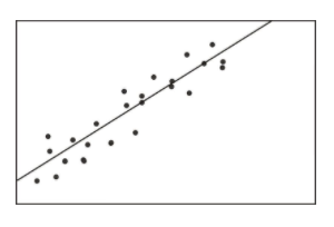
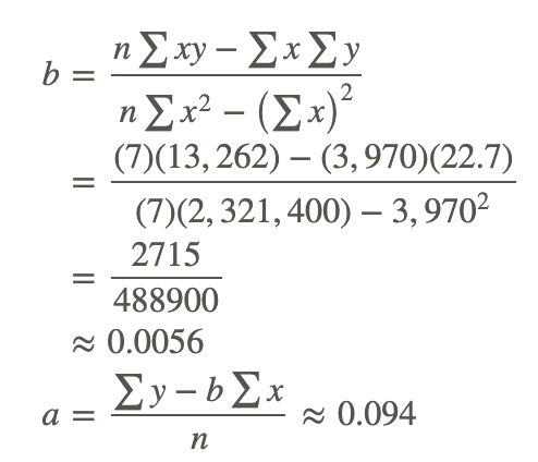
In a previous Concept, we illustrated the concept of correlation through scatterplot graphs. We saw that when variables were correlated, the points on a scatterplot graph tended to follow a straight line. If we could draw this straight line, it would, in theory, represent the change in one variable associated with the change in the other. This line is called the least squares line, or the linear regression line (see figure below).
Calculating and Graphing the Regression Line
Linear regression involves using data to calculate a line that best fits that data and then using that line to predict scores. In linear regression, we use one variable (the predictor variable) to predict the outcome of another (the outcome variable, or criterion variable). To calculate this line, we analyze the patterns between the two variables.
We are looking for a line of best fit, and there are many ways one could define this best fit. Statisticians define this line to be the one which minimizes the sum of the squared distances from the observed data to the line.
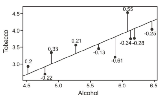
To determine this line, we want to find the change in X that will be reflected by the average change in Y. After we calculate this average change, we can apply it to any value of X to get an approximation of Y. Since the regression line is used to predict the value of Y for any given value of X, all predicted values will be located on the regression line, itself. Therefore, we try to fit the regression line to the data by having the smallest sum of squared distances possible from each of the data points to the line. In the example below, you can see the calculated distances, or residual values, from each of the observations to the regression line. This method of fitting the data line so that there is minimal difference between the observations and the line is called the method of least squares, which we will discuss further in the following sections.
As you can see, the regression line is a straight line that expresses the relationship between two variables. When predicting one score by using another, we use an equation such as the following, which is equivalent to the slope-intercept form of the equation for a straight line:
Y=bX+a
where:
Y is the score that we are trying to predict.
b is the slope of the line.
a is the y-intercept, or the value of Y when the value of X is 0.
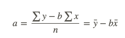
To calculate the line itself, we need to find the values for b (the regression coefficient) and a (the regression constant). The regression coefficient explains the nature of the relationship between the two variables. Essentially, the regression coefficient tells us that a certain change in the predictor variable is associated with a certain change in the outcome, or criterion, variable. For example, if we had a regression coefficient of 10.76, we would say that a change of 1 unit in X is associated with a change of 10.76 units of Y. To calculate this regression coefficient, we can use the following formulas:
where:
r is the correlation between the variables X and Y.
sY is the standard deviation of the Y scores.
sX is the standard deviation of the X scores.
In addition to calculating the regression coefficient, we also need to calculate the regression constant. The regression constant is also the y-intercept and is the place where the line crosses the y-axis. For example, if we had an equation with a regression constant of 4.58, we would conclude that the regression line crosses the y-axis at 4.58. We use the following formula to calculate the regression constant:
Finding the Line of Best Fit
Find the least squares line (also known as the linear regression line or the line of best fit) for the example measuring the verbal SAT scores and GPAs of students that was used in the previous section.
| Student | SAT Score (X) | GPA (Y) | xy | x2 | y2 |
|---|---|---|---|---|---|
| 1 | 595 | 3.4 | 2023 | 354025 | 11.56 |
| 2 | 520 | 3.2 | 1664 | 270400 | 10.24 |
| 3 | 715 | 3.9 | 2789 | 511225 | 15.21 |
| 4 | 405 | 2.3 | 932 | 164025 | 5.29 |
| 5 | 680 | 3.9 | 2652 | 462400 | 15.21 |
| 6 | 490 | 2.5 | 1225 | 240100 | 6.25 |
| 7 | 565 | 3.5 | 1978 | 319225 | 12.25 |
| Sum | 3970 | 22.7 | 13262 | 2321400 | 76.01 |
Using these data points, we first calculate the regression coefficient and the regression constant as follows:
Note: If you performed the calculations yourself and did not get exactly the same answers, it is probably due to rounding in the table for xy.
Now that we have the equation of this line, it is easy to plot on a scatterplot. To plot this line, we simply substitute two values of X and calculate the corresponding Y values to get two pairs of coordinates. Let’s say that we wanted to plot this example on a scatterplot. We would choose two hypothetical values for X (say, 400 and 500) and then solve for Y in order to identify the coordinates (400, 2.334) and (500, 2.894). From these pairs of coordinates, we can draw the regression line on the scatterplot.
Predicting Values Using Scatterplot Data
One of the uses of a regression line is to predict values. After calculating this line, we are able to predict values by simply substituting a value of a predictor variable, X, into the regression equation and solving the equation for the outcome variable, Y. In our example above, we can predict the students’ GPA's from their SAT scores by plugging in the desired values into our regression equation, Y=0.0056X+0.094.
Predicting Values using Linear Regression
Say that we wanted to predict the GPA for two students, one who had an SAT score of 500 and the other who had an SAT score of 600. To predict the GPA scores for these two students, we would simply plug the two values of the predictor variable into the equation and solve for Y (see below).
| Student | SAT Score (X) | GPA (Y) | Predicted GPA (Ŷ ) |
|---|---|---|---|
| 1 | 595 | 3.4 | 3.4 |
| 2 | 520 | 3.2 | 3.0 |
| 3 | 715 | 3.9 | 4.1 |
| 4 | 405 | 2.3 | 2.3 |
| 5 | 680 | 3.9 | 3.9 |
| 6 | 490 | 2.5 | 2.8 |
| 7 | 565 | 3.5 | 3.2 |
| Hypothetical | 600 | 3.4 | |
| Hypothetical | 500 | 2.9 |
As you can see, we are able to predict the value for Y for any value of X within a specified range.
Outliers and Influential Points
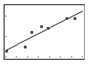
An outlier is an extreme observation that does not fit the general correlation or regression pattern (see figure below). In the regression setting, outliers will be far away from the regression line in the y-direction. Since it is an unusual observation, the inclusion of an outlier may affect the slope and the y-intercept of the regression line. When examining a scatterplot graph and calculating the regression equation, it is worth considering whether extreme observations should be included or not. In the following scatterplot, the outlier has approximate coordinates of (30, 6,000).
Let’s use our example above to illustrate the effect of a single outlier. Say that we have a student who has a high GPA but who suffered from test anxiety the morning of the SAT verbal test and scored a 410. Using our original regression equation, we would expect the student to have a GPA of 2.2. But, in reality, the student has a GPA equal to 3.9. The inclusion of this value would change the slope of the regression equation from 0.0055 to 0.0032, which is quite a large difference.
There is no set rule when trying to decide whether or not to include an outlier in regression analysis. This decision depends on the sample size, how extreme the outlier is, and the normality of the distribution. For univariate data, we can use the IQR rule to determine whether or not a point is an outlier. We should consider values that are 1.5 times the inter-quartile range below the first quartile or above the third quartile as outliers. Extreme outliers are values that are 3.0 times the inter-quartile range below the first quartile or above the third quartile.
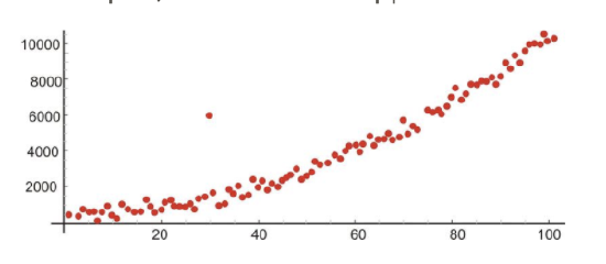
An influential point in regression is one whose removal would greatly impact the equation of the regression line. Usually, an influential point will be separated in the x direction from the other observations. It is possible for an outlier to be an influential point. However, there are some influential points that would not be considered outliers. These will not be far from the regression line in the y-direction (a value called a residual, discussed later) so you must look carefully for them. In the following scatterplot, the influential point has approximate coordinates of (85, 35,000).
It is important to determine whether influential points are 1) correct and 2) belong in the population. If they are not correct or do not belong, then they can be removed. If, however, an influential point is determined to indeed belong in the population and be correct, then one should consider whether other data points need to be found with similar x-values to support the data and regression line.
Transformations to Achieve Linearity
Sometimes we find that there is a relationship between X and Y, but it is not best summarized by a straight line. When looking at the scatterplot graphs of correlation patterns, these relationships would be shown to be curvilinear. While many relationships are linear, there are quite a number that are not, including learning curves (learning more quickly at the beginning, followed by a leveling out) and exponential growth (doubling in size, for example, with each unit of growth). Below is an example of a growth curve describing the growth of a complex society:
Since this is not a linear relationship, we cannot immediately fit a regression line to this data. However, we can perform a transformation to achieve a linear relationship. We commonly use transformations in everyday life. For example, the Richter scale, which measures earthquake intensity, and the idea of describing pay raises in terms of percentages are both examples of making transformations of non-linear data.
Consider the following exponential relationship, and take the log of both sides as shown:
y = abx
log y = log(abx)
log y = log a + log bx
log y = log a + x log b
In this example, a and b are real numbers (constants), so this is now a linear relationship between the variables x and logy.
Thus, you can find a least squares line for these variables.
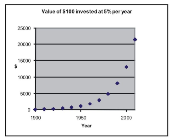
Let’s take a look at an example to help clarify this concept. Say that we were interested in making a case for investing and examining how much return on investment one would get on $100 over time. Let’s assume that we invested $100 in the year 1900 and that this money accrued 5% interest every year. The table below details how much we would have each decade:
| Year | Investment with 5% Each Year |
|---|---|
| 1900 | 100 |
| 1910 | 163 |
| 1920 | 265 |
| 1930 | 432 |
| 1940 | 704 |
| 1950 | 1147 |
| 1960 | 1868 |
| 1970 | 3043 |
| 1980 | 4956 |
| 1990 | 8073 |
| 2000 | 13150 |
| 2010 | 21420 |
If we graphed these data points, we would see that we have an exponential growth curve.
Say that we wanted to fit a linear regression line to these data. First, we would transform these data using logarithmic transformations as follows:
| Year | Investment with 5% Each Year | Log of amount |
|---|---|---|
| 1900 | 100 | 2 |
| 1910 | 163 | 2.211893 |
| 1920 | 265 | 2.423786 |
| 1930 | 432 | 2.635679 |
| 1940 | 704 | 2.847572 |
| 1950 | 1147 | 3.059465 |
| 1960 | 1868 | 3.271358 |
| 1970 | 3043 | 3.483251 |
| 1980 | 4956 | 3.695144 |
| 1990 | 8073 | 3.907037 |
| 2000 | 13150 | 4.118930 |
| 2010 | 21420 | 4.330823 |
If we plotted these transformed data points, we would see that we have a linear relationship as shown below:
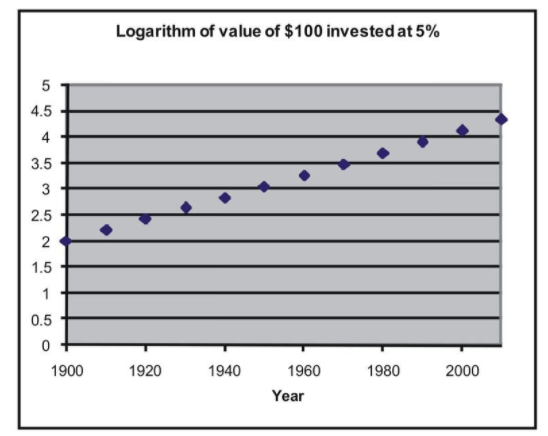
We can now perform a linear regression on (year, log of amount). If you enter the data into the TI-83/84 calculator, press [STAT], go to the CALC menu, and use the 'LinReg(ax+b)' command, you find the following relationship:
Y=0.021X−38.2
with X representing year and Y representing log of amount.
Calculating Residuals and Understanding their Relation to the Regression Equation
Recall that the linear regression line is the line that best fits the given data. Ideally, we would like to minimize the distances of all data points to the regression line. These distances are called the error, e, and are also known as the residual values. As mentioned, we fit the regression line to the data points in a scatterplot using the least-squares method. A good line will have small residuals. Notice in the figure below that the residuals are the vertical distances between the observations and the predicted values on the regression line:
To find the residual values, we subtract the predicted values from the actual values, so e=y−ŷ . Theoretically, the sum of all residual values is zero, since we are finding the line of best fit, with the predicted values as close as possible to the actual value. It does not make sense to use the sum of the residuals as an indicator of the fit, since, again, the negative and positive residuals always cancel each other out to give a sum of zero. Therefore, we try to minimize the sum of the squared residuals, or ∑(y−ŷ )2.
Calculating Residuals
Calculate the residuals for the predicted and the actual GPA's from our sample above.
| Student | SAT Score (X) | GPA (Y) | Predicted GPA (Ŷ ) | Residual Value | Residual Value Squared |
|---|---|---|---|---|---|
| 1 | 595 | 3.4 | 3.4 | 0 | 0 |
| 2 | 520 | 3.2 | 3.0 | 0.2 | 0.04 |
| 3 | 715 | 3.9 | 4.1 | −0.2 | 0.04 |
| 4 | 405 | 2.3 | 2.3 | 0 | 0 |
| 5 | 680 | 3.9 | 3.9 | 0 | 0 |
| 6 | 490 | 2.5 | 2.8 | −0.3 | 0.09 |
| 7 | 565 | 3.5 | 3.2 | 0.3 | 0.09 |
| ∑(y−ŷ )2 | 0.26 |
Plotting Residuals and Testing for Linearity
To test for linearity and to determine if we should drop extreme observations (or outliers) from our analysis, it is helpful to plot the residuals. When plotting, we simply plot the x-value for each observation on the x-axis and then plot the residual score on the y-axis. When examining this scatterplot, the data points should appear to have no correlation, with approximately half of the points above 0 and the other half below 0. In addition, the points should be evenly distributed along the x-axis. Below is an example of what a residual scatterplot should look like if there are no outliers and a linear relationship.
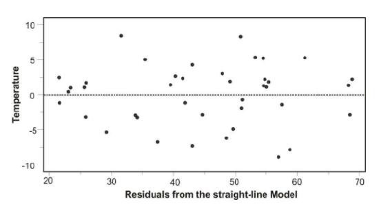
If the scatterplot of the residuals does not look similar to the one shown, we should look at the situation a bit more closely. For example, if more observations are below 0, we may have a positive outlying residual score that is skewing the distribution, and if more of the observations are above 0, we may have a negative outlying residual score. If the points are clustered close to the y-axis, we could have an x-value that is an outlier. If this occurs, we may want to consider dropping the observation to see if this would impact the plot of the residuals. If we do decide to drop the observation, we will need to recalculate the original regression line. After this recalculation, we will have a regression line that better fits a majority of the data.
Examples
Suppose a regression equation relating the average August temperature (y) and geographic latitudes (x) of 20 cities in the US is given by: ŷ =113.6−1.01x
Example 1
What is the slope of the line? Write a sentence that interprets this slope.
The slope of the line is -1.01, which is the coefficient of the variable x. Since the slope is a rate of change, this slope means there is a decrease of 1.01 in temperature for each increase of 1 unit in latitude. It is a decrease in temperature because the slope is negative.
Example 2
Estimate the mean August temperature for a city with latitude of 34.
An estimate of the mean temperature for a city with latitude of 34 is 113.6 – 1.01(34) = 79.26 degrees.
Example 3
San Francisco has a mean August temperature of 64 and latitude of 38. Use the regression equation to estimate the mean August temperature of San Francisco and determine the residual.
San Francisco has a latitude of 38. The regression equation, therefore, estimates it mean temperature for August to be 113.6 – 1.01(38) = 75.22 degrees. The residual is 64 – 75.22 = -11.22 degrees.
Review
- A school nurse is interested in predicting scores on a memory test from the number of times that a student exercises per week. Below are her observations:
| Student | Exercise Per Week | Memory Test Score |
|---|---|---|
| 1 | 0 | 15 |
| 2 | 2 | 3 |
| 3 | 2 | 12 |
| 4 | 1 | 11 |
| 5 | 3 | 5 |
| 6 | 1 | 8 |
| 7 | 2 | 15 |
| 8 | 0 | 13 |
| 9 | 3 | 2 |
| 10 | 3 | 4 |
| 11 | 4 | 2 |
| 12 | 1 | 8 |
| 13 | 1 | 10 |
| 14 | 1 | 12 |
| 15 | 2 | 8 |
(a) Plot this data on a scatterplot, with the x-axis representing the number of times exercising per week and the y-axis representing memory test score.
(b) Does this appear to be a linear relationship? Why or why not?
(c) What regression equation would you use to construct a linear regression model?
(d) What is the regression coefficient in this linear regression model and what does this mean in words?
(e) Calculate the regression equation for these data.
(f) Draw the regression line on the scatterplot.
(g) What is the predicted memory test score of a student who exercises 3 times per week?
(h) Do you think that a data transformation is necessary in order to build an accurate linear regression model? Why or why not?
(i) Calculate the residuals for each of the observations and plot these residuals on a scatterplot.
(j) Examine this scatterplot of the residuals. Is a transformation of the data necessary? Why or why not?
- Suppose that the regression equation for the relationship between y=weight (in pounds) and x=height (in inches) for men aged 18 to 29 years old is: Average weight y=−249+7x.
- Estimate the average weight for men in this age group who are 68 inches tall.
- What is the slope of the regression line for average weight and height? Write a sentence that interprets this slope in terms of how much weight changes as height is increased by one inch.
- Suppose a man is 70 inches tall. Use the regression equation to predict the weight of this man.
- Suppose a man who is 70 inches tall weighs 193 pounds. Calculate the residual for this individual.
- For a certain group of people, the regression line for predicting income (dollars) from education (years of schooling completed) is y=mx+b . The units for are ______ . The units for are _________.
- Imagine a regression line that relates y = average systolic blood pressure to x = age. The average blood pressure of people 45 years old is 127, while for those 60 years old is 134.
- What is the slope of the regression line?
- What is the estimated average systolic blood pressure for people who are 48 years old.
- For the following table of values calculate the regression line and then calculate ŷ for each data point.
X 4 4 7 10 10
Y 15 11 19 21 29 - Suppose the regression line relating verbal SAT scores and GPA is: Average GPA = 0.539 + .00365Verbal SAT
- Estimate the average GPA for those with verbal SAT scores of 650.
- Explain what the slope of 0.00365 represents in the relationship between the two variables.
- For two students whose verbal SAT scores differ by 50 points, what is the estimated difference in college GPAs?
- The lowest SAT score is 200. Does this have any useful meaning in this example? Explain.
- A regression equation is obtained for the following set of data points: (2, 28), (4, 33), (6, 39), (6, 45), (10, 47), (12, 52). For what range of x values would it be reasonable to use the regression equation to predict the y value corresponding to the x value? Why?
- A copy machine dealer has data on the number of copy machines, x, at each of 89 locations and the number of service calls, y, in a month at each location. Summary calculations give x¯=8.4,sx=2.1,y¯=14.2,sy=3.8,r=0.86. What is the slope of the least squares regression line of number of service calls on number of copiers?
- A study of 1,000 families gave the following results: Average height of husband is x¯=68 inches, sx=2.7 inches Average height of wife is y¯=63 inches, sy=2.5 inches, r=.25 Estimate the height of a wife when her husband is 73 inches tall.
- What does it mean when a residual plot exhibits a curved pattern?
- Hooke’s Law states that, when a load (weight) is placed on a spring, length under load = constant (load) + length under no load. The following experimental results are obtained:
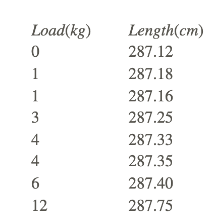
a. Find the regression equation for predicting length from load.
b. Use the equation to predict length at the following loads: 2 kg, 3 kg, 5 kg, 105 kg.
c. Estimate the length of the spring under no load.
d. Estimate the constant in Hooke’s law
- Consider the following data points: (1, 4), (2, 10), (3, 14), (4, 16) and the following possible regression lines: ŷ =3+3x and ŷ 1+4x. By the least squares criterion which of these lines is better for this data? What is it better?
- For ten friends (all of the same sex) determine the height and weight.
- Draw a scatterplot of the data with weight on the vertical axis and height on the horizontal axis. Draw a line that you believe describes the pattern.
- Using your calculator, compute the least squares regression line and compare the slope of this line to the slope of the line you drew in part (a).
- Suppose a researcher is studying the relationship between two variables, x and y. For part of the analysis she computes a correlation of -.450.
- Explain how to interpret the reported value of the correlation.
- Can you tell whether the sign of the slope in the corresponding regression equation would be positive or negative? Why?
- Suppose the regression equation were ŷ =6.5−0.2x. Interpret the slope, and show how to find the predicted y for an x=45.
- True or False:
- For a given set of data on two quantitative variables, the slope of the least squares regression line and the correlation must have the same sign.
- For a given set of data on two quantitative variables, the regression equation and the correlation do not depend on the units of measurement.
- Any point that is an influential observation is also an outlier, while an outlier may or may not be an influential observation.
- Following is computer output relating son’s height to dad’s height for a sample of n=76 college males.
The regression equation is Height = 30.0 +.576 dad height
76 cases used 3 cases contain missing values
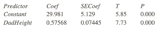
S=2.657 and R−Sq=44.7%
a. What is the equation for the regression line?
b. Identify the value of the t-statistic for testing whether or not the slope is 0.
c. State and test the hypotheses about whether or not the population slope is 0. Use information from the computer output.
d. Compute a 95% confidence interval for β1 , the slope of the relationship in the population.
Vocabulary
| Term | Definition |
|---|---|
| criterion variable | The outcome variable in a linear regression is the criterion variable. |
| Influential point | An influential point in regression is one whose removal would greatly impact the equation of the regression line. |
| least squares method | The least squares method is a statistical method for calculating the line of best fit for a scatterplot. |
| least squares regression line | If we draw a straight line to represent the change in one variable associated with the change in the other. This line is called the linear regression line. |
| line of best fit | The line of best fit on a scatterplot is a draw line that best represents the trend of the data. |
| outliers | An outlier is an observation that lies an abnormal distance from other values in a random sample from a population. |
| Prediction | A prediction is a statement one makes about the likelihood of a future event. |
| predictor variable | A predictor variable is a variable that can be used to predict the value of another variable (as in statistical regression). |
| regression coefficient | The regression coefficient (or the slope) explains the nature of the relationship between the two variables. |
| residual values | The differences between the actual and the predicted values are called residual values. |
| test for linearity | tests for linearity, a rule of thumb that says a relationship is linear if the difference between the linear correlation coefficient (r) and the nonlinear correlation coefficient (eta) is small |
| transformed data | When there is an exponential relationship between the variables, we can transform the data by taking the log of the dependent variable to achieve linearity between x and log y. |
Additional Resources
PLIX: Play, Learn, Interact, eXplore - Least-Squares Regression
Video: Intro to Linear Regression
Practice: Least-Squares Regression